The public is more familiar with bad design than good design.
Three primary themes differentiate iOS from other platforms:
Clarity. Throughout the system, text is legible at every size, icons are precise and lucid, adornments are subtle and appropriate, and a sharpened focus on functionality motivates the design. Negative space, color, fonts, graphics, and interface elements subtly highlight important content and convey interactivity.
Deference. Fluid motion and a crisp, beautiful interface help people understand and interact with content while never competing with it. Content typically fills the entire screen, while translucency and blurring often hint at more. Minimal use of bezels, gradients, and drop shadows keep the interface light and airy, while ensuring that content is paramount.
Depth. Distinct visual layers and realistic motion convey hierarchy, impart vitality, and facilitate understanding. Touch and discoverability heighten delight and enable access to functionality and additional content without losing context. Transitions provide a sense of depth as you navigate through content.
Bars
| Element name | Definiton / Picture / GIF |
|---|---|
| Navigation Bar | 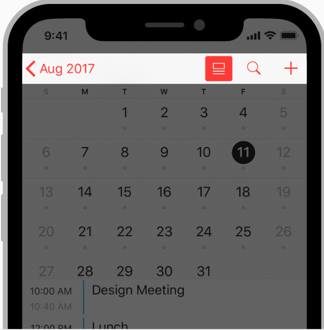 A navigation bar appears at the top of an app screen, below the status bar, and enables navigation through a series of hierarchical screens. A navigation bar appears at the top of an app screen, below the status bar, and enables navigation through a series of hierarchical screens. |
| Navigation Bar Title |  A navigation bar title helps people understand what they’re looking at. A navigation bar title helps people understand what they’re looking at. |
| Search Bar | 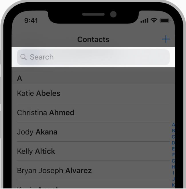 A search bar allows people to search through a large collection of values by typing text into a field. A search bar allows people to search through a large collection of values by typing text into a field. |
| Status Bar |  The status bar appears along the upper edge of the screen and displays useful information about the device’s current state, like the time, cellular carrier, network status, and battery level. The status bar appears along the upper edge of the screen and displays useful information about the device’s current state, like the time, cellular carrier, network status, and battery level. |
| Tab Bar |  A tab bar appears at the bottom of an app screen and provides the ability to quickly switch between different sections of an app. A tab bar appears at the bottom of an app screen and provides the ability to quickly switch between different sections of an app. |
| Toolbar |  A toolbar appears at the bottom of an app screen and contains buttons for performing actions relevant to the current view or content within it. A toolbar appears at the bottom of an app screen and contains buttons for performing actions relevant to the current view or content within it. |
Views
| Element name | Definiton / Picture / GIF |
|---|---|
| Popover |  A popover is a transient view that appears above other content onscreen when you tap a control or in an area. A popover is a transient view that appears above other content onscreen when you tap a control or in an area. |
| Scroll View | A scroll view allows users to browse content, such as text in a document or a collection of images, that’s larger than the visible area. |
| Split View | A split view manages the presentation of two side-by-side panes of content, with persistent content in the primary pane and related information in the secondary pane. Each pane can contain any variety of elements, including navigation bars, toolbars, tab bars, tables, collections, images, maps, and custom views. |
Controls
| Element name | Definiton / Picture / GIF |
|---|---|
| Activity Indicator |  An activity indicator spins while an unquantifiable task, such as loading or synchronizing complex data, is performed. An activity indicator spins while an unquantifiable task, such as loading or synchronizing complex data, is performed. |
| Page Control | 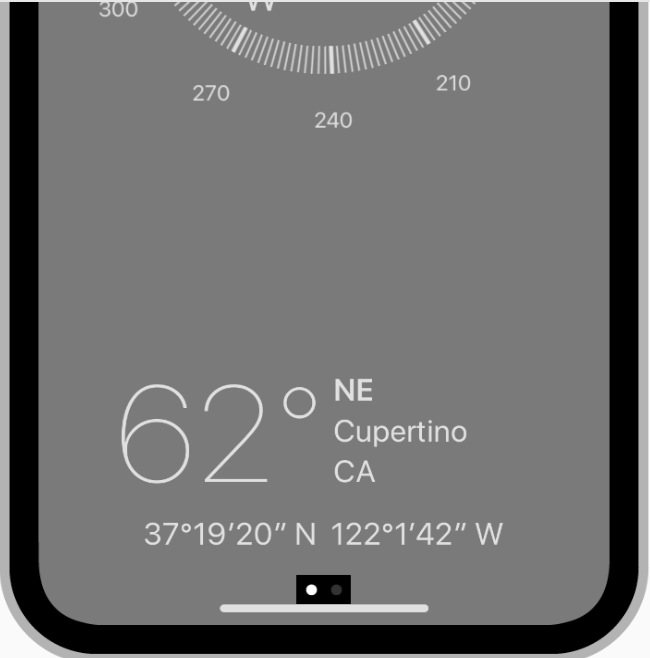 A page control shows the position of the current page in a flat list of pages. A page control shows the position of the current page in a flat list of pages. |
| Date Picker | 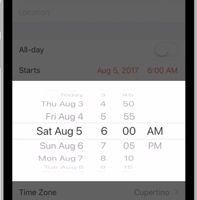 A date picker is an efficient interface for selecting a specific date, time, or both. A date picker is an efficient interface for selecting a specific date, time, or both. |
| Slider | 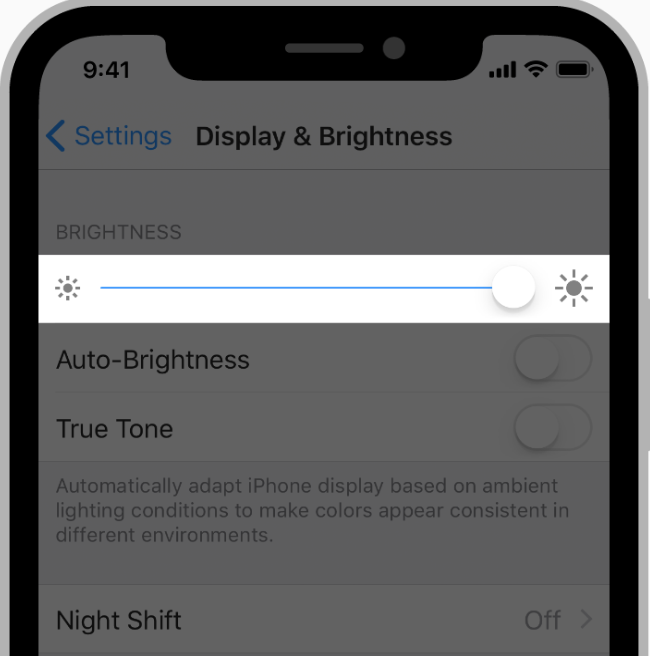 A slider is a horizontal track with a control called a thumb, which you can slide with your finger to move between a minimum and maximum value, such as screen brightness level or position during media playback. A slider is a horizontal track with a control called a thumb, which you can slide with your finger to move between a minimum and maximum value, such as screen brightness level or position during media playback. |
| Stepper | 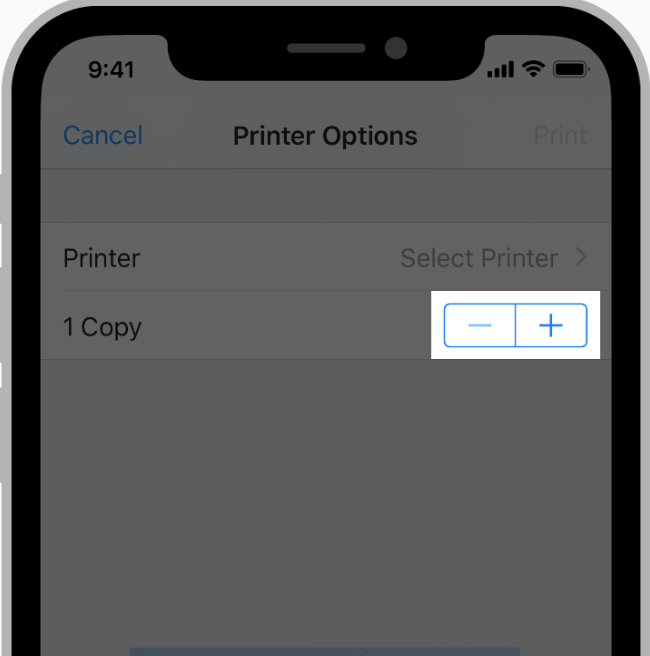 A stepper is a two-segment control used to increase or decrease an incremental value. A stepper is a two-segment control used to increase or decrease an incremental value. |
| Switch | 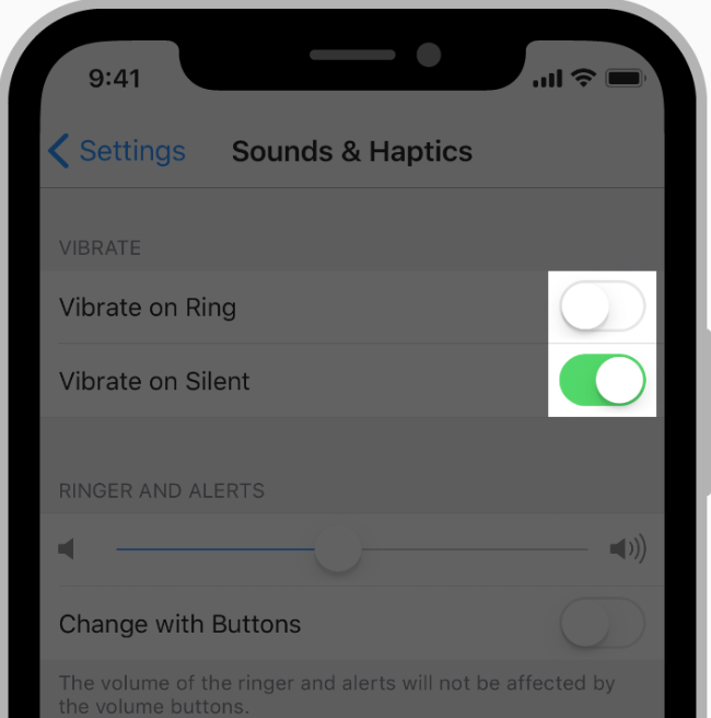 A switch is a visual toggle between two mutually exclusive states—on and off. A switch is a visual toggle between two mutually exclusive states—on and off. |
You can find more on Human Interface Guidelines.