Designers are meant to be loved, not to be understood.
Common design implementation mistakes
Over the years, the design department noticed the same mistakes keep popping up in implementation... so they decided to make them into a checklist.
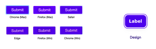
Check the components page or library file of your project for; * Styleguide * All variants of a specific component * All states of components
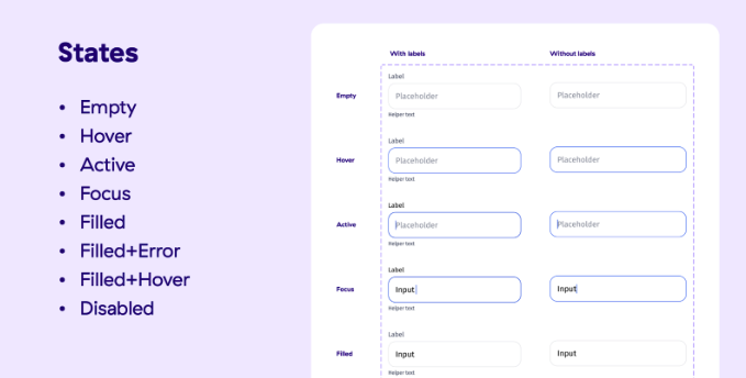
Text states
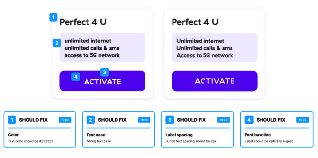
Example of a component and fixes that should be done on it:
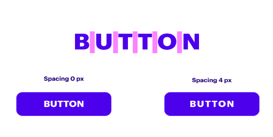
Example of font spacing in a button:
Keyboard types on mobile
💡 Check if we have the right keyboard type
Keep in mind that different input data require different keyboard types e.g.; Numeric, Text, E-mail, Date, etc… Talk to the designer about it if it’s not already specified in the app or web you are testing!
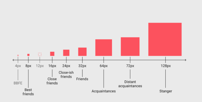
Spaces and alignment
We use the 8 pt grid (usually with a multiplier of 8, sometimes of 4) so you will see a lot of values like 48 px.
💡 If you are reviewing the design and you notice something is off in the file, please let the project designer know so they can check it.
🔗 UI cheat sheet: Spacing friendships by Tess Gadd (UX Collective)
Most common mishaps
- Margins
- Padding
- Spacing between elements
- Alignment with other elements
- Margin to the top and bottom of the page
💡 Check icon colors, sometimes they appear to be #000 black but in reality, they are dark grey!
Shapes
💡 Watch out for visual properties like color, borders, and radius.
Corner radius on cards and buttons
Usually, cards have round corners, check the radius values, and don’t use defaults.
The border width and color
Sometimes a slightly darker border is added to add contrast between the card and the background color.
Check the color of the drop shadow (it’s not always a shade of black)
Testing the hitboxes or touch area
Make sure to check that the touch area (tappable space in which the user can interact with an element) and pointer targets (mouse or stylus) is big enough (e.g. On mobile it should be 48px), if the designer didn’t define it, check with them if it needs to be defined and also check that area in-between is not smaller than 8px.
Icon variations for different sizes
💡 We define multiple icon sizes of the same icon. When the wrong icon sizes are used you will notice that the lines are too thin or too thick.
Images, video, audio
- If a graphic element file size is too big, ask the designer how it should load on the website (i.e. fade in, progressive image loading from blurred state to clear, etc.).
- Cover images for 1x or 2x (size), always check support for retina display (higher pixel density display)!
- Check whether all the images are optimized and placed in the correct placeholders.
- Check if the video and audio files are compatible with different devices and if they are formatted correctly!
- All media should have an alternative text which describes the image visually (accessibility).
Placeholders
Check if the correct placeholder appears if an image is not loading. Examples:
Fallback font
There should always be fallback font options for when the page is not loading;
- Sans fonts fallback: [Original sans font from design] → Helvetica → Arial → Sans-serif;
- Serif font fallback: [Original serif font from design] → Times New Roman/Georgia → Serif;
- Monospaced font fallback: [Original monospaced font from design] → Courier → Monospace;
Web design specifics
Always check implementation on the web page for:
- Website favicon
- OG graphics for social media
- Anchor links on single pages
- Forms - success message or page after submitting
- Terms, Privacy policy pages (static pages)
- Avatar and image placeholders
- Cookie pop-up with manage cookies pop-up/page
- Loaders and spinners
- Back to top button for long 400 and 500 error pages
💡 Navigating with the keyboard The ESC key always closes the pop-up or modal page or cancels. ← → arrows always navigate through a photo gallery!
💡 Check the focused state outline The default-focused state should be replaced by an accessibility-focused state according to the design of the website.