This article is a cheatsheet for checking design implementation before Design review or QA testing. Over the years, we have noticed that the same mistakes keep popping up in implementation. We decided to make them into a checklist for both mobile and web developers so that we don’t have to focus on those common mistakes in the design reviews.
If you didn’t already have one, the design review (officially should be called design implementation review) is a way for a designer to check if everything is implemented as it is defined in the design. Think of it as the last stage of debugging design to keep errors from getting in production. These reviews usually involve a designer and (in an ideal case) software tester. We go through the staging version of the app or a web and look at (and abuse) all of the screens and components. After we notice that something is off we will point the developer to the documentation (most often a style guide in Figma) and show them where it differs. If something doesn’t function quite right we will explain the issue, current behavior, and expected behavior.
Back to the checklist, the idea is that once you got everything working smoothly, you do a comparison with the design documentation and check for hiccups that got in along the way. There are some details developers might miss, and therefore not implement, but in design, those details are what make all the difference and it’s greatly appreciated if they are given some attention while making them come to life. The purpose is to maintain a consistent user experience as well as UI quality.
Everything should be clearly defined from the designer’s side before you start with the implementation, but if something is missing or you have any questions regarding the look or behavior of a certain component please reach out to the designer anytime - the product’s excellence is in everyone’s best interest.
Figma tips
Here are some useful Figma tips for developers and QA:
- Check the components page
Before you start implementation, go through the project’s style guide, usually on the components page. If anything is unclear or seems to be missing, speak out so that the designer can fix it before you deep dive into your work. A place where you can see all variants of a specific component (e.g. different states). Check it before you start with the implementation, and during the implementation of specific components.
Shortcut: Right-click (on any component) > Go to the main component - Get all elements with CMD + Right-click
- You can navigate through layers with your keyboard. Press Enter to select child and Shift + Enter to select the parent of the selected element
- Help > Keyboard shortcuts
Check FAB with ”?” or Help from the menu for more shortcuts.
Read a bit more about the Developer’s inspect view here.
Fonts
Style definitions
The following attributes are usually defined through text styles.
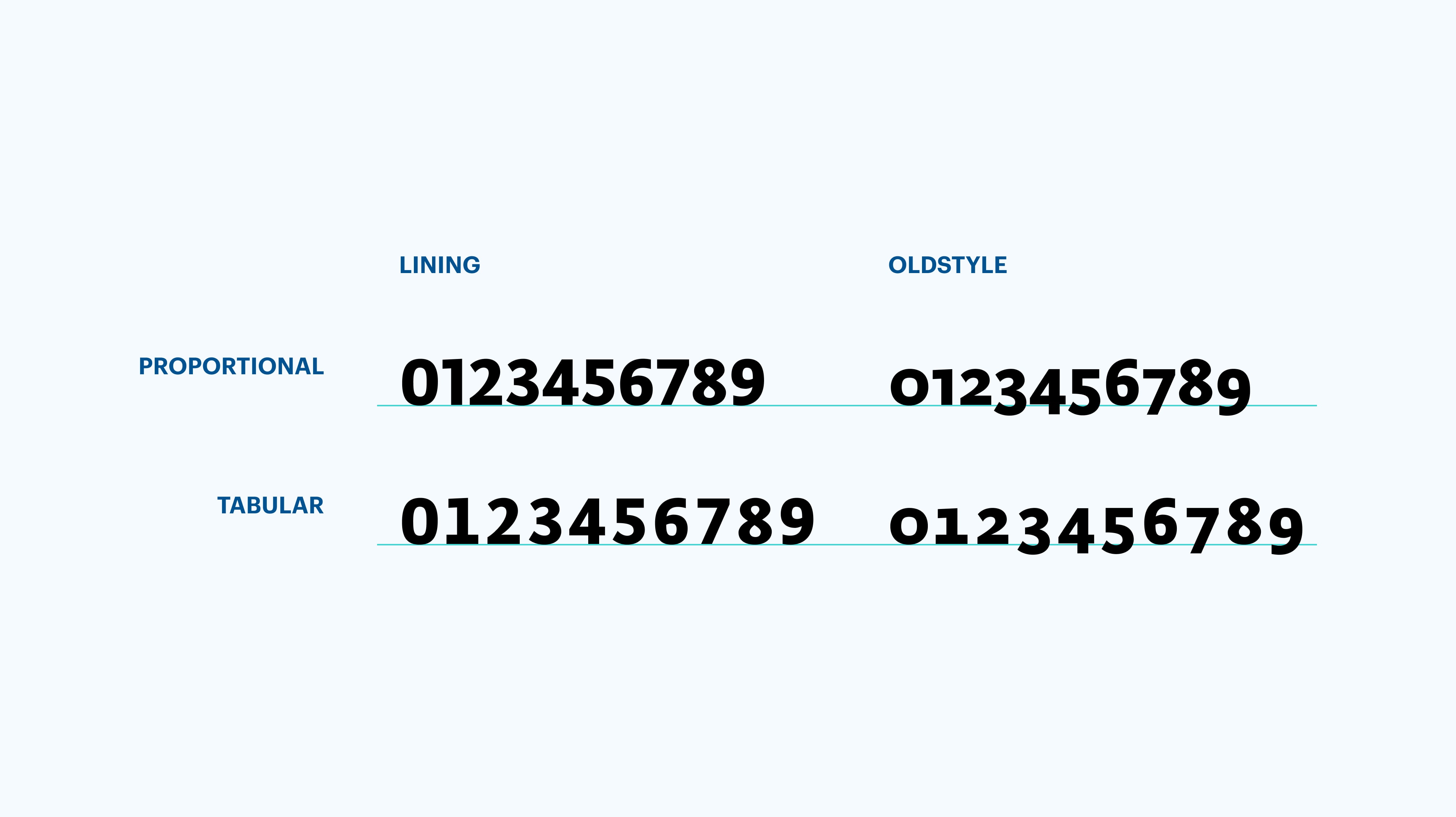
- Font family
Check that you use the correct ones. Sync with the designer so both of you have the same version of the font, sometimes this may cause the problems. - Font weights
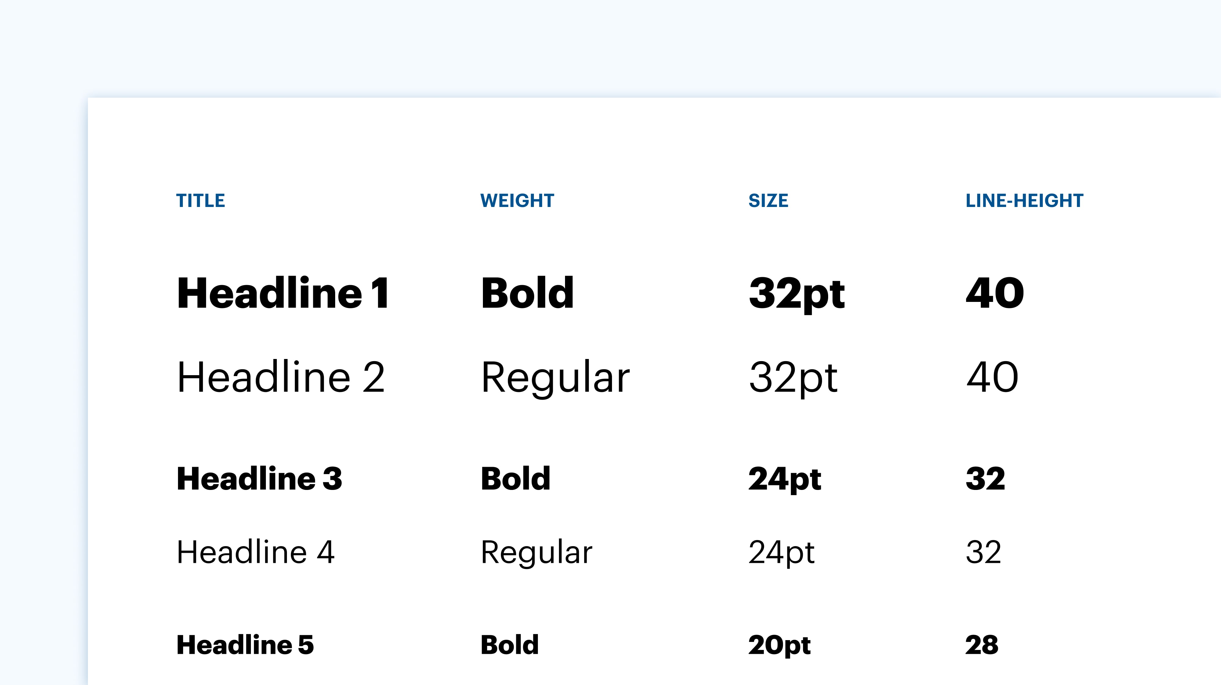
Pay attention to bold vs medium vs black, light vs regular. - Font sizes
Most of the times designers use values that are multipliers of 8 (sometimes even 4), please don’t round up to 25 if you see 24 pt size - Line length
Designers usually specify the paragraph length which is appropriate for reading on a specific font size. Don’t make paragraphs wider or narrower than that. - Line height
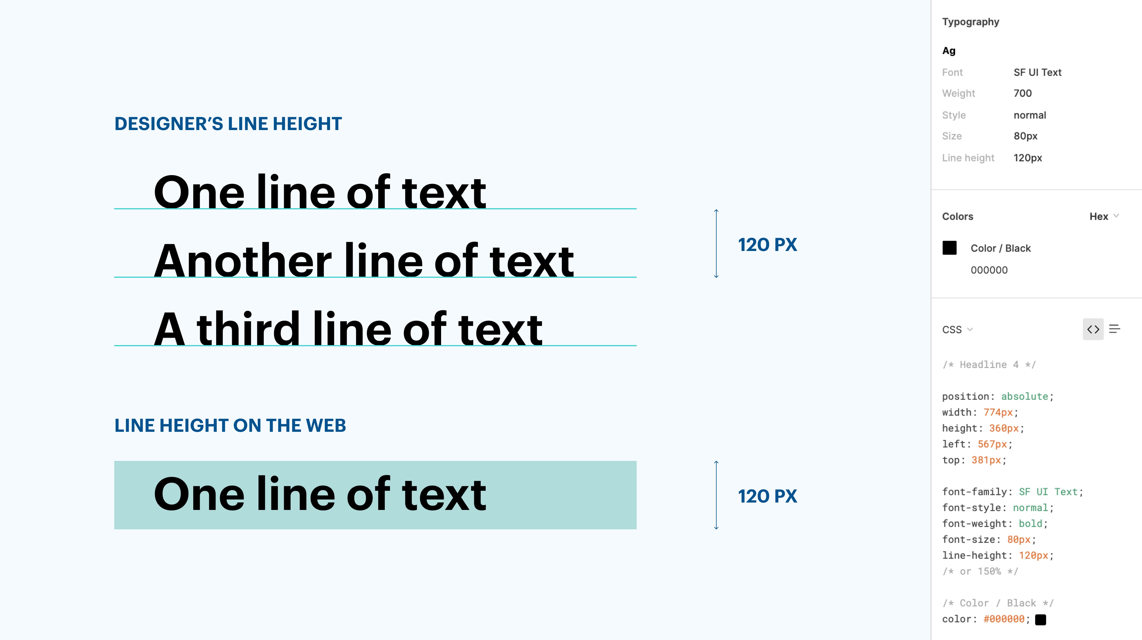
Check the line height values, designers define a line height for every font and it has a big impact on the final product. If something looks strange, what might differ is the way the line height is measured in design software and development software.
- Letter style (type of capitalization)
Usually as typed, but can also be: UPPERCASE (ALL CAPS), lowercase, Title Case
Needs to be consistent across website - Font spacing
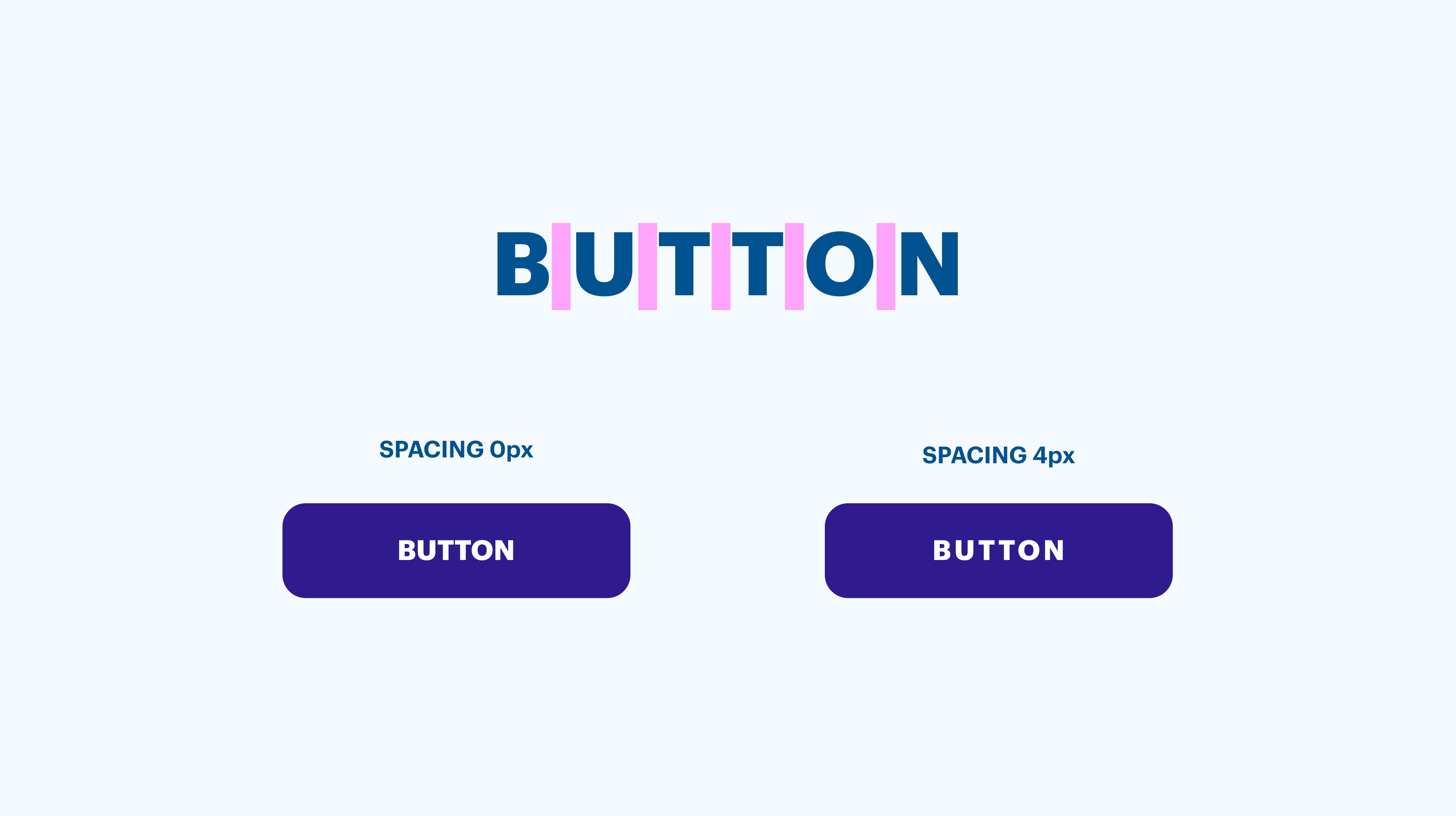
The distance between letters in a word, it’s not defined for every style but sometimes we change it to increase the readability of e.g. buttons, tab bars, all caps titles.
- Font colors
Usually, we don’t use #000 for black, so make sure to check dark shades that appear as black
Adapting for different screen sizes
- Before starting, if it isn’t yet clearly defined, discuss with the designer whether to go with a responsive or adaptive design approach for web projects.
- When working on a mobile app, discuss whether we will need to have scalable UI to adapt the design for different screen sizes of mobile phones and tablets
Spaces and alignments
We use the 8 pt grid (usually with a multiplier of 8, sometimes of 4) so you will see a lot of values like 48 px, please don’t round up to 50 px. A lot of grey hair is grown over these details, please take them into consideration.
- Margins
- Padding
- Spacing between elements
- Alignment with other elements
- Margin to the top and bottom of the page
Shapes
Watch out for visual properties like color, borders, and radius.
- Corner radius on cards and buttons
Usually, cards have round corners, check the radius values, don’t use defaults - Border width and color
Sometimes a slightly darker border is added to add contrast between the card and the background
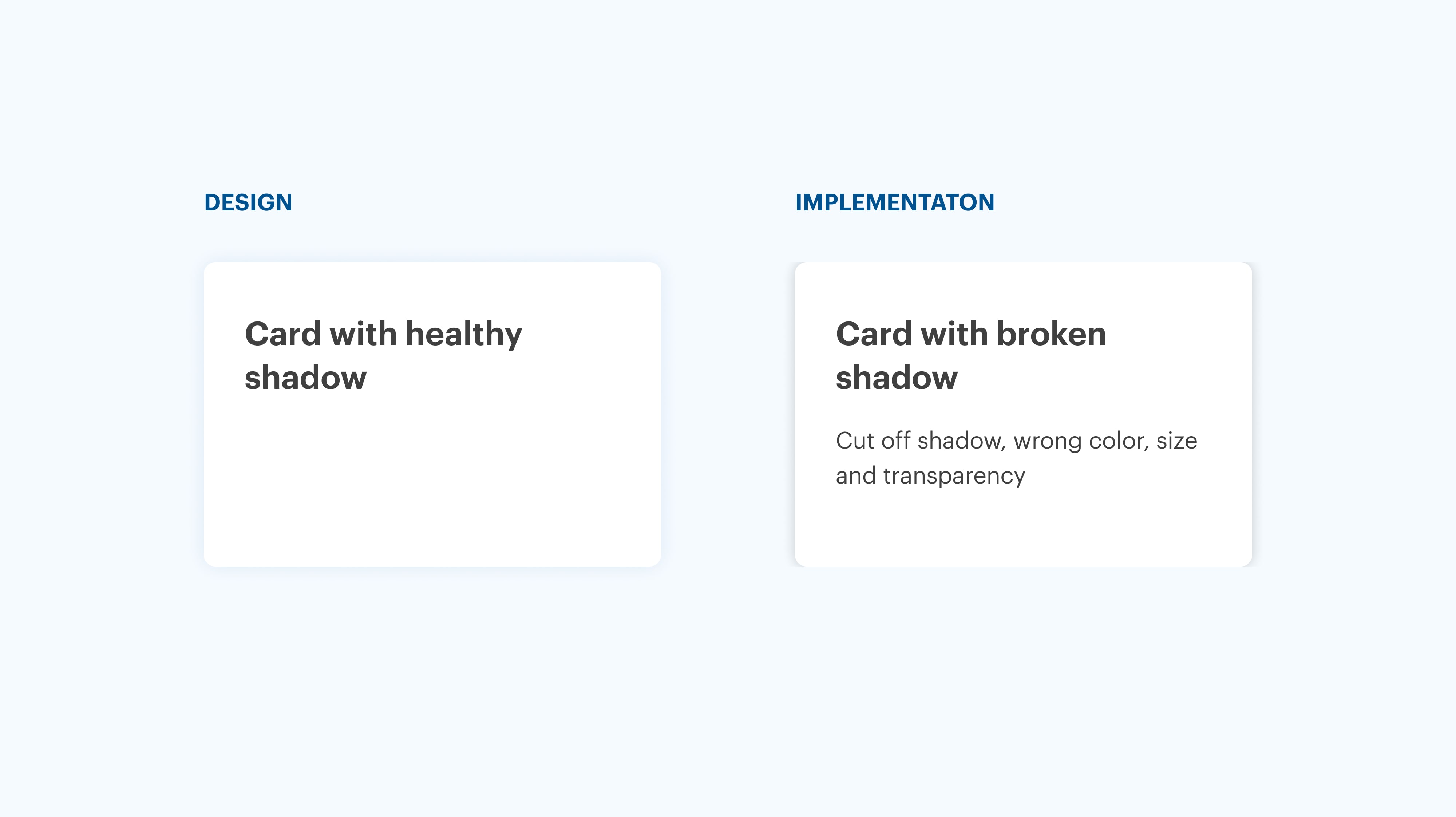
Drop shadows
- Color
Check the color of the drop shadow (it’s not always a shade of black) - Size and transparency
Check the drop shadow size and transparency - Avoid cutting off shadows
e.g. on cards
Buttons
- Set minimum and maximum width
We don’t want a tiny OK button if the label is short, we also want to avoid having long ones if the width size is relative to the view size, check with the designer if they didn’t define minimum and maximum widths - Don’t let the text wrap in multiple lines
Please
don’t - Make touch area big enough
Make sure that touch and pointer targets are big enough (e.g. On mobile it should be 48px, read more about it), if the designer didn’t define it, check with them - Check area in-between
Please check that the area between two touch areas is not smaller than 8px
Icons and illustrations
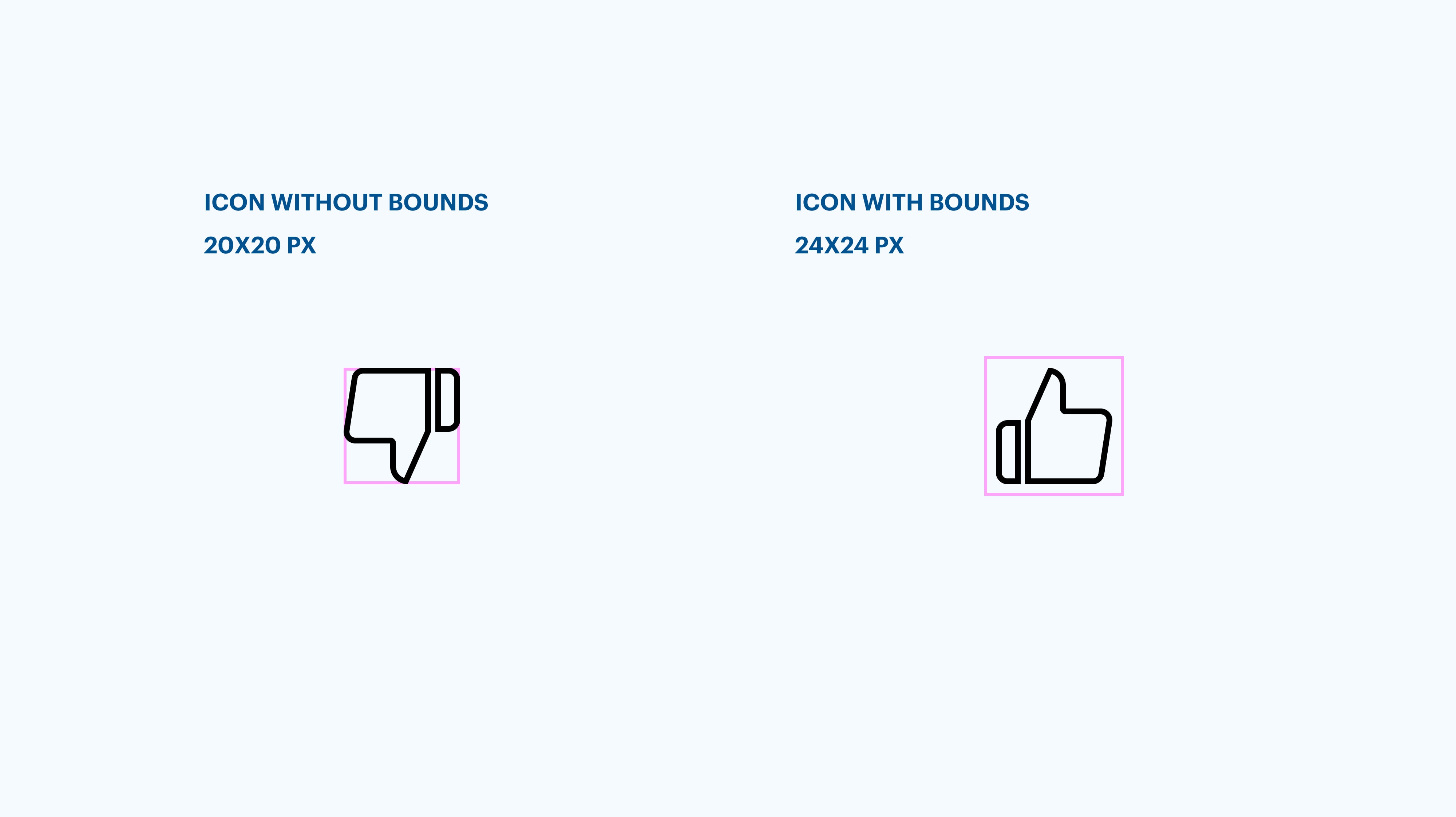
- Use icon variations for different sizes
If designers defined multiple icon sizes, please use the correct icon version for each size. Icons shouldn’t be resized automatically because the lines will be too thick or too thin. - Bounds
Export icons and illustrations with bounds (shift+enter to select parent layer), otherwise it’s hard to optically align the icons. It’s easiest to find the icon layer by searching for the purple rhombus icon in the layer panel indicating the component.
- Colors
Check icon colors, sometimes they appear to be #000 black but in reality, they are dark grey - Illustration resizing
Check breakpoints for illustration resizing across resolutions - consult with the designer if it’s not already defined
Interaction
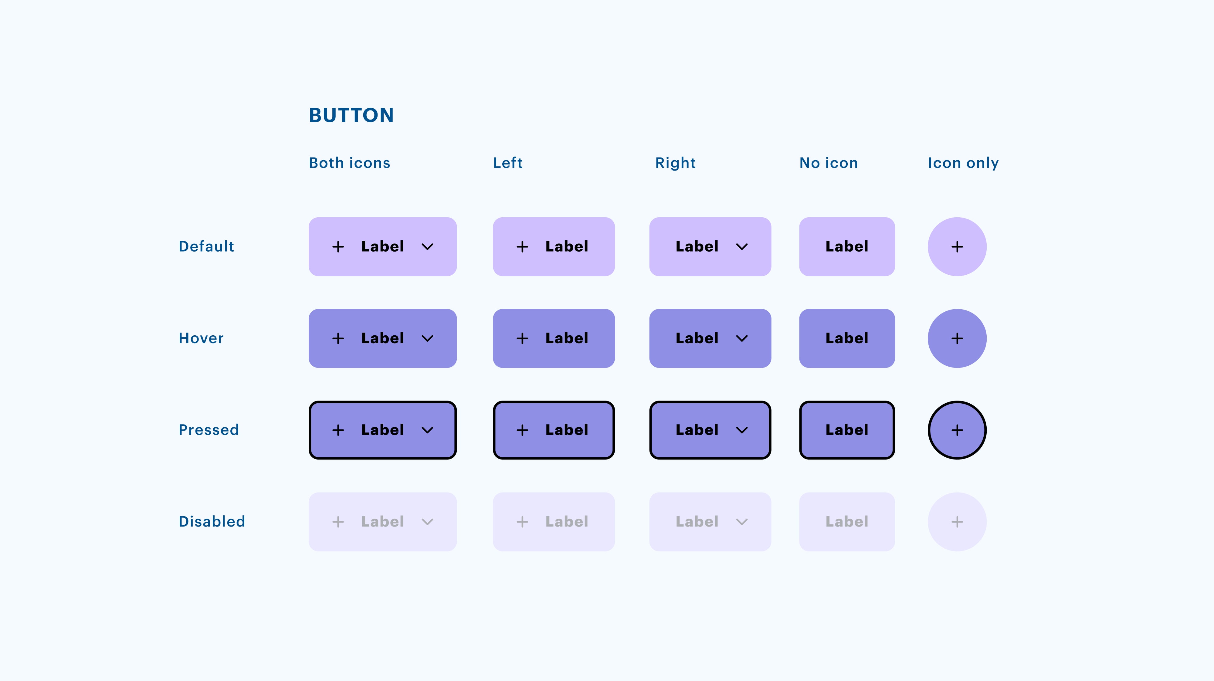
States
- Check if you have all needed states
Most of the time we should cover these states: Hover (for web), Pressed, Focused, Disabled, Error
States vary across components, e.g. a card might not have the disabled state
If you are unsure, check with the designer
Scrollable vs fixed
- Watch out for areas that should be fixed, such as headers and bottom actions. If it’s not defined, talk to your designer.
Keyboard type (on mobile)
- Use the right keyboard type
Keep in mind that different input data requires different keyboard types: e.g. Numeric, Text, Email, Date... Talk to the designer about it, if it’s not already specified.
Modals
- Most of the time we want to close the modal by clicking/tapping on the outside area
Motion
- Check transitions
Ask your designer about transitions you should use between screens and different component states (e.g. button hover, closing modal) E.g., use the dissolve transition to make this experience smoother (change opacity with a transition time of 0.3 seconds).
Web specifics
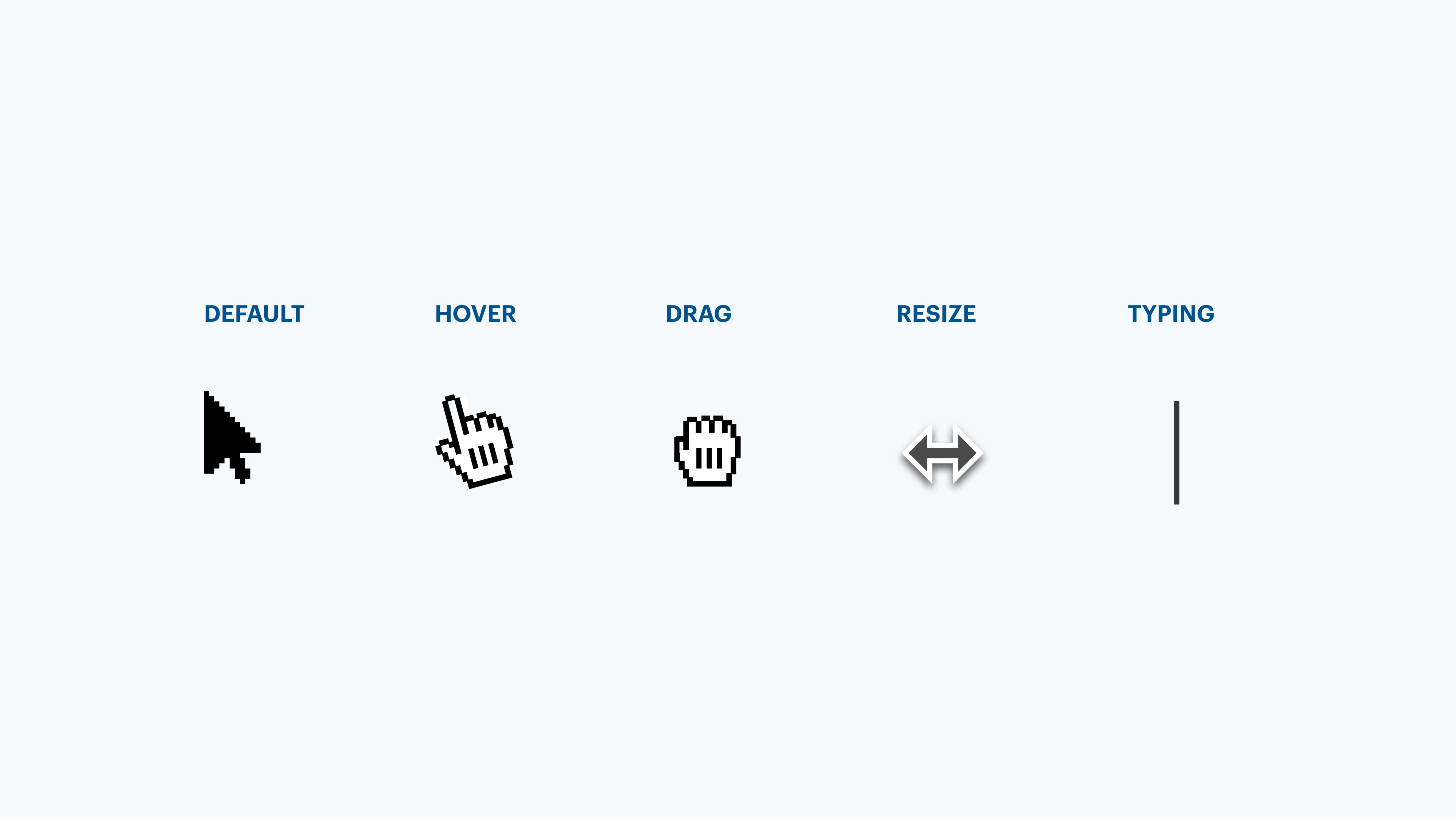
Pointer type (web)
- Use right pointer type
Keep in mind that we should always use the right pointer type for specific activities, e.g. when hovering use hand on icons, typing on input fields
Links
- Check link behavior
If a link leads to an external page, we usually open it in a new tab. Talk with your designer if they didn’t specify the link behavior.
Responsive (or adaptive?)
- Before starting, if it isn’t yet clearly defined, discuss with the designer whether to go with a responsive or adaptive design approach
- Don’t forget to define the maximum width of the whole page so we look pretty on the wide screens too. Talk to the designer if it isn’t documented in the file.
- Pay attention to card grid layout changes on different screen sizes, consult with the designer.
- All pages were tested at the following breakpoints: 320px, 768px, 1024px, 1920px
Animated element states (hover/pressed, default, disabled)
- Always use translate in duration 0.3s if not specified otherwise
Some interaction is better than none. This works for text input, textarea, buttons, select, radio buttons, checkboxes, messages, snackbars, progress etc.
Page/Modal Loading or Closing
- Check with designers how the page should load and close. Is the transition instant, or there is a flashy opening/closing.
Images
- If a graphic element file size is too big, ask the designer how it should load/appear on the website (i.e. fadein, progressive image loading from blurred state to clear, etc.)
- Cover images for 1x or 2x, support retina display.
- Check whether all the images are optimized and placed in the correct placeholders.
- Check if the correct placeholder appears if an image is not loading
- Check if the video and audio files are compatible with different devices, and they are formatted appropriately.
- All
have an alternative text which describe the image visually (accessibility).
Fallback font (when the page is not loading)
- Ask the designer to specify fallback font options.
Examples for Sans fonts: [Original sans font from design] → Helvetica →. Arial → sans-serif;
Serif font fallback: [Original serif font from design] → Times New Roman/Georgia → serif;
Monospaced font fallback: [Original monospaced font from design] → Courier → monospace; - Control loading behavior with a webfont loader.
Text highlight color
- Don’t use a default light blue text highlight. Ask the designer to specify the text highlight color or check the project styleguide.
Focused state outline (blue keyboard outline)
- Hide the default blue focused state and ask the designer to specify accessibility focused state according to the design of the website.
Navigating with keyboard
- ESC key always closes pop-up or modal page, or cancels an action (i.e. search)
- ← → arrows always navigate through a photo gallery
Check if designers have already specified
- Website favicon
- OG graphics for social media
- Cookie pop-up with manage cookies pop-up/page
- Loaders and spinners
- Back to top button for long pages
- 400 and 500 error pages
- Anchor links on single pages
- Forms - success message or page after submitting
- Terms, Privacy policy pages (static pages)
- Avatar and image placeholders