SVGs
1. Export
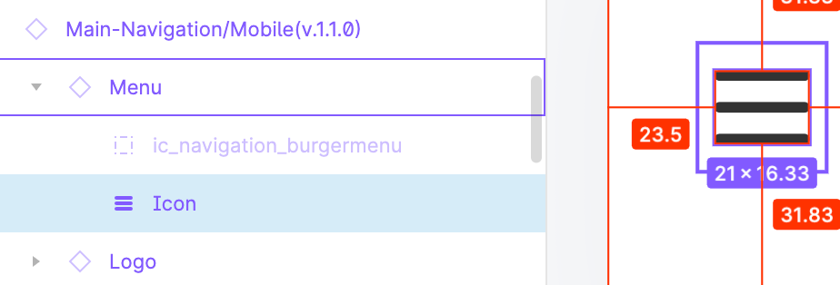
When we export an icon from Figma or Zeplin, we should export the icon container instead of the actual icon. Check the image
 In this case, we will export
 Menu as SVG instead of the Icon element.
With this, every icon we export will have the exact box dimensions, which is easier to maintain in the long run.
2. Optimization
Before adding a new icon to our codebase, we should optimize it. svgo is the go-to tool for this purpose, with SVGOMG as its hosted UI. Here are the preferred settings that should give the optimal output.
3. Add to codebase
After we exported and optimized the icon, we can add it to our codebase. We will add this new icon in one of two directories:
a. src/assets/icons
Prior to using an SVG icon this way, check the following:
- Make sure that the SVG element has only the
viewBoxproperty (withoutwidthandheight). The context surrounding the icon should define its dimensions. - Sometimes, designers use the
<mask>element in SVGs. Those elements are referenced by an ID, and if you use multiple SVGs per an HTML document, multiplemaskelements will have the same ID. As a result, SVGs won't work as expected. Often thesemaskelements are simple to resolve manually so after resolving them make sure to remove them.
We should add an icon to this folder if it uses only one color and will be used in components like buttons and dropdowns and/or will be inlined with the code. The fill property of the icon source should be changed to currentColor. This way its color can be changed by setting the color: ${someColor} style in CSS.
React.js example:
import AddIcon from 'src/assets/icons/icon-add.svg';

const AddButton = () => (
  <Button>
    <Icon as={AddIcon} color='primary' />
  </Button>
);
For this to work in your repository, you need to configure
next-react-svgorsvg-react-loaderor something similar.
b. public/images
If the image is using complex colors gradients/multiple colors/... it probably belongs to this category.
Before adding it, you can check if this image could be smaller in size using PNG or JPG image formats. If this is the case, and the image doesn't need to scale dynamically, use that one instead of the SVG. If instead the image needs to change dimensions based on the viewport width for instance, use the SVG.
Example in code:
const InstagramLink = () => (
  <Link>
    <Image src='/images/instagram-icon.svg' />
    Link to Instagram page
  </Link>
);