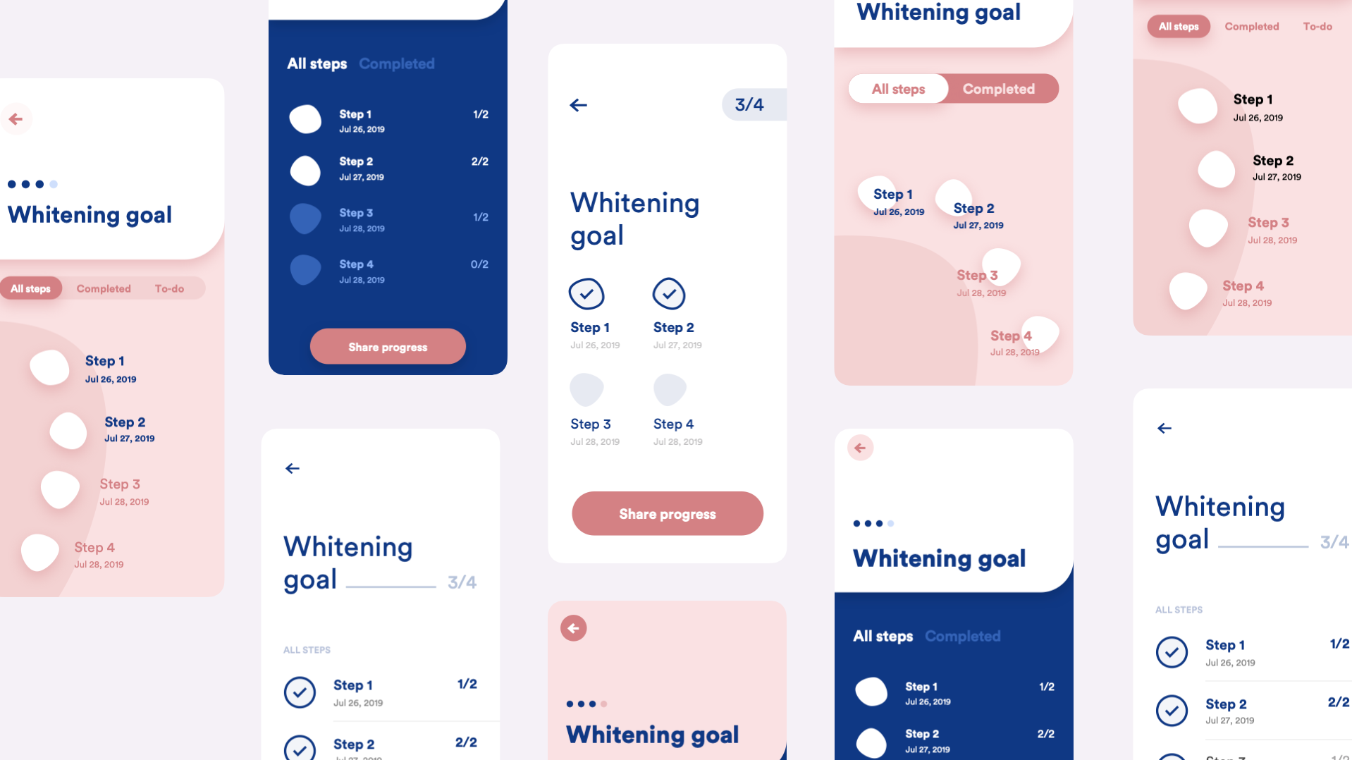
Once we have the whole app or website structure in place, it's time to use some color, photos, icons, illustrations, and beautiful typography.
If you don't know at the moment what these elements are, meaning there is no branding for the app or website, you need to define the whole visual identity before digging into UI design details.
Through UI design, our task is to:
- make the user experience easy, enjoyable and delightful
- make the app recognizable and stand out from other apps
- make the app communicate the same brand values as the company does
- achieve consistency throughout the features and mobile platforms
Iterating on the UI

Before you dig into the UI design of every screen, make as many versions as possible to find the right visual fit. Present 2 (3 at most) polished versions to the client. You don't want to confuse them with too many ideas and variations. You are the expert, and you need to show your skills and expertise in the best light.
Testing the UI with users
If you're working on a project highly influenced by user opinion, you can use the desirability testing method to ask the users which version of the UI design is better. Desirability testing helps us get objective feedback from users. We usually show them 2-3 versions of the UI and ask them to choose terms from the list of adjectives that describe the version best. The proposal which overlaps the most with the objectives we have set for UI design wins.
Finalizing the UI design
While approaching the end of the design phase, make sure you have:
- a styleguide with colors, typography, brand elements and components
- all the screens set in color and typography styles organized in components
- screens organized in flows separated into different pages
- archive page or duplicated file with old iterations and unused versions
- comments with specific behavior and flow descriptions for developers
- App Store and Play Store icons, screenshots, and featured graphics for mobile apps
- Complete UI stack (↓) of the screens and components

Type foundries
Paid foundries
- Type Foundry Index
- Fonts by Hoefler&Co.
- Type Network
- Typotheque
- Klim Type Foundry
- Darden Studio
- Colophon Foundry
- Order
Free foundries
Useful typography links
Color palettes
Brand logos
Icons
Free icons (No attribution required)
These icon sets are free to use and are open-source. You can use them freely in your projects without worrying about licensing fees and restrictions. There is no limit on the number of icons you can use per project. They can be used across various platforms, including mobile and web apps, WordPress sites, and in webpage builders. While attribution is appreciated, it is not required.
Free icons (Attribution required)
These icon sets are also free to use and are open-source, meaning that you can use, modify and distribute them freely, provided you include the original copyright and license notices in your project. There is no limit on the number of icons you can use per project. They can be used across various platforms, including mobile and web apps, WordPress sites, and in webpage builders.
Freemium (Attribution required)
These icon sets are available in both free and paid versions. In most cases, the free version requires attribution, so it's recommended to include the original copyright and license notices in your project, just in case.
Streamline's licensing terms permit usage of free icons in unlimited projects, both personal and commercial, including mobile and web apps. However, free license prohibits using the icons as assets in applications like webpage builders or 'Canva-style' apps that allow users to integrate the icons into their designs. That includes our WordPress projects as well. It is also important to notice that some free icon sets are open-source and some are not. Open-source sets permit you to share and adapt the icons for any purpose provided that appropriate credit is given and a link to their website is included.