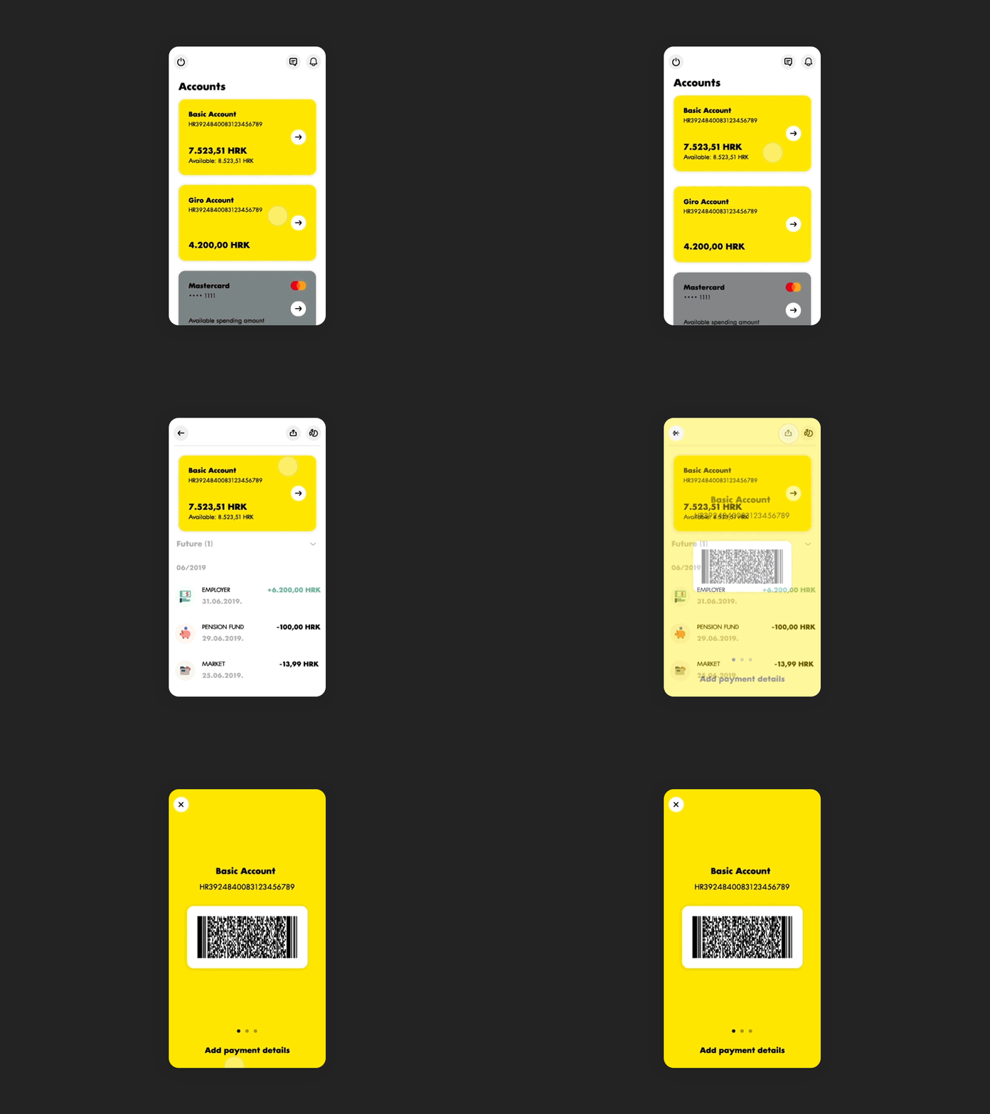
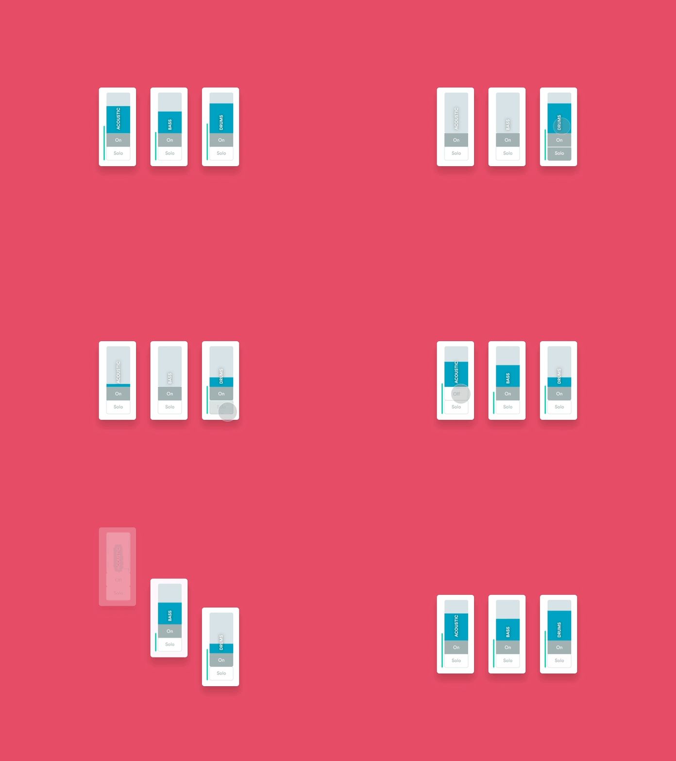
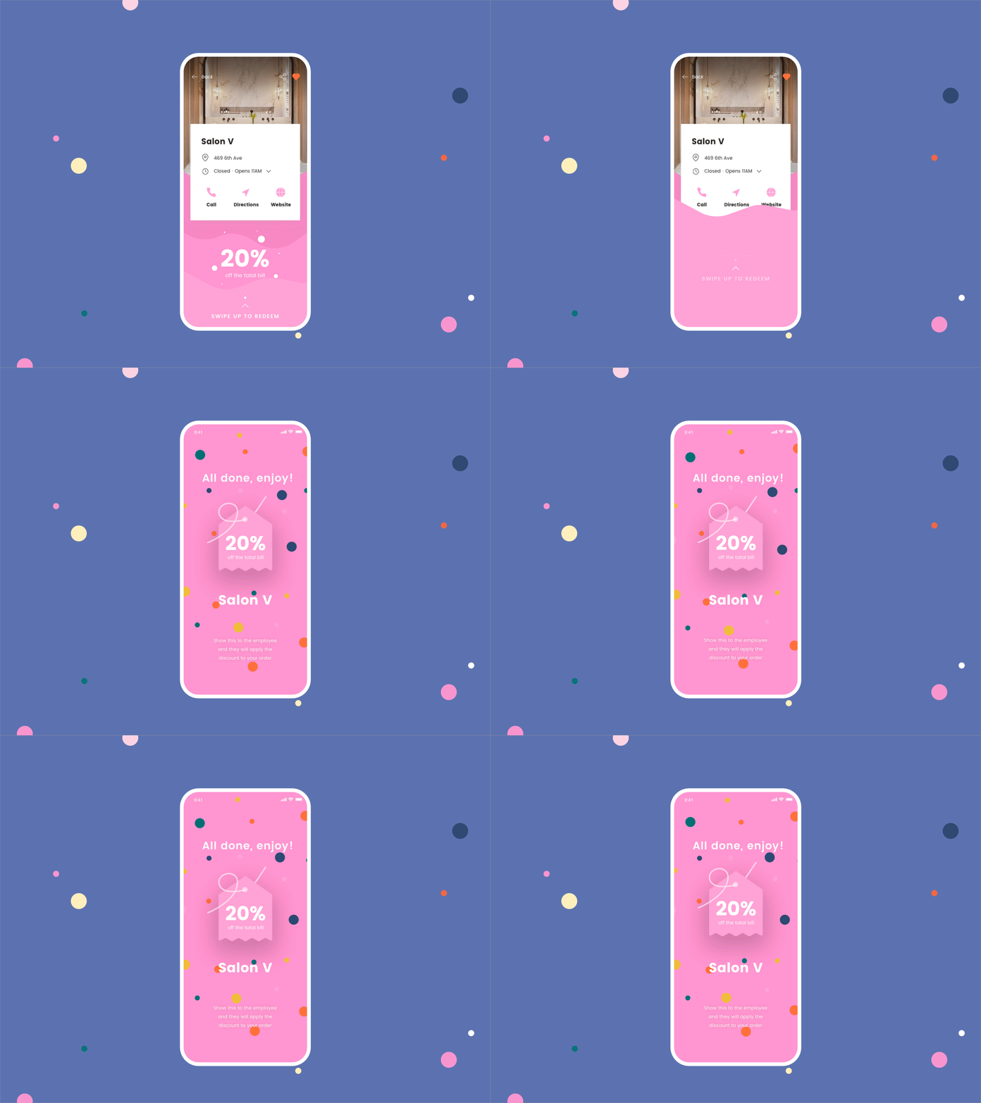
Since the introduction of smartphones, motion design has become a vital UX tool. When utilized right, it makes using technology feel natural, responsive, and more enjoyable.
Adding motion to user interfaces means doing a lot more than decorating. Animation is a functional element used for giving feedback to an action and helping users understand the app's hierarchy and flow of information.
When to use motion
Before adding animations to a web page or app, ensure that their goal and purpose are well-defined. When considering an animation, contemplate the following questions:
- Where would the user’s attention otherwise be focused at the time when the animation occurs?
- How frequently will one user encounter it during one session?
- Is it triggered directly by a user’s action or indirectly (upon page load, while scrolling, or by some other unrelated activity)?
- Is the goal to:
- attract users’ attention, so they notice something and act on immediately?
- show continuity in a transition between the states of an object?
- indicate a relationship between objects that are already in the user’s focus of attention?
Once you worked out the purpose, think about how to visually approach solving the problem by using motion:
- Feedback - Provide instant and relevant feedback about a completed action and keep the user enlightened about what is happening..
- State-change - Draw attention to and explain changes on the page. Changes in the state of an element, revealing and hiding of content, or shifts to another area of content are all common areas for transitional animations. Communicate state changes that are not triggered by users’ actions.
- Spatial and navigation metaphors - Signal to users the direction in which they are moving within a process or hierarchy; this supplemental cue can make navigation through a complex IA more intuitive and understandable.
- As a signifier - Help users understand how to interact with UI elements. The direction (or other attributes) of the motion signifies the type of acceptable actions. For example, a card that expands from the bottom of the screen towards the top signals to the user that it can be closed by pulling down. A new card that comes from the right of the screen signals that it can be closed by swiping it to the right.
Animation types
Transitions

Motion design comes in to help users understand the app flow between screens, making the navigation easier. Another way to use motion design in transitions is during loading times. Why not shorten the waiting time with an interesting animation? Animations help hold users' focus while the device is downloading the necessary data.
Micro-interactions

Micro-interactions are events used to create an engaging moment with the user. Most of the time, the animation starts with a trigger (user action) that causes a reaction, letting the user know what’s happening, making the navigation inside an app or a website easier. We can divide micro-interactions into four steps:
1. Triggers — Initiates a micro-interaction
- User-initiated trigger — the user has to initiate an action (e.g. buttons)
- System-initiated trigger — software detects certain qualifications are being met and initiates an action (e.g. notifications)
2. Rules - what happens once a micro-interaction is triggered
What happens when the user clicks this button? Are they directed to a new page? Will it add a product into their shopping cart? The same goes for system-initiated triggers.
3. Feedback - Lets people know what’s happening.
Anything a user sees, hears, or feels while a micro-interaction is happening is feedback.
4. Loops and Modes - determine the meta-rules of the micro-interaction.
What happens to a micro-interaction when conditions change?
Micro-interactions have to be unobtrusive, brief and subtle.
Superfluous animations

Surely, animations can also be simply decorative – as long as they don’t negatively affect user experience. These animations can create a positive experience for the user on a page that's inherently negative (empty states, onboarding flow).
The workflow
Step by step guide
- Before diving into the motion part, figure out the time and budget constraints:
- Upcoming projects - should have ballpark estimates for motion included,
- Current projects - Project Designer checks with PM if there’s a budget for motion on the project.
- The Project Designer discusses the animation and works out concept ideas together with a Motion Designer.
- Motion Designer creates an estimate and a brief direction description. When figuring out an estimate, make sure to include:
- buffer time for importing and exporting assets,
- time for 2 critique check-in points with the Project Designer (first draft and polishing),
- in case of a more complex animation, the motion designer might create a proof of concept and re-estimate the project if needed.
- An estimate is sent off to the PM.
- When the PM gives the green light, we schedule it via Operations.
- The Project Designer or PM creates a task stating the estimated hours and due date.
- The Project Designer prepares assets and hands them over to the Motion Designer. Upload or link assets in task.
- Motion Designer gets to work! ✨
- 🎯 1st check-in point: Draft - The first draft needs to be reviewed early on in the process, so we’re sure we’re on the right track. Keep in mind that motion iterations take longer than those in static design. Include devs in this step also, so we make sure our idea is feasible and won’t run into issues in development or under-estimate the needed effort.
- Motion Designer continues working.
- 🎯 2nd check-in point: Polishing
- Motion Designer works on final touches hands it off to developers via Productive tasks. The final versions need to be stored in the project's Google Drive folder as well.
- After implementation, the Motion Designer should review the implementation.
Project info (provided by designer and/or PM)
- Who's who on the project (designer, design coordinator, PM)
- Productive: project and billing point
- If it's a client project: state its purpose (pitching the idea or actual project that will be handed off to devs)
- If it's an internal project then knowing the budget (available hours) is a must
Preparing assets for handoff to Motion design
- Properly name layers and groups that need to be animated
- Avoid clipping content in masks whenever possible
- Prepare states for all elements that animated elements (if they aren’t part of the provided flow)
- It’s ok to use auto layout
- If you are preparing assets for the Lottie animation, make sure to flatten elements (CMD ⌘ + E in Figma) - especially if you have elements with border-radius because Lottie has some problems on iOS and Android with rendering it correctly
- If you are preparing assets for dribbble, you don’t have to flatten elements
Access to project files
- Access to Google Drive folder
- Access to Figma files
- Access to fonts
- Access to production and/or staging
- Authorisation for staging when needed (banking apps)
Achtung!
- Designers, keep in mind that we need to schedule motion in advance. If you don't prepare assets on time, we'll need to reschedule the booking.
- PMs, AfterEffects changes aren't as swift as iterations in Figma. Rendering takes time, mid-animation changes result in moving a lot of stuff around, Lottie export might have bugs, and so on. Try to round up all client comments at once and not iterate on an animation bit by bit.
The tools
Principle
Principle — ease of creating animated flow from different applications or web screens through predefined animations allows motion designers to quickly and easily create an animated prototype.
Another big advantage of this software is the easy way of importing screens from the other design software, such as Figma.
🔗 Principle: Documentation
🔗 Principle: Tutorials
After Effects
Adobe After Effects has always been the most widely used animation tool. Being a more complex tool than Principle, more oriented towards explanatory videos and long-term animations, it is emerging as an essential interface animation tool.
While Principle allows us to create a fast flow and prototypes to present the main interactions of an application, After Effects lets us explore the creation of more complex effects and interactions.
ZXP
Free installer for CEP (Common Extensibility Platform, which enables developers to build integrated panels in Adobe desktop applications). It will work with any ZXP extension (e.g. aeux, bodymovin, overlord...). It is a great tool to instal and keep all of your plugins organised in one place. Just drag and drop the .zxp file to the ZXP interface to install any new plugin.

AEUX Plugin
You have created your design in Figma, and now is time to transfer it to After Effects. The easiest way to transfer layers with the least friction between visual design and motion is by the AEUX plugin.
AEUX is a set of panels for Figma, and After Effects. Spell it out or say it like A-Yo.
Although AEUX is not available as a community plugin, there are a few steps you need to do before you start using it.
Instructions:
- Make sure your elements are inside of a frame in Figma
- Open the AEUX plugin (Plugins > Development > AEUX)
- Select the frame
- Press the button “Send selection to AE” (Make sure you already have created the composition in the AE)
- Do your magic inside of the AE

OVERLORD Plugin
You can easily import illustrator files to after effects by dragging and dropping the file in the AE animation pane, but there is also a helpful plugin to speed up your workflow - Overflow.
Transfer shapes as you need them without importing, converting or redrawing.
Check out the whole set of features here.

Useful after effects plugins for animation:
Bodymovin
Once you have installed the Bodymovin plugin through the ZXP installer, you’ll find it in AE - Window > Extension > Bodymovin.
It is important to select the composition you’d like to export as Lottie and select the folder where you’d like to save it.
If you press “Settings”, you’ll see multiple export modes. Check the “Standard” option and “Demo” to preview the animation in the browser.

Lottie
Lottie renders animations exported from After Effects through the bodymovin plugin. This makes integrating animated assets in apps and websites quick and easy.
Although some After Effects features are not yet supported, this library is growing, allowing for the export of more complex shapes, masks, trim paths, solids, and alpha matte effects.
The community is continuously growing – check out more great examples already created by the Lottie community.
Check the list of supported features.
Motion libraries for web projects
Here are a couple of libraries that can come in handy when creating landing pages with Wordpress:
📚 Recommended reading
- UI Movement (Examples of UI Animations)
- Creating Usability with Motion (Article)
- How Motion Design Applies to UI (Article)
- Motion Design Is the Future (Article)
- Motion Design School (Course)
- Material design - The motion system
- Human-interface-guidelines - Motion