Discover how AI data visualization can help businesses uncover meaningful insights, make future predictions, and develop informed, data-driven decisions at lightning speed.
In the age of big data, the ability to transform complex information into understandable and actionable insights is more important than ever. Data visualization – the graphical representation of information using elements like graphs, charts, and infographics – plays a pivotal role in helping people find and understand patterns, enabling decision-makers to grasp intricate concepts and identify emerging trends.
Data visualization is an essential tool for the collection and analysis of large quantities of information. However, as the volume and complexity of data continue to increase, traditional visualization techniques often fall short.
This is where artificial intelligence (AI) can help, revolutionizing the field of data visualization. By using AI for data visualization, businesses can efficiently uncover meaningful insights, make future predictions, and develop informed, data-driven decisions at lightning speed. AI data visualization tools utilizing natural language processing (NLP) offer even greater capabilities, allowing for more intuitive interaction and deeper analysis.
This article explores the transformative impact of AI on data visualization, highlighting how this synergy is reshaping industries and redefining the way companies interact and communicate with data.
The democratization of data
Data visualizations can be found everywhere in the modern world, from company board meetings to live sports to fitness apps to journalism in mainstream media. Modern organizations use data visualizations for customer data analysis, results forecasting, campaign reporting, and more.
Even the tradition-bound world of golf is not immune, as evidenced by our work on the data-driven interface of the Skytrak simulator, which embraces math, physics, and eye-grabbing visualization in pursuit of a better handicap.
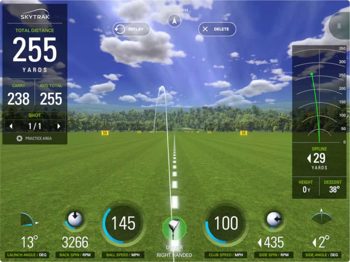
We designed the user interface of the popular golf simulator Skytrak. Club speed, ball spin, and launch angle are among the many data points presented to the user.
Enhancing communication
There’s a good reason why data visualizations have become more and more a part of your communications lexicon.
Human beings are drawn to visuals, including color and patterns. We register and remember visuals faster and longer than text.
In business settings, this is amplified by the fact that most executives are overwhelmed by an influx of data, presentations, email, meetings, and other communication. To stand out from the noise and present information in a more palatable and memorable format, companies must embrace data visualization as a central internal communications tool and within their consumer-facing digital products. Generative AI can enhance these visualizations, making them even more engaging and insightful.
Data visualizations can be modest formats like bar graphs, pie charts, or even simple drawings that illustrate an idea. These formats can be effective for showing comparisons, trends over time, peaks, ranks, types, components, groups, percentages, and pieces.
More advanced data visualizations can include histograms, scatter plots, alluvials, flow charts, interactive visualizations, and more. These can be effective visualization tools for demonstrating clusters, distributions, relativity, connections, if/then, structure, relationships, and more.
The stage is set for AI
As organizations and customers generate increasing amounts of data, AI is becoming an indispensable visualization tool for making sense of this information.
For AI to be a successful tool in the art of creating data visualizations, it must rely on the best possible data set. AI uses machine learning and natural language processing to digest enormous datasets for the purpose of identifying and correcting mistakes and inaccuracies. This process includes the detection and correction of outliers, missing values, and other anomalies that could skew results.
AI can visualize complex patterns and relationships that are not readily apparent. For instance, clustering algorithms can group data in meaningful ways, uncovering underlying trends that might be invisible to the naked eye.
This capability allows business decision-makers and researchers to gain important insights into customer behavior, market trends, and other relevant dynamics. As an additional AI-powered benefit, utilizing a language model in this context can provide narrative explanations of these trends, making them more comprehensible and actionable.
Further, AI-driven tools like NLP enable the transformation of qualitative data into quantifiable visual representations. This can be of particular value in areas like social media analysis, customer feedback, and sentiment analysis, where vast amounts of text can be converted into meaningful visualizations.
Infinum integrated numerous internal and external data sources to create an elegant interactive dashboard for the hospitality group Maistra, which they use to predict hotel occupancy and autonomously adjust accommodation rates. This is an excellent example of how AI can be used to mine different sources of data that would be extremely difficult for a user to process, synthesize, and act upon without a powerful visualization tool.
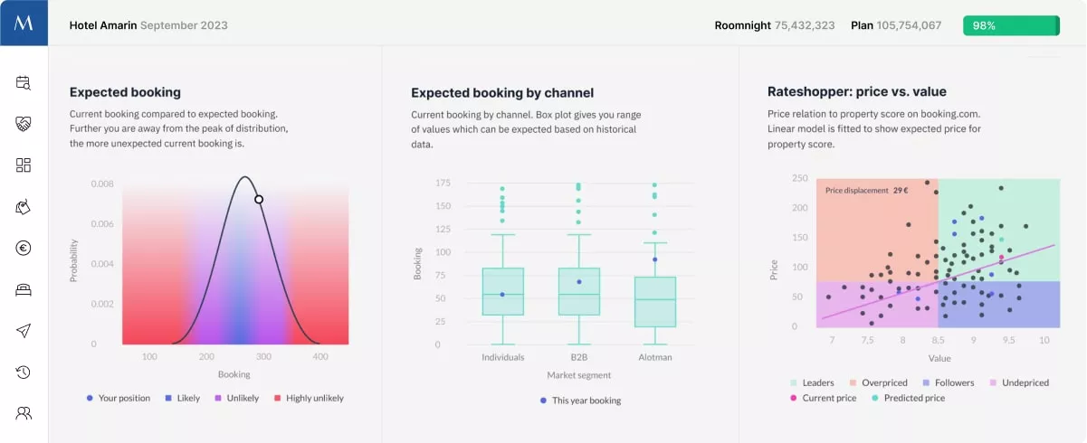
The Maistra revenue optimization tool presents data from multiple disconnected sources in an array of easy-to-consume graphics formats from scatterplots to distribution curves. These are all designed to empower the user to make faster decisions on pricing to reduce vacancies and maximize revenue. Machine learning models perform an array of data analyses, predicting the optimal price for every accommodation unit across the portfolio.
Here are just a few ideas for using AI data visualization to power better business decision-making:
Consumer insights
Visuals can present survey results, demographic and psychographic data to highlight key audience personas. Line graphs, statistics, bar charts, and maps can depict visual representations of audience segments.
Market trends
Diagrams provide summaries of trends in markets over time using line graphs, histograms, scatter plots, treemaps, and 2×2’s to show changes in behavior, sales, market share, competitive landscape, or market forces.
Media performance
Infographics can summarize campaign metrics such as engagement rates, follower growth, top-performing assets with colorful images and graphs to represent a brand’s online positioning and presence in a memorable way.
Sentiment analysis
Qualitative data such as reviews and feedback can be analyzed with AI and used for associations with products or services in data visualizations. A language model can further enhance these visualizations by providing detailed explanations and narratives that help decision-makers understand the sentiments behind the data.
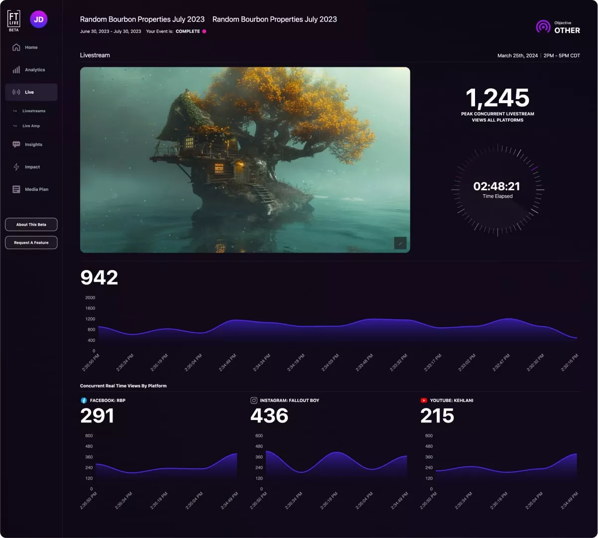
For digital experience company FirstTube, our goal was to provide the end-user with an intuitive, real-time dashboard that displayed critical metrics such as concurrent viewers and peak concurrent views, allowing them to make informed decisions on the fly. We aggregated all the data to generate comprehensive visualizations that charted the best-performing platforms, ad placements, total watch time, and total view counts.
Digital products can incorporate AI data visualizations in a number of ways. Here are a few:
Health trackers
Users’ behaviors can be analyzed to make recommendations on ways to improve workouts or health outcomes. Charts, graphs, and illustrative suggestions can indicate where to focus for the best results.
Entertainment recommendations
Spotify’s Wrapped is an obvious exemplar of this potential. By presenting a visual snapshot of music consumption, users can gain insights about their own behavior and identify trends and valuable insights that might otherwise be lost in the rhythms of everyday life.
Product comparisons
Original graphics can be used to compare features, benefits and pricing using side-by-side charts or tables, vibrant icons, and statistics to help customers discover more information and facts about offerings.
Consumption trends
As one example, utility providers could illustrate a user’s consumption patterns in ways that could help customers reduce their carbon footprint or save on their energy bills.
Smart homes
Users can learn more about their usage of appliances, thermostats, doors and windows, and lighting to improve energy efficiency, lower their bills, or even find new recipes tailored to their equipment and tastes. By presenting this information in easy-to-consume formats, homeowners can be engaged and motivated to evaluate and act up their behavior.
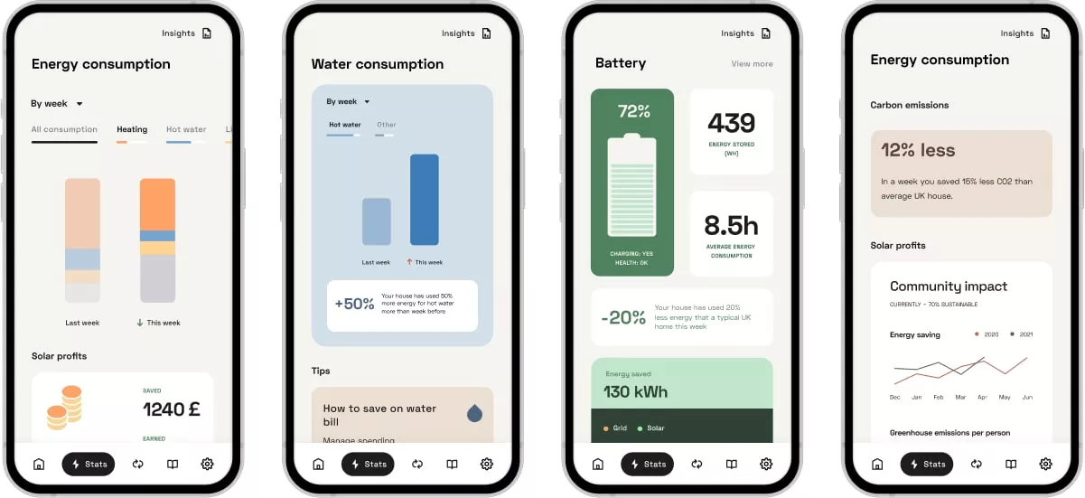
The app we designed for The Arbour Smart Homes features numerous data visualizations that are intended to make it easier for residents to gauge their energy consumption and make energy-saving adjustments on the go. Because it’s a deep experience, consistency and cohesiveness help tie everything together and create mental shortcuts when moving between functions.
Best practices for AI data visualization
From forecasting to communications, it’s critical to be precise, meaningful, and authentic. Several best practices come into play, specifically with data and design, for data visualization and common business processes.
Accuracy
Beginning with the data and the source, accuracy is the most important factor. Inaccurate data can lead to incorrect assumptions, conclusions, and messaging.
Relevance
Ensuring the data is relevant to the audience will help build a case.
Contextualization
Contextualizing the data is important as it allows the audience to evaluate and understand its significance. Titles, subtitles, labels, annotations, and explanatory text are beneficial. Comparisons and benchmarks will provide value by showing progress and patterns over time.
Providing actionable insights
Actionable insights can serve as a narrative aid that help users form opinions and make educated decisions based on patterns, trends, and concepts that are highlighted within the data visualization.
Similarly, there are several design best practices for creating and using data visualizations in business and marketing.
Simplicity
As with most design concepts, simplicity is the first and most important element. Avoid overwhelming viewers with too much information, too many colors or fonts.
Consistency
Consistent use of design elements will create a cohesive experience.
Visual hierarchy
Establishing a clear visual hierarchy will guide the users to view the most important parts of the visualization in the correct order. Labels and fonts (weight and size) can be used to create hierarchy.
Accessibility
Accounting for all users is important, and including alternate text with visuals is central to any visual element.
Keeping best practices top of mind while developing charts and graphs will create a stronger user experience while drawing in the audience.
Proceed With Care
While AI can enhance the process of creating data visualizations, there are also cautions. Companies should not over-rely on artificial intelligence for data visualizations. Instead, combining AI tools with human interface is the best approach.
While AI can deliver many efficiencies to the process, it is best when administered by creative and development teams with full knowledge of the subject, the data, the audience and the idea.
AI is known for inherent bias, hallucinations, inaccuracies, and lack of tone and voice. It is critical to consider company standards, policies, and ethics prior to using any new technology, visualization tool or AI. For these reasons, use of AI should always be managed closely.
Entering the new frontier with AI data visualization
As businesses enter the new frontier of big data and technology, AI can be a valuable visualization tool. When utilized with care, and together with best practices in data and design, companies can convey complex information in a highly visual and engaging way – whether that’s to the board room or to customers, empowering decision-makers with the insights they need.
Selecting a strong digital partner can provide data visualizations and AI tools to scale a business. If you are interested in utilizing AI in your digital product, check out what we can do to help.
Kelly Cutler is an educator, author, and marketing leader. She currently teaches digital marketing and communication across programs at Northwestern University. An active adviser and consultant, Kelly brings more than two decades of experience to Northwestern. The author of “Search Marketing: A Strategic Approach to SEO and SEM,” Kelly enjoys researching digital marketing, web3, generative AI, and the future of marketing. You can connect with Kelly on LinkedIn.


