


Want to make sure the product you are building is user-friendly for all types of users? We’ve put together a list of 8 best practices for designing user interface components that are perceivable, operable, understandable, and robust.
Throughout the last decade, we’ve grown accustomed to performing many everyday tasks via web or mobile apps. For many people, this is the go-to, minimum-hassle way.
But imagine digital solutions are all around you, and you’re unable to take advantage of them. You can’t shop online, access your account balance on a banking app, understand graph data because all the colors look oddly similar, or you submit a form without realizing it because the button labeled “Next” was actually “Submit”.
Accessible design is good design
Accessibility, sometimes abbreviated as A11y, tries to address issues in using digital products to provide access to services or products to everyone, whichever way they interact with them. Sadly, for many users, accessibility issues create barriers to using digital products and services and many digital products end up being inaccessible.
In order to avoid this, UI/UX designers need to shift their mindset because accessibility benefits all users. In fact, some features that were primarily intended for accessibility purposes, such as the “Zoom In/Zoom Out” function, have actually become crucial to the user experience as a whole and are now common practice.
By providing solutions for one group, we often end up accommodating a much larger audience.
The four accessibility principles
First, you need to understand the four main guiding principles of universal design. These principles were developed as a part of the WCAG standards, which are considered to be the primary international accessibility standards for the web.
Based on WCAG, the accessibility team at Infinum has come up with a universal accessibility approach that covers both mobile platforms and the mobile Web and includes accessibility in the lifecycle of digital products. If you’re curious, you can find out more about the accessibility initiative at Infinum in this article.
Accessibility principles and levels, a breakdown
| A | AA | AAA | |
| Perceivable | Content must be presented in a way that can be operated by the widest range of users, including people with disabilities. | Content must be presented in a way that can be perceived by a wider range of users, including those with color blindness or impaired vision. | Content must be presented in a way that can be perceived by the widest range of users, including those with more severe disabilities. For example, sign language interpretation should be provided for all audio content. |
| Operable | Content must be presented in a way that can be operated by the majority of users, including those with visual, auditory, or other types of disabilities. | Content must be presented in a way that can be operated by a wider range of users, including those with visual or cognitive disabilities. | Content must be presented in a way that can be operated by the widest range of users, including those with more severe disabilities. |
| Understandable | Content must be presented in a way that can be understood by the majority of users, including those with cognitive disabilities. For example, instructions should be clear and concise. | Content must be presented in a way that can be understood by a wider range of users, including those with limited literacy or who speak languages other than the primary language of delivery. For example, abbreviations and acronyms should be defined. | Content must be presented in a way that can be understood by the widest range of users, including those with more severe cognitive disabilities. |
| Robust | Content must be presented in a way that is compatible with the majority of users, including assistive technologies. For example, all HTML code should be well-formed and valid. | Content must be presented in a way that is compatible with a wider range of users, including assistive technologies. For example, all content should be accessible without relying on any specific technology. | Content must be presented in a way that is compatible with the widest range of users, including assistive technologies. For example, all content should be accessible using a wide variety of technologies and devices. |
Inclusive design: creating products for everyone
To state the obvious, accessible design is good design and promotes inclusivity. But how does one incorporate accessibility into their design?
To help you make sense of it all, we have summarized the accessibility guidelines into a handy list to help designers in product development solve many accessibility issues through design. Feel free to incorporate these best practices incorporate into your workflow to ensure your output follows the four main accessibility principles.
1. Set a color contrast scale
Have you tried using your phone in bright sunlight? In all likelihood, it was not a very pleasant experience, having to squint your eyes or glue your face to the screen in order to make sense of what you were trying to look at. The reason for this was probably low color contrast.
Now, if you are a low-vision or color-blind user, you may experience low color contrast issues daily. Color contrast impacts the readability and legibility of your content and is an important element of the Perceivable principle. There is a specific rule for contrast ratio that has been accepted as standard, as it ensures a satisfactory level of contrast.
To avoid contrast issues down the line, incorporate color contrast into your design right from the very beginning. Invest time in defining your color scale and how these colors can be best used when creating your product’s style guide.

Your design to-do list:
Test the colors when defining your product’s color palette. Check which colors work together and which don’t, and make a note in your style guide library
Follow size-ratio rules: 3:1 for large text sizes and 4.5:1 for normal text sizes
Follow the ratio rule 3:1 for icons and actionable graphics. Side note: decorative and brand elements do not require minimal contrast ratios
If you are using text on images, make sure that the text is legible – check if there is enough contrast between the background and the text (you can add an overlay layer between) and export text as a separate asset rather than as part of an image
Make sure you avoid using pure black on pure white and vice versa, as such a contrasting value in color brightness creates intense light levels that overstimulate the eyes and lead to screen fatigue
Avoid using overly bright and saturated colors, as they also overstimulate the eyes and lead to screen fatigue
Useful tools to help you check the contrast ratios:
2. Include visual cues & labels
Relying on transmitting information through only one of our senses can make users miss key information.
For example, users who are color-blind may not perceive the red outline of an input field. Users who use screen readers may not be able to understand what “ic_24” means in the context of the screen they are interacting with. Or imagine filling out a long form with numbers, only to find out at the end that you entered some information incorrectly, but the fields are unlabelled, so you have to remember which fields held which data.
All of this can lead to users making unintentional mistakes that constitute a barrier to their use of the service or product. By adding simple cues and labels, you can both guide users and save their time and energy.

Your design to-do list:
Add labels to input fields and forms
Use a combination of icon + color + descriptive test for feedback status
Differentiate active vs. inactive input fields by adding another visual indicator, such as different fill options, shape weights, different graphic elements such as lines or dots
Underline links
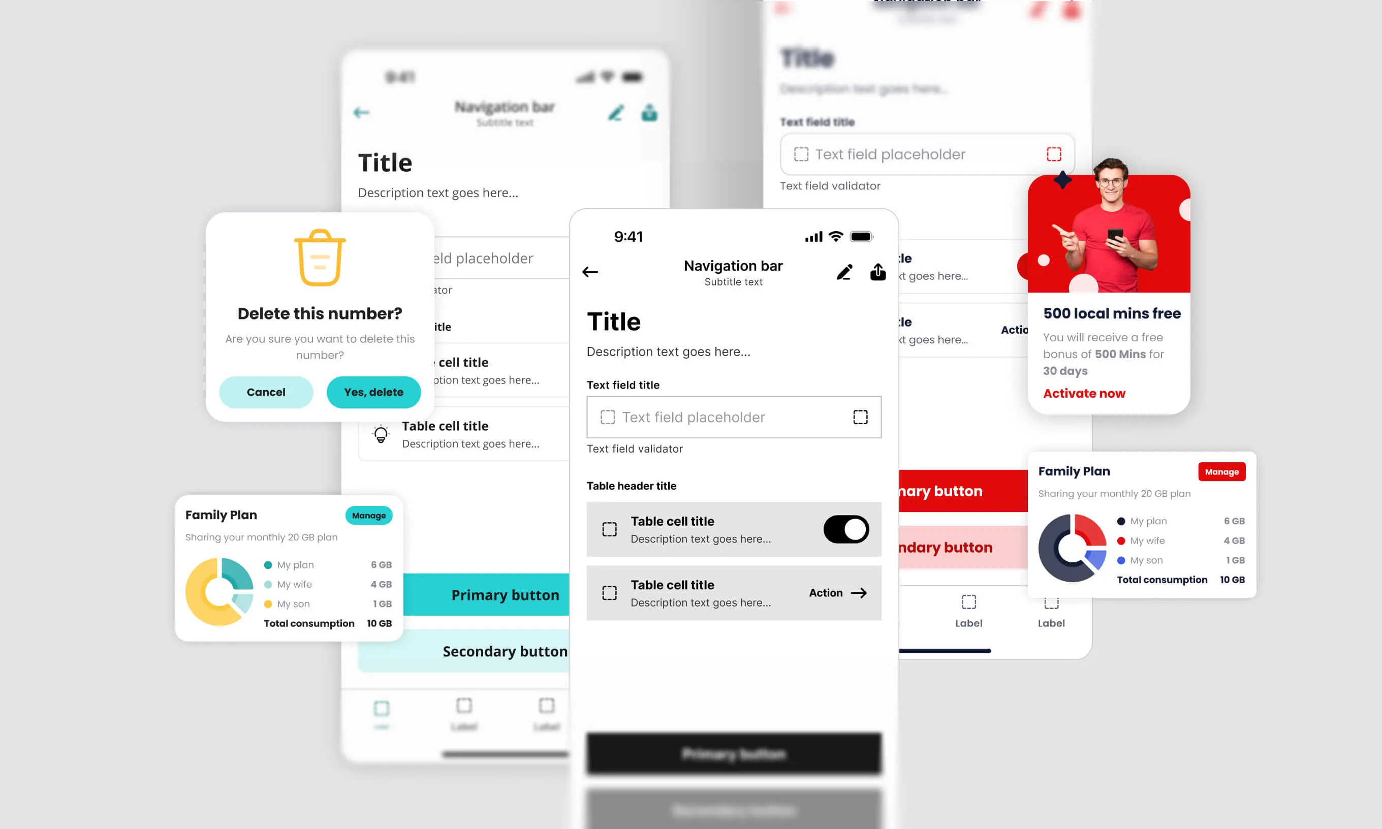
Use color + patterns or icons for graphs, charts, and additional quantitative data
Use a progress stepper in large flows with multiple steps
3. Create a clear hierarchy of information
This sounds like an obvious practice for every designer on the planet. But you need to be aware of the intended order in which things will be experienced. Sometimes your creative passions may lead you down an experimental path, and a possible side-effect may be an unclear or inaccurately implemented content structure that doesn’t get information across as it was intended.
This can present problems for users who use assistive technologies. Make sure you organize information in a logical and easy-to-follow structure, as it helps users to understand, prioritize and navigate through content.
Your design to-do list:
Include a page title
Have distinctive groups of items
Create subheadings for each group
Use a linear & logical layout
Use consistent text alignments and layouts
Align with developers on the intended order of how elements need to be read
4. Use descriptive & non-ambiguous CTAs
Below are two actionable item options. Which one is more understandable by the text alone?
Option A: “More”
Option B: “View more details about our Shipping policy”
I’m guessing you chose option B.
Now, there may be other options that work and are more character-optimized, but keep in mind that you should avoid ambiguous links or buttons that are not clearly labeled. Instead, be more descriptive so that the purpose of the button or link can be understood by the text alone.
Your design to-do list:
Conduct a usability test to check your accessibility hypothesis
Align with copywriters, content creators, UX writers, and whoever shapes the text within a product
5. Ensure the touch target areas are big enough
Are you respecting minimum touch target areas? Touch targets are the areas of the screen that respond to user input, aka all of the actionable items. If that area is too small or too close to another actionable item, it can trigger undesired interactions or leave users frustrated. Therefore, users need at least 1 cm2 of screen space to select the desired item. Keep in mind that different platforms have different requirements: iPhone = 44x44 px, Android = 48x48 px, Web = 44x44 px.

Your design to-do list:
Ensure a minimum touch target area based on the platform for which you are designing
Make sure your small actionable items have enough area around them in accordance with the minimum sizing
Provide at least 8px of space between actionable elements
6. Put users in control
Users should always be aware of what the next step within the product they are interacting with will be. Do not refresh or update pages automatically unless it is really necessary. Unexpected product behaviors can cause issues, such as unintentional submission of data or purchase, the inability to read a page because of automatic updates, or audio playing automatically.
These things can lead to users not having enough time to complete an action. By giving users control of the situation, they are able to more easily navigate and interact with digital products.

Your design to-do list:
Avoid time-dependant features
If you need to have time-dependent features (e.g., security tokens), make sure users see and are aware of the time remaining
Provide users with an option to extend the time
Don’t change the context of a screen without user confirmation
Don’t update content automatically
Give users the option to pause or stop any automatic process
Don’t play audio automatically and provide users with the option to control volume and sound
Don’t trap users in a flow, and provide them with a clear closing action
7. Avoid using flashing or excessively dynamic animations
It is important to avoid using flashing and overly dynamic animations for accessibility reasons because these can cause seizures, migraines, and other health issues for people with photosensitive epilepsy or sensory processing disorders. Additionally, these elements can be distracting and disorienting for all users, interfering with their ability to focus on the content and complete tasks effectively.
Your design to-do list:
Opt for static content instead of moving, blinking, or flashing content
If you are using flashing elements, make sure the flash rate is 3 times per second or less
Ensure that flashing objects cover less than 5% of the screen
Warn users in advance if the content is photosensitive
Align with motion designers on this topic
8. Align with the rest of the project team to address accessibility
The last accessibility practice doesn’t concern the design process as much as team communication. It is an important practice for designers to align with other project team members because both design and development are critical in successfully creating an accessible digital product.
When designers, content specialists, software testers, and developers work together, they can ensure that the design vision is implemented accurately, technical considerations are taken into account and the product is tested in different environments and with different assistive technologies in order to meet accessibility requirements and provide the best user experience for all users.
Your design to-do list, in alignment with the product team:
Define focus states for actionable elements for the keyboard
Make sure the highlighted focus border has enough contrast within your user interface
Define the right focus order of the elements in cooperation with developers
Support scaled UI, e.g., users increasing font sizes
Align with the content team to provide text alternatives to images that convey information (decorative images do not require a text alternative)
Align with the content team to provide captions and transcripts and include entry points in your designs
Accessibility review – a second chance to make things right
After going through this list of best design practices, you probably realized that some of your finished projects don’t tackle all of these accessibility issues. So what happens now?
If you didn’t design with accessibility principles in mind, there’s still time to improve your product. Your efforts shouldn’t end after a design proposal is sent. In the same way that you would do design implementation reviews, you should also periodically review your product’s accessibility.
The first step in a review is understanding the main accessibility principles and which issues they tackle. We have covered that in this article, but if you want to go into greater depth, there’s a Figma file for that.
We created an in-depth Figma file on Accessibility Guidelines for Designers to give designers a description of accessibility guidelines with examples.
The next step in a review is to make a strategic plan that works best for you. You can divide the review by platform, by A11y categories, or by an app’s main navigation and hierarchy. You can perform the review on your design file or the implemented product. Share the review efforts with software testers so that they can cover technical implementation and you can cover design.
At the end of the Accessibility Guidelines for Designers file, you will also find an A11y checklist template. It will help you document the accessibility status of your designed product, which will come in very handy when delivering your review findings.
A11y jigsaw falling into place
Designing for accessibility is a crucial aspect of creating digital products that can be used by everyone. Not only does it help to ensure that all users can access and use products, but it also leads to better design overall. Following the four guiding principles of accessibility, designers can create products that are more user-friendly and accessible for all.
Remember, design is just one piece of the big accessibility puzzle, but it plays an essential role. By incorporating these eight practices into your web design workflow and doing regular A11y reviews, you are helping all the pieces of the puzzle fall into the right place for a range of people.