


48 hours into Apple’s iOS 26 reveal, and accessibility experts are already speaking up. Is Liquid Glass a top-shelf design innovation, or a glass ceiling for inclusive design?
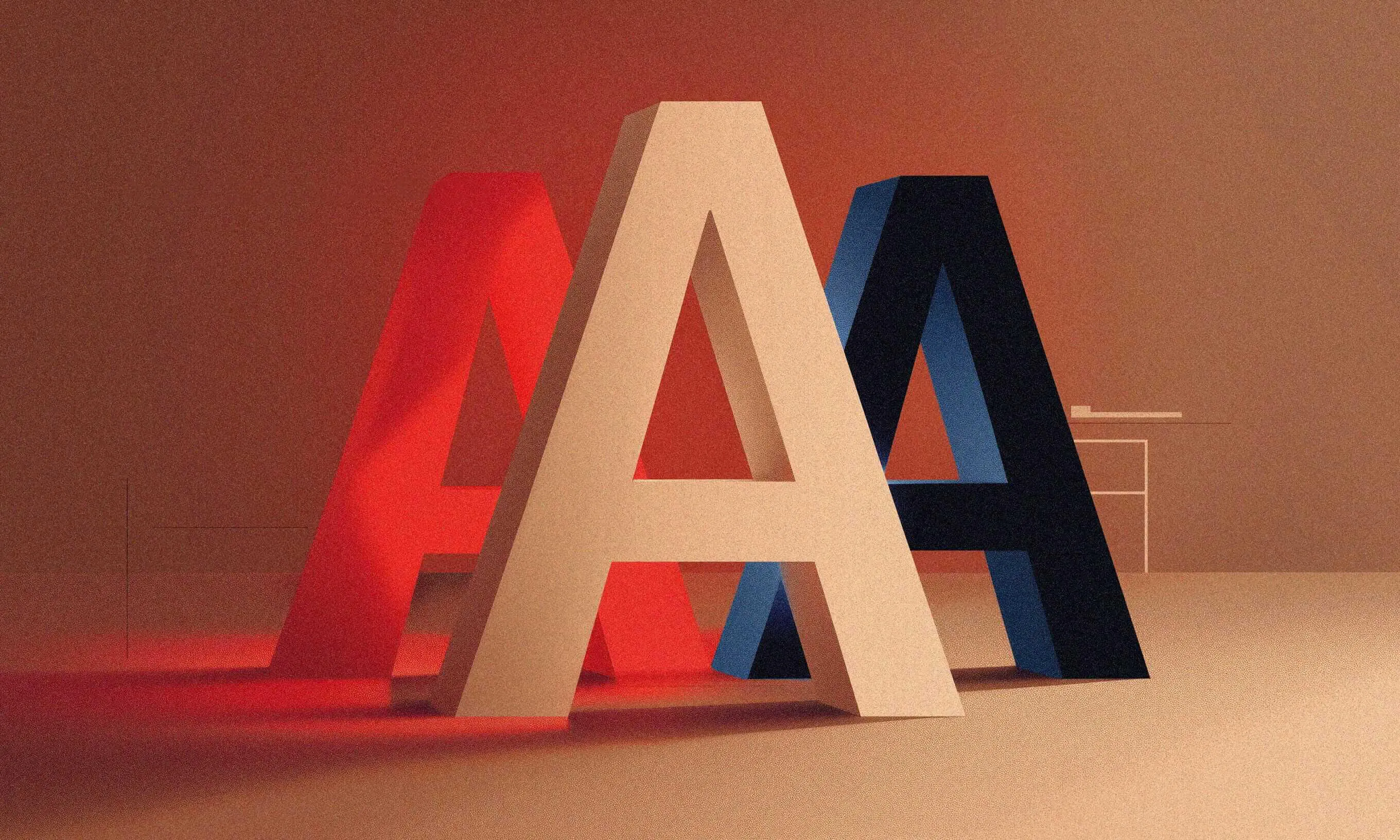
Liquid Glass is Apple’s new digital material introduced with iOS 26: a reactive, translucent design that animates, morphs, and responds to your touch in real time. It’s visually striking, with glowing highlights and slick, glass-like effects that change depending on the content and context.
According to Apple:
“Controls have a refreshed look across platforms… the knob transforms into Liquid Glass during interaction, and buttons fluidly morph into menus and popovers.”
LIQUID GLASS IS A NEW DIGITAL META-MATERIAL THAT DYNAMICALLY BENDS AND SHAPES LIGHT. – APPLE
Currently in beta and rolling out with iOS 26 later this year, Liquid Glass is already generating equal parts excitement and criticism.
The Apple doesn’t fall far from the previous design revolutions
Apple has never shied away from shaking up UI design. Remember iOS 7? Some praised its minimalism. Others… well, one four-year-old famously burst into tears after updating.
Liquid Glass may look futuristic, but it didn’t appear out of nowhere. A look back at the key design moments reveals how Apple got here.
2001: Aqua (macOS X)
Apple’s first big leap into using digital “materials” to create a rich, visual UX.

2013: iOS 7
Apple ditched skeuomorphism for a colorful translucency, real-time blur and motion.
2017: iPhone X & iOS 11
With the Home button gone, Apple introduced a more tactile, fluid UI.

2020: macOS Big Sur
Big Sur brought back depth with soft shadows and glassy surfaces.

2023: visionOS
Built for spatial computing, visionOS introduced floating, translucent interfaces that respond to light, movement, and your gaze.

2025: iOS 26 & Liquid Glass
Apple’s boldest visual update yet: a dynamic, translucent material that bends light, reacts to touch, and brings apps to life.
Where Liquid Glass falls short
Since the reveal, designers and accessibility experts on X (formerly Twitter) have been quick to weigh in. While some love the new aesthetic, others are raising valid concerns, especially around readability, contrast, and sensory overload.
Accessibility in digital design means making sure everyone, including people with disabilities, can use your app or website. It’s not an add-on. It’s fundamental. And for users with vision impairments, dyslexia, or neurological sensitivities, visual clarity and calm are non-negotiable.
Our own early beta testing surfaced some real accessibility concerns:
Some screens fall well below WCAG minimum contrast
We clocked 1.5:1 in places, and the bar is 4.5:1. Low contrast makes it difficult or impossible for users with low vision, or even just a bright screen, to read text or recognize interface elements.
Text occasionally fades into background layers
This is especially true with complex imagery or bright surroundings. Without strong visual separation, users have to strain to read or guess what’s on screen.
Glassy effects amplify visual noise
They add reflections, shine, and motion that can overwhelm the interface, making it harder to distinguish elements quickly, especially for users with cognitive or sensory sensitivities.
Overuse of blurred backgrounds confuses users about what’s interactive and what’s not
When buttons and text blend into decorative layers, users can’t easily tell what to tap, which increases cognitive load and reduces usability.
These issues aren’t edge cases, they affect millions of users who rely on visual clarity for a usable experience. Let’s take the most striking criticism: low contrast.


Contrast isn’t some complex accessibility setting, it’s one of the simplest, most effective things designers can get right. And yet, it’s still too often sacrificed in the name of aesthetics.
Good contrast isn’t a design preference, it’s a core accessibility requirement. It ensures that text and UI elements remain readable in all environments, for all users. Choosing low contrast for the sake of aesthetics might look elegant, but it excludes users with visual impairments and introduces unnecessary friction for everyone else.
Yes, this is still beta, and yes, things may change. But what we’ve seen so far is enough to raise red flags, not just eyebrows.
Can a design be truly beautiful if it leaves people out? Initial impressions suggest that while the visual language is innovative, it currently misses key accessibility standards. Designers should proceed with caution.
ANA ŠEKERIJA,
ACCESSIBILITY LEAD, INFINUM
Not everyone is sounding the alarm just yet. Some accessibility experts remain optimistic, expecting Apple to refine Liquid Glass before the official release, or at the very least, offer alternative styles or settings that better support inclusive use.
If history is any guide, Apple will likely bake in accessibility overrides for Liquid Glass. But the real question isn’t whether users can disable it, but whether the default experience is inclusive enough to begin with.
KERRIN WHIPPLE,
SENIOR UX DESIGNER AND WEB ACCESSIBILITY SPECIALIST, INFINUM
Wait — Apple Did Think About Accessibility
And to be fair, Kerrin was right. Apple hasn’t left accessibility completely out of the picture.
Liquid Glass responds to system-level accessibility settings, automatically adapting without extra developer input. Here’s what kicks in:
- Reduced transparency makes the glass effect frostier and more opaque, helping with legibility
- Increased contrast highlights key elements in high-contrast black or white and adds borders for better visibility
- Reduced motion dials down dramatic animations and disables elastic interactions that could trigger motion sickness
It’s a solid baseline, but let’s not mistake it for full accessibility.
Sure, system settings like reduced motion or increased contrast do some heavy lifting. But they don’t close the gap. That’s where designers come in.
It’s on us to make sure your interface works for everyone, because even folks with perfect vision and steady hands benefit from accessible design. Think: bright sun, cracked screens, one-handed use on a crowded train. Accessibility isn’t just about permanent disabilities; it’s about making products usable in the real world.
Inclusive design helps all of us. And it takes all of us to build it.
Should you use Liquid Glass?
That depends.
Liquid Glass is still evolving, and so is Apple’s UI guidance. Historically, they tend to tweak visual systems post-launch, so don’t blow up your entire design system just yet.
For existing projects, avoid rushing to redesign all custom components immediately. Apple allows opting out for a year, giving teams time to align designers and developers and establish clear guidelines.
HRVOJE HRVOIĆ,
LEAD IOS ENGINEER, INFINUM
So: explore it. Prototype with it. But stress-test it with real users, especially those with accessibility needs. A sleek interface means nothing if it’s not usable by everyone.
For new projects aimed at iOS 26+, it makes sense to embrace Liquid Glass early. But do it with intention. That means building a design strategy that prioritizes clarity, consistency, and accessibility from the start.
Some key things to keep in mind:
- Build in high-contrast alternatives
- Don’t place critical content (buttons, text, controls) on a blur
- Test with accessibility settings turned on
- Use tools like VoiceOver, Accessibility Inspector, and WCAG checkers
- And above all: never sacrifice legibility for the sake of aesthetics
Final thought: Shine responsibly
Liquid Glass is visually ambitious and could unlock exciting new UI possibilities, but inclusive design doesn’t come automatically, even from Apple. It’s on us, designers, developers, testers, to make sure the magic works for everyone.
Let’s stay curious, test everything, and push for a future where beauty and accessibility go hand in hand.