Prototypes serve as a demo of connected screens so that the team, stakeholders or users (during usability testing) have a clear understanding of the flows, since flows are hard to explain in words.
If you're designing in Figma, it's best to keep the prototype there. We won't get too technical as tools often change, so check out these resources:
Interactions are an integral part of the user experience. Make sure that:
- Tap zones need to be large enough.
- Modals appear from the bottom and you dismiss them downwards.
- The screens behave according to navigation and flow placement (previous, next) (Material's navigation transitions).
- The dialogs have a transparent overlay behind them and can be dismissed anywhere outside of the dialog box.
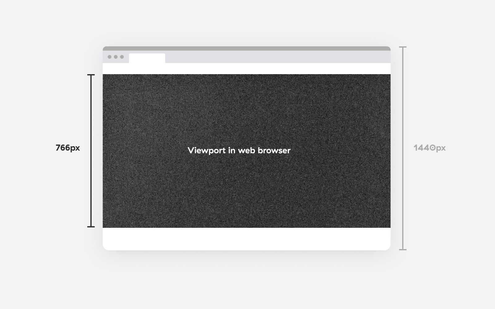
When prototyping, take into account additional UI elements that are hardware and/or software dependent. For example, someone viewing a website on the desktop will have an OS bar at the top (or bottom) and browser UI elements at the top. Designing at the default frame height 1440px differs from the real experience so keep that in mind.
Figma's interface already takes up enough space at the top when viewing a website on a desktop. Still, for mobile, we need to mock extra OS and browser interface elements to have a more natural and realistic preview.
Prototype instructions
When sharing the prototype with clients, ensure they understand how to navigate it. Here is everything you need to cover so they have a good viewing experience.
The prototype is a clickable Figma file that we use to showcase interactions on the screens still in design.

Getting started with the prototype
In the sidebar (A), located on the left side of the screen, you can find all prototype links – different design flows (e.g. Login flow, Registration flow, etc.) you can access in this file. Clicking on those links switches to the starting point of the selected flow. You can hide or show the sidebar by clicking the sidebar icon on the top (B). By pressing the “Options” dropdown (C) you can:
- change the preview options (if the prototype is cut off or isn’t fitting your screen as intended)
- hide/show the top toolbar
- show/hide comments
Navigating through the screens
Interact with hotspots (blue areas that appear on the screen when you click) to move to the next screen/page. You can also use arrow keys to move from one screen to another or arrows on the bottom of the screen (D). Pressing “R” key on your keyboard returns you to the starting point of the prototype flow.
Leaving feedback
Press “C” on your keyboard or click the comment icon on the top (E) to open the comment dialog. You can click anywhere on the screen to leave feedback.
Viewing prototype on mobile
To view the prototype on your mobile device you will need a Figma account. It is recommended that you download the Figma mobile app (iOS version or Android version) to have a better experience with viewing the prototype.

Once you open the prototype, long pressing with two fingers opens the prototype menu where you can control the prototype. Here you can find the options to switch to another prototype flow, restart the prototype and go to the starting point of the prototype flow, and leave feedback using comments.
Onboarding clients
To avoid worrying if your clients memorized everything you explained, send them these instructions (which you can find on Google Drive) along with your prototype. You can adjust the instructions in the Pages document and export it as PDF before sending it off.