One popular mobile app we’ve produced helps drivers in Croatia on a daily basis. To make it even better, we’ve recently expanded its functionality with mobile widgets. While widgets are very cool from the user’s perspective, adding them to an app like HAK turned out to be far from trivial.
HAK is a mobile app we’ve built for the Croatian Auto Club (called HAK in Croatia). It helps drivers manage their daily traffic routines, as well as plan longer trips, more easily. For example, with the HAK app on your smartphone, it’s super easy to pay for parking, calculate toll expenses for your upcoming trip, or check for traffic jams with reports and live traffic cameras. As you can see, an app like this just screams for widget support.
What are these widgets you speak of?
So what are mobile widgets? A widget is a component of an application focused on serving a specialized purpose. The idea is to take the most important parts of an application and present them to users in a simple way for a more efficient use. In practice, this means placing a visual element on your smartphone screen in a more prominent location (like the Lock screen or the Notifications screen). This function can be passive like showing weather conditions, or it can require user action.
Android widgets have been present for quite some time now, but they’ve become available on iOS just recently with the release of iOS 8. Our goal was to capitalize on this opportunity by providing users with a similar experience on both platforms.
Widgets on Android
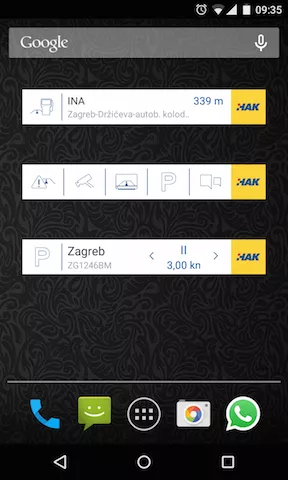
We’ve implemented three widgets on Android. Ideally, we would have opted for only one widget, but this was not technically possible. Two widgets are focused only on one isolated function, while the third widget is multi-purpose:
- Parking widget enables the user to purchase a parking ticket with a few taps on the screen;
- Gas station widget displays information about the nearest gas station. The user is informed about its brand, address and the distance to the gas station;
- Shortcuts widget embeds links to several most popular modules of the app to save you the time of starting the app manually and then activating the desired function.

Why not go with one big widget? It’s the classic problem of the Android platform – making your software work on a variety of Android devices with different screen sizes. Since a single large widget can’t fit on all screens, we’ve split its functionality into three smaller widgets.
Battery consumption
The second problem we encountered was much more challenging – how to avoid high battery consumption while still making sure widgets do what they’re supposed to do.
You see, to work correctly, the app needs to have access to the current user’s location and a remote API (in other words, it needs to communicate with another computer over the Internet). Widgets need the same access to work their magic.
To balance the widget’s functionality with battery life, we chose to monitor the user’s location with moderate accuracy and request updates from the server only when these three requirements are met:
- there is at least one instance of the widget added
- the user just unlocked their screen and data should be refreshed
- the location itself has changed significantly (approx. 10 meters)
The last requirement is important for the Parking widget because the difference in the location of 10 meters might place the user in a different parking zone, with a different price. Generally speaking, if you want to get data from a remote server and have the widget display it, you need a custom Service to do all that work and trigger the widget’s refresh actions (since the widget can’t do it on its own).
Widgets on iOS
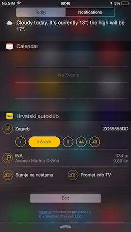
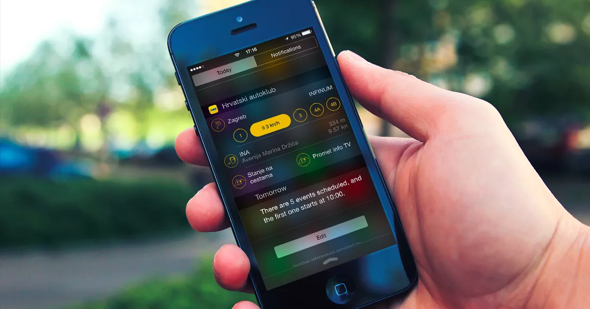
On iOS, we’ve built one widget with a somewhat different logical structure and functionality.
This widget has three sections, with the functionality of each corresponding to one of the widgets on Android — namely:
- Parking section
- Gas station section
- Section with different modules

There were technical challenges in the development of widgets on iOS as well.
Xcode hates me
The first problem we came across was that the widget would often fail to start on a real device after being built with Xcode (the tool used for building iOS apps). For example, if the app’s Today widget is open on the device and we start the widget again within Xcode, we won’t be able to start Xcode again until the device is restarted.
However, we did not experience this problem on the simulator, but its location service is limited compared to the one on a real device, so we had to tread carefully and develop the widget on a real device.
Animated widgets also hate me
The second problem was updating the widget’s UI. Built-in methods have to be called differently in contrast to the usual calls of the application view. Until we found the right solution, the widget had been flickering all over the place, especially when updating the UI with animations.
Are widgets worth the trouble?
There will always be apps that will benefit from widgets more than others. Those groups of apps should apply a strategy of creating and using them to gain competitive advantage.
But still, the question arises – are widgets here just for the sake of being cool and having that futuristic feel, or do they actually satisfy a real need in a purposeful manner?
I got my answer to that question when I was in a hurry in the middle of the day, and had to pay for parking in a hurry. As I already had my device unlocked (I’m an Android user), I managed to do it with only two taps!
It’s safe to say they meet both criteria.


