Along with how much it costs, the question we get most of the time is – how much is building this project going to take?
We thought that the best way to show it is to use an app we built as an example. We’ll use an app called Scannr. Since it’s something we built in-house, we’re free to publicly present the exact numbers and stats behind it.
What is Scannr?
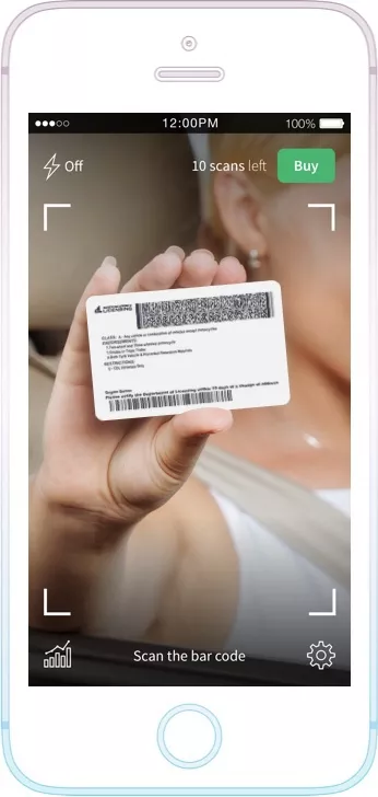
Scannr is an app that uses the phone’s camera to scan the barcode on the back of a US or Canadian driver’s license. By using proprietary image recognition technology, information from the barcode is decoded into a human-readable form and presented in a snazzy UI.
Bouncer mode
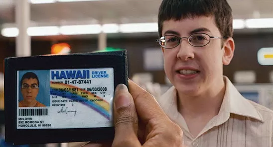
Why would I use an app for reading the info from a driver’s license when I can read it myself? There are multiple use cases, but one specific one (that’s supported in the app) is the Bouncer mode.
You know how people can’t enter clubs and drink alcohol in the US until they’re 21? With the Bouncer mode, you set an age limit in the app and filter these customers accordingly.
Bouncers scan IDs on the entrance of a club, and get visual cues if the would be patron is above a certain age limit.
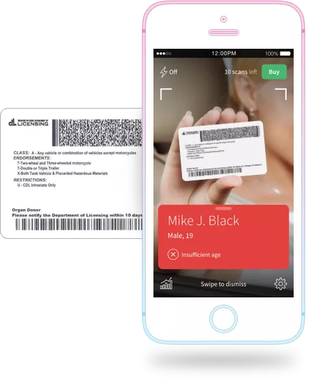
The app can also detect expired licenses and gather anonymized stats (i.e. you can see how many girls and guys entered the nightclub that night).
Disclaimer: The numbers and statistics shown below serve only as an example for the time needed to develop Scannr app. It doesn’t apply to other applications. Every project is stand-alone project and the estimations can vary from 100 to unlimited number, depending on the scope, functionalities, integrations etc.
The process
Scannr may not look like it has a lot of screens and a diverse UI, and that’s on purpose. We wanted to build a very simple app that does one thing good. Nevertheless, we had to go through an elaborate process before getting the final product out there.
1. Brand
At the beginning of the project, Scannr had no name and no visual identity. The first step was figuring a good name, after that it was defining a basic visual identity. We needed some time to get the creative juices flowing, make a bunch of sketches and when we were happy with the result, transferred them to the screen with the help of graphic design tools.
2. Wireframes
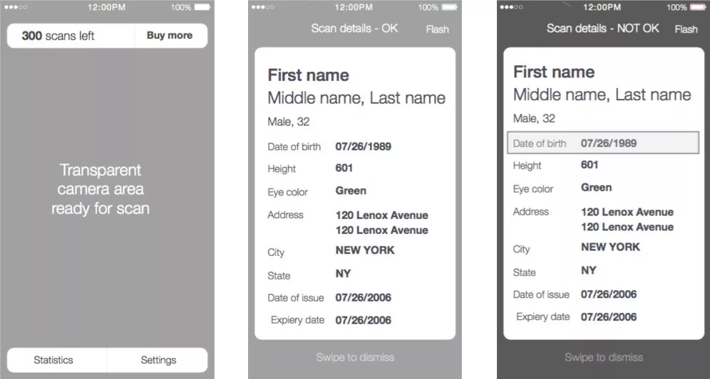
Wireframes define two important things:
- The scope of the project – what are all the things we’re trying to do
- The user experience – how will the user perform the tasks in the most intuitive and fastest way possible
They are sketches, ‘black & white’ representations of what the app will look like; where the buttons are going to be, what information each screen will provide and so on.
3. App design
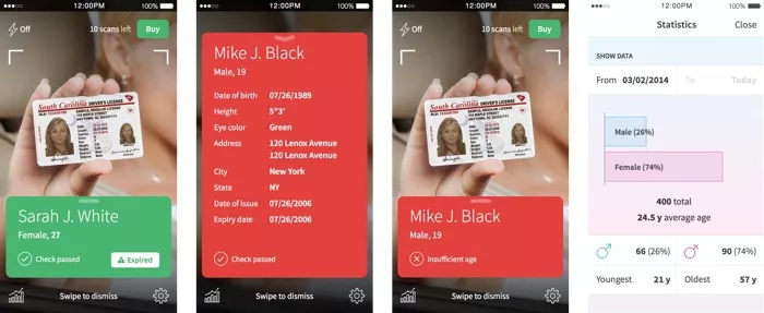
After we agree on the wireframes and the branding, the final phase is applying the brand visuals to the user experience flow we created earlier giving us a new and beautiful design.
4. Development
After designers are finished with their part of the project, it’s time for software engineers to step in. They have to work their magic and create the software engine that runs all those pretty screens in a meaningful way. Development always takes much longer than design. We’ll show you the actual difference in a bit.
5. Marketing website
In order to promote the app, we also decided to build a simple one-pager website. We needed to create the look of this website, mimicking the look and feel of the app itself. After designing it, we needed to do a small amount of HTML and CSS frontend coding to bring it to life.
6. Testing
Our quality assurance team had to test both the app and the website to minimize the chances of users encountering problems. This covers testing on different devices, different browsers and (in our case) – different drivers licenses.
So, how much time?
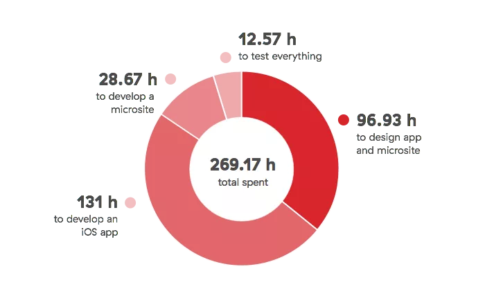
Finally, here are the numbers I promised! To be as precise as I can be, we have spent 269.17 hours on designing, developing and testing the app and the website.
More precisely, it took us:
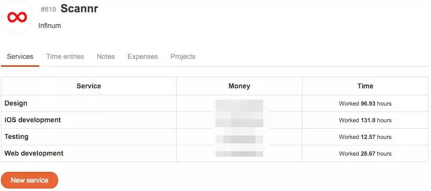
96.93 hours to design app and microsite 131 hours to develop an iOS app 28.67 hours to develop a microsite 12.57 hours to test everything
You can see the pie chart representing these rations below.
But where am I getting these numbers? We use Productive to track time and profit (and many other things) for each project that we work on.
I need to point out that we used Microblink’s proprietary scanning technology, and the time needed to develop this is not included here.
We also didn’t track time for project management, which we usually do for the client projects. Project management time typically adds up to around 15-20% of the entire time spent on a project.
Breaking down the data
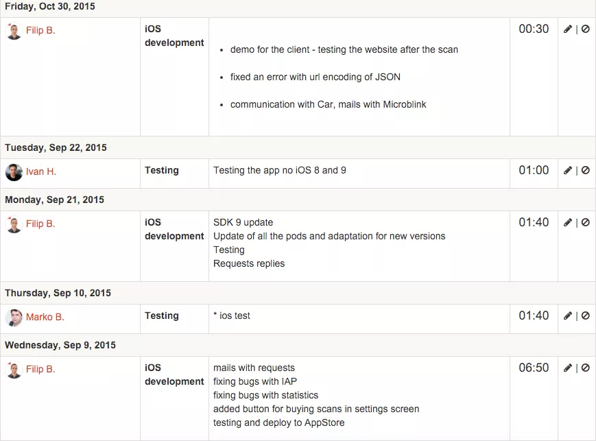
When people put in some work, they track the time on the corresponding project (Scannr) and the service (Design, Development and Testing in our case).
We can filter this information by days, and it looks like this.
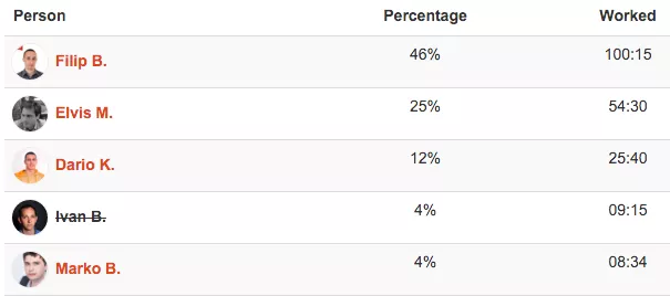
We can also filter the results to show stats for each person who worked on the project. For each person we can see the total time put into the project, as well as their relative contribution indicated by a percentage.
What if we wanted more granular data?
If we wanted to breakdown the time more precisely, instead of just tracking time against two services – design and development, we could have created several more. In that case, we would have:
- Wireframing
- App design
- Web design
- iOS development
- Web development
- QA (testing)
Since this was an in-house project, it wasn’t necessary to go down that path.
What about other apps we’ve built?
By using Productive and over 500 projects behind us, we can give our new clients more or less accurate estimates on how long it will take to build their digital products.
These estimates mostly depend on whether the app is part of a larger ecosystem, or if it’s a standalone app like Scannr. Integration with third party systems, web services and other features typically increase the complexity of the project more than anything else.
How about building the same app for different platforms?
Another question is how does building an app for two platforms (iOS and Android) affect the time as opposed to building it only for one platform?
Well, Android development usually takes around 30 percent more time than iOS development. If you want to know why, please check out our article on this topic and find out why building Android apps takes 30% more time.
Design vs. development ratio
These numbers indicate that the ratio between design and development is close to 1:2. In other words, we used almost twice as much time to develop the app and marketing website than to design them.
Keep in mind that, in this case, we did the mini-branding, wireframes and both mobile and web design in the process. When working with clients, we usually already have a visual identity, so the ratio between time required for design and development is closer to 1:3.
These number obviously can’t be extrapolated from one project, but nonetheless are pretty much consistent to what we see across the board with other projects.
Keeping both hands on the wheel
Productive helps us run the company overall – starting from the sales phase, and then over to the project management and delivery phases. It helps us know how far we are from the chequered flag. The Scannr app is a good example of how we keep track the project’s progress.
But the more important question is – what does this mean for our clients?
We believe that the most important thing in managing a project is good communication. These statistics don’t tell the whole story, but they provide a core narrative around which we can shape the communication with our clients.
Additionally, by using Productive, clients can, in realtime, track the progress of their projects, but more importantly, their budgets. No matter where we are and how far we want to go, the client is at the steering wheel.
We are here to design, build and give our maximum support by providing accurate information and expert advice.

