A new standard for the retail industry
REPSLY
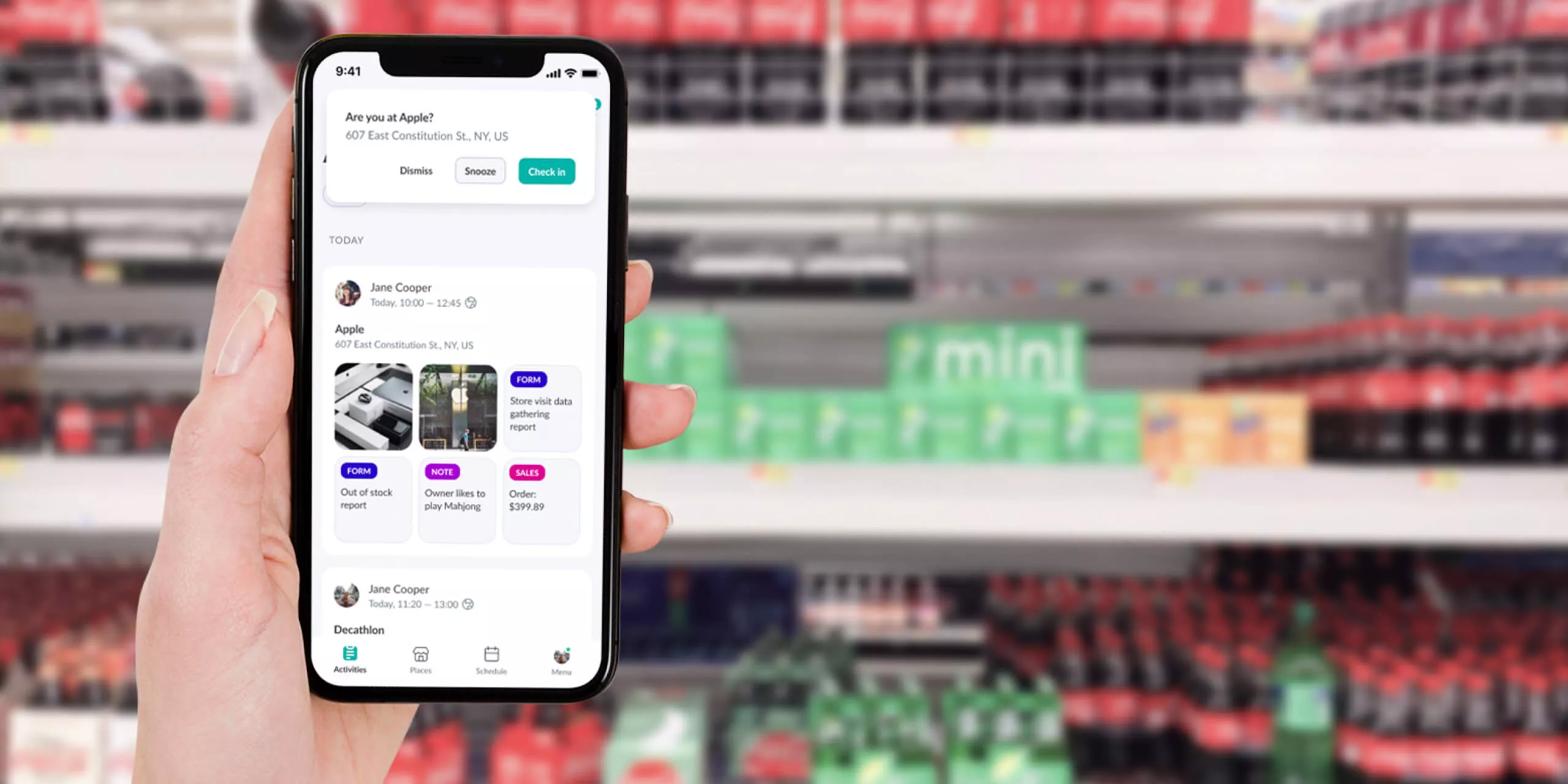
We built a custom platform that enables field reps to optimize the retail experience for their products, unifying and simplifying operations.
SERVICES
RESEARCH
USER TESTING
UX RESEARCH
UX DESIGN
UI DESIGN
PROJECT INFO
Top brands use Repsly
Repsly is a B2B platform that focuses on customer relationship and field sales management. Powering teams in over 80 countries, their flagship product is the central place for field retail teams used for merchandising, sales execution, and product promotion.
Replacing the old with the new makes the retail industry go round. Field teams who manage retail locations and make sure their brand shines on point of sale know it better than anyone.
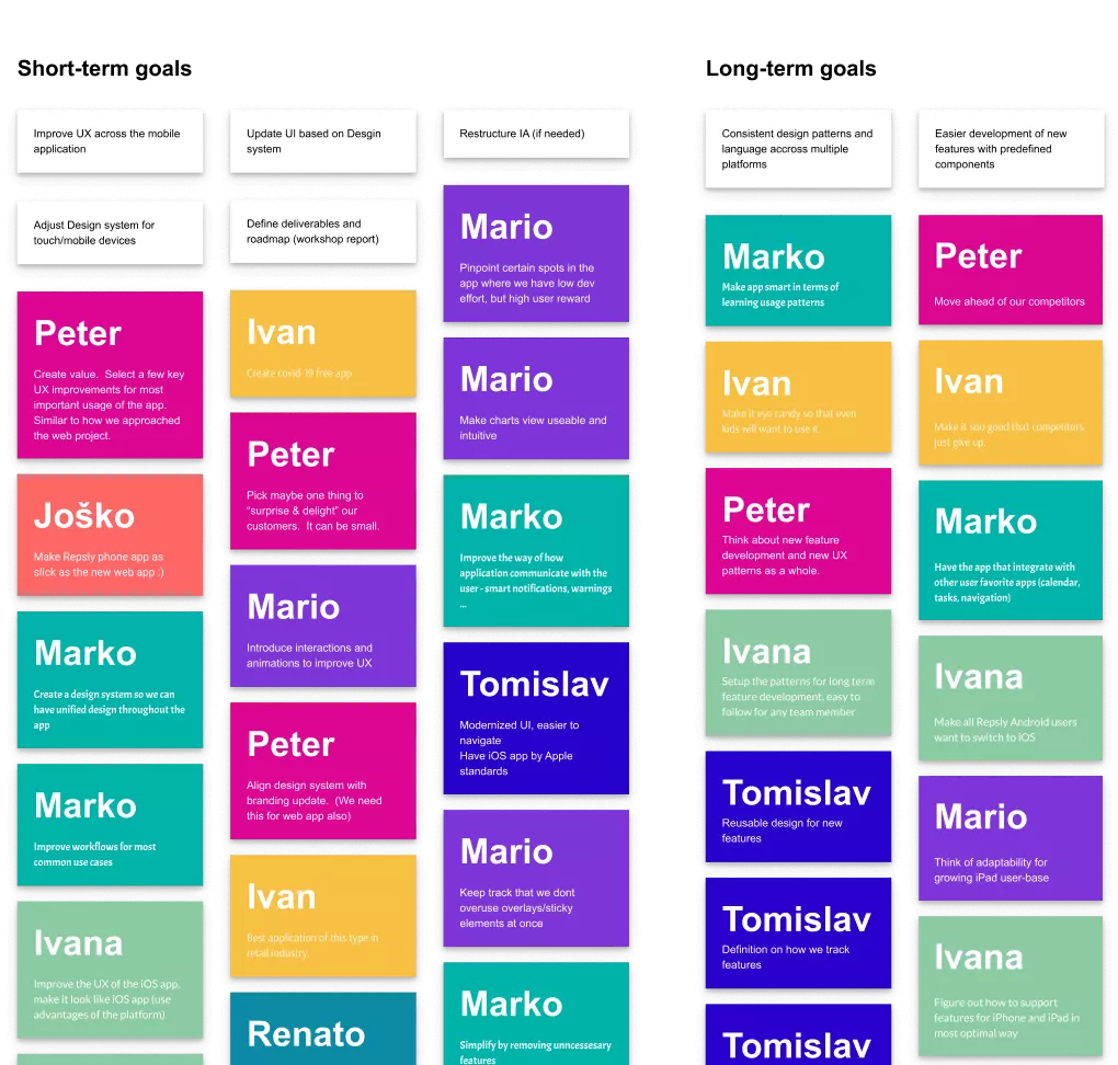
Repsly listens for user feedback and responds to feature requests. Few years in, it took a toll on the user experience. Our goal was to reimagine and rebuild the user experience to boost the tool’s usability and performance.
COLLABORATION
The retail industry was particularly affected by the pandemic, causing pressure and uncertainty. Still, Repsly entrusted us with a complete redesign of their mobile and desktop products.
Out with the old, in with the new
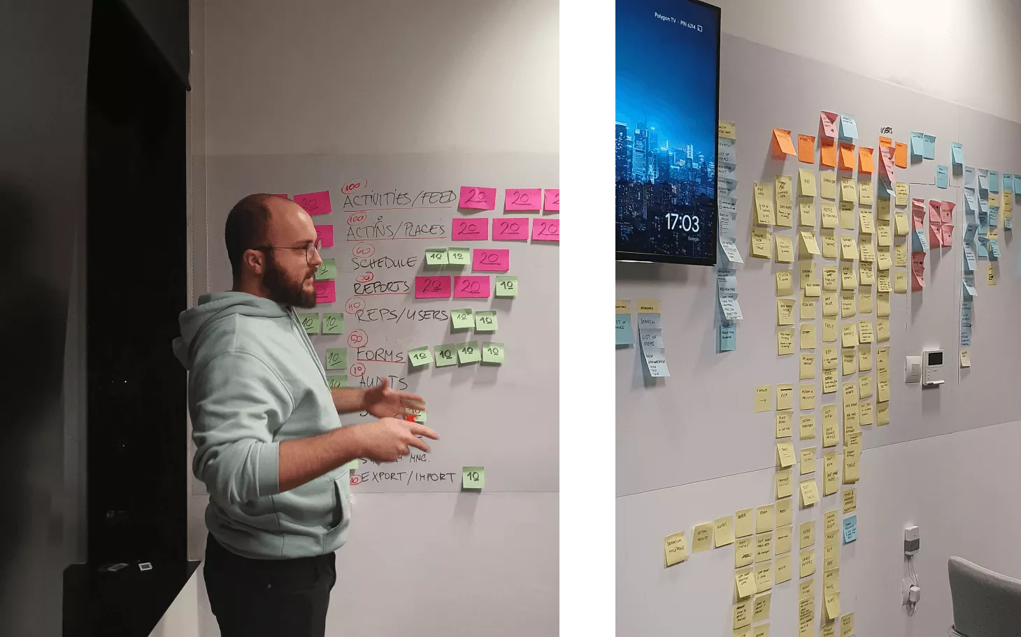
The team at Repsly initially turned to us for advice on user experience. We conducted an in-depth review of the existing information architecture paired with user research and testing. What started as a review ended up as a blueprint for the product overhaul.
Guesswork?
No. Only facts and data
Rather than pursuing a traditional client-agency collaboration, we joined forces with Repsly’s in-house design team. This paved way for fresh perspectives as we embarked on a journey to completely rethink how Repsly looks, feels, and functions.
A new design system
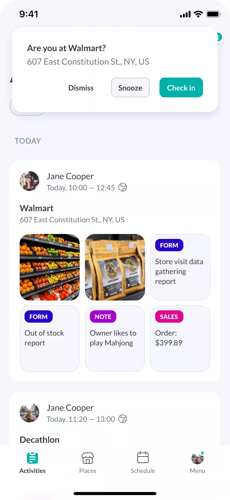
We created an experience that’s consistent across mobile and desktop devices. A carefully designed collection of components are built in a way to maximise the use of screen real estate. We wanted to present users with relevant and actionable information, no matter the screen they’re on.
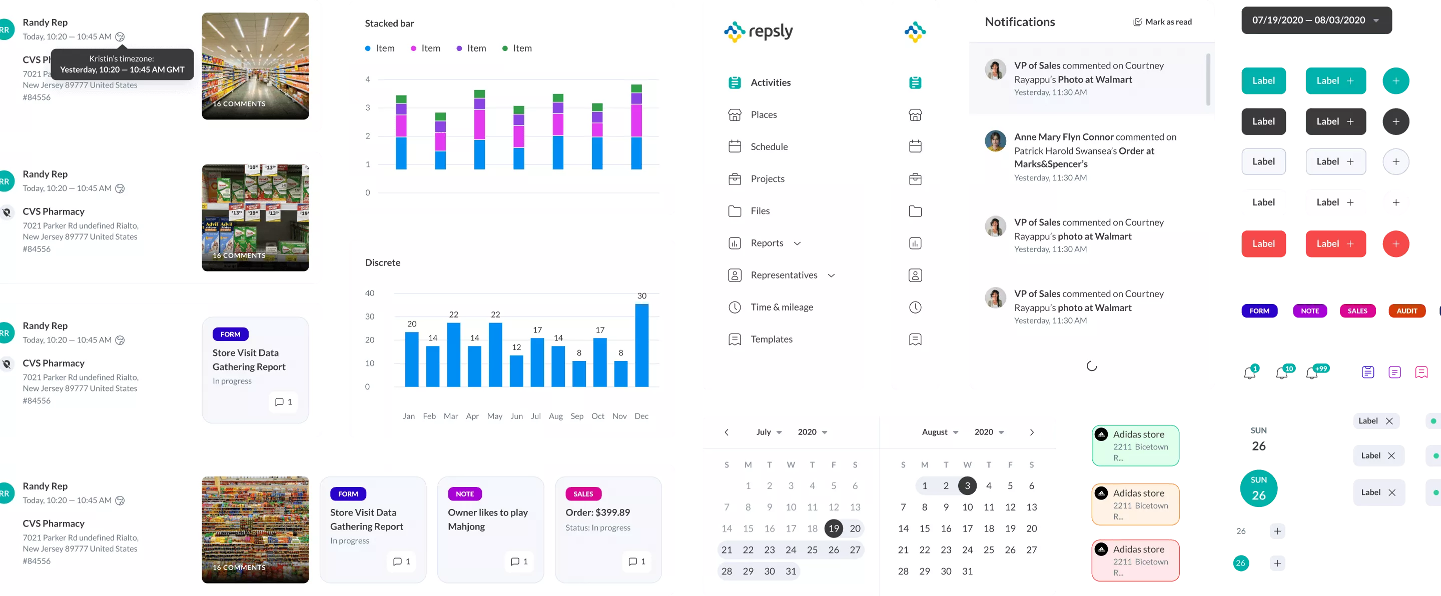

Infinum’s team led the process of rethinking our product in light of our larger corporate clients. All of them expect the app to be flexible and able to adapt to their needs, but also simple and intuitive.
PETER BILLANTE
CPO, REPSLY
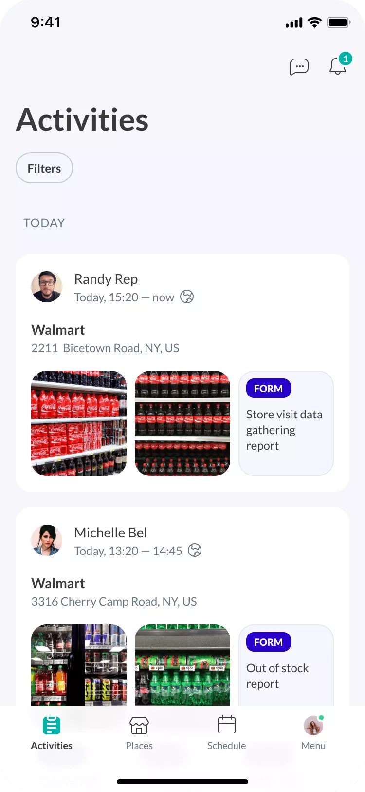
New reports experience based on usage data
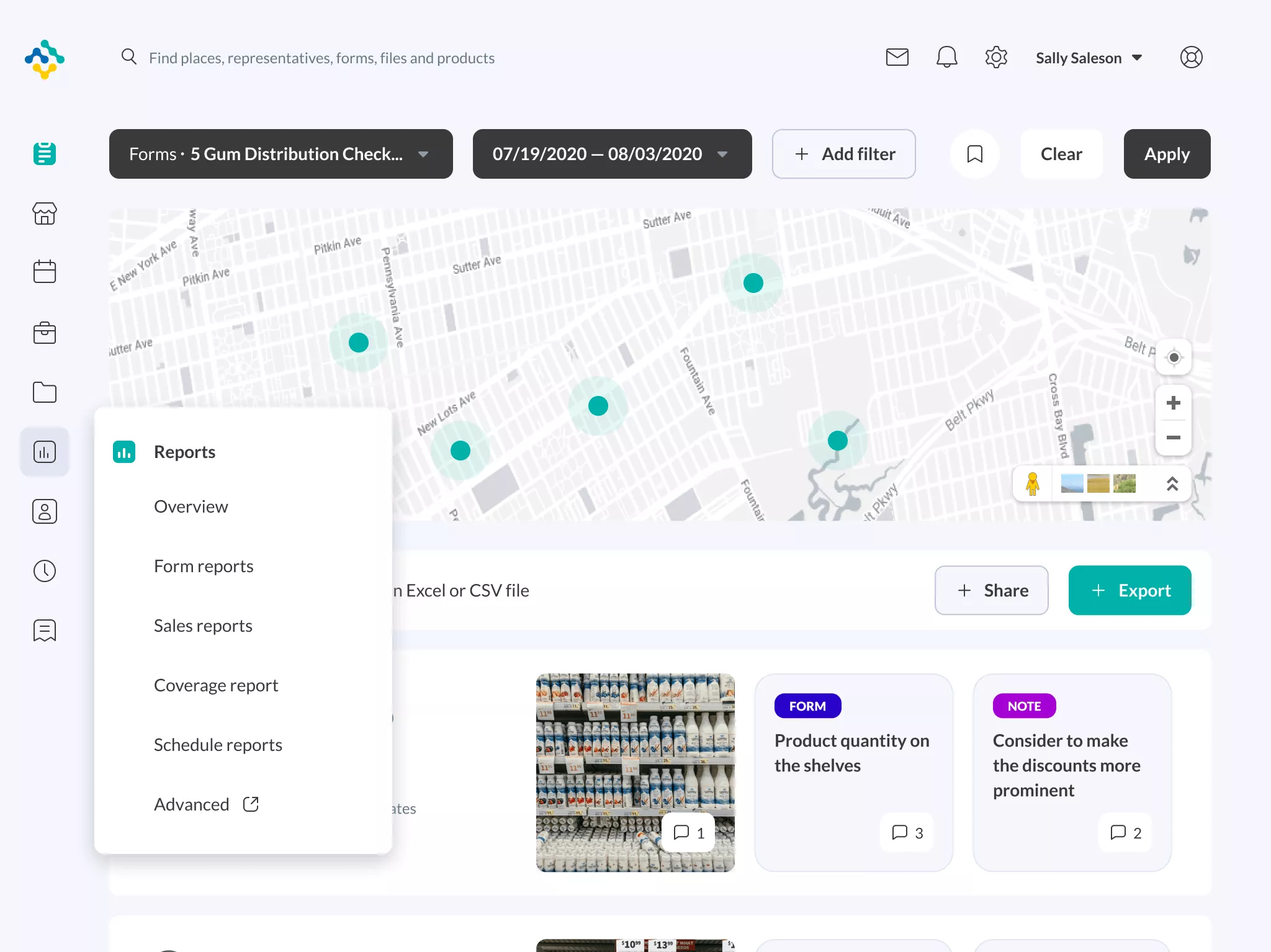
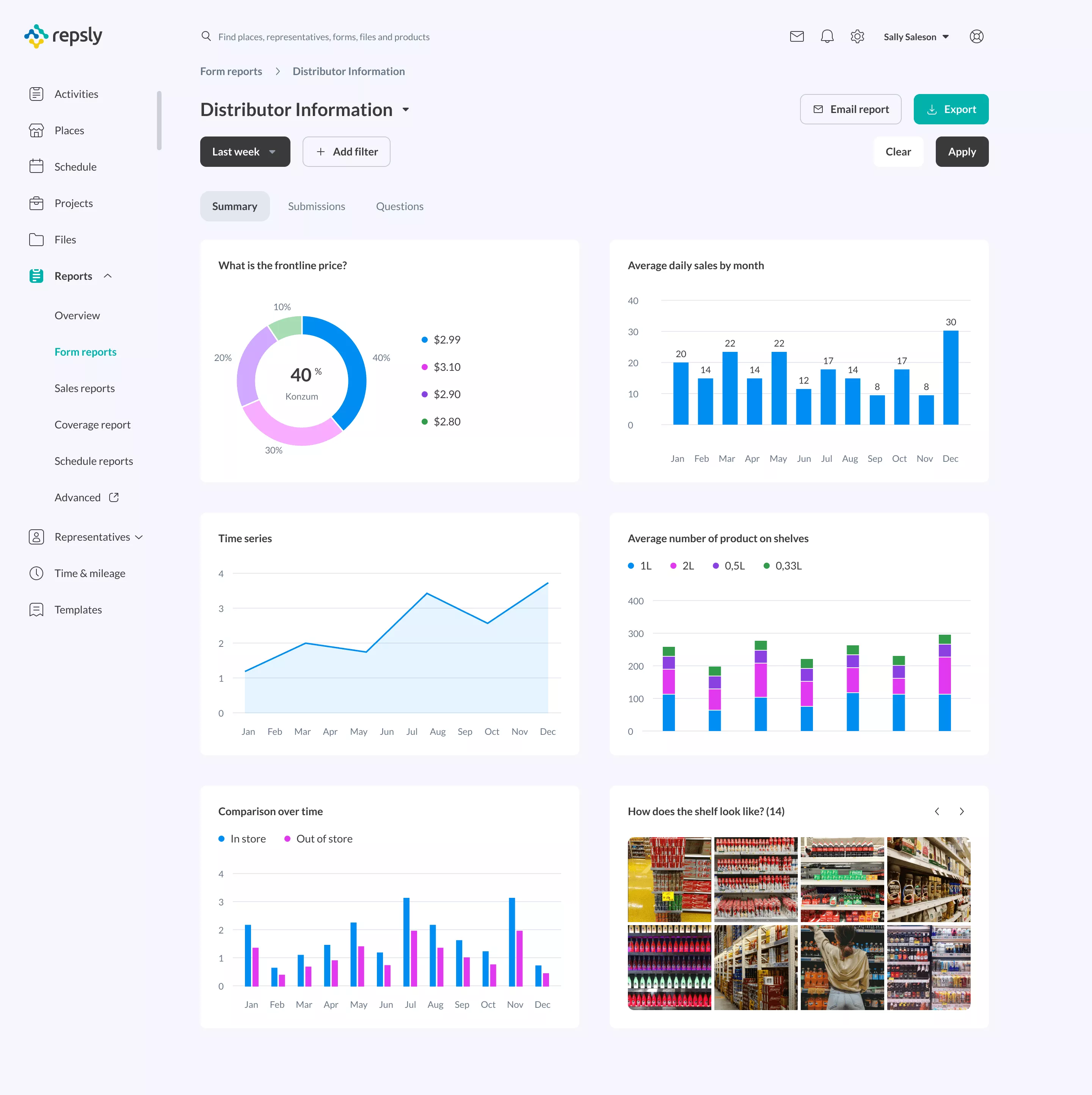
Diving into Repsly usage data, we singled out the reports users interact with most. Knowing this information helped us build an enhanced reporting experience.
We also discovered users had a hard time finding certain reports, so we overhauled the report gallery, focusing on data presentation and discoverability.
A better way to manage files
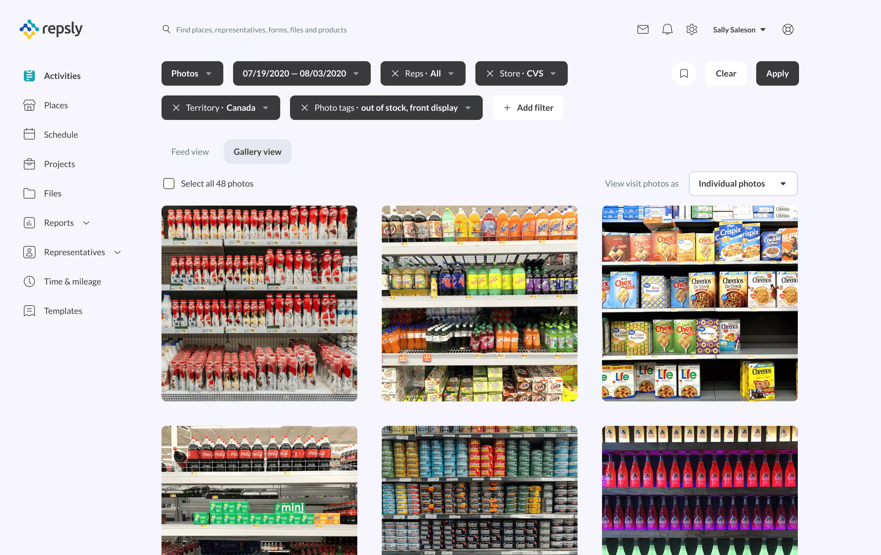
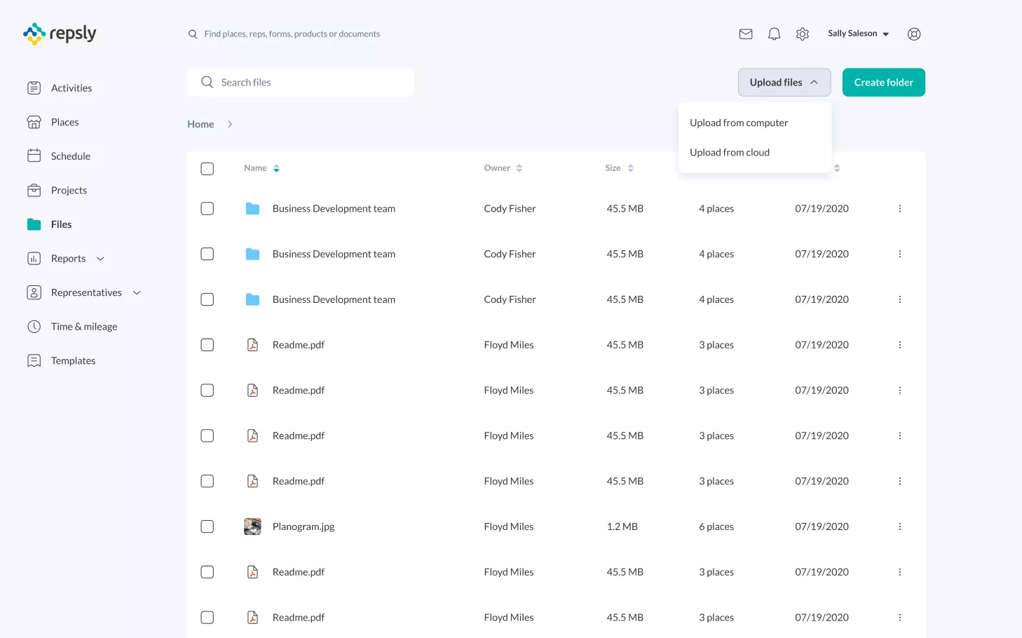
We introduced a new feature for managing files and documents. It’s a central place for managing everything necessary to complete tasks.
Scheduling 5,000 people made easy
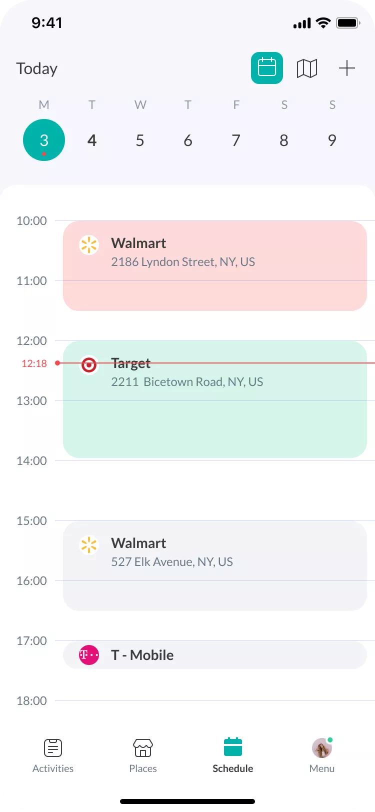
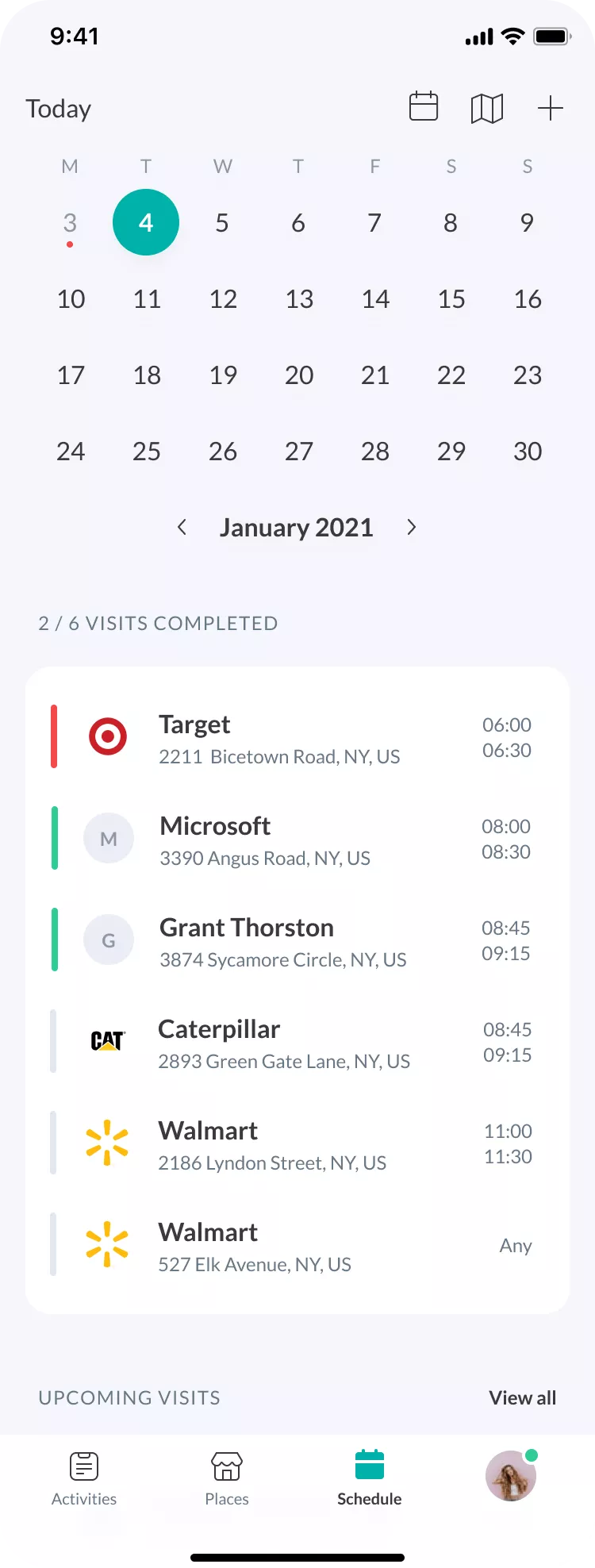
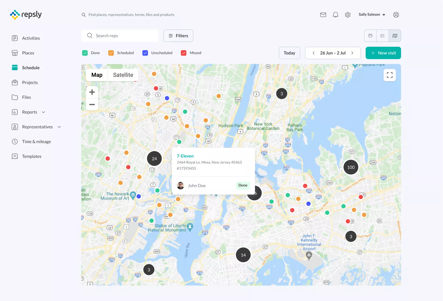
Managing several sales representatives can get complicated, but when that count hits a few hundred or more, one mistake can unleash chaos. We worked with a real-life scenario, using a workforce of 5K people, really stretching the tool to deliver performance at scale. Multiple views, filtering options, and individual schedules were introduced to improve versatility and allow users to hone in on what’s important for them.
Overseeing sales reps’ whereabouts
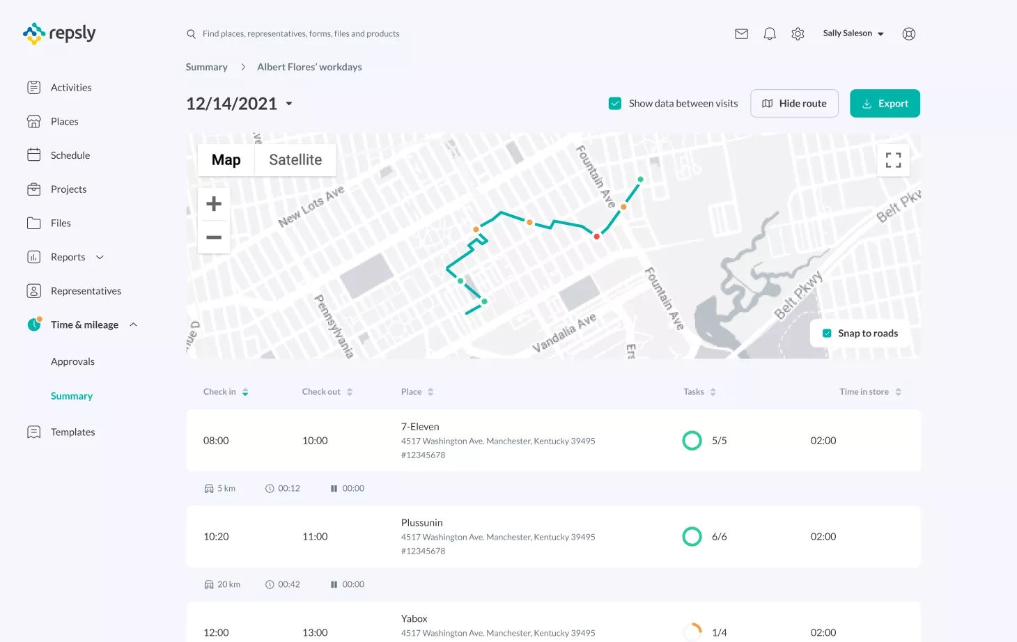
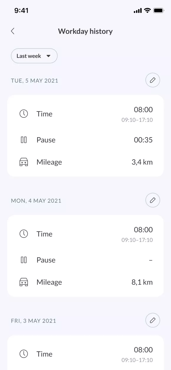
One statistic stood out in analyzing Repsly usage as important and most commonly used: the whereabouts of sales representatives. With this insight, we decided to turn time and mileage into two separate features. We’ve achieved better insights, and a greater level of transparency.
RESULTS


