Fighting cardiac failure with a vitals-tracking app
CORMEUM
We created an engaging tracking app for heart-failure patients and their care providers.
SERVICES
STRATEGY
MARKET RESEARCH
UX DESIGN
UI DESIGN
ENGINEERING
GROWTH
QUALITY ASSURANCE
PROJECT INFO
Five million potential users
Over five million people are living with heart failure in the US. Once diagnosed, the average life expectancy of a patient is dependant on consistent tracking of vitals, monitoring fluid intake and sodium levels, logging symptoms, and adhering to prescription regimens.
Patients have a hard time keeping track of it all, resulting in a shortage of useful data for healthcare providers.
Tracking made simple
Consistent data saves lives. It can help inform diagnostic decisions and shape the course of effective heart failure management.
That’s where Cormeum comes in. It encourages patients to continuously monitor their cardiac health and adhere to treatment plans. Three minutes twice a day is all that it takes.
OUR APPROACH
Creating a HIPAA-compliant product for healthcare providers and patients
Inspired by a nurse who has dedicated her life to helping cardiac failure patients, we’ve built an engaging tool that helps patients get in the habit of vitals tracking. Each step of the way, we’ve had the average patient’s age in mind. The user experience had to be simple, intuitive, and rewarding.
Sharing life-saving data with the patients’ healthcare providers is just as important as tracking. Having worked with delicate healthcare information before, we made sure the product was built in accordance with HIPAA, GDPR, legal and database regulations and limitations.
Establishing focus through the discovery sprint
We organized a five-day discovery workshop with the team at Cormeum. Before diving into designs and code, we discussed business models and competitors. Most importantly, we gained a deep understanding of the cardiac patients’ routines, habits, and challenges.
User journey findings
Designing for the senior population, we paid special attention to legibility, clarity, and ease of navigation. We aimed to reduce cognitive load and remove complexity from each feature.
Encouraging consistency
We aimed to achieve engagement through a healthy cycle of motivation and reward, combined with reminders to enter data and take medication.
Competitor analysis
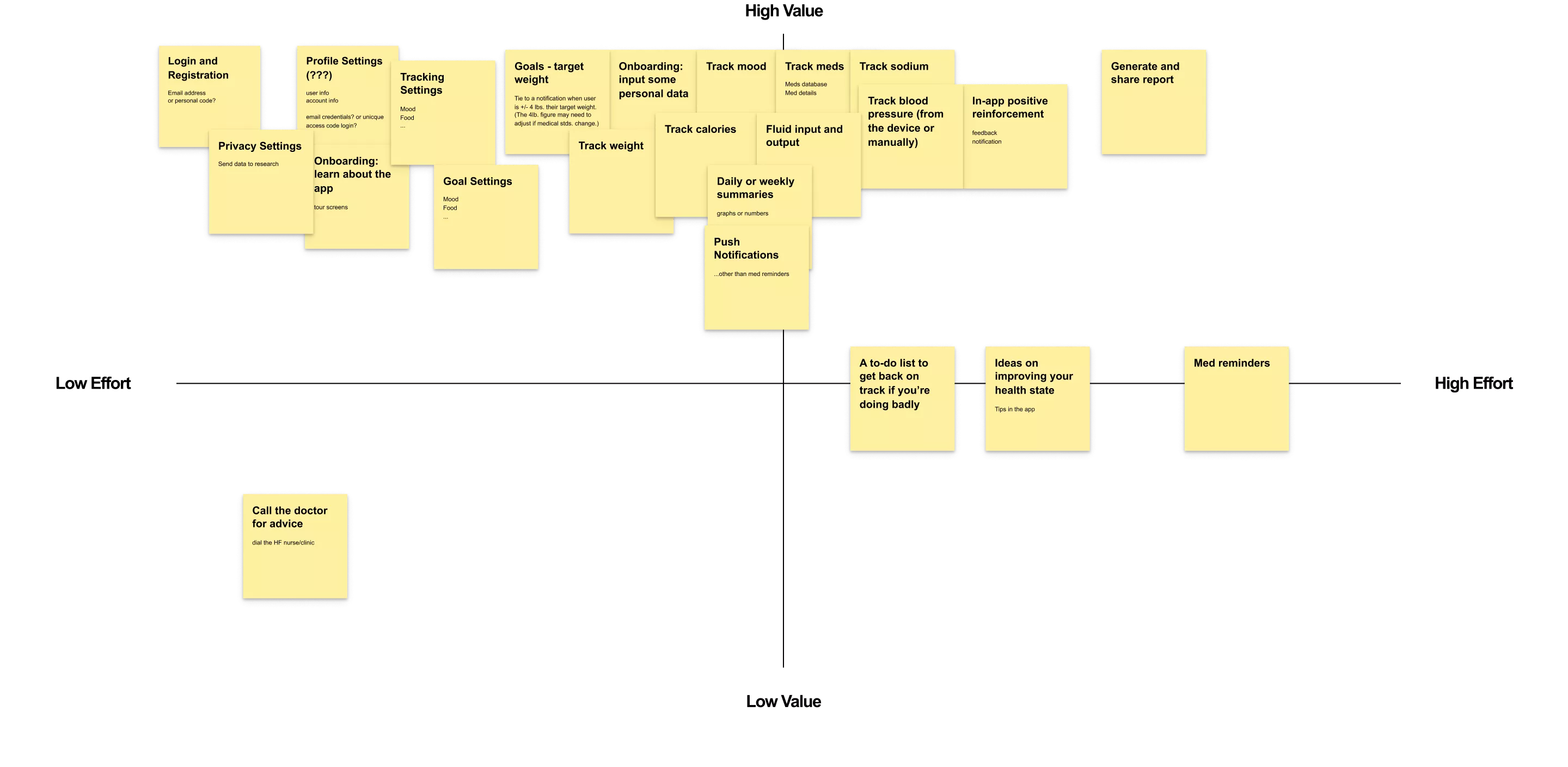
By surveying the market, we were able to identify the gaps in the functionalities of similar healthcare digital products. This helped us determine the scope of our app.
Achieving product-market fit
Unlike comparable apps, Cormeum focuses on tracking only what’s important, reinforcing patients’ habit of journaling, and sharing data with health providers.
Testing the prototype
To validate our assumptions, we trialed the prototype with four cardiac arrest patients. We discovered their preference towards larger visuals and UI elements, a straightforward tone of voice, and a streamlined morning/evening tracking routine.

THE SOLUTION
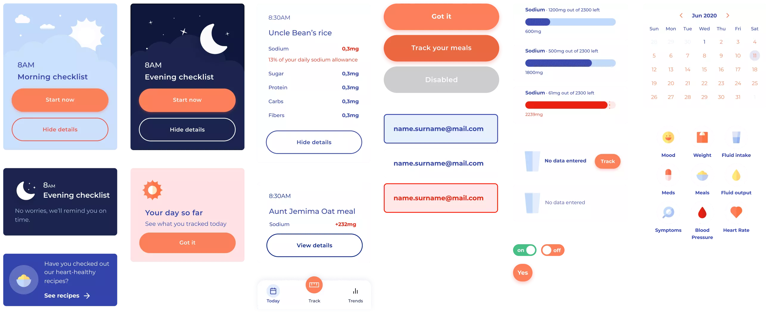
Modular design,
powered by Flutter
USER INTERFACE
Focused on tracking data
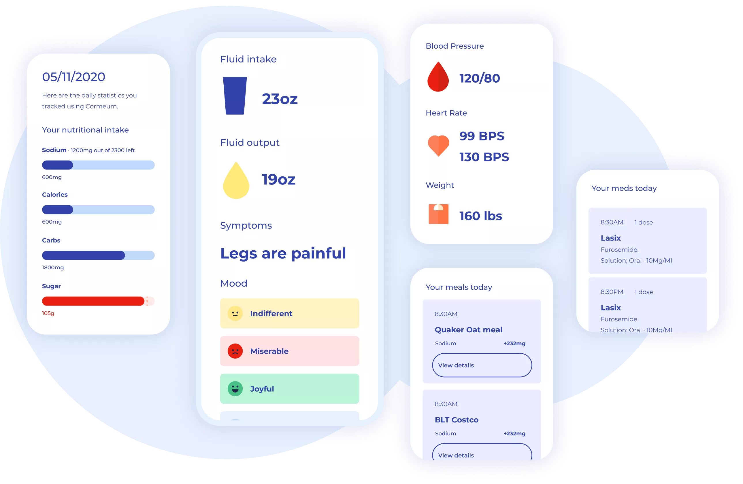
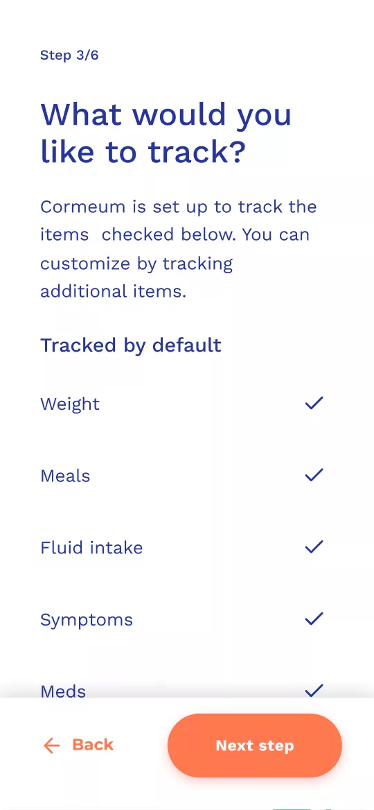
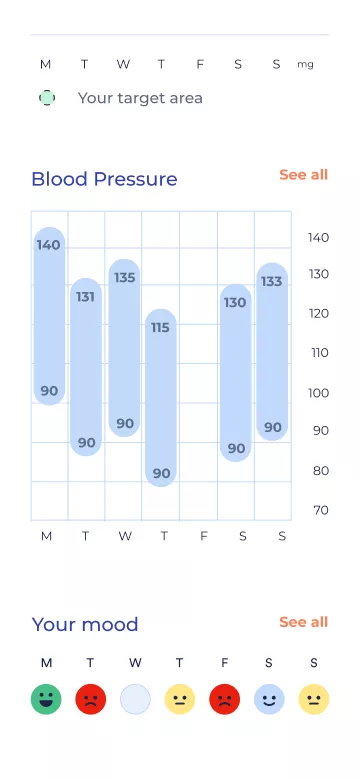
Other similar apps offer a multitude of features, making it difficult for uses to single out what’s important. We focused on life-saving tracking data – meds, moods, weight, water and sodium intake, as well as daily and weekly summaries. Finding trends is key.
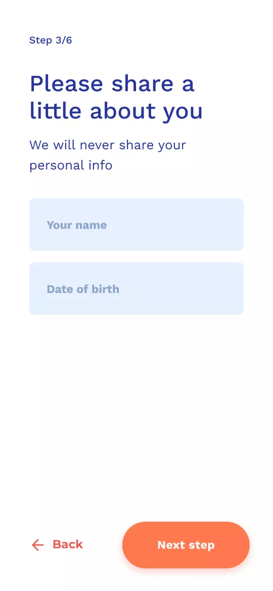
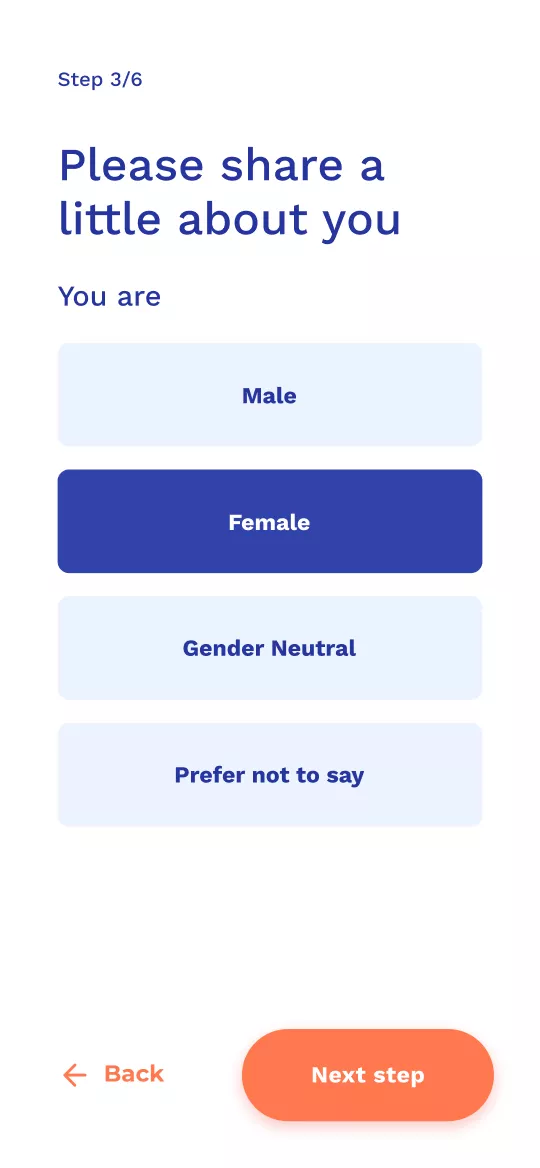
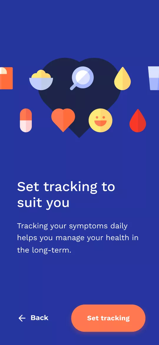
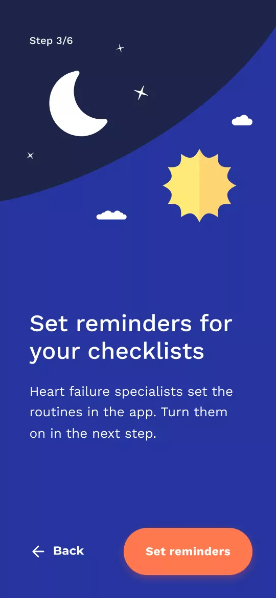
Simple onboarding
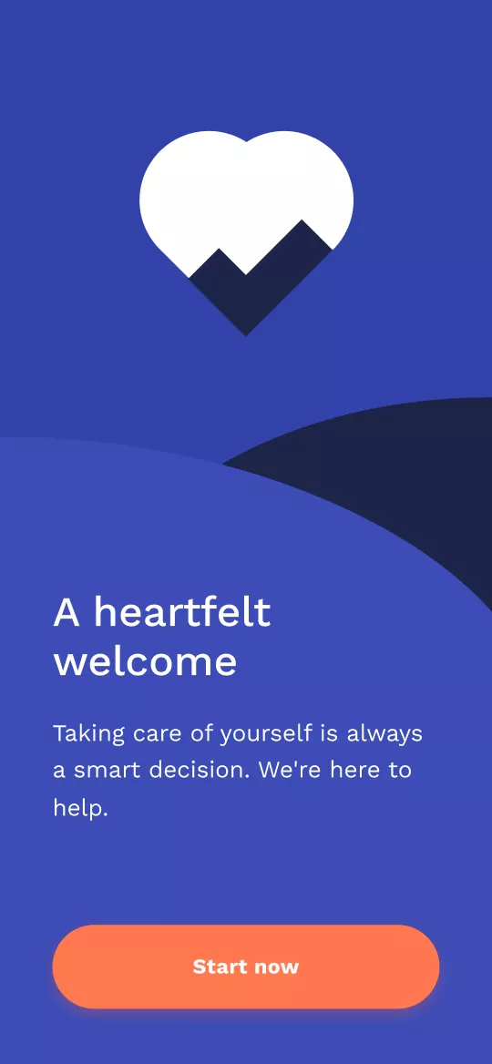
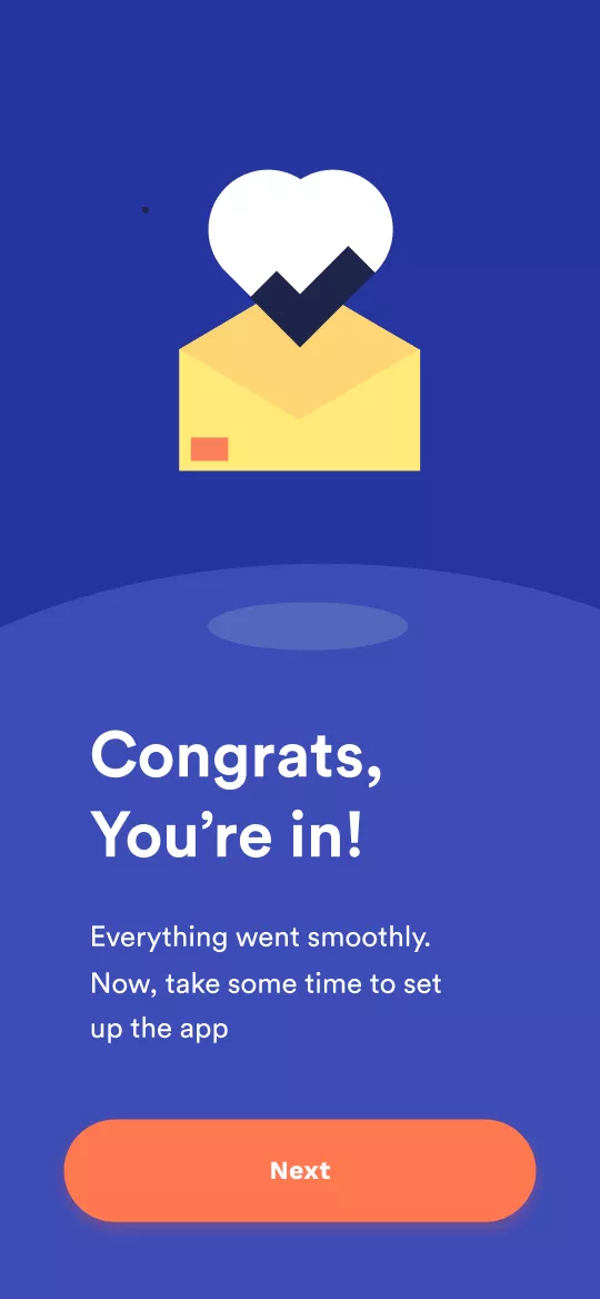
It all starts with a heartfelt welcome.
Quick vitals
check-in
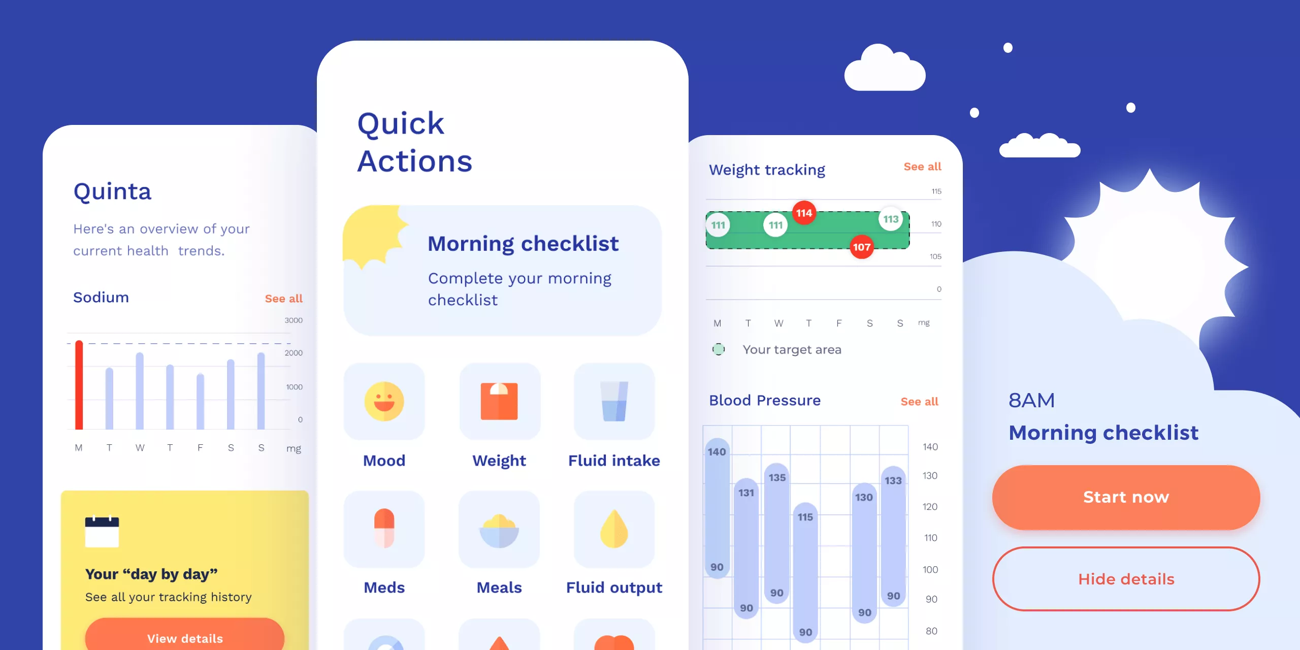
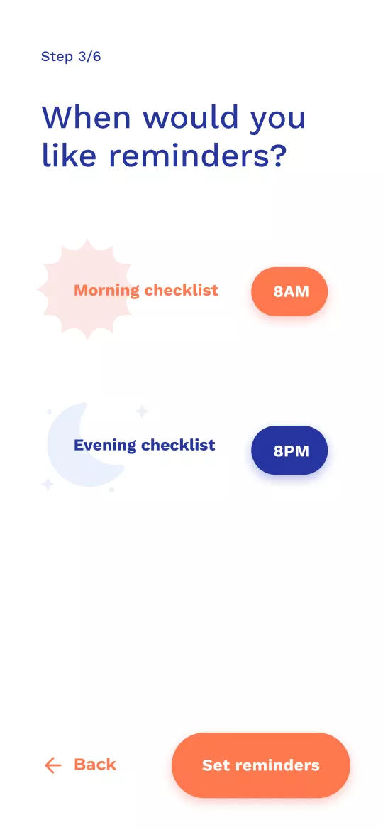
Cormeum is designed around two daily reminders so no vital information gets forgotten. Checking in is quick and straightforward.
Finding trends is key
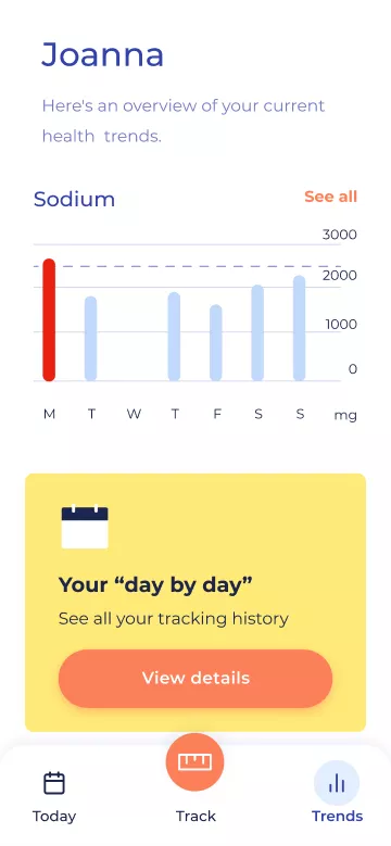
Patients and chosen health providers track progress over time. Looking at weekly insights or even taking a deeper dive into the monthly stats helps identify and track trends.
Information-sharing between health providers
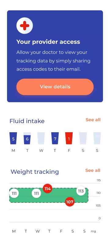
From the ground up, the product was designed to be simple to use and secure. HIIPA-compliance ensures confidential information is shared with chosen health providers only.
