Design documentation is what a brand book or a graphic standard manual is for graphic design projects – but for your website or app.
We use design documentation to keep the UI consistent, to quickly onboard new designers or team members and to ease the UI setup for developers.
A web or app design documentation may include:
1. Styleguide
- color styles
- typography styles
- effect styles (shadows, blurs, etc.)
- grids and layouts
- standard spacing elements
- brand assets
- communication tone&voice
- icon set
- photos
- guidelines on using these elements
- categorized UI components
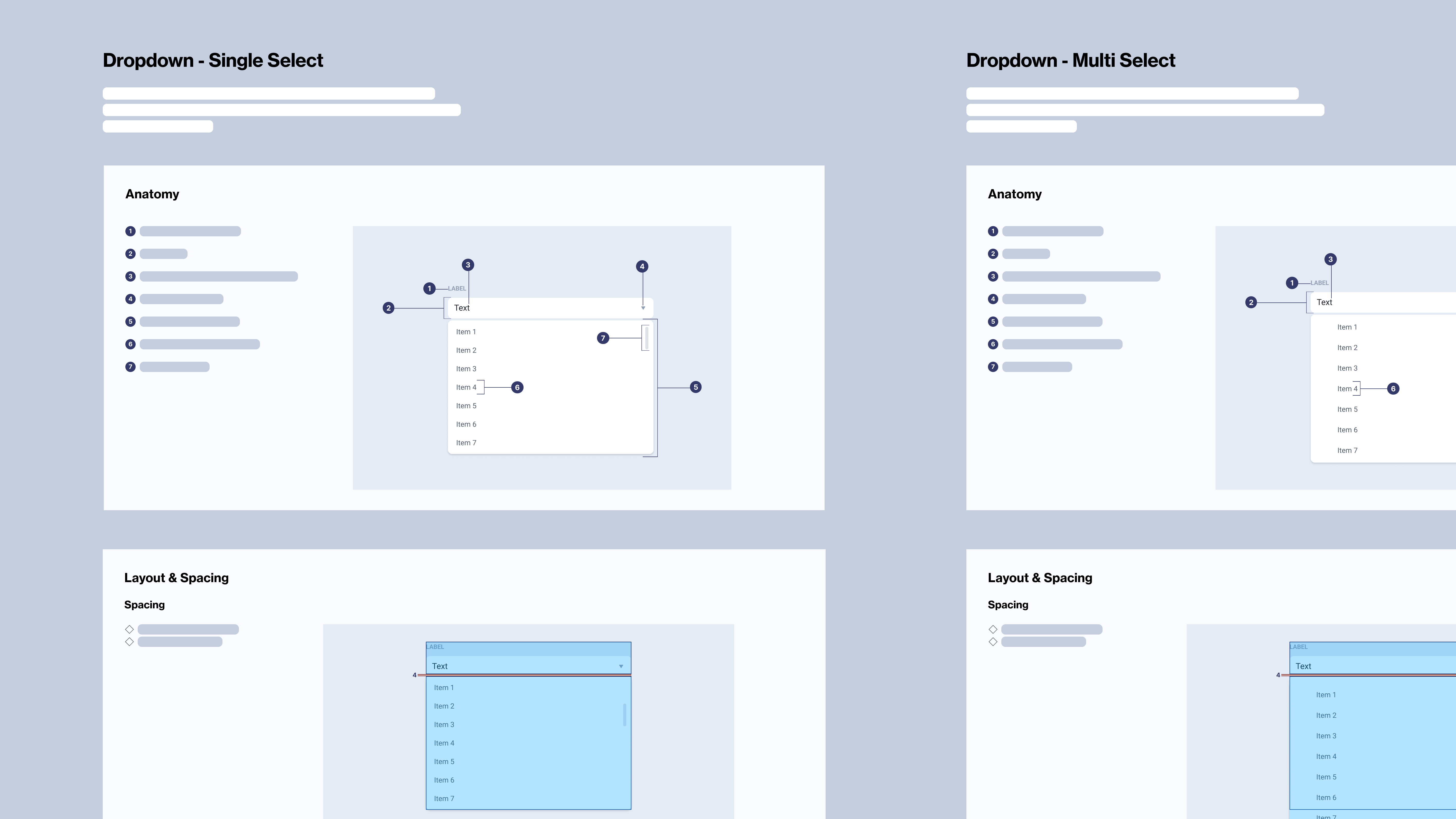
2. Component library
- categorized UI components
- component specification, including variants and states (default, hover, focused, empty, loading, error, etc.)
3. Pattern library
- categorized patterns
- pattern specifications, usage guidelines, and examples of how to use them
When to document?
In short – always. But how you approach the documentation process will largely depend on the project size, complexity and, sometimes – timelines. Smaller, shorter projects may not require more than a concise set of guidelines, while complex, collaborative projects need more detailed and structured documentation to ensure consistency and quality in design.
Design pattern documentation, in particular, is useful for larger projects that involve multiple designers and developers, as it helps to ensure that everyone is on the same page throughout the project lifecycle. It can also help with projects that are intended to evolve, as it provides a solid foundation of building blocks for future design decisions and ensures consistency.
How to document?
There is no one-size-fits-all approach to design documentation. However, there are some best practices and general guidelines that you could try to follow.
For example, if you are working on a short, in-and-out project, let’s say – a web one-pager, chances are that you don’t need a particularly detailed design documentation. What you might do instead:
- Create a single UI design file in Figma
- Include UI of all screens in their various states (empty, loading, error, etc.)
- Screens linked with arrows: Use arrows or connectors to indicate the flow between screens, clarifying which components lead to different parts of the application.
- Add a separate page for your basic styleguide (e.g. colors, typography, grids and spacing, etc)
- Add a separate page for your main components, with basic specifications, such as component states
- If needed, add small notes for developers as a reminder of how a specific pattern is meant to behave and interact

On the other hand, if you are just now building a foundation of what promises to be a complex, long-term project, with a potential to evolve even cross-platform, this is what you might want to do:
- Create a Figma project
- Create a separate file for UI design
- Create a separate file for your styleguide, as a Figma project library
- Create a separate file for your components and patterns, as a Figma project library
- Map out and design all component variants
- Map out all distinct design patterns
- Add detailed specifications and guidelines for all design patterns
- Show examples of pattern usage
- Provide specifications for animations and transitions
- Create a separate file for interactive prototypes
Useful links
Here are some best practice examples to get you started: