“We’re gonna build the best app”
That’s not a strategic statement; that’s a Christmas wish.
UX strategy defines how the digital product will affect users’ thoughts, emotions, and behavior to achieve strategic business goals.
An example: what’s Uber’s strategic goal? You hailing it as often as possible. What’s its UX strategy? Safety every step of the way.
💭 Thoughts: You’re sure your Uber will pick you up and know at what time.
❤️ Emotions: You can see the driver’s face in the app, their reviews, and you can even flash a color so that they don’t pick up the wrong person.
👋 Behavior: Typing your destination is error-proof with recent destinations, map pinning, and smart search that suggests the address when you start typing—also, Uber’s seamlessly handling payments. Once you add payment data, you’re set.
DNA of UX strategy
UX strategy needs to understand the client’s business model and where its revenue comes from. These are the outcomes we want to facilitate. It needs to take into account the technical capabilities of both client and our team (i.e., budget). The strategy needs to be feasible. Finally, it combines user research data and consumer psychology to create glue between business goals and technology.
Business needs + tech capabilities + user psychology
= UX strategy
What’s a good UX strategy? One that guides visual design, interaction design, and content creation for a digital product. You should be able to give a clear yes-no answer to the question, “Is my design of this screen or feature in line with the strategy?” If you can’t, the strategy is defined too vaguely.
Nuts and bolts of writing UX strategy
Every app aims to be unique and memorable, so approach creating your UX strategy with that mindset. Your goal is to differentiate from others, not copy their ways of delighting users.
There are some guidelines we’ve found useful that might help you also.
1. Strategy first, features second
Don’t let features define your strategy. Why? Because next time you need to decide over one or the other feature, you won’t be able to use strategy as a rule of thumb.
Set strategy during the Discovery workshop or soon after it. Before you start building a flowchart or mapping the backend’s database, you’ll need to know what you’re making and why.
2. Think of it as an ad copy
For your strategy to come to life, you’ll need first to persuade your client to go for it. Don’t write it in a plain academic language, make it salesy to an extent. Research your client’s current marketing communication. Try and see if you can fit strategy and its wording within the same framework. Show how your strategy complements and extends what they’re already doing.
3. Not set in stone
Shi(f)t happens. The client’s priorities, market situation, or users’ habits might change, sometimes even change drastically. It’s a delicate balance to strike, but don’t hold on to a non-performing strategy for too long. Find new opportunities to delight users or alleviate some other pain points. Or look for a completely different set of primary users. Don’t make it na alibi pivot; if things aren’t working out, make a meaningful change.
Walk the talk
Here are a few examples of UX strategies we’ve defined and executed for our clients.
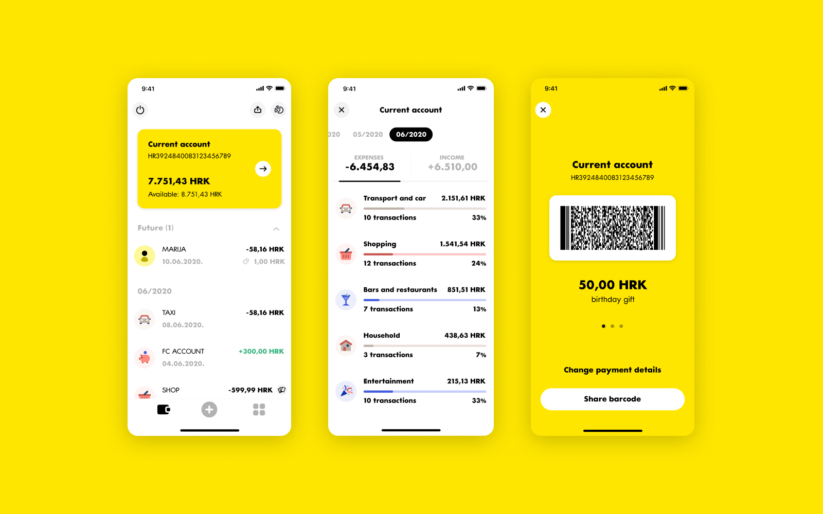
mojaRBA: User needs left, right and centre.

We’ve reshuffled the features and the whole layout of the app to be more in line with what users want and how they think about their finances. Reviews in app stores went up for a whole grade, and the average user is using it more frequently than before.
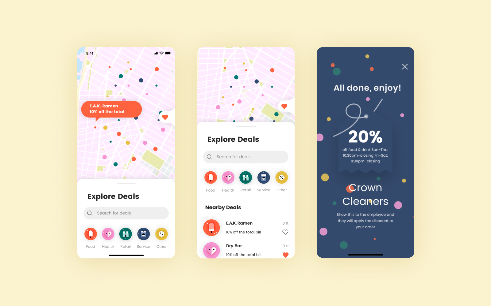
Village Access: Treasure hunt, not discounts hunt

The client was the Business Improvement District in Greenwich Village, New York, promoting local businesses. We didn’t want to emphasize the discounts but the local “mom and pop shops” character of deals because discount hunters are not loyal customers.