Everyone wants a happy heart.
Preparation
We went through a five day workshop with clients (4h/day) via Zoom video calls. We used a Figma file with pages organized by exercises and prefilled with templates we usually work with to facilitate the workshop and exercises.
Before the workshop, we had an intro call where we met the Cormeum team, and we introduced them to the tools for the workshop.
From Infinum's side, we had two designers, a project manager as a facilitator and a tech director for expert advice. From Cormeum's side, we had their product owner Mark (UX Designer), and founder Leslie.
Product context
There are 5 million people with heart failure in the United States and 550,000 newly diagnosed patients every year. It is one of the deadliest disorders in the US. Once diagnosed, life expectancy is around 5 years. The treatment for Heart Failure is medications, salt reduction, and reduced fluid intake.
As a medical worker, the founder Leslie had a lot of experience with heart failure patients. During her time with patients, she noticed a constant battle for patients to track vital data. Heart failure patients require close monitoring and a trusting partnership between care providers and patients.
Discovery Workshop Findings
Walking through existing documentation, post-mortem exercise, and stakeholder mapping, we created a business case foundation and found the challenge for the sprint. Discussing users through personas and customer journey provided another perspective we've considered for building a solid UX.
1. Users
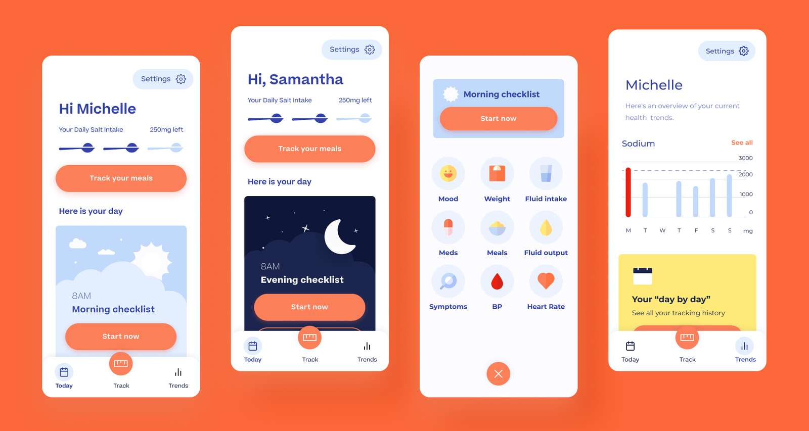
The goal was to provide a beneficial, accessible, and engaging tool to heart failure patients. The app should enhance patients' care by providing physicians and nurses with accurate and up-to-date current data and trends to manage their patients effectively. Features would include mood tracking, medication reminders, meal/fluid tracking, and awards for adherence.
We approached the product from the lens of elderly and not tech-savvy people at risk of heart failure or who unfortunately experienced a heart attack previously.
These patients often struggle with sodium intake, weight, and blood pressure and need close monitoring from their family or caregivers.
Through user journeys, we concluded that the most significant pain points for the users were keeping track of their data and progress, and of course, reassurance - "Am I on the right track?"
Caregivers and physicians are secondary users who need to be informed about the patient's progress and give advice based on the stats.
2. Business case
The business model is based on user subscriptions. This business decision made us think through the user value even more and think about bringing that value to the user through easy flows, valuable data, and intelligent recommendations.
3. Competitor products
We've taken a look at 10+ similar healthcare digital products, which helped us determine the future product's visual and communication direction.
We decided to focus on:
- Nice and inviting onboarding flow
- Simple dashboard
- Tracking in a simple and straightforward flow
- Concise and informative reports
- High contract colors
- Bigger, easier to read fonts
- Easy to digest data charts
- Encouraging and caring tone of voice
- Straightforward communication
- Warm, but not juvenile UI design
4. Challenge for the sprint
How to make an engaging symptom tracking experience which benefits patients with heart failure and their care providers? How to emphasize the importance of tracking and recording honestly? How can we make this experience easy, but with HIPAA, GDPR, legal and database limitations in mind?
MVP scope
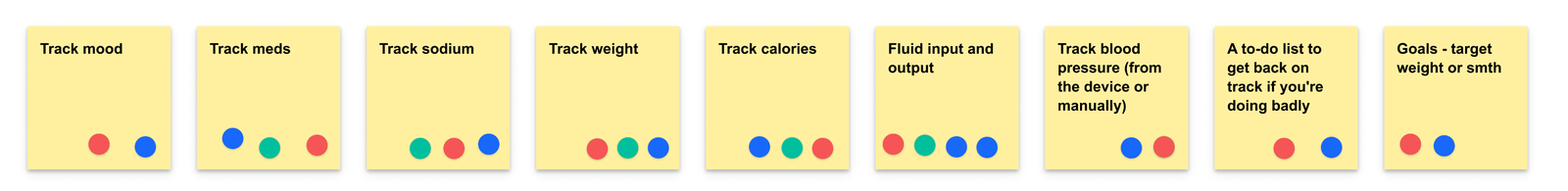
The feature prioritisation exercise helped us see the most important trees from the forest of feature wishes. It's hard to decide which features need to be included in the first launch when many ideas can make a product better. But, only the core ones make the product useful and desirable. Based on team voting and tech effort, we focused exclusively on tracking data: meds, weight, mood, sodium, etc., and daily and weekly summaries.
Feature Workshop
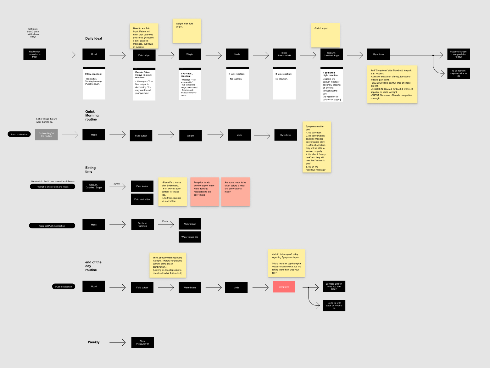
Feature workshops enable us to do initial hands-on work in this kick-off phase of the project. For this specific case, we defined the tracking process's general concept during a 1-day workshop.
Design Ideas for tracking process
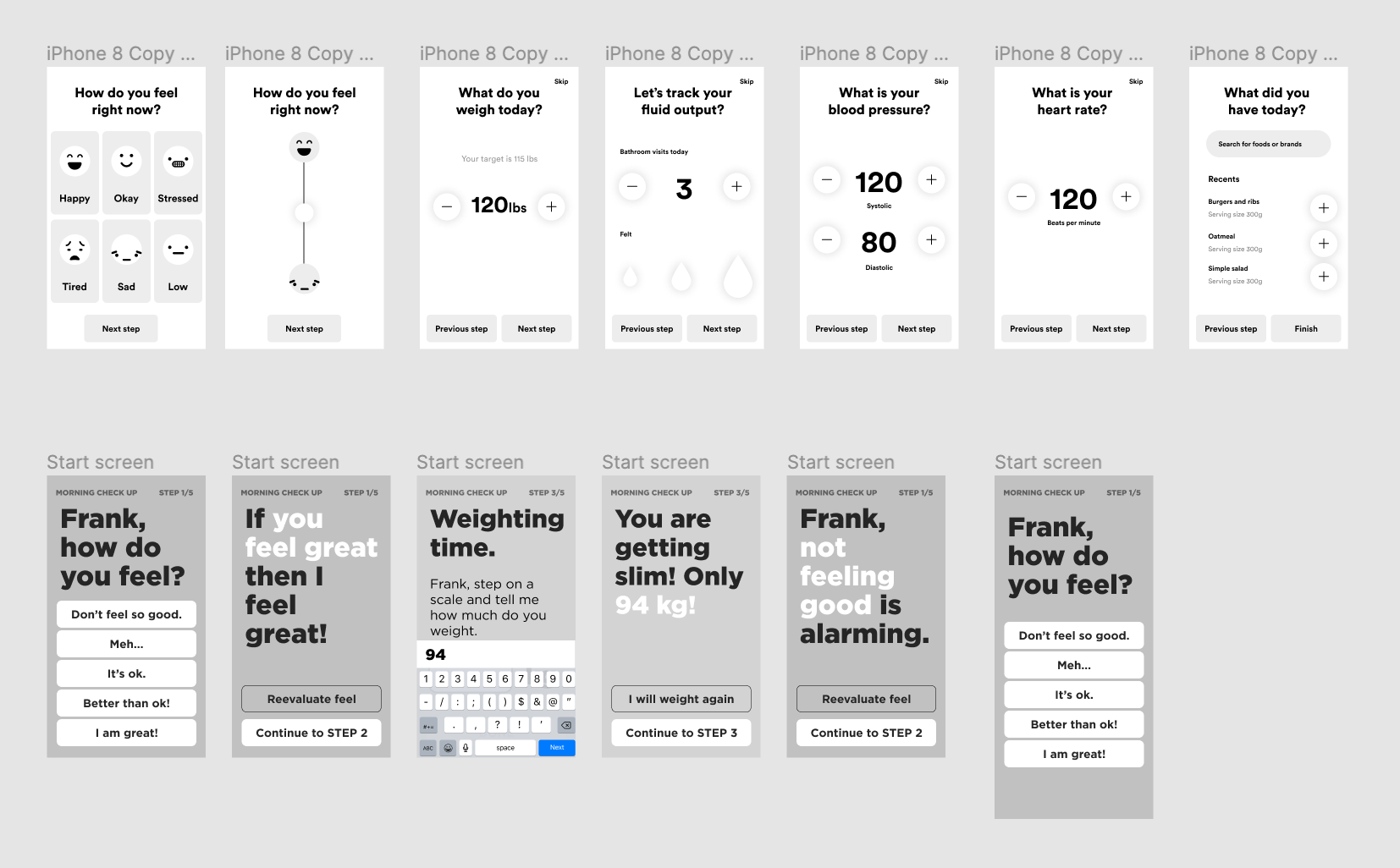
It's important to explore a different possible solution in this phase, so our designers created different tracking processes for the users. Some ideas were purely typographic and communication-oriented but clear to the user, and some ideas were more oriented towards visual inputs such as buttons, steppers, etc.
We discussed how to decrease the fatigue of tracking so much data all at once and how we can break it into smaller chunks. The question was also when and how to remind users about tracking without bothering them.
By discussing both solutions and goals of the product, we decided to focus on visual inputs and routines and finally test it with users.
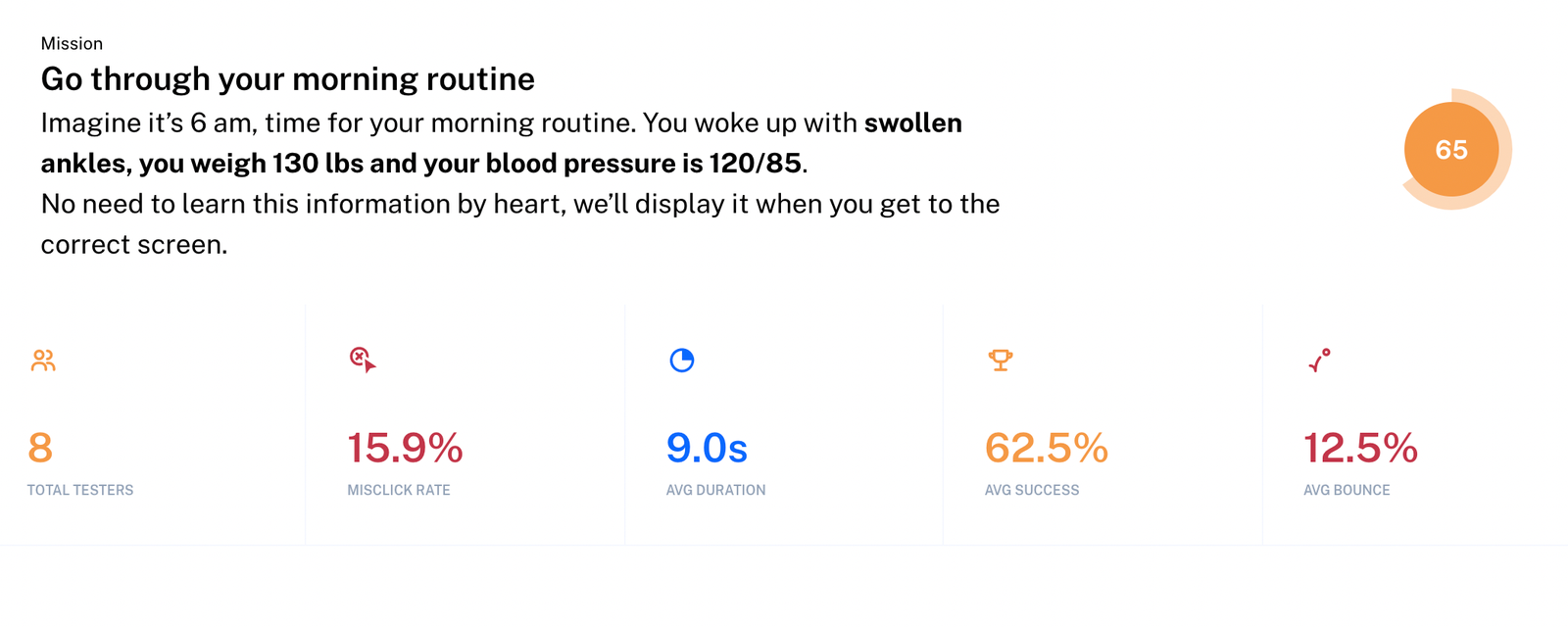
Usability testing
We have prepared the materials for testing, tasks and clickable prototype, and our partners Leslie and Mark conducted the testing sessions.
We tested the initial prototype with 8 users through maze.design tool and got some useful insight about their experience.
- Bigger visuals and UI elements worked great for this demo
- They liked the straightforward tone of voice
- They preferred morning and evening routine tracking instead of multiple tracking flows or custom flows.
Final UI design
After the sprint, we focused on onboarding, dashboard design, reports, and statistics. We launched the final design just eight months after the design sprint, which shows how important it is to have an MVP scope with well-done core features.
To sum up
We spent the whole week (4h / day for five working days) working side by side with clients, and after that, we took another five days (4h / day) for ourselves to prepare materials and the prototype for testing. Clients completed the testing itself in the US a few weeks after the sprint.
In total, our designers spent 147 hours on the workshop itself and another 72 hours on usability testing materials and onboarding. The project took 20 hours for the project manager and another 20 hours for our technical director.