IoT solution development opens up incredible possibilities, but it also brings unique complexities that require thoughtful execution. Have you ever stopped to think about the challenges that come with Internet of Things (IoT) app design?
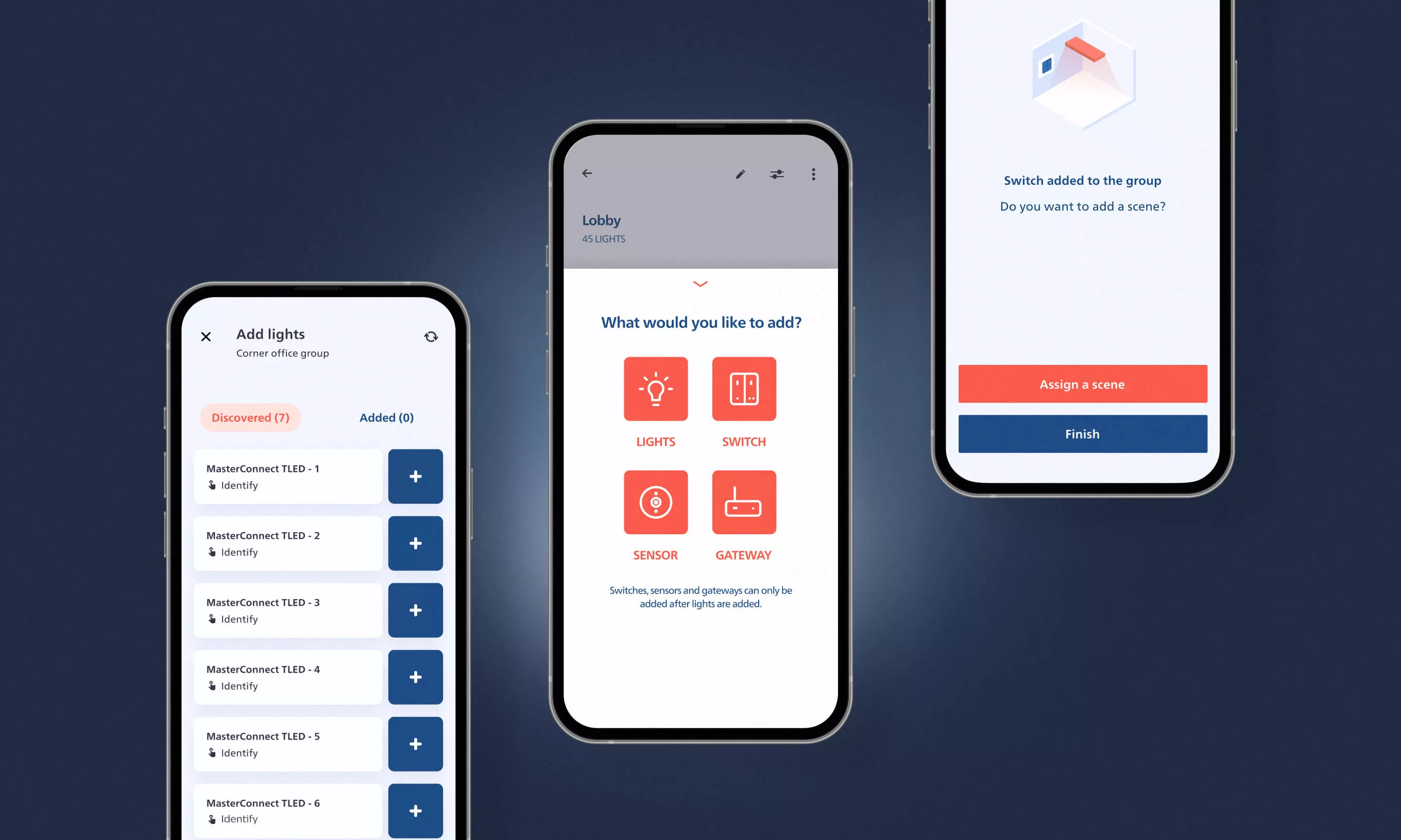
In this article, we’re diving into the complexities of designing the UX of the Philips MasterConnect app, the core tool for setting up and configuring smart lighting networks in commercial buildings. The app helps light system installers manage connected lighting systems and brings complex hardware-software interactions, while championing simplicity.
IoT opportunities are too good to ignore
The benefits of IoT devices are too great to ignore. They bring significant cost savings, efficiency, and a better user experience – all reasons we should embrace the challenges and push the boundaries of IoT app design.
At the same time, designing an IoT app like MasterConnect is a whole different ballgame compared to, e.g., banking or telecommunications apps. With IoT, you’re dealing with not just the user, app, and cloud but also multiple connected devices, all exchanging information in real time. It’s a technical minefield, which is why it’s so important to do your research, validate design decisions, keep things simple, and keep the user experience front and center. In this particular instance of IoT app design, the interactions between the users, the devices, the app, and the cloud have to be as smooth as possible.
The number of entities exchanging information can add up
In typical everyday apps, the app interacts with the user and the database stored in the cloud. So whatever the user does in the app, it is a matter of interaction between them, the app, and the cloud.
However, with IoT, we do not just have the user, the app, and the cloud but also a plethora of connected devices that exchange data. The Philips MasterConnect app can hold up to 500 connected lights, switches, sensors, and gateways. Not only does the app communicate with all these devices, but we also use it to control how the devices communicate with each other.
Since the end user is at the center of our development process, we never compromise on usability. For example, if someone wanted to power on all the lights in a warehouse, they would have to be in the range of only one light, and the others would also light up.
Solutions like this make the product a perfect fit for every lighting system size, but IoT app design becomes far more complex.
Research and validation are critical for IoT app design
Since most Internet of Things projects are relatively big, with a long development time (more than two years), IoT app design has to be considered – and nailed down right from the start. Any slight change can result in much extra development effort, even if it is just a small UI thing. That’s why it is essential to research and validate before making any big design decision.
Most IoT app design solutions often have to be a bit conservative in order to be future-proof. For example, in our app, devices belong to projects divided into groups consisting of zones and areas. Additionally, we have cloud backup, access sharing, and many other features. The navigation has to be set up well to make the app more intuitive and easier to use.
Interacting with physical devices for usability testing can get complicated
Usability testing is one of the main UX techniques used to evaluate the usability of an app. In recent years, unmoderated and remote usability tests which eliminate the need for participants to travel to a physical location have become increasingly popular because of their cost-effectiveness, flexibility, and efficiency.
However, when it comes to testing the usability of IoT apps, it is usually necessary to conduct the test in person. This is because testing the app’s usability requires interacting with the physical devices.
Therefore, tests are typically done in the lab where the app is being developed. Additionally, during the app design and development process, the IoT devices are often still in the prototype phase, making it difficult to ship them to remote users for testing.
Commissioning of lights, switches, and sensors needs to be well thought-out
The rationale for keeping the IoT app design conservative is to facilitate its technical complexity. A lot of research and development effort is required to come up with seemingly simple features, such as switching the lights on or off wirelessly using a wireless switch or sensor.
For example, commissioning lights, switches, and sensors are pretty complicated because a lot of user input is needed for the process to be done precisely the way it is required in a building.
Also, many factors need to be taken into account, like which group, zone, or area we should place the device in. Also, its firmware versions must be matched with other devices; sensors need calibration, etc.
Slower interactions require additional UX effort
A big friction factor in IoT is that the delays between mobile phones and connected devices are significantly longer than the usual communication between a mobile phone and the database in the cloud.
One of the reasons for it can be a lot of interference between different signals and considerable distances between phones and devices. That’s why certain actions in IoT apps are fairly slow, so some interactions need to be tweaked, so the UX does not suffer.
Wireless technology brings long-term flexibility
Wireless technology impacts overall efficiency – it cuts down the time and effort required to service the network and lets light systems installers do their work faster. It also brings long-term flexibility in using the building since lights that are controlled by switches and sensors are not connected by wire so we can rearrange lighting in a building way easier.
The reduction in installation and maintenance time can mean up to 50% in cost savings. In addition, thanks to the wireless system’s flexibility and the ability to adapt to occupants of buildings, up to 75% of energy is saved compared to conventional lighting.
Using IOT specifics to the designer’s advantage
There are other features that help light system installers use most of the IoT nature of the system. For example, users can use the app to blink one or more lights. The lights users select are shown with a blinking animation in the app. A nice trick to help users identify the light.
Blinking can also be used on a bigger scale. For instance, users can blink a specific set of lights, like all lights that belong to a specific group or zone, to identify if the grouping of lights on the ceiling corresponds to their arrangement in the app.
Also, we can use the lights to indicate progress. For example, if there is a particular action the installer needs to do on multiple lights, we can dim all lights that do not need the installer’s attention while the others can be on full brightness. Once they are done with what they need to do with the light, it can be dimmed down. That feature could be used to update the firmware of lights, rename them, reorganize them, or something else.
IoT App Design – the next frontier
Philips MasterConnect simplifies the complex task of managing connected lighting systems in commercial buildings. While IoT app design as such brings challenges that require extra research, validation, and usability testing to ensure a smooth and efficient user experience, the potential outcomes are worth the effort.
With Master Connect’s design geared towards getting the most out of its technical potential, it is a prime smart lighting management solution and a step forward in the journey toward a sustainable future.
To find out what else we can do in the Internet of Things realm, check out our IoT solutions page.

