


Charging ahead in the EV charging race

HRVATSKI TELEKOM
We partnered with Hrvatski Telekom to transform their EV charging solution from a functional tool into a modern, seamless experience built to lead the market.
SERVICES
PRODUCT STRATEGY
SYSTEM ARCHITECTURE
UX/UI DESIGN
PROTOTYPING
MOBILE DEVELOPMENT
QUALITY ASSURANCE
DATA ANALYTICS
PROJECT INFO
Power play in the EV charging landscape
Hrvatski Telekom has been shaping Croatia’s digital infrastructure for over a decade – and their ambitions don’t stop at connectivity.
Through its e-mobility initiative, HT operates 250+ charging locations across Croatia, managing around a third of all public chargers in the country. As EV adoption accelerates across Europe, HT wanted a digital experience worthy of that infrastructure.
A stronger solution for a more demanding market
The existing solution, espots, gave users what they needed to get started – but in a market where drivers routinely run multiple charging apps in parallel, the basics aren’t enough to earn the first tap.
Most competitors were converging on near-identical white-label solutions. HT saw an opening: not just to raise the bar, but to build the digital experience drivers reach for first.
The project brought together three organisations – Hrvatski Telekom, Infinum, and a backend provider managing charging infrastructure across Europe. HT provided strategic guidance and Infinum technical expertise to keep everyone aligned and moving in the same direction.

“Infinum’s professional approach and ability to see the bigger picture are impressive.”
JOSIP STJEPANOVIC
HEAD OF SECTION,
HRVATSKI TELEKOM
Find, charge, pay
Flawless first impression
Easy sign in with Apple ID or Google: no new account, no forgotten password, no reason to abandon setup before it’s even started.

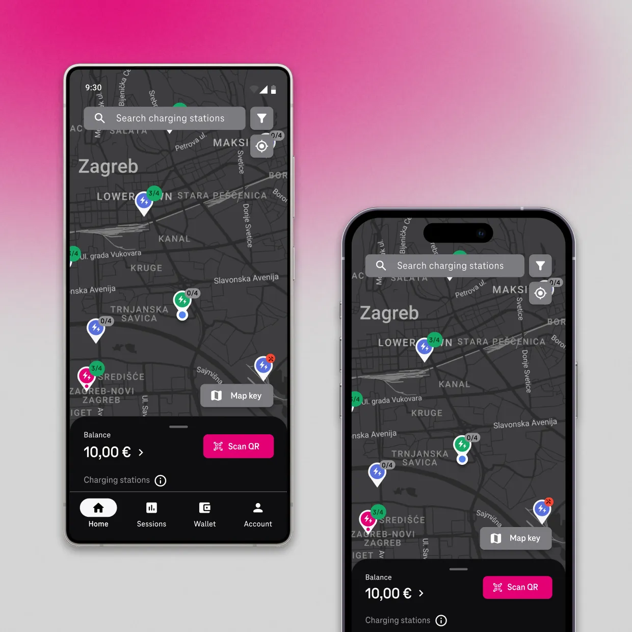
Location-based charger discovery
The solution detects the user’s location and surfaces nearby stations, including roaming partners across Europe. HT’s chargers are highlighted to guide users toward preferred infrastructure and reduce decision time.

Charger compatibility filtering
Users enter their vehicle once, allowing the map to automatically filter and display only compatible charging stations. This removes unnecessary friction and eliminates the risk of arriving at incompatible connectors.


Key information at a glance
Each station listing surfaces key decision-making information upfront, including price per kWh, connector types, and popular charging times. Users can also save frequently used stations to favourites, reducing friction in repeat charging scenarios.
Charging session visibility
Charging sessions can be started via QR code, with real-time updates throughout the process. Key data points such as battery level, energy delivered, elapsed time, and estimated cost are continuously surfaced, ensuring users remain informed and can react quickly if issues occur.

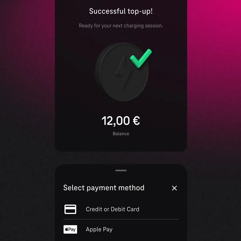
Ditching the prepaid card
Topping up used to mean tracking down a prepaid card and entering it manually. Now users add funds with credit cards, or Apple Pay and Google Pay in a single tap and they’re ready to charge.
The road starts with discovery
Our product strategists, solution architects, and designers ran an intensive discovery phase with HT’s product team through weeks of workshops – defining key user journeys, feature priorities, and UX strategy together.
1
Customer journey mapping
2
User personas
3
UX design
4
Prototyping
5
User feedback

“Infinum didn’t just listen and deliver, they invested the effort to build expertise, research the market and competition, and help us shape the service. This was a new experience for us.”
JOSIP KAŠTELAN
E-MOBILITY PRODUCT OWNER,
HRVATSKI TELEKOM
Faster cycles, consistent experience
Flutter powered the entire build, delivering native-quality iOS and Android apps from a single codebase – we cut estimated development effort by 40% compared to building two separate native apps.
Designed to move forward
The new solution doesn’t just work better, it looks the part. A modern visual identity reflects HT’s ambition in the e-mobility space, while the experience is built around one principle: get out of the driver’s way.
Accessibility was designed in from the start. Colour contrast, readability, navigation clarity – not bolted on at the end, but considered in every screen from the first sketch.
“The solution looks fantastic.”
User feedback since launch has been consistently positive, pointing to a noticeable improvement in the overall customer experience. As one user put it, “The solution looks fantastic.” While quantitative results are still being measured, early signals suggest the solution is already resonating well with users.

PLANNING THE ROAD AHEAD
A new standard for a maturing market
The new digital experience replaced the old one entirely, migrating the existing user base without disruption. Early reactions have exceeded expectations, with users responding positively to the improved experience.
Now, with the product in drivers’ hands, the team is listening closely and already planning the next phase of development, focused on expanding functionality and strengthening their position in an increasingly competitive market.