


Transforming a budget telco into a market disruptor that calls for attention

tomato
Through a complete brand and mobile transformation, we turned an overlooked budget telco into a bold, digital-first challenger brand that people genuinely connect with.
SERVICES
BRAND STRATEGY
BRAND IDENTITY
VISUAL & MOTION DESIGN
MERCHANDISE DESIGN
PACKAGING DESIGN
MOBILE DEVELOPMENT
QUALITY ASSURANCE
UX/UI DESIGN
PROTOTYPING
PROJECT INFO
All value, no fine print
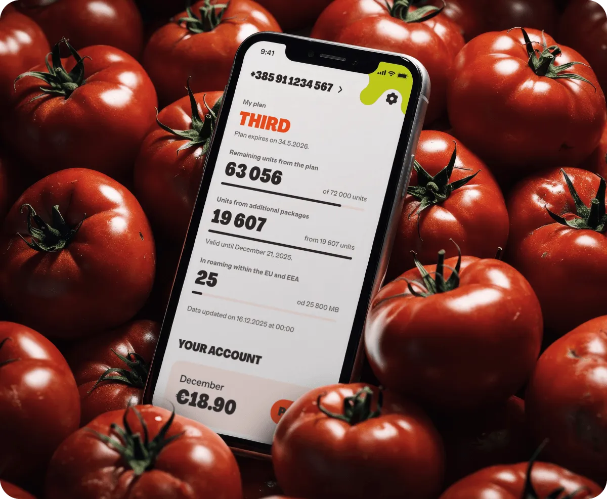
Tomato is a B-brand within A1 Hrvatska, Croatia’s leading telecommunications operator. The brand is built around one promise: the best price on the market, with unmatched simplicity. No contracts, no confusing tariffs, no fine print. What sets them apart is their flexible unit-based tariff model. SMS, talk time, or data — tomayto, tomahto. One unit covers all three, and users spend them however they see fit.
20-year-old brand ripe for change
Infinum and A1 Hrvatska have been partners for 20 years. Together, we’ve built both the Moj A1 and Moj Tomato mobile solutions. When they approached us in 2025, the brief was focused: refresh the mobile experience to reflect the new tariff model and payment methods, and enable complete digital self-service.
But the deeper we looked, the clearer it became that there was no point in refreshing the digital surface without addressing the brand identity crisis beneath it. Two decades on the market, a genuinely disruptive product, and yet the brand had been reduced to one idea in the minds of consumers: the cheapest option.

“Through an open and friendly approach, the usual client-agency line naturally faded, while the level of professionalism stayed high. It genuinely felt like we were one team working towards the same goal. What we especially appreciated was their proactivity. They didn’t just stick to the initial scope; they kept bringing new ideas to the table and pushing us to go further, which was really refreshing.”
ana ključević
MARKETING COMMUNICATIONS EXPERT
A1 HRVATSKA
In a telco market drowning in corporate sameness, Infinum and A1 Hrvatska saw fertile ground for disruption. Together, we grew a brand that’s fresh, bold, and impossible to ignore.
From a low-cost option to the only option for people who want mobile on their terms
Our partnership resulted in a complete brand transformation and a full app rewrite and redesign. In collaboration with Tomato’s external creative partners, we also provided the visual direction and campaign toolkit for the new brand launch. Multiple challenges, solved in parallel, under one roof.
By going back to Tomato’s rebellious roots and building the strategy around its fight against a broken mobile industry, we transformed a brand people settled for into one they genuinely connect with. The product, the brand, and the mobile experience now tell the same story: Tomato isn’t just another budget telco. It’s a modern, digital-first brand that stands for freedom, zero corporate BS, and mobile that works on people’s terms, not their telco’s.
JUICY RESULTS
Reaping what we sow
App Store rating
4.4
Users rated the app
4.9k+

“The app is great. Very simple and easy to navigate, especially for us older users with poor vision.”
“Excellent app. Very clean, stable, and really well designed.”

“The initial response has been very encouraging. Industry feedback has been overwhelmingly positive, and one of the most telling signals is that people are actually stopping to notice our ads and taking the time to read and engage with them. In today’s fast-paced media environment, that is a strong indicator that the new Tomato is resonating.”
ana ključević
MARKETING COMMUNICATIONS EXPERT
A1 HRVATSKA
Workshops got our creative juices flowing
We ran a series of strategic workshops with A1 Hrvatska’s stakeholders to align on business, brand, and customer objectives, and define a clear brand foundation: why Tomato exists, what it uniquely offers, and how it brings real value to people.
Strategy rooted in qualitative research
We started by reviewing A1 Hrvatska’s existing qualitative research and conducting additional analysis to understand how the brand was perceived in the market. The picture was clear: Tomato was seen as a low-cost last resort, out of sight and out of mind, and not the go-to choice for young or savvy audiences.
The obvious choice for smart shoppers
The same research also revealed an opportunity: a growing audience segment was already out there, perfectly aligned with what Tomato had to offer. Called smart shoppers, they’re defined not by age or income but by attitude. They’re not looking for the cheapest option, just the most sensible one. A shift towards this audience meant repositioning Tomato away from cheap and towards smart value that fits one’s life.
Rebel with a cause
Tomato’s existing product offering was genuinely disruptive. No contractual obligations, no hidden surprises, a flexible unit system that bends to your life. Even the brand name came from a historical form of audience protest: throwing tomatoes. Rebelling against the system was already written into Tomato’s DNA. So we went back to those roots and built the strategy around it.
We defined Tomato’s brand purpose around one simple but powerful insight: the mobile industry is broken. Built on contracts, terms and conditions, and plans designed to work for telcos, not for the people using them.
Tomato exists to flip that. They’re not the low-cost, quiet backup; they’re the only telco that gives people the freedom to live on their own terms, change their plan whenever they want, and never worry about what’s buried in the fine print. To make that purpose actionable across every touchpoint, we defined five brand pillars that guide how Tomato thinks, speaks, and behaves.


Saucy by Nature
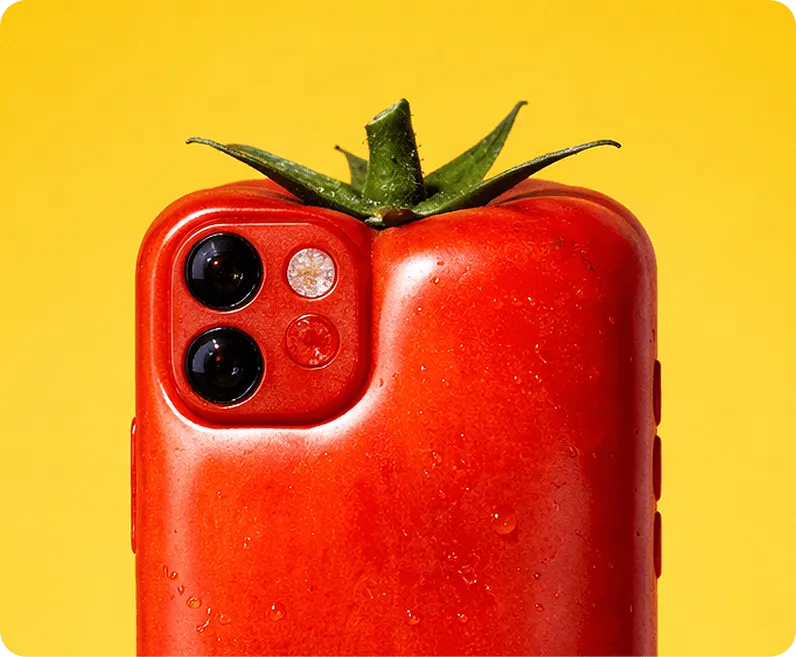
We brought Tomato’s new proposition to life through a bold, loud, proud, and unpolished creative direction called Saucy by Nature. Every design ingredient traces back to the same two sources: the physical world of the tomato, and the rebellious, anti-corporate attitude at the heart of the brand.
The rallying type
Tomato’s primary facetype is the kind of type you’d paint on a sign at a protest. We worked with Pangram, the type foundry behind Agrandir, to develop a bespoke custom cut, making it even more bold and undeniably Tomato.
When life gives you tomatoes, make a color palette
Vibrant and colorful, the color palette takes its names from real tomato varieties found around the world — Kumato, Roma, Valencia, Lemon, and Tomatillo.


AI-generated instead of generic
Every telco uses the same polished, forgettable stock photography. We went in the opposite direction, using AI to create surreal, unexpected, and quirky imagery designed to make people look twice. It was also a practical win: what a photo studio would take a month to produce, we delivered in two days.

“AI gave us the freedom to explore unexpected compositions, textures, putting a tomato in different environments, ultimately helping us build a world around the brand that feels fresh, memorable, and ownable.”
ana ključević
MARKETING COMMUNICATIONS EXPERT
A1 HRVATSKA

Inspired by DIY and rebel culture and a nod to fruit stickers, stickers add an irreverent visual punch to any layout. They carry short, provocative messages and are always placed overlapping other elements, as if stuck there after the fact.
Bursting with personality
Iconography is big, bold, and juicy, much like a ripe tomato. Where a major telco would use perfectly geometric icons, Tomato’s are deliberately imperfect and characterful.
Splat 2.0
The splat is a flexible visual device that represents the brand’s rebellious spirit. Tomato’s original splat looked more like a scientific illustration, so we evolved it into a system with genuine logic connected to the brand’s origin story. Each splat represents a tomato thrown at a wall, captured at a different stage of impact.
All animations run at 12fps for a raw, stop-motion feel, deliberately unpolished, and a direct statement against the smooth, corporate aesthetic of the big telcos.
A digital-first telco
Infinum originally built the Moj Tomato mobile solution for iOS and Android in 2017. But with a new brand identity, a new tariff model, new payment methods, and a growing ambition to become a digital-first telco, it was time for a complete rewrite and redesign.
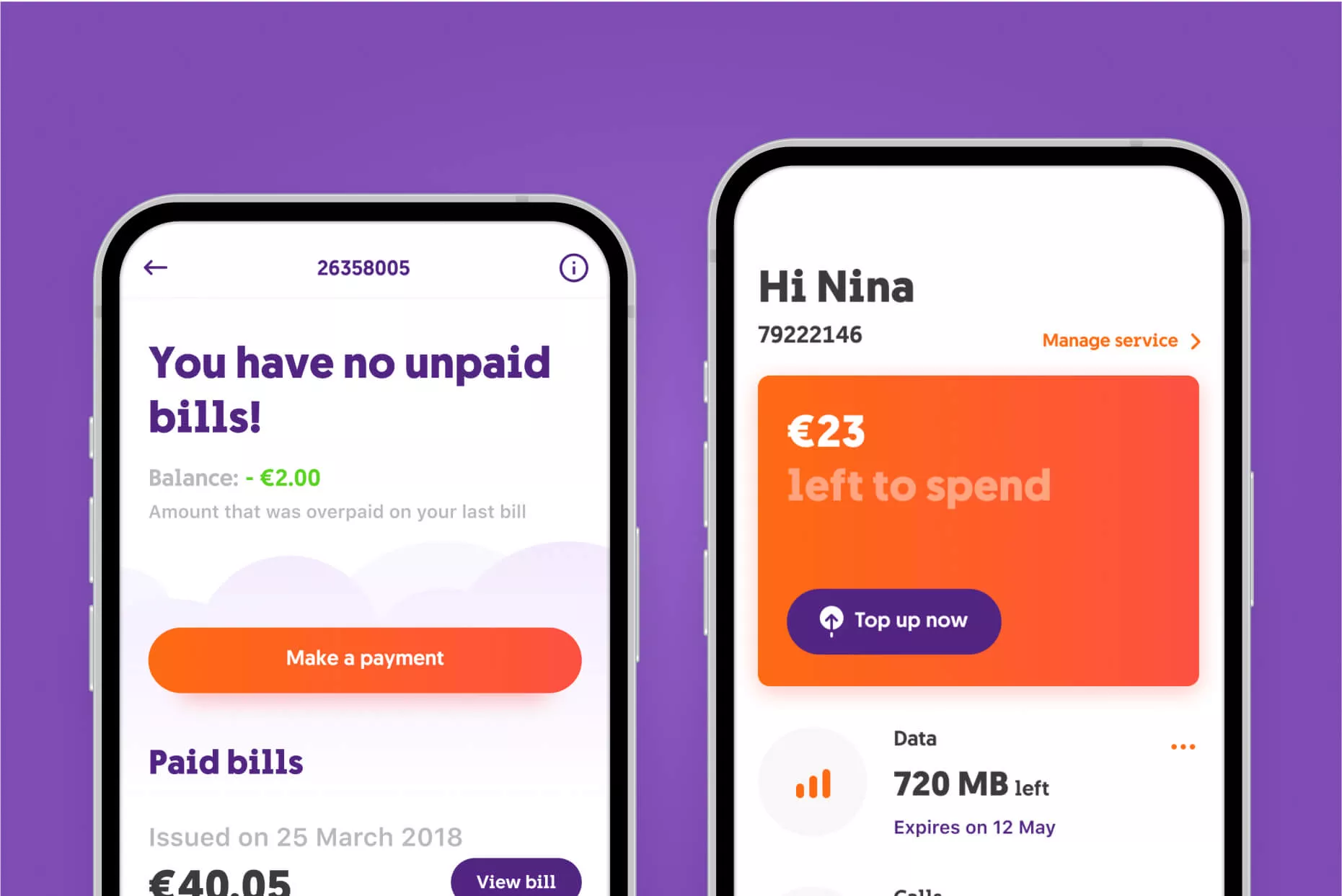
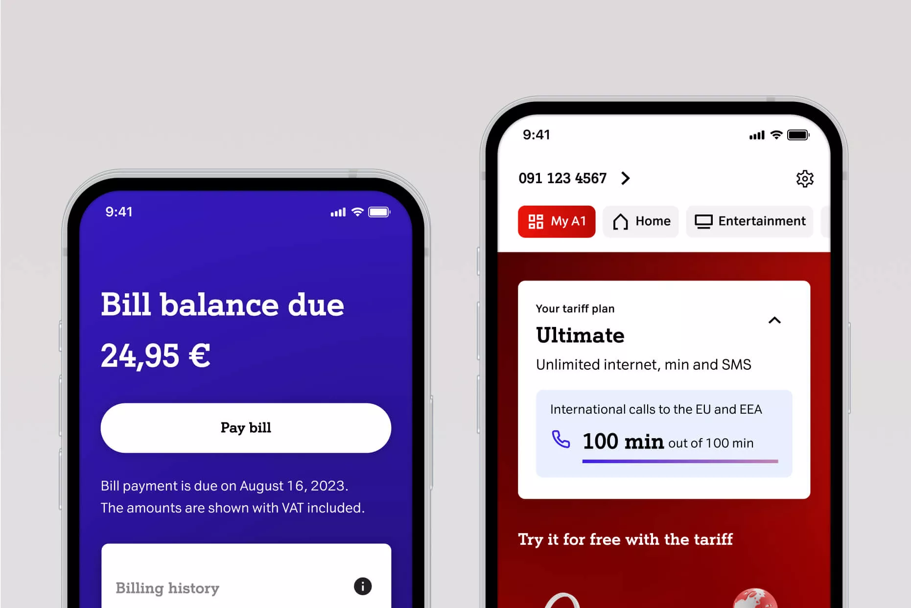
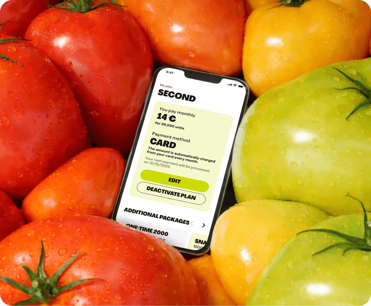
For a brand built around giving people control, the mobile experience had to deliver on every bit of that promise. Users can now do everything themselves: change tariff, view and pay bills, switch payment method, activate additional packages, and check usage history. All in just a few clicks, without ever having to visit a store.
Giving A1 Hrvatska’s product team full control
Thanks to the app’s server-driven architecture, A1 Hrvatska’s team can now update what users see without releasing new app store updates. Content, promotions, and pricing are all controlled dynamically from their side, giving them the autonomy and speed to move at the pace of their business.
Catching bugs face-to-face
With frontend on our side and middleware and backend on A1 Hrvatska’s side, cross-team software testing could have been slow and fragmented. So we brought everyone together in person for five live testing sessions. What would have taken days to resolve remotely was caught and fixed on the spot.
Made to be remade
We built the solution on a modular, component-based design system that is brand-agnostic at its core. This means the visual identity can be fully adapted without rebuilding from scratch, providing long-term flexibility and ease of maintenance.
Effortless experience, expressive interface
Bold, expressive, colorful, and playful, the UI breaks every convention the telco category has set. Roma red anchors the interface, with Lemon, Valencia, and Tomatillo adding vibrancy across cards and buttons. The illustrations go a step further — where most apps use a checkmark for a success state, Moj Tomato uses a tomato-shaped mountain.

For all the boldness of the UI, the UX is clean and simple. We were guided by the Goldilocks principle: don’t overwhelm users with too much information, or leave them hanging with too little, provide just enough to explain what’s happening and what comes next. To create a truly effortless experience, we reduced complex flows like tariff changes and payment method switches to just a few clicks.

Accessible design benefits everyone
We followed WCAG 2.2 digital accessibility guidelines and tested to achieve an AA level of accessibility throughout. Not as a compliance checkbox but as a design principle. Because a digital product that’s easy to navigate for users with disabilities is simply a better product for everyone.
Concentrating on real user needs
Before a single line of code was written, we built an interactive prototype and put it in front of real people, existing Tomato users and users of competing telcos alike. The goal was to catch friction early and shape the experience around what users actually need.
A refreshing collaboration
What started as a mobile refresh grew into a full-scale revolution. Infinum and A1 Hrvatska continue their long-term partnership, nurturing both the Tomato brand and the mobile solution. The shared ambition is clear: for Tomato to become a culturally relevant brand that doesn’t just participate in the market, but actively shapes it.