Since its introduction last year, SwiftUI has piqued the interest of most Apple ecosystem developers with its “learn once, apply everywhere” approach. After playing around with it for a bit, we wrote an overview of SwiftUI itself, as well as looked into how Combine fits in the picture.
It looked promising and made UI programming really fun. However, its initial shortcomings and imposed minimal OS support version prevented it from ever fully taking off.
A more mature SwiftUI
Improvements that came during this year’s WWDC, along with the maturation of the toolkit itself, mean more and more teams are going to slowly make a switch to a new way of building cross-platform user interface layers that work across iOS, iPadOS, macOS, tvOS, and even watchOS, using one set of tools and APIs.
The shift to a more declarative programming paradigm is coming, and we need to be ready for it.
I’ve talked about this very same topic at the recent Shift Remote E05: MOBILE event, and if you’d like, you can check out the recording of that talk here.
Now, let’s see what SwiftUI promised, what it delivered, and where it’s going in the future. Grab a coffee, settle in and let’s begin.
Humble beginnings, not quite
When Apple first announced SwiftUI, they backed it up with some big claims regarding the changes it was going to bring to the development world of the Apple platform. Here are some of them.
They said that we would need to write less code.
Stuff like creating a tableView or a collectionView that before took a lot of boring, boilerplate code would become things of the past.
After that came adaptability, in all its forms:
- platform – our apps would behave as first class citizens on all Apple platforms, from our Macs all the way down to our iPhones and Apple watches. The code we write would adapt to take full use of their respective capabilities, e.g. elements like pickers would show up as scrolling wheels on iOS, but on macOS they would take the dropdown shape.
- light & dark mode – by using features introduced in iOS 13 such as system colors, we could easily adapt our applications to light & dark mode. I’ve actually written a handy how-to guide on adopting dark mode. SwiftUI helps us here with the @Environment property wrapper which we could use to get the current environment value, as well as any updates to it.
- font scaling – fonts used by SwiftUI adapt to the scale that your users pick in the phone settings, and SwiftUI views like Text would in turn adjust their size to fit everything nicely.
Next things next. After adaptability improvements came something that would upgrade our development process, as well as increase the speed of our output – the ability to preview our UI at the same time as actually writing the code for it.
Technologies like Flutter or React Native had had this option for a while, and last year we were finally given a native alternative to the build-install-run dance that used to bite out a solid chunk of developers’ daily programming time. By using preview, the written code would automatically and immediately be seen in it, as well as all made changes. There was also an option to run a live preview, allowing for test user interaction or navigation testing, similarly to running the app in the Simulator/on a real device.
Code & preview combination also meant that we now had a single point of truth for our UI; checking out storyboard/xib files and/or code to find out who has overwritten whom and caused our UI bugs was gone, going, gone.
Btw, if you’d like to know more about those hardships, we’ve got you covered with our article on the long-term UI-building dilemma of choosing between storyboards and code.
Finally, a native declarative way of writing apps for Apple platforms
Finally, we got a native, declarative way of writing our applications for Apple platforms. Imperative approach stood the battle of time, but with general advancements in UI development, as well as the increase in app complexity our users expect, we needed something fresh which allowed for faster iterations, as well as easier state management.
All those things were supposed to make SwiftUI great – Apple wrapped them up in a shiny wrapper and told us “Here you go, play around with it.”. Naturally, presented with something new and unfamiliar, we did just that, and it didn’t take long before articles were touting this as the end of Objective-C, UIKit/AppKit and the be-all and end-all way to go.
However, with the honeymoon period over and our rose-tinted glasses off, we started seeing there was still a lot of room for improvement. Preview was not always working and used to crash consistently. New Xcode/Swift versions would break the existing SwiftUI code. Navigation would sometimes break, too. Tab management was not preserving the navigation stack. UI elements that we were used to in the UIKit world were missing their SwiftUI counterparts.
Creating simple UIs was fast and fun, but doing anything remotely complex or adjusting some existing elements like Lists usually meant dipping back into UIKit/AppKit, which kinda defeated the whole declarative purpose.
Last but not least, SwiftUI requires iOS 13 as the minimum OS version. For large scale applications, that meant leaving a significant part of their user-base behind, and that wasn’t really an option. However, it got us thinking about state management, and the way its declarative nature goes around solving issues that popped up.
State management (is hard)
State management is hard.

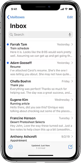
Let’s take the screen above from the Apple’s Mail app as an example. There’s a list of data, driven by some data models (in this case emails), as well as some extra navigation options, filters and actions.
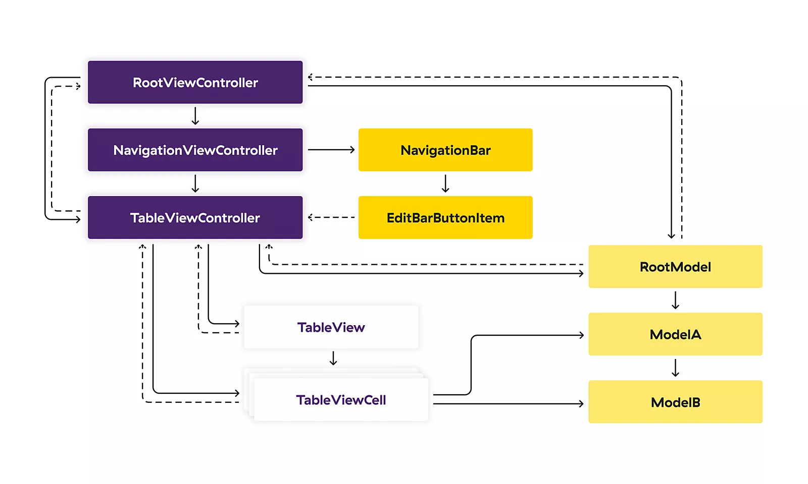
To create a screen like this, we need to connect our views with our models, and each one of these arrows seen in the image below represents a dependency.

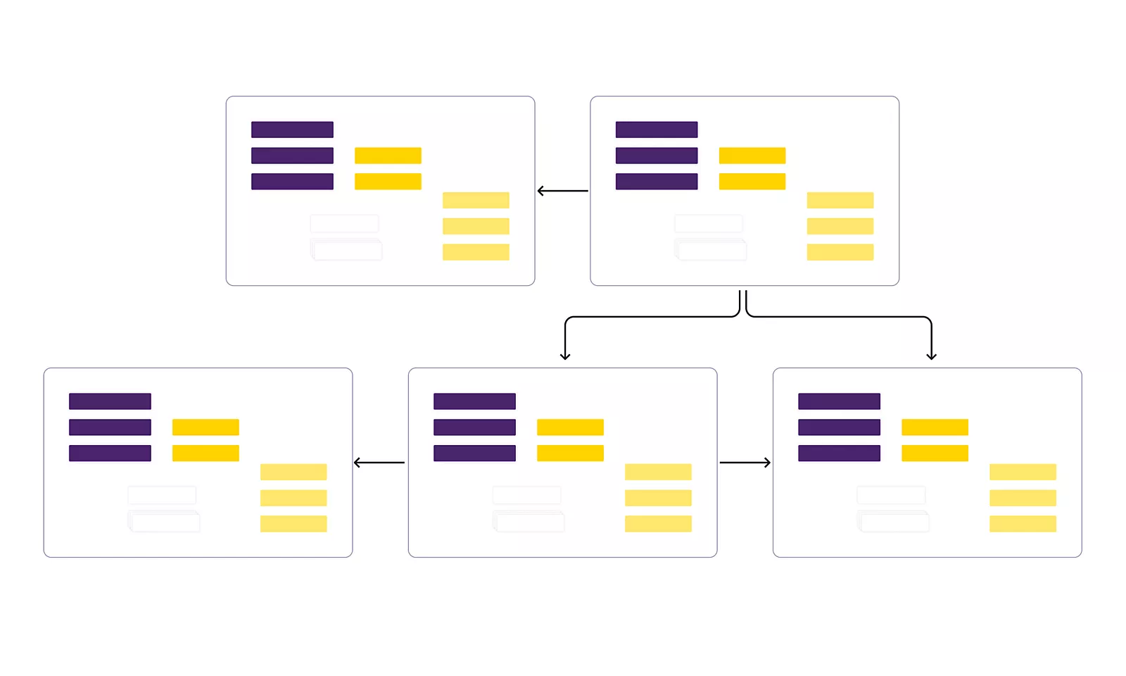
As you can see, there are a lot of interconnected elements here since UI actions can update our models, and in turn they can update our UI. If you think this is complicated, bear in mind that this is just a single screen, and today our applications have a lot of screens which can share the same models, which makes the whole picture even more convoluted.

This brings me back to the starting point of this section – state management is hard, and state management in large-scale applications that we usually build for our clients is getting harder each year. Supporting multiple device sizes, light & dark modes, accessibility features, complex device features such as AR or Bluetooth, having a multiplayer mode and so much more – it all makes building apps in 2020 more challenging than ever. We work in bigger development teams, where each contributor comes with a different skill set that needs to be aligned in order to make a cohesive app.
Sure, it can be easy to put a custom button on a screen, but how does it respond to accessibility? Does it adjust properly to different device sizes and orientations? Does it break if the customer changes their font scale? Is the state that button updates properly propagated to all the screens that require it? Now do that for not just a single button, but for all the UI elements you have on a screen. Not so easy now, is it?
As iOS developers, our job is to build applications that empower our users and adapt to their needs and potential disabilities. If we don’t, it can lead to a disappointing experience for our customers and can make the end product appear cheap and untrustworthy.
Remember, UI is all the end customer sees. If it sucks, they think the product sucks, no matter how good your backend & foundational engineering work is.
The declarative solution
With SwiftUI, we don’t need to worry about how our app is going to transition between all those different states. The age-old problem probably every single engineer has stumbled upon of animating updates to this set of content based on a diff – gone. We just need to write the code to describe how each state should look and the system figures out the rest. Like magic.

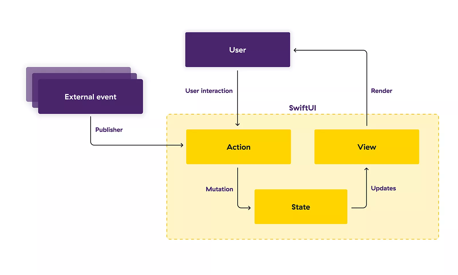
SwiftUI offers a declarative approach to user interface design. As you compose a hierarchy of views, you also indicate data dependencies for the views. When the data changes, either due to an external event like a notification or because of an action taken by the user, SwiftUI automatically updates the affected parts of the interface. As a result, the framework performs most of the work traditionally done by view controllers.
This unidirectional Action -> State -> View approach means that we no longer need to worry about keeping our UI and our data models in sync. Our state is the only one responsible for updating our Views, and Actions are in turn the only ones responsible of updating our State. Since our Views can’t update the State directly, the problem is automatically solved for us.
Paving the way forward
Having gone over how SwiftUI started and the problems it aimed to solve, we should now cover the novelties announced at this year’s WWDC and see where SwiftUI is heading in the future.
New UI elements and options
SwiftUI’s coverage of commonly used views has been greatly expanded this year, which is fantastic news both for developers who already have existing apps built with SwiftUI, and for people who are now getting started with the framework for the very first time.
What most of us were looking forward to is the inclusion of alternative UI elements we were used to, and I think it’s fair to say that we weren’t disappointed with what we got:
- TextEditor – offers a built-in way to add a larger text editing area to a UI, which is what makes it different from the TextField type that SwiftUI has been shipping with since its introduction. Wrapping UIKit’s UITextView is no longer needed, at least when looking to add a more basic set of text editing functionality to our applications
- ProgressView – platform-adaptable way of showing an appropriate default loading spinner, as well as an alternative version that can be used to show progress (e.g. for downloading some data)
- document-based apps support – we’ve been given two main types to work with: the FileDocument protocol to define what a document in our app looks like, and the DocumentGroup struct that gives us a default scene to let users create, open, and save documents.
- LazyHGrid & LazyVGrid – collectionView alternative was something that was glaringly missing in the initial SwiftUI release, and these grids are what can be used to create similar layouts to what we were used to. They are container views that arrange their child views in a grid that grows horizontally and vertically respectively, creating items only as needed.
The concept of laziness is a big trend when it comes to this year’s SwiftUI changes, which is only solidified with the addition of LazyHStack and LazyVStack to their non-lazy counterparts. In general, implementations that are lazy don’t perform their work up-front, but rather at the time when it’s first needed. This can often lead to a ton of performance improvements, especially when dealing with larger collections and other heavy data.
There are also a host of other new things which could be a whole blog post for themselves like matchedGeometryEffect, ScrollViewReader, ColorPicker, DisclosureGroup etc. Stay tuned to Capsized Eight, I guess?
New property wrappers
Adding to the existing host of property wrappers, we got some new ones which will make our lives a bit easier:
- @AppStorage – helps us read and write UserDefaults easily
- @ScaledMetric – scales values based on Dynamic Type settings
- @StateObject – safely creates reference types in views
- and even more, such as @UIApplicationDelegateAdaptor, @Namespace, @SceneStorage etc.
On iOS 13, we had to use a UIHostingController (or NSHostingController on the Mac) to actually render out SwiftUI views, but now, our root view hierarchy can simply be embedded in a type conforming to the new App protocol, and by annotating that type with Swift’s new @main attribute, it’ll act as the entry point for our app – without the need for any app delegate or any other bootstrapping code:
@main
struct BlogPostApp: App {
    var body: some Scene {
        WindowGroup {
            ContentView()
        }
    }
}

struct ContentView: View {
    var body: some View {
        Text("Hello, SwiftUI 2.0!")
            .multilineTextAlignment(.center)
            .padding()
    }
}
Not just an alternative
All of this brings me to my final point:
SwiftUI is not just an alternative; it is the future.
Apple has already started pushing in the spotlight by making it the only way to create widgets for the newest OS versions. MacOS has also started using it prominently in some of its redesigned features, like the new notification center.
The new unified design language Apple is pushing forward, combined with the fact that Apple Silicon Macs will be able to run iOS/iPadOS applications as well, means that having a single UI framework that can be used to develop for all platforms makes perfect sense.
Barely over a year old, SwiftUI is just getting started. Armed with all the new announcements and improvements, it’s already packing quite a punch and is set to be the future of development for all current, as well as future Apple platforms.
Prove me wrong?


