


As iOS 13 has become available on more than 70% of the iOS devices, dark mode has been getting great support from iOS developers every day.
However, sometimes you want to go beyond the monochromatic color scheme and brighten up your app with a lively shade.
Before we delve into implementing dynamic color schemes we recommend you check out our Bullet-Proof Color-Naming System for iOS Development. The system offers a structured approach to color-naming, and also makes it easier to add dark mode support.
The white & black approach
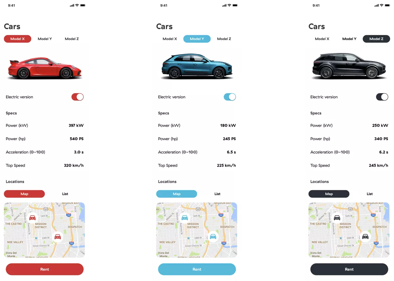
Imagine you have to create a new app with the functionality to rent your branded car. Currently, there are only three models available for rent: X, Y, and Z. The app should be able to show basic information about each car, availability, and the possibility to rent it.
That UI could look something like this.
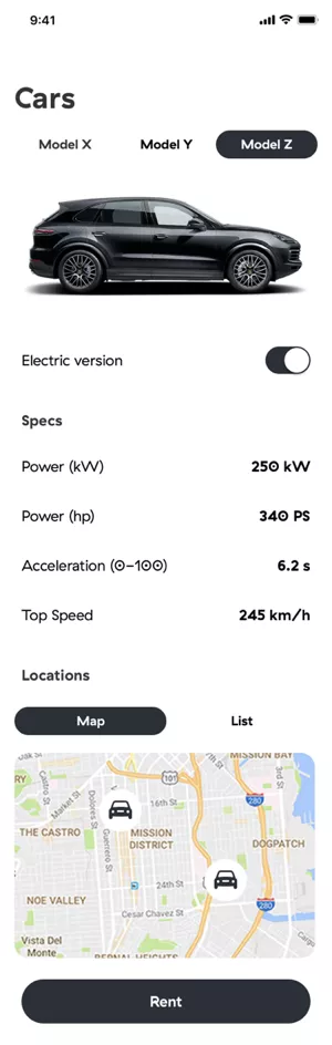
It would be quite easy to modify the UI to support dark mode, but now the designer has sent us a proposal for another cool feature – every car should have its own color.
How to make apps dynamically colorful?
The implementation should support as many themes as the designer wants, as well as any number of screens and components that might be themable as a result of that design proposal.
There are a few possible approaches to adding color functionality, some better than others.
1. Theme-specific ViewController?
This approach comes naturally to everyone faced with such a problem. Basically, inside viewWillAppear it’s possible to assign a color, font, image, etc. to the UI elements by checking which theme was last selected. Theme selection can be stored in UserDefaults.
What are the flaws to that approach? Well, the problem occurs the first time when adding a new element, i.e. next time when adding a new view controller. There is no way to keep track of every element that is added to viewWillAppear so that the correct color or font is set.
The code gets cluttered faster this way.
Also, sometimes it’s not even desirable to connect our UI with our code (e.g. static labels that don’t have to be localized or changed in runtime). When adding a new view controller, also account for the extra time necessary to implement the logic for color change (duplicated code).
However, the biggest problem with this approach is theme reloading, which will introduce multiple bugs. For example, when changing the theme on the currently active screen, it will not be changed without somehow reloading the entire screen, which will either look ugly, or cause a screen flicker.
2. App reloading?
The second approach can fix some things from the first one.
If you ignore the problem of connecting every UI component to our code and code duplications for a moment, you would be able to reload the entire app, i.e. change the navigation stack so that the user is on the first screen in the app every time the theme is changed.
Even if this fixes the initial problem with the UI reloading, there will now be a new problem — the app state.
The user will lose the session, a new login should be made, and maybe the setup of the app should be done again.
This could be fixed by trying to store the last known app state, but as the app becomes bigger and bigger, this will increase the complexity linearly for such a small feature. So, this is a no-go as well.
3. Notification and subscription
Getting warmer but not quite there yet.
You could create a subscription to NotificationCenter in every view controller and post a notification that will trigger UI reloading whenever theme change occurs. The problem of reloading and app state is solved in this approach.
There’s still the problem of cluttered, error-prone code in which a component could be easily forgotten.
4. Protocol-oriented theming
We have a winner!
The two key components here are UIAppearance and Protocols . Let’s see how these two small but powerful things can help us implement any color.
UIAppearance
As official documentation says, UIAppearance is a collection of methods that grants access to the appearance proxy for a class. It is a protocol which returns a proxy that forwards any configuration to instances of a particular class.
Once config is received, it is applied when a class is added to the window hierarchy and can be applied to all instances of a class, or classes contained within a certain hierarchy structure.
	UILabel.appearance().textColor = .red
UINavigationBar.appearance().barStyle = blackTranslucent
There is the problem of every UILabel contained in our hierarchy having red text color. To solve this, use whenContainedInInstancesOf :
UILabel.appearance(whenContainedInInstancesOf: [CustomViewController.self]).textColor = .red
It’s possible to use appearance proxy on most of the element properties, but what if you wanted to do something like this:
AppButton.appearance().cornerRadius = 12
The problem you will encounter is that UIButton does not have a property named cornerRadius that conforms to UIAppearance protocol. Let’s fix that as well!
In order to add that support, create @objc dynamic computed property:
	class AppButton: UIButton {

    @objc dynamic var cornerRadius: CGFloat {
        get { return layer.cornerRadius }
        set (newValue) { layer.cornerRadius = newValue }
    }

}
That’s it! With this powerful OS feature, you will be one step closer to a colorful app.
Before continuing to the Protocol part, there is one small thing to consider regarding UIAppearance. As you can see, there isn’t a created extension on UIButton but a custom subclass AppButton instead.
Even when it’s possible to use directly UIAppearance on UIButton, it is a good practice to subclass every element which should be themeable.
The reason for doing that is so you can use UIButton later as the component with default appearance, as well as easily see which component is themeable in code and be sure that your coloring will not interfere with other system components used by the iOS.
Protocol, enum and manager
The second part of this feature contains a simple enum, two protocols, and one manager to glue everything together.
- Enum
Enum has two responsibilities – to list all of the available themes and to provide the configuration for the selected theme.
	enum Theme {
    case red
    case green
    case blue
}

extension Theme {

    var appTheme: ThemeProtocol {
        switch self {
            case .red: return RedTheme()
            case .green: return GreenTheme()
            case .blue: return BlueTheme()
        }
    }

}
- Protocols
In general, only one protocol is enough in order for this to work, but let’s separate the responsibility in two protocols. Main ThemeProtocol and Themeable as a helper protocol.
ThemeProtocol is used as the main protocol responsible for defining the behaviour of main assets and extension:
	protocol ThemeProtocol {
    var assets: Themeable { get }
    var `extension`: (() -> Void)? { get }
}
This protocol is used later in the last component — manager. But inside of it we can see another Themeable protocol responsible for describing how the item should look.
If there is a theme which conforms to Themeable and you would like to extend functionality only for that one theme, use extension block in order to extend features only for that one theme.
Themeable is the main protocol in this case since item description is defined in it.
	protocol Themeable {
    var labelAssets: LabelAssets { get }
    var buttonAssets: ButtonAssets { get }
    var switchAssets: SwitchAssets { get }
    // ...
}
E.g. description of the one item could look something like this:
	struct LabelAssets {
    var textColor: UIColor { get }
}
- Manager
The last component here is ThemeManager that binds everything together. All the logic needed to apply the selected theme can be written in just a few lines of code:
	struct ThemeManager {

    static func apply(_ theme: Theme, application: UIApplication) {
        // 1
        let appTheme = theme.appTheme
        // 2
        updateLabel(using: appTheme.assets.labelAssets)
        // 3
        appTheme.extension?()
        // 4
        application.keyWindow?.reload()
    }
}
Let’s go through those four lines of code one by one, in order to make everything clear. In // 1 first line, you are just retrieving items descriptions for the selected theme.
The second line // 2 is responsible for applying that theme using UIAppearance protocol described in the first part. This will only set the new value for our label, but it will not change it yet. Implementation of updateLabel is simple as well:
	func updateLabel(using themeAssets: LabelAssets) {
    AppLabel.appearance().textColor = themeAssets.textColor
}
In the next line // 3 apply some additional changes specific for the theme that implements the extension.
Let’s say the Blue theme is doing something extra that red and green are not doing (here is shown the implementation of only a blue theme, but the same principle is applied on other themes as well):
	class BlueTheme: ThemeProtocol {

    var assets: Themeable {
        return ThemeAssets(
            labelAssets: AppLabelAssets(
                color: UIColor.blue.primary,
                font: .systemFont(ofSize: 18)
            ),
            buttonAssets: AppButtonAssets(
                normalBackgroundColor: UIColor.blue.primary,
                selectedBackgroundColor: UIColor.blue.secondary,
                disabledBackgroundColor: UIColor.blue.tertiary
            ),
            switchAssets: AppSwitchAssets(
                isOnColor: UIColor.blue.primary,
                isOnDefault: true
            ),
            cellAssets: AppTableViewCellAssets(selectedColor: UIColor.blue.tertiary),
            segmentedControlAssets: AppSegmentControllAssets(activeColor: UIColor.blue.primary),
            pinAssets: AppAnnotationViewAssets(color: UIColor.blue.primary)
        )
    }

    override var `extension`: (() -> Void)? {
        return {
            let proxy = AppButton.appearance(whenContainedInInstancesOf: [AppView.self])
            proxy.cornerRadius = 12.0
            proxy.setBackgroundColor(color: blue, forState: .normal)
        }
    }
}
Last // 4 step is to force UI to apply these values to all components and the easiest way is to just reload everything in a window hierarchy:
	// application.keyWindow?.reload()

// Implementation
public extension UIWindow {

    /// Unload all views and add them back
    /// Used for applying `UIAppearance` changes to existing views
    func reload() {
        subviews.forEach { view in
            view.removeFromSuperview()
            addSubview(view)
        }
    }
}
When tested, this approach did not have any big impact on CPU/GPU and it worked nicely with auto layout (all constraints were intact).
Applying the theme
To change the theme, call one line of code and the entire magic will happen.
ThemeManager.apply(.red)
The red theme will be applied on all screens in the app, without the need to add any kind of code for theme handling inside any view controllers or connect your UI with the code.
Now, if you set your label as AppLabel, even added from the Storyboard, a new color will always be properly applied.
Color your apps away
These were four different ways to implement app customization and make apps dynamically colorful. To make your life easier, avoid using the first two and make apps colorful with the other two methods.
Use the power of Apple’s UIAppearance for setting the new appearance of an element in combination with Protocols for describing that appearance and applying it. This way, you can create customizable items only once.
By using them anywhere in the app, you have support for changing themes without the need to add any additional logic for changing its appearance when the theme is changed.
Now that you’ve got this in black and white, your app can finally show its true colors.