


Since my earliest days in iOS development, I have wondered about the best way to work with colors.
Colors are essential to any app. Choosing the right ones can make your application more intuitive and easier to interact with. Choosing the wrong ones is likely to result in weird and unexpected behaviors.
If you don’t believe me, try painting an error message green – and wait for the users to get confused.
After years of using colors in different areas like design, programming, and even cooking, I can conclude that color is a property added to basically everything surrounding us, including us.
My opening rant aside, the use of colors is an important topic for any development team. A structured approach to color-naming helps in onboarding new team members to our way of working, and what’s more, adding dark mode support becomes easier.
This article will present our naming system and provide a way of implementing it. The implementation example we use is iOS-based, but the naming principles can be applied on any platform.
An easy and logical way to name colors in development
Our team used to have a confusing naming system that took a lot of time to learn. Wanting to up our efficiency and lessen the confusion, we set out to create a simple system for naming colors that would also be easy to explain to new team members. This way, they can use it much sooner, and as a bonus, save the nerves they would rack trying to discern what color is jupiterSunset and what is tigerCat.
First of all, a good naming system requires you to communicate with the app’s designer. They have their own color palette, which means you have a list of colors you need to name. When deciding what names to use, take into consideration these three simple facts:
1
Every color already has a name, so there’s no real need to name burgundy red elephant.
2
Some colors have a more important role in your app than others.
3
Some colors are assigned to elements like buttons, separators, or backgrounds.
For example, if our app uses blue as its tint color, it can be called primary color or tint for short. Most text in the app uses some variant between black and white, however, it mostly appears on labels, so we can name the colors LabelPrimary, LabelSecondary and so on.
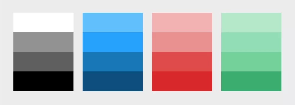
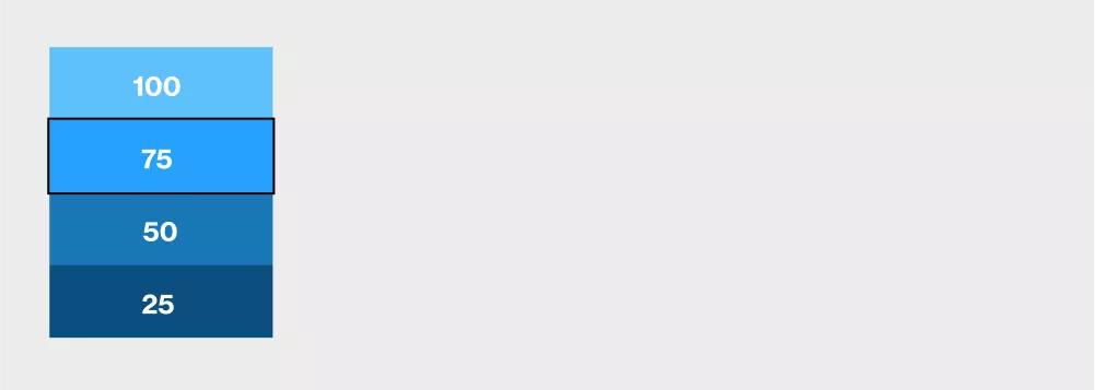
Of course, we have to consider shades as well. In our example, there are a couple of shades of blue. If we use the color under number 75 as our primary one, we can use it as a basis for naming the other variants. We follow this logic: a number closer to 0 will mark a darker variant, and the closer we move to 100, the variants are lighter. This is how it would look like: primary, primary25, primary50, primary100.
We can apply the same strategy to error, success, and warning messages. When you’re naming colors used in screens showing those messages, you can combine the color variants with the message type. For example, for an error message, you would name the color used for the bubble error80, the color of the border around it error50, and the color of the message text error.
The last colors to mention are used for structure, like separators, backgrounds, and similar elements whose colors appear only there and nowhere else. Name those colors using their semantic names – separator and background.
Implementing the color-naming system in iOS
Implementing the naming system is short and simple, albeit repetitive. The first step is to add all the colors to your project resources. The image below is an example of how it should look.
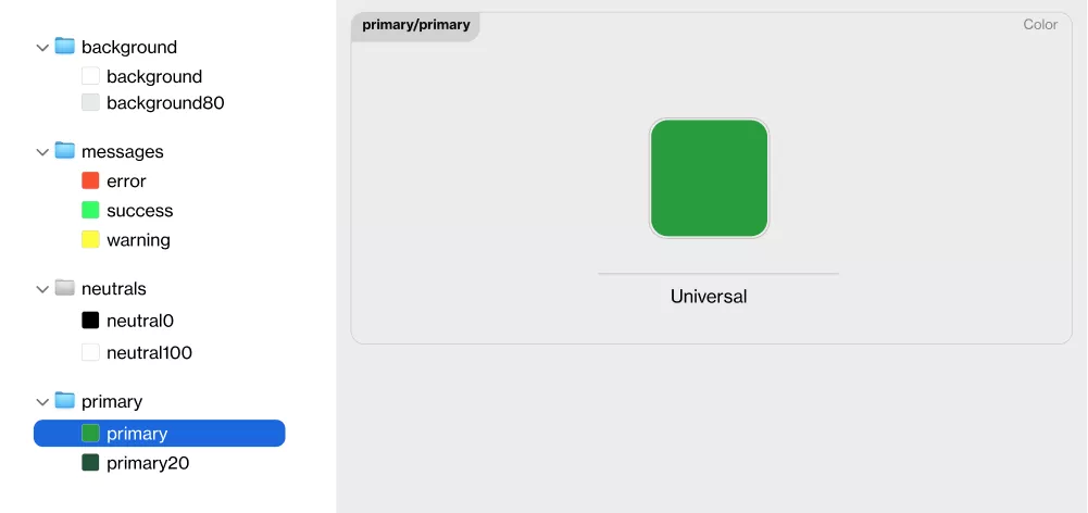
Once you have added the colors, you should implement the extension to UIColor. See the code example below.
extension UIColor {


    static var primary: UIColor {
        return UIColor(named: "primary/primary")!
    }


    static var primary20: UIColor {
        return UIColor(named: "primary/primary20")!
    }


    enum Error {
        static var error: UIColor {
            return UIColor(named: "messages/error")!
        }
    }


    static var separator: UIColor {
        return UIColor(named: "separator")!
    }


    enum Label {
        static var primary: UIColor {
            return UIColor(named: "label/primary")!
        }


        static var secondary: UIColor {
            return UIColor(named: "label/secondary")!
        }
    }
}
When you’ve added the colors and implemented the necessary extensions, adding new colors is simple, and using them is the same as using system-defined colors. You can add primary colors to buttons through storyboards simply by selecting it, or if you’re using code, by adding .primary to the element’s color property.
Color within the lines
To create a solid naming system you can use consistently, you need to think about all the ways you use certain colors, their priorities, and contextual meaning. Implementing such a system can seem boring at first, but in the long run, it gives you an organized and defined color system and hierarchy.
The added value is that you can extract this type of color system into a library, which you can then share across multiple apps that use the same design language.
Creating a system may take some additional effort, but it’s worth investing your time and energy because it makes using colors in development significantly easier.