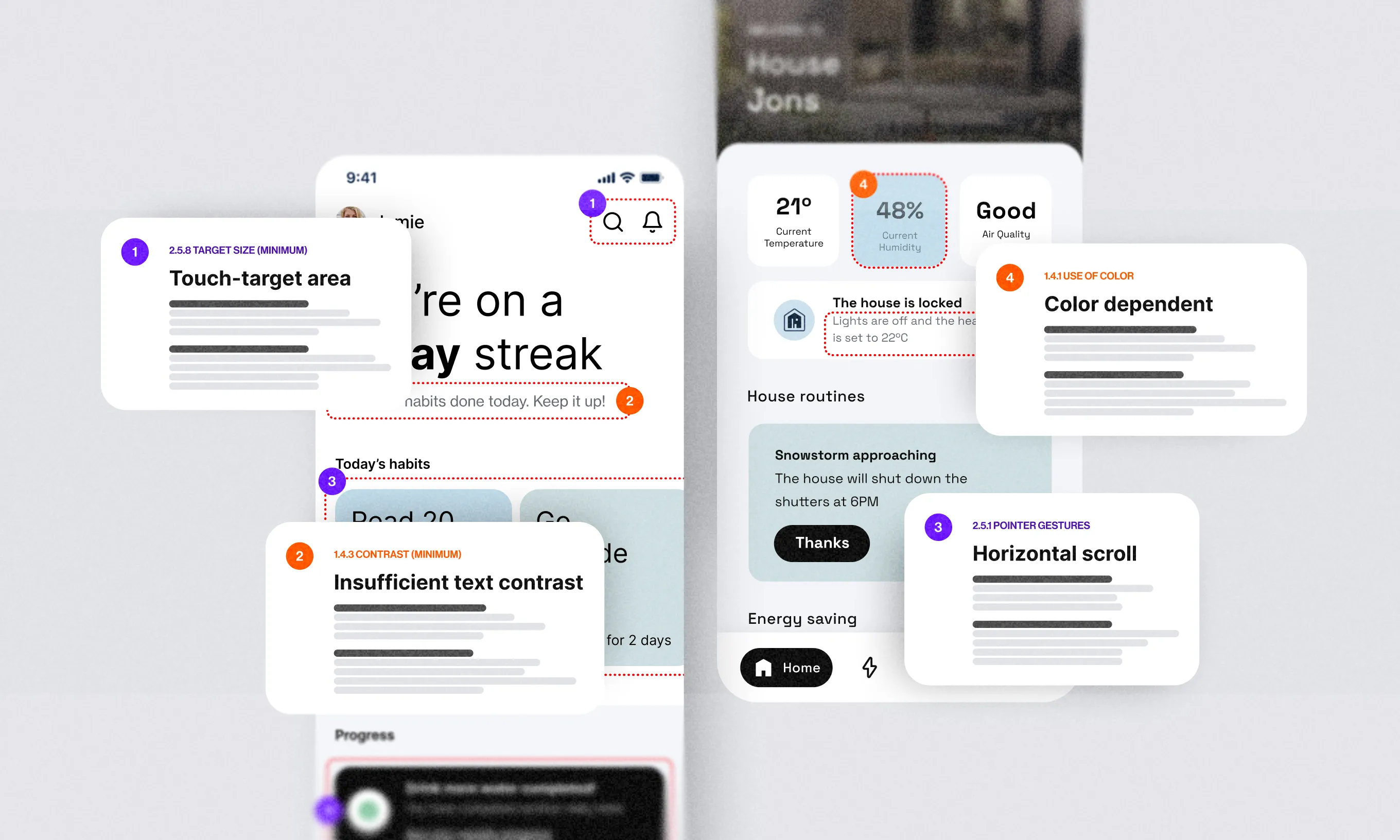
Having gone through dozens of portfolios and participated in multiple candidate selections in the last couple of years prompted me to share the best practices for creating a design portfolio and propose a set of guidelines that could simplify this intimidating task.
The struggle is real
It would appear that design portfolio creation is a hot potato most designers are reluctant to tackle. In fact, I’ve struggled with it myself back in the day. To gain insight, I’ve read a number of portfolios over the years–some of them really helped me take my portfolio to the next level.
Today, I’m in the position where I interview designers and evaluate their portfolios. To help a brother and a sister out, I’ve spelled out the tips, tricks, and useful resources for creating an impressive design portfolio.
If you read this post and click through all the links–many of them from highly experienced designers, you will notice the pattern for creating a great portfolio slowly forming.
Time to reveal the cards!
Behind the scenes
Let me give you a quick example of a process that happens every year. Many applications for our design team arrive during the year, but it never feels as intense as it does at the end of September when we open applications for Infinum Academy.
Applicants usually send in their portfolios during the last few days of the application period (that’s now). Then, our job is to pick only 12 students from a pile of applications in the next couple of days.
For this occasion, we retreat to a cozy conference room with sofas and spend the next few hours reviewing portfolios–first separately and then Marina and me together. And to think some people do this for a living!
Anyway, before we ever get our hands on one of those portfolios, a designer has to work hard to create it. Shall we rewind the process a bit?
The last-minute portfolio
Designers often get the urge to create their portfolio in the few days preceding the deadline for the job application they’ve been eyeing (I said often, not always).
The process goes a little like this: “Let me google portfolio creation. Well, that looks like a lot of effort. Let’s just put all of my work in one folder and let them choose what’s important. Or maybe I could create one big image so they can scroll, this should be good enough.“
Yes, I agree, something is better than nothing, and this is not always the case, but I did find myself digging through the folders quite a few times. Believe me, it’s really difficult.
Sometimes, we also see websites with a lot of images but no context, or portfolios that are not crafted for the position in question but is rather a general portfolio for various design positions in companies.
I’m not trying to be the bad guy here—on the contrary, these are just examples of what you should not do from my experience.
I’ve also seen many applications that were nicely structured, thoughtfully designed, the user experience was great, and the effort behind it obvious. Respect for that.
What is a design portfolio anyway?
Think of a portfolio as a 5-minute pitch about yourself, except you are not there to (re)present yourself, so the most important things have to be obvious at a glance.
It seems that the colleagues from Spotify share a similar definition: “Your portfolio is your voice when you’re not around to explain your projects.” Another way of thinking is that it is like an elevator pitch about yourself. Yes, I know, easier said than done. But help is on the way!
The design-portfolio-creation guidelines
Do you have to create a website or a PDF? There is no doubt that a website is more professional. However, a PDF portfolio presentation is a must-have, and I know that you are not going to publish everything on the web anyway, so it’s good to have a good old PDF.
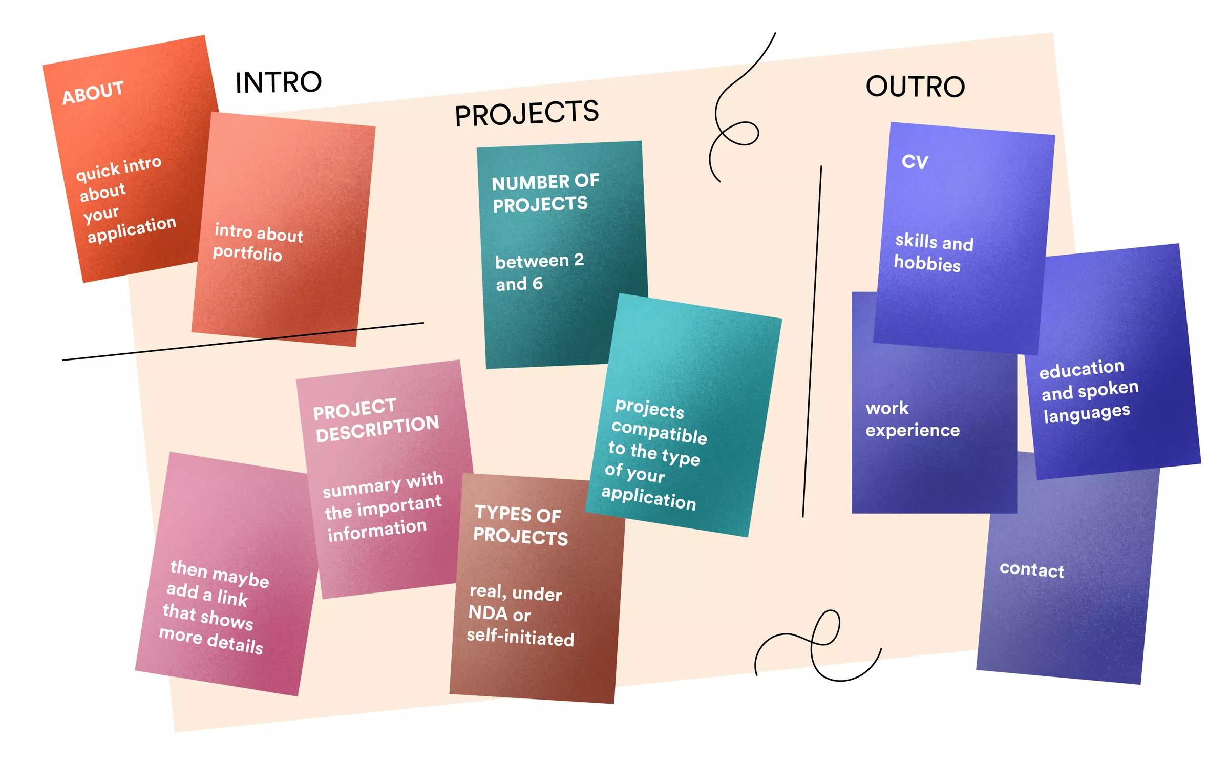
After you’ve researched your dream job/company, start by creating an outline of how you want to represent yourself. That is the table of contents that you’ve seen in the books. You’ll be tempted to start with visuals, but it’s smarter to start with content.
The two main sections of content you need to cover are Projects and About you. Projects tell us what you’ve done or you’re still doing, while About you section tell us about your education and who you are.
The content: Projects (aka case studies)
Case studies are divided into three main parts–the number of projects, type of projects and project description.
Number of projects
This can vary and it’s not set in stone, but the rule of thumb is to go between 2 to 6. If you go up to three, you’ll have more space to go into detail. If you go up to six, then it’s good to emphasise only the most important stuff. You can always put the list of all projects you did somewhere and show your full experience.
Type of projects
Projects can be real, under NDA or self-initiated. They can also differ by the platform and industry. In the end, when choosing projects, it all depends on the position you are applying for. It is always practical to have a “modular portfolio”, like lego bricks. Prepare case studies for your favourite projects and pick the ones that represent you in the best light for the position that you are applying to—that is the only “secret” formula.
Project description
Fun part—project descriptions, yaaay. I always like to recommend that your cases follow the inverted pyramid type of information prioritization. This means that you should write the summary with the most important information stated first, then add important details only, and at the end maybe place a link that shows more details, like an app preview website or something else.
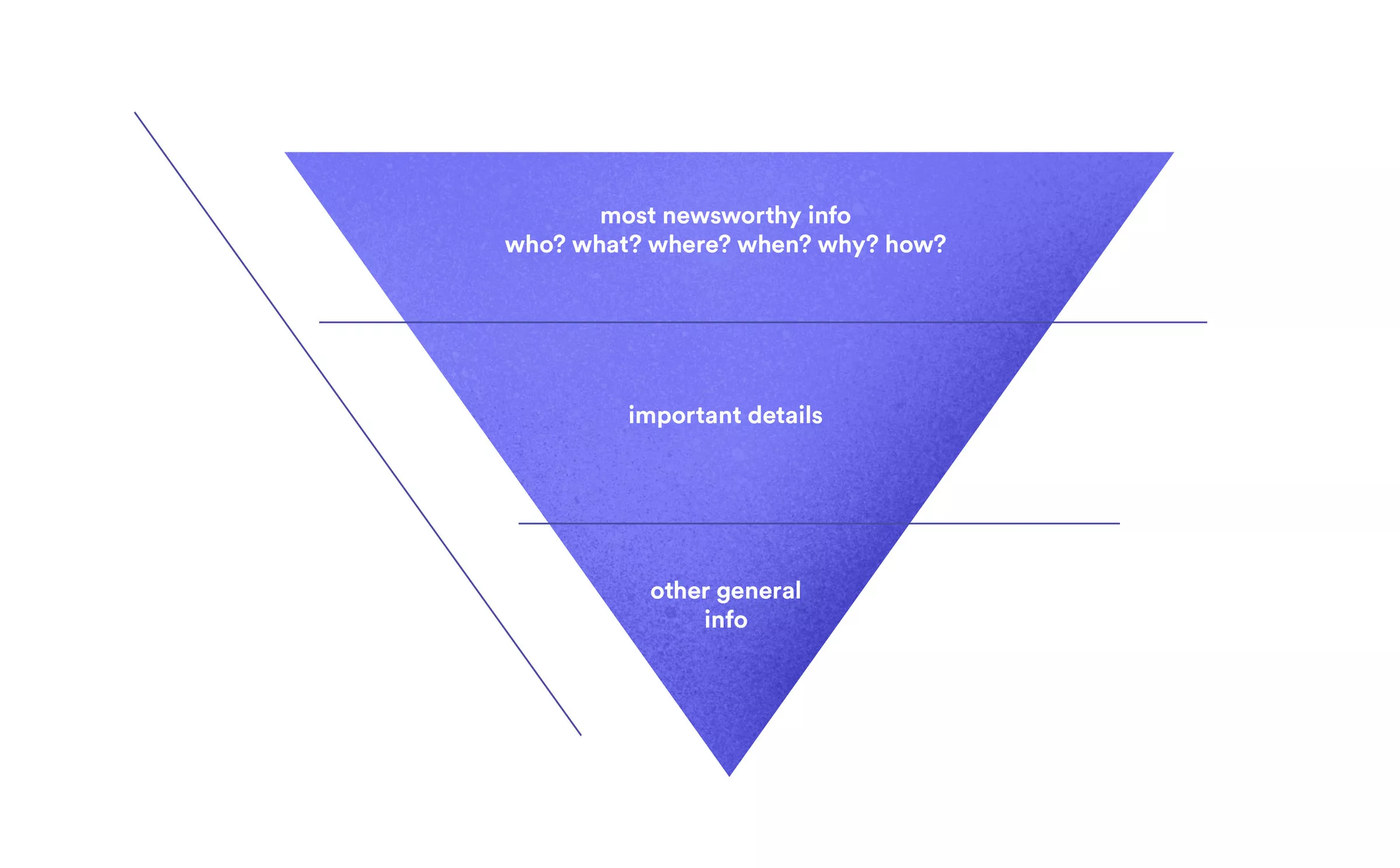
Additionally, this way you show us the storytelling skills that you need as a designer. Tell us the story about what the main problem and goal were and how you solved it. Please avoid talking about the design process, as we will talk about that during the interview.
Garron Engstrom from Facebook gave a piece of advice in his blog post which I find very useful. He said that you should focus on product thinking, interaction design, and visual design. Yup, stick to that.
When you are writing about real projects that are not implemented as you’ve imagined it, don’t be afraid to include the link of the final product. We’re aware that sometimes something somewhere is missing to make the product perfect in production. That is also the kind of experience we like to see.
We also like self-initiated projects. Yes, please! If you have few or no projects at all, don’t hesitate to create something on your own. This way you show us your skills, proactivity- and you learn new stuff!
What about NDA projects? Those are always tricky. If you are allowed, remove the branding or change the colors. If not, it’s okay to present it as the project you can’t talk about.
No matter what type of project it is, tell us about your contribution. We are aware that big projects require big teams (with multiple designers). It is always good to write about the specifics of your contribution and how you helped the team build the product.
A final piece of advice for the project section – I strongly recommend that you write content in your own voice, because the portfolio should represent you and your style of communication.
The content: About you
Enough projects talk. Let’s talk about you! The most recent and important things about your formal and additional education, a short history of your work experience, additional skills such as web development, 3D, database management, and other things you found interesting for the job you’re applying to should all be here.
Try to fit all the info on an A4 sheet of paper or a couple of presentation slides.
The format
I’m personally a fan of the CV&Portfolio cocktail (or a burrito if you wish), which allows me to get to know you in just one file. I’m aware that some companies prefer the two documents to be separate and that’s fine. The most important thing is that your portfolio is easy to scan regardless of the format or the number of slides.
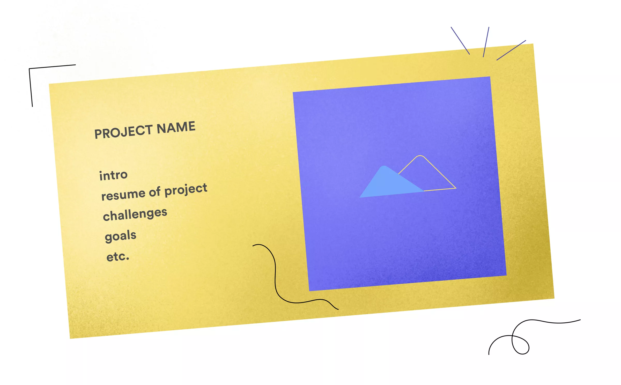
If you stick to the title and a few sentences with an accompanying product image per slide, you are on the right track. On slides which only contain images, remember to create captions in order to make clear what the reader is looking at. Also, please do not use highly isometric mockups where I can’t see anything. The rest of the creativity is up to you.
What to do when you’re done?
You are not done yet! First, check your grammar. Maybe it is good to have someone else proofread your portfolio and application before you send it.
Next, you should check links because you worked on it for soooo long and copy/pasting can be tricky sometimes. Collapse (close) the main categories (in Keynote, Powerpoint, or on paper) and see if it still makes sense.
Finally, send it to your (designer) friend to get their perspective. Make improvements based on the feedback, if needed, and you have all the pre-requirements for your dream job to become reality–start filling that dream job application form and show off your brand new shiny portfolio!
Speaking of your dream career, I strongly advise you to acquire as much knowledge as you can, whenever you can.
Portfolio maintenance
If your portfolio has played its part right, you are likely to go through a few rounds of interviews. Whether they go successfully or not, jot down what you think was good and what could be improved about your portfolio or your performance. The worst thing you can do is to take nothing out of it.
You should work on your portfolio all the time, jobless or employed. The best part of creating and maintaining a portfolio is that there is no one to limit your creativity. This is your playground.
How to stand out from the crowd?
One might say: “If we’re all reading the same blog posts and books about portfolio creation, we will all create the same portfolios”. However, every one of us is a unique individual and implements the exact same theory in different ways. We all work in different companies on different projects. We even perceive this very blog post differently!
What I hope you’ll take away from this blog post are the recommended type of content to put in your portfolio and the format that works best from my experience.
Your knowledge, personality, and creativity are the ingredients that will make your portfolio stand out.
Think of it as a game of cards. It’s not the hand you’re dealt that determines whether you win or lose–it’s your skill that makes the difference.
Having an ace up your sleeve sure helps.
For those who want to know more:
What makes a design portfolio truly great? by Julie Zhuo
How to write case studies for your portfolio? by Tobias Van Schneider
Portfolio Building Checklist by Tobias Van Schneider
UX Design Portfolios by NNGroup
I Got Rejected by Apple Music… So I Redesigned It by Jason Yuan
UX portfolio mistakes to avoid by Andrew Wilshere
How to build a killer portfolio by Bradley Gabr-Ryn
Learn more at Infinum Academy
Completing the design course at Infinum Academy will launch you to the centre of designer action and open doors you didn’t even know had handles. Explore open courses!


