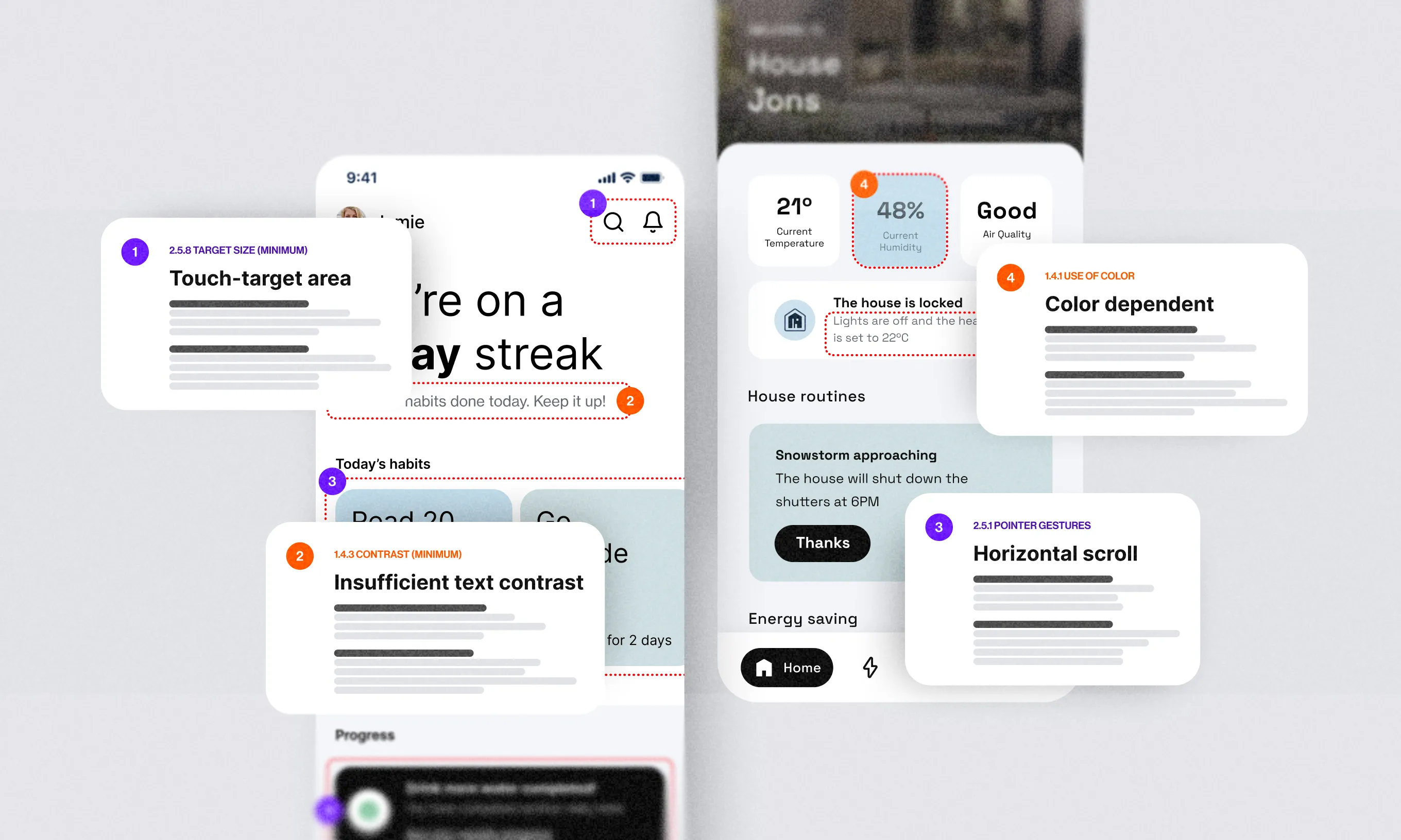
It’s been two years since a huge switch happened to my career, and what seemed like a little-promising technique turned my work around.
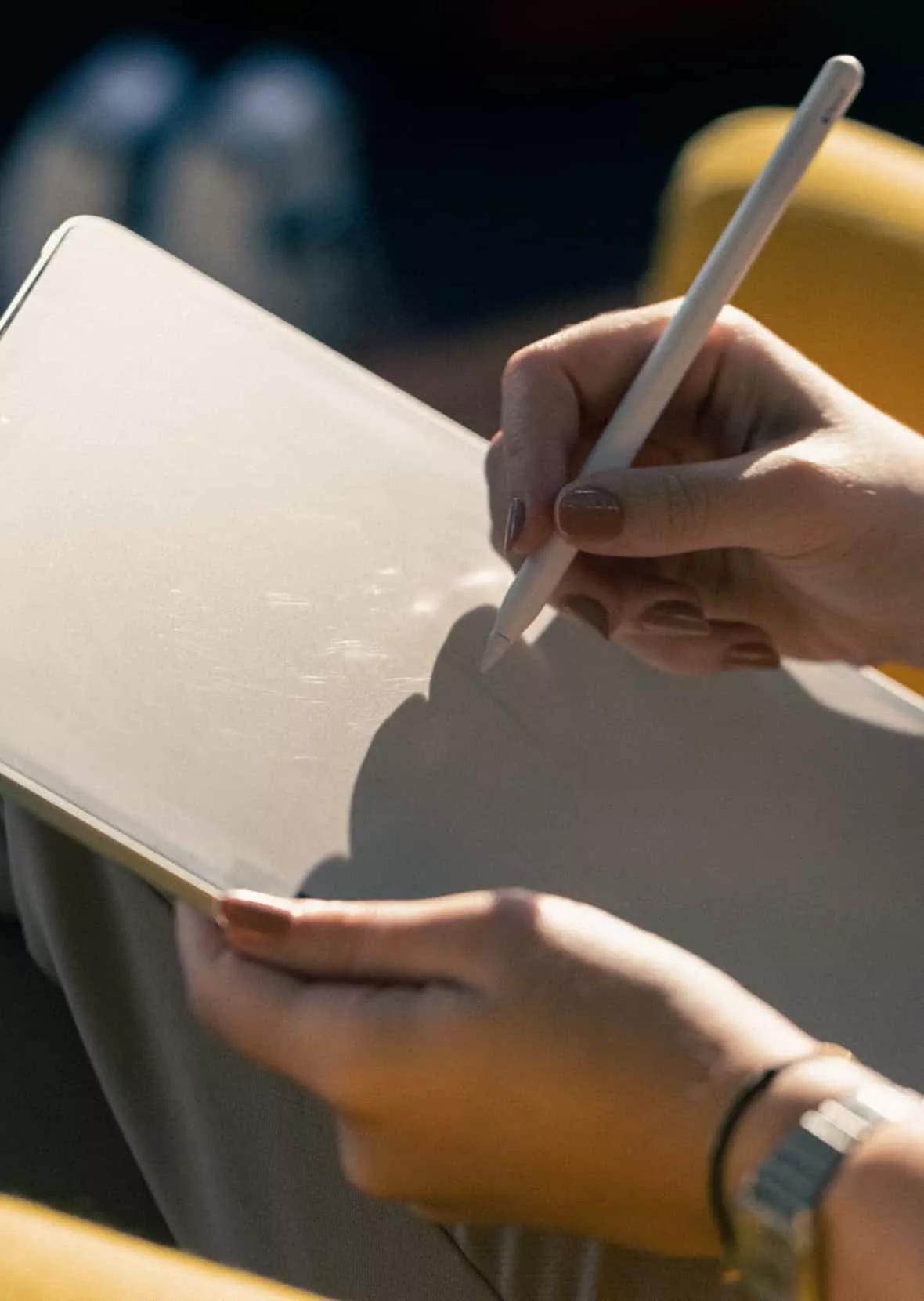
I am a UX designer and besides many advanced digital tools available nowadays, I’m happy to say I’ve recently done my best work using just a pen and paper – as simple as that.
Organizing the mental clutter with visual thinking
Two years ago I was promoted as the UX designer on a big-deal project for professional smart ovens. Although I had always thought of myself as a visual learner, I had never actually practiced visual thinking before that project.
After the initial chaos of handling a ton of information, I started sketching as a method of articulating my thoughts. I started drawing so I would better understand my ideas, and move faster between different concepts.
As it turned out to be my most efficient period ever, I just kept on doing it.
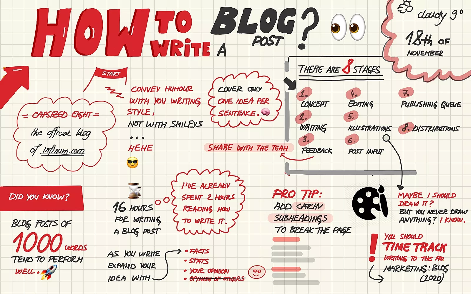
My colleagues loved the visual notes I would take at meetings. When it comes to defining problems, I can put my thoughts and ideas down with more precision that way: whether I’m simply communicating ideas or creating a user journey.
I found taking visual notes to be a great “tool” when creating concepts and discovering potential issues in the early phase of design – which I would otherwise discover too late.
Why use pen and paper?
Of the myriad benefits I’ve witnessed when sketching things out, one of the most convincing reasons to try it would be this: No other tool provides you a faster and more efficient way to iterate your ideas than a simple pen and paper.
In addition to this, it helps document the thought process and showcase an overview of all iterations that didn’t work before coming up with a final proposal.
Sketching using a pen and paper helps designers with the following:
- Aligning ideas and possible solutions. I’ve participated in more than one meeting where everyone was saying the same thing, but we all left the meeting with entirely different takeoffs. If people can visualize your ideas they are more likely to accept it or give more constructive feedback.
- Eliminating any ideas that won’t work quickly. It saves money and time: It’s never so “cheap” to iterate and change as when it’s just a pen and paper.
When to use pen and paper?
Even though there is no clear rule, I recommend using it whenever possible. Here are some situations when you might find sketching on pen and paper useful, but the list can be a lot longer:
- Meeting notes
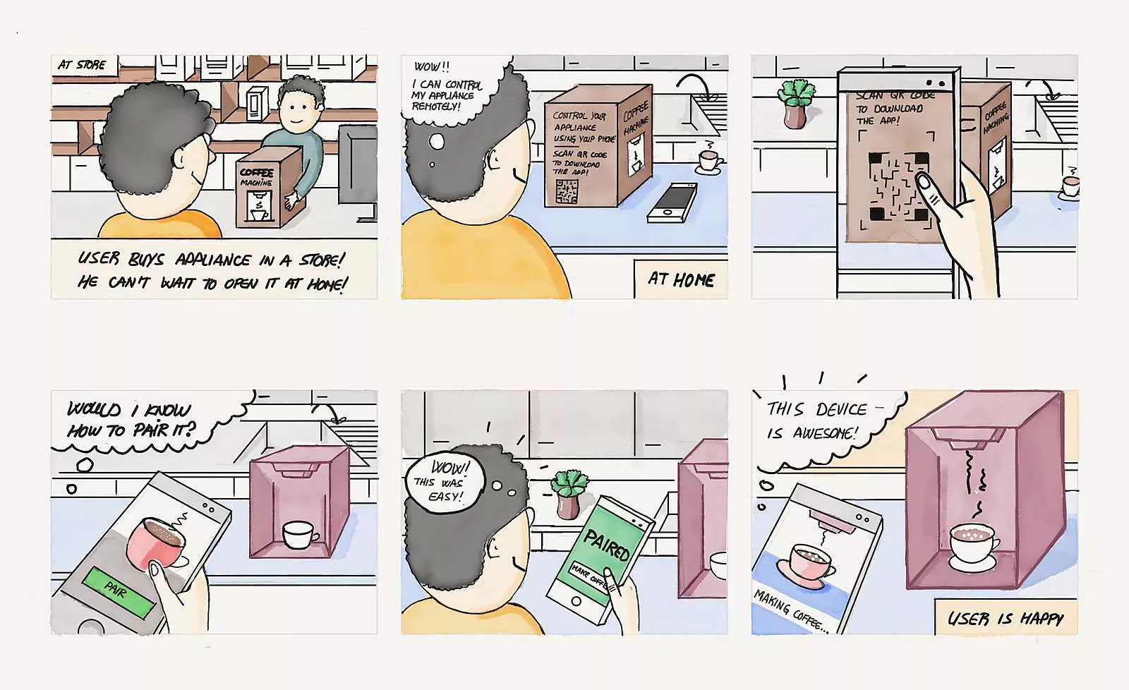
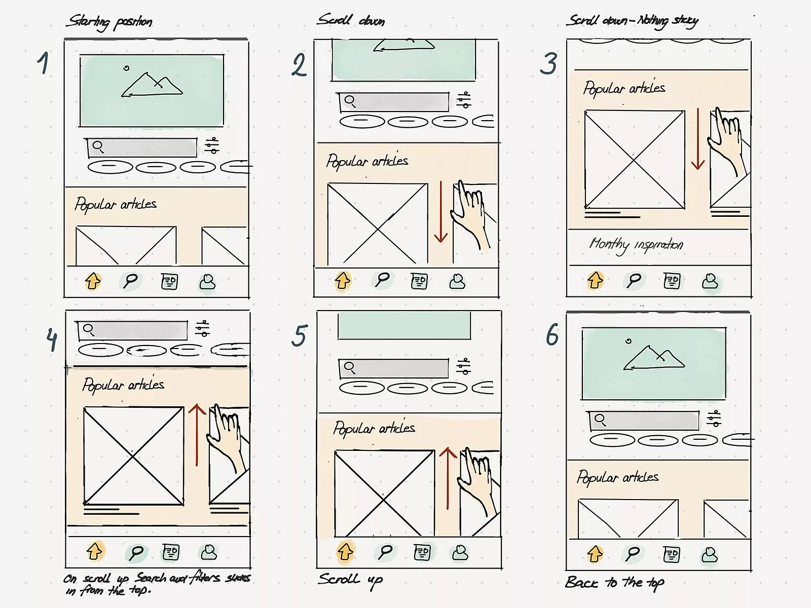
- Creating the flow: app flow / process comic strips / storyboards
- Quick concepts
- Communicating ideas
Meeting notes
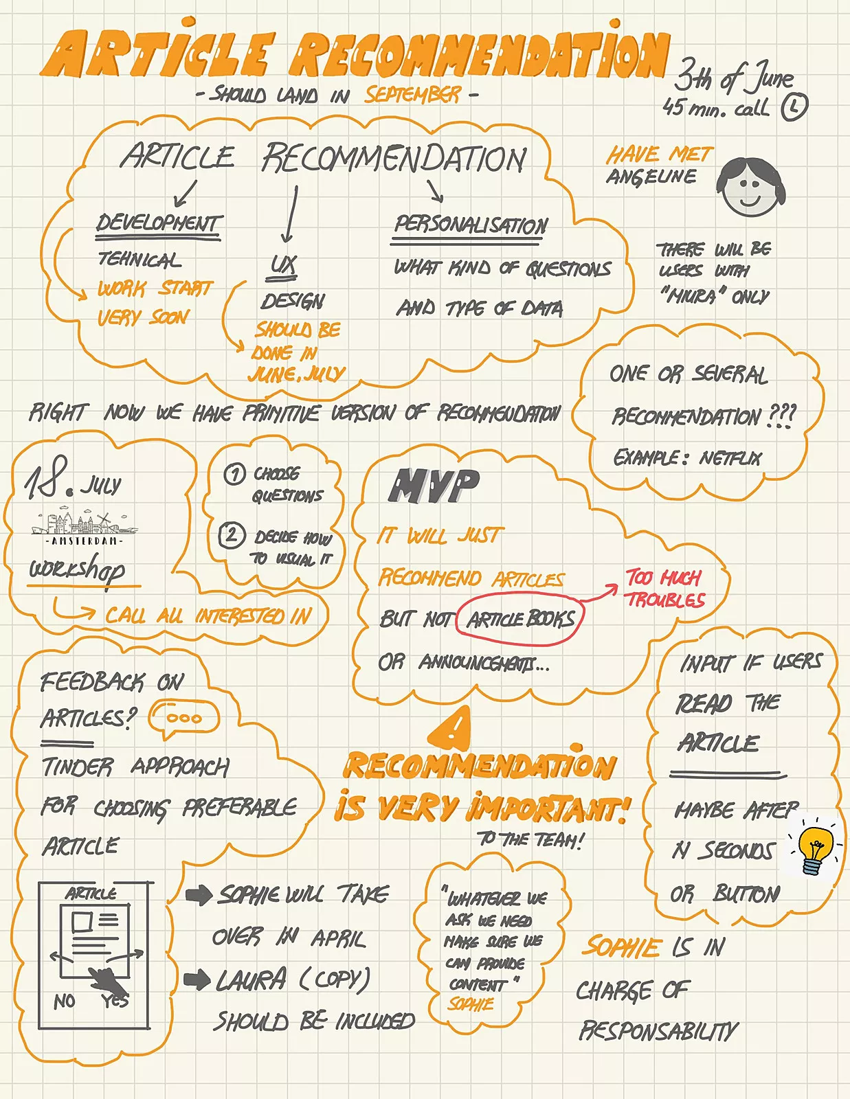
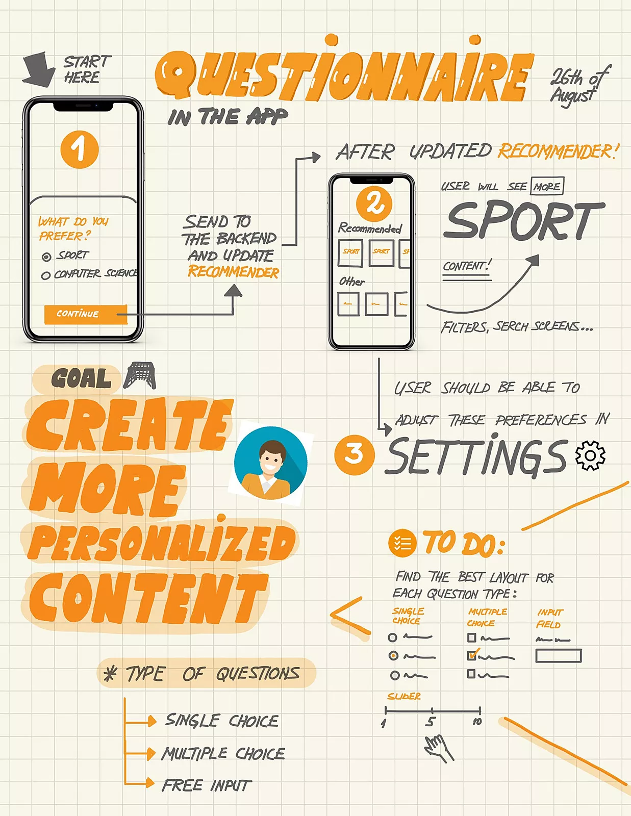
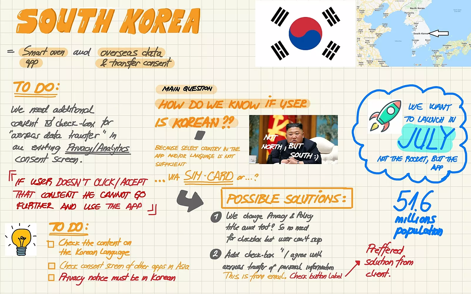
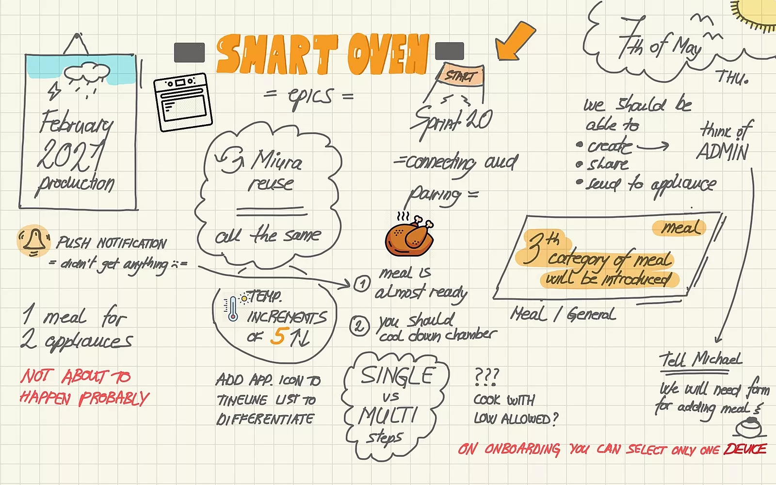
I said before that I find it difficult to remember all the things from meetings, so recently I decided to make it more memorable. If you have been taking notes like this, you’re aware that it’s not always possible to take notes – for example, if you are presenting or actively participating. Don’t force yourself to note every meeting. Do it when possible and make long calls a bit more interesting.
Creating the flow: app flow / process comic strips / storyboards
My favorite one: It just helps things clear out. I never go into digital before doing this, and I encourage you to do the same. It’s an efficient way for a designer to get a wider perspective on the flow and project itself. Do this phase right and you’ll save time in UI and be more efficient afterward.

Quick concepts
Capturing my ideas visually early on in one core image can really help get clients or teammates on board. Quick concepts don’t always have to be a design or business problem. I often use this outside of work, when I don’t understand something, or want to explore certain ideas further.
I like quick concepts because it’s an opportunity to explore the arc of what is possible before project constraints appear.
In such concepts, it’s a good idea to use arrows and annotations and include feedback directly on sketches, so people can navigate through the story even in the absence of the sketch author.
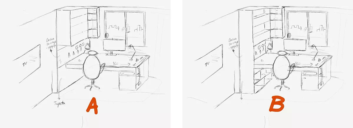
As far as the personal life sphere goes: Recently, I was making a new desk in my room so I put my ideas on paper, along with the measurements, so I could show the carpenter my idea and discuss changes on paper, rather than cutting the wrong piece of wood ahead of time.
Communicating ideas
Don’t wait to get the whole UI done to ask for feedback. Sketch ideas, ask for feedback early on, and iterate. For quick concepts, I use different annotations to communicate interactions, user actions, and everything else that might be difficult to figure out from a sketch.
Don’t worry about the looks of it
Designers have an array of techniques at their disposal, and sketching should be a part of their arsenal.
Also, keep in mind that the aesthetic of these things is the least important.
They primarily need to be useful and jumpstart your imagination. I have much more ugly than pretty notes and sketches! Of course, it’s a bonus if they look nice, but that’s not why I sketch them.
The uglier your notes are, the better and faster are your thoughts as well – and that’s the priority. You can always come back at the end and fix the font, colors, or add some visuals if something looks sketchy.

