


Another WWDC is behind us and oh boy, did they leave us with some cool new kids in town. We were kind of expecting a new UI framework that’s packing Swift’s power under the hood, but the extent of it caught us by surprise.
As a team, we’ve generally moved in the direction of writing reactive code (mostly using RxSwift), so when we saw that Apple has decided to move in the same direction with Combine, we were thrilled. To add more fuel, they’ve shown SwiftUI and all of its glory. It looked fun and snappy so we decided to give it a test ride.
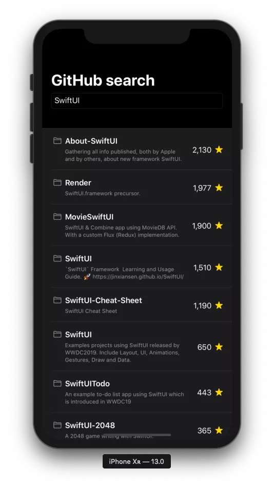
So, today we’ll be making a GitHub search app that uses SwiftUI and Combine under the hood.
Apple released beta 2 versions of both frameworks a few weeks ago, so we’ll be going with that, as it makes developers’ lives a bit easier.
GitHub search
We’ll use GitHub search as an example. It’s very straightforward, and given its features supplied with the current SDK, SwiftUI really shines.
So, what do we want to make? Something like this:
Here’s the list of components we need to make in order to get this up and running:
- A List view (obviously)
- A Row view to embed the repository, made of several components
- A
ViewModelto drive our data
Along with a couple of smaller tweaks and tricks (I’ll get into them shortly), that’s pretty much all we have to do.. That said – let’s dive in!
Making a list – the old way
If you watched most of the SwiftUI related talks, you’ve probably seen this gem. Up until this point, creating a simple list required many steps like adding a UITableView on a screen, implementing the UITableViewDataSource and the UITableViewDelegate to handle cell selection… and that’s just the UI.
Additionally, developers had to provide the data source on the presentation layer as well as to make sure the indexes are correct if any changes were made to the data source, etc.
Well, not anymore!
Making a list – the SwiftUI way
SwiftUI leverages all of that boilerplate that we needed to write before it came with its declarative handywork. It gives us an object (guess the name of that object) that simply takes a list as a data source and turns that into cells.
That object is called List and it does all the “heavy lifting” under the hood!
Making a cell is also as simple as making a simple Text(_ stringLiteral:) view inside the list.
struct ListView : View {

   var body: some View {
       List(0...5) { _ in
           Text("Repository")
       }
   }
}
In the most basic of examples, this is our list.
However, we’re making a search-enabled app, meaning we’re still missing a TextField. While we’re at it, let’s customize our row in the list as well.
Modifying views in SwiftUI is as simple as calling methods on existing views in our body property. Those methods are known as modifiers.
An important note though – each time you end up calling a modifier, a wrapper view will be created. That wrapper ends up wrapping the view you’re modifying and it’s represented as _ModifiedContent, which itself conforms to the View protocol.
Essentially, with SwiftUI, we’re building wrappers around our views which in the end represent a single view that was built around aforementioned wrappers.
struct ListView : View {

   @State var text = ""

   var body: some View {
       VStack {
           TextField($text, placeholder: Text("Search..."))
               .textFieldStyle(.roundedBorder)
               .padding([.leading, .trailing], 20)

           List(0...5) { _ in
               HStack(alignment: .top) {
                   Image(systemName: "folder")
                       .font(.subheadline)
                       .padding(.top, 5)
                       .foregroundColor(.secondary)

                   VStack(alignment: .leading) {
                       Text("Repository")
                           .font(.headline)
                           .lineLimit(2)
                           .layoutPriority(1000)

                       Text("Description")
                           .font(.caption)
                           .color(.secondary)
                           .lineLimit(nil)
                           .layoutPriority(999)
                       }
                   }
                   .padding(.leading, 5)
                   .padding([.top, .bottom], 10)

               Spacer()

               HStack(alignment: .center) {
                   Divider()
                   HStack(alignment: .center) {
                       Text("1")
                           .padding(.top, 2)

                       Image(systemName: "star.fill")
                           .font(.subheadline)
                           .foregroundColor(.yellow)
                   }
                   .padding(.leading, 10)
               }
           }
       }
   }
}
At this point, we’re almost done with the desired layout.
Adding all that vertically-written layouting code creates a lot of noise. On the plus side, a great feature in SwiftUI is that no one is really stopping you from creating another custom view and then simply constructing that inside of a list.
This way, code can be divided into smaller components that only handle a piece of the data. Let’s see this in action.
Making a Row
We will first move all the code we had into a separate RepositoryRowView. Since there’s already a lot of code even for that single view, we’ll break that down into smaller chunks.
This is the result we’re aiming for:
- Repository view
struct RepositoryRowView : View {
   var body: some View {
       HStack(alignment: .center) {
           DetailsContainerView()
           Spacer()
           StarsContainerView()
       }
   }
}

struct RepositoryRowView_Previews : PreviewProvider {
   static var previews: some View {
       return RepositoryRowView()
   }
}
- Repository details container view
struct DetailsContainerView : View {
   var body: some View {
       HStack(alignment: .top) {
           Image(systemName: "folder")
               .font(.subheadline)
               .padding(.top, 5)
               .foregroundColor(.secondary)

           VStack(alignment: .leading, spacing: 5) {
               Text("Repository")
                   .font(.headline)
                   .lineLimit(2)
                   .layoutPriority(1000)

               Text("Description")
                   .font(.caption)
                   .color(.secondary)
                   .lineLimit(nil)
                   .layoutPriority(999)
           }
       }
       .padding(.leading, 5)
       .padding([.top, .bottom], 10)
   }
}
- Repository stars container view
struct StarsContainerView : View {

   var body: some View {
       HStack(alignment: .center) {
           HStack(alignment: .center) {
               Text("1")
                   .padding(.top, 2)

               Image(systemName: "star.fill")
                   .font(.subheadline)
                   .foregroundColor(.yellow)
           }
           .padding(.leading, 10)
       }
   }
}
- List view
struct ListView : View {
   @State var text = ""

   var body: some View {
       VStack {
           TextField($text, placeholder: Text("Search..."))
               .textFieldStyle(.roundedBorder)
               .padding([.leading, .trailing], 20)

           List(0...5) { _ in
               RepositoryRowView()
           }
       }
   }
}
@State property wrapper enables SwiftUI to handle memory management of the text variable. Since we’re dealing with value types, it means our view can’t be mutated. Text changes as users type, and without the property wrapper, this wouldn’t be possible.
Design-wise, the screen is almost done!
You might notice that, compared to the initial image, a navigation bar is missing, as well as the fact that the design incorporates that new, flashy dark mode. Thankfully, both of these changes are extremely simple to make.
SwiftUI doesn’t use conventional navigation. Instead, it has an appropriate view that handles navigation. The name of the view is NavigationView, shockingly so.
This view will serve as a root and it’ll also be used as a means of setting the colorScheme of the entire view hierarchy to .dark.
Since we’re using system colors, iOS will do the heavy lifting, changing the colors of all the views accordingly.
That being said, let’s replace our root VStack with a NavigationView.
We’ll also adjust the listStyle, which is the last change we need to make to match the initial design.
struct ListView : View {
   @State var text = ""

   var body: some View {
       NavigationView {
           TextField($text, placeholder: Text("Search..."))
               .textFieldStyle(.roundedBorder)
               .padding([.leading, .trailing], 20)

           List(0...5) { _ in
               RepositoryRowView()
           }
           .listStyle(.grouped)
           .environment(\.defaultMinListRowHeight, 50)
           .navigationBarTitle(.init("GitHub search"))
       }
       .colorScheme(.dark)
   }
}
This wraps up the SwiftUI part for now.
We’ve covered a lot. Don’t miss out on the documentation Apple provided, after all, that’s the ultimate guide for everything SwiftUI-related.
The SDK is not yet complete, but if you get up to speed now, you’ll have less catching up later.
In our next post, we’ll Combine (get it?) SwiftUI with the logic required to run the app.
See you swiftly!