


To create visually stunning and color-consistent apps, designers and developers need to be on the same page about using color schemes in Flutter app design.
As a Google-made app development framework, Flutter utilizes the power of Google’s Material Design for its theming capabilities. In this blog post, we’re going to focus specifically on color schemes and what designers and developers can expect when working together on Flutter projects.
Our approach to implementing colors in Flutter app development can be applied to any kind of design and various use cases. Of course, it is not the only way to go about implementing colors in Flutter, but these suggestions are the result of our experience and come with several benefits:
Streamlining Flutter design implementation
Providing a standard and expected way of handling colors in Flutter app design
Solving some common challenges like using light and dark themes and theme changes
If you’re interested in more Flutter content, some of the topics we’ve already covered include when to choose Flutter over native, using Flutter with embedded devices, drawing charts in Flutter, and testing Flutter apps.
Theme widget
The starting point for tackling Flutter design is the Theme widget and the ThemeData class. The latter is the class that holds all the colors and allows the developer to set around 60 colors.
There are 60 colors available because Flutter supports both old and new coloring systems. Managing them all is somewhat complicated, but luckily, we can create ThemeData from the Material color scheme. This way, we only need to define 10 colors.
Tip for developers:
Use ThemeData.from(colorScheme: colorScheme) to construct the ThemeData from the color scheme.
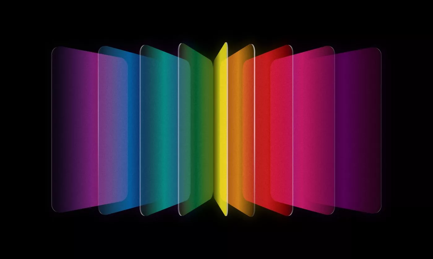
Flutter color scheme
The colors in Material schemes come in pairs. First, there is the color itself, and then there’s the color of text or other content on that color.

The 10 colors used here are not optional. They are the minimum colors required for constructing the Material color scheme in Flutter. Notice that the color names are derived from their purpose and not their specific hue. It is completely normal to have more than one color use the same hex value. In this example, you can see that OnPrimary, Surface, and OnError all use the same white color.
Color in bulk
Whenever you use a Flutter widget, it will often pull a color from those 60 colors in the theme. This means that if you set ThemeData correctly, a big portion of the app can be colored automatically without the developer needing to specify the color for every possible widget.
This system will help you streamline the implementation of the design into the app since the app will follow the color scheme from Figma directly.
Tip for developers:
If you are not an experienced Flutter developer, you might not even know the full scope of Flutter Theme possibilities. From experience, developers don’t tend to rely on Flutter Theme and set all the colors manually through code. Doing this has several disadvantages since Flutter’s system already offers a standard way of solving some app-theming challenges.
Why stop at 10 colors in Flutter design?
Apart from the 10 colors that you’re required to set, you can also define as many additional colors as you want.
Tip for designers:
Be mindful when naming the colors. Don’t call your color LightGray if it switches to white in dark theme. Try to use meaningful names that are not connected with the hue.
If you are certain that your color won’t change across themes, then it’s fine to name it Red10, Red20… or something similar. You should put all these colors in separate Figma pages because that’s what the developer will use when implementing them into the app.
Tip for developers:
Construct your ColorScheme from that Figma page. Use ThemeExtensions for any additional colors.

Referring to color names
Once a color scheme is defined on a Figma page and implemented in code, we can refer to the colors using their names. You’ll agree that this is much easier than remembering hex codes.
The colors should be added to Figma color styles. And those same colors should be used for all design elements (components, screens, etc.).
Tip for developers:
When implementing s screen, you don’t have to read the hex values. Just look at the name of the color and use it like Theme.of(context).colorScheme.primary.
Important info for designers:
There should be no unlinked colors in Figma since the developer will not be implementing the hex values directly to the screen. All the colors need to be linked so that the developer can read only the names.

However, there is an exception to this rule, and it involves graphics and assets that are exported as .svg or .png and implemented into the app as such.
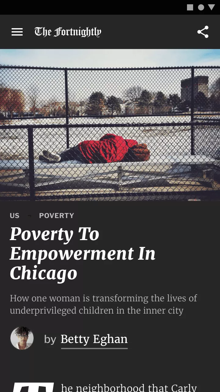
Defining multiple themes
If you’ve set up correctly everything covered so far, adding multiple themes should be a walk in the park. Designers should duplicate the color scheme page and change the color values, and developers can then add that scheme as an alternative ThemeData. This means that if we want to implement a dark theme, it’s just a matter of making a simple change in one place, and there’s no need to go through every screen.

Common use cases for alternative themes
There are several common situations that require the use of multiple themes.
Dark theme
The most common use case found in many apps.
Alternative theme
In this case, the user can select different looks for the app. Maybe there’s a special theme that is only live during the Christmas season.
Whitelabel apps
This is used when an app is exported to multiple clients, and each one of them can personalize it by changing the colors.
Section themes
It’s possible that an app has a very different color scheme used only with certain screens or flows. If this is a significant part of the app, we recommend creating a new theme for these screens.

Tip for designers:
When using multiple themes, the color names should have a common prefix or grouping defined by theme. You can do this in Figma by adding /. For example:
Light/Primary Light/OnPrimary Light/Background
Dark/Primary Dark/OnPrimary Dark/Background
Tip for developers:
All the separate themes should be implemented in the app, and depending on the use case, it’s all matter of changing the MaterialApp(theme: ) with the appropriate one. If you want to change the theme dynamically (while the app is running), we recommend rebuilding the MaterialApp with a different theme using Riverpod, Provider, Bloc, or similar solution.
The Material 2 or Material 3 dilemma
This guide is based on a color scheme that’s sometimes referred to as the Material 2 color scheme. The new version of Material design is Material 3 and contains quite a bit more colors. However, it’s still not default.
The reason why I chose to explain the workflow in Material 2, is that this guide is adaptable to any kind of design. In order to use Material 3, a designer will need to understand how Material 3 system works, as there are more colors available, and there are specific tonal relationships between them, which is much more complex than Material 2.
If a designer knows how Material 3 works, there’s no reason against using the Material 3 color scheme. However, having worked on different projects, I can say that the case is rarely that ideal. You have to find a solution that everyone involved can agree on, and the workflow I described can be applied to any project. It usually requires only minor design touch-ups, like renaming the colors.
Working together to create great Flutter app design
A well-implemented color scheme can make a big difference in the overall design of a Flutter app. By utilizing Material Design’s ten-color scheme and Flutter’s ThemeData class, developers can easily streamline the implementation of the design into the app.
Additionally, the use of multiple themes can offer users more options and allow for personalization. By taking the time to properly define and implement a color scheme, designers and developers can both take the necessary steps to create Flutter apps that are both functional and visually pleasing.
As mentioned before, the proposed workflow is not the only way to go about implementing color schemes in Flutter. However, it’s tried and tested, and judging by experience, both developers and designers benefit from it.