


With the European Accessibility Act in place, accessibility is no longer just a “good idea”. It’s now mandated by the law, compelling many teams to revisit older or still-in-progress products to make them accessible.
While engineers and testers do their part in an accessibility review, we recommend that designers dive into their Figma files.
This guide, written by designers for designers, covers conducting accessibility reviews in Figma from start to finish for projects that already exist and need improvements.
Whereas for new projects, the best move is to build accessibility in from the very beginning, so it’s not something you have to fix later.
Okay, has everyone opened their Figma yet?
Step 1: Pre-audit setup
Before you dive into the review, make sure you’re properly set up. That means knowing what you are looking for and which tools will help you along the way.
Get familiar with accessibility guidelines
There’s no way around it – you need to get comfortable with WCAG (Web Content Accessibility Guidelines). These are the internationally recognized standards that most regulations use to determine if a product is accessible. If you’re not sure whether this affects your product, learn what the European Accessibility Act means for your business.
WCAG is organized into four core principles: Perceivable, Operable, Understandable, and Robust. Each principle includes a set of success criteria that a product must meet to be considered accessible.
These criteria are grouped into three conformance levels:
- A & AA → sufficient for most digital products to be considered accessible. Meeting these levels covers the majority of accessibility needs and makes the product usable for most people with disabilities.
- AAA → the highest level of accessibility. It is not legally required and is rarely expected in full, but some AAA criteria can be valuable to consider if you’re designing for older users or audiences with specific accessibility needs.
They are structured this way to cover the entire user experience, making sure people can perceive content, operate the interface, understand the information, and rely on robust code that works across technologies.
The WCAG documentation is long and sometimes intimidating, but we have resources to make it easier to understand. We created an Accessibility Handbook and a Figma Accessibility Overview community file with visual examples of what passes and what doesn’t.
These are enough to get you started. As you progress, you’ll feel the need to check the official WCAG page for a deeper understanding of specific topics, but by then it will already feel more familiar and less overwhelming.
Know which criteria you will audit
Not every criterion can be reviewed in Figma. In existing projects, screen reader order and accessibility labels will be tested in the working product, so your development and QA teams will handle them. Depending on your product, some criteria may not apply.
For example, if you don’t use animations or have video captions, you can cross out the criteria that apply to them. Narrowing down the list right from the start makes your process quicker.
Gather tools and prepare your Figma file
- Dedicated file. Create a separate accessibility review file and a solutions proposal file for redesigns you’ll need later.
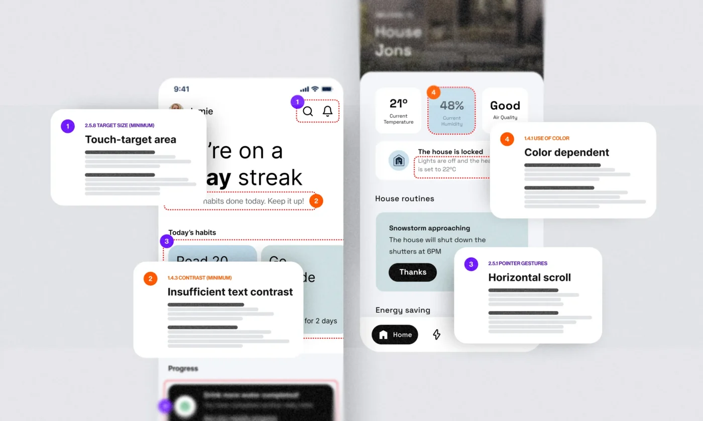
- Highlight the issues. Use simple lines or highlights to point out problematic elements on the screen.
- Label issues directly. Use notes or annotations to explain which criterion failed and why. Color-coding by WCAG principles helps you quickly identify issue categories and how many there are.
- Use plugins. We have a long list of Figma plugins and community files that you will find helpful, but a contrast checker is essential. Figma’s built-in picker works for some cases, but not always if you’re using styles/variables. So, I recommend starting the Contrast and Color Blind plugin.

Step 2: Run the audit
How you run the audit depends on your project scope and the setup of your Figma file.
At Infinum, we usually go flow by flow, starting with the most critical user journeys. Making a full product accessible takes time, so it helps to start small, often with a simpler flow to build momentum and avoid overwhelm. From there, check each screen against your criteria list, annotate issues, and move forward.
The first few screens will feel like the hardest, but once you get into the rhythm, you’ll start recognizing repeating issues. After a few flows, you will know most of the criteria by heart.
For smaller projects, you can take a different approach by reviewing one principle or criterion at a time, across all screens. For example, check all screens for contrast first, then go through them again to check the correct form labels.
Step 3: Document findings
The advantage of running reviews in Figma is that the file itself doubles as documentation. For some teams, this will be enough, especially if your clients are comfortable with Figma.
In some cases, however, using multiple formats can make collaboration smoother.
Here is a breakdown of the ones we use most often:
- Figma review file – This is where all the annotated screens live. For tracking issues and a high-level overview, you can use our Accessibility Checklist. You can also add a dedicated findings page that summarizes the most common mistakes and action points. Once you begin working on fixes, set up a separate solutions proposals page or file where you keep before/after examples to review with the team.
- Document or presentation – Useful when handing findings off to stakeholders. This format adds context: why accessibility matters, which criteria failed, the most critical issues, and before/after examples that show the impact of fixes.
- Tasks (e.g., Productive, Jira, Miro) – Turning discovered issues into tasks makes them actionable and trackable. Usually handled by a project manager, this approach keeps everyone aligned from design through development to QA. It will also come in handy when tracking fixes later in the process.
Step 4: Align with the team
Once the review is finished, the next step is to align with developers and project managers.
A live handoff session is the best way to do this. Here, designers walk developers through the main findings, identifying which fixes will be design-driven and which will require code changes. It’s also a good opportunity to get developer input, since they may notice issues you missed.
Together with PMs, the team then prioritizes the fixes, agreeing on scope and order. This ensures everyone is aligned on what to tackle first and how to move forward.
Step 5: Track fixes
Tracking fixes can be done in several ways, depending on your project setup and team size.
Once you’ve prioritized what to fix and in which order, start by creating solutions in your solutions proposals file. Review them with developers, align on the changes, then apply them to your actual flows and design system.
If tasks were created earlier, use them to track progress. If not, open your own tasks or create a to-do list; sometimes even something as simple as adding checkmarks next to the screens in your review file works, giving you a quick overview of what’s already been fixed and what’s left.
Consistency beats perfection
Accessibility reviews can feel daunting, especially if you’re not fully familiar with the rules or the process. But with the right setup, clear guidelines, and good collaboration with your team, they become manageable.
Reviews won’t always run smoothly. Some fixes will be straightforward, while others will require deeper research and team support. That’s normal. Over time, you’ll also figure out how to adapt the review process to best fit your team and your workflow.
What matters is being consistent with accessibility and making steady progress with every project. Hopefully, this guide will help you feel more confident as you take on your next review.