


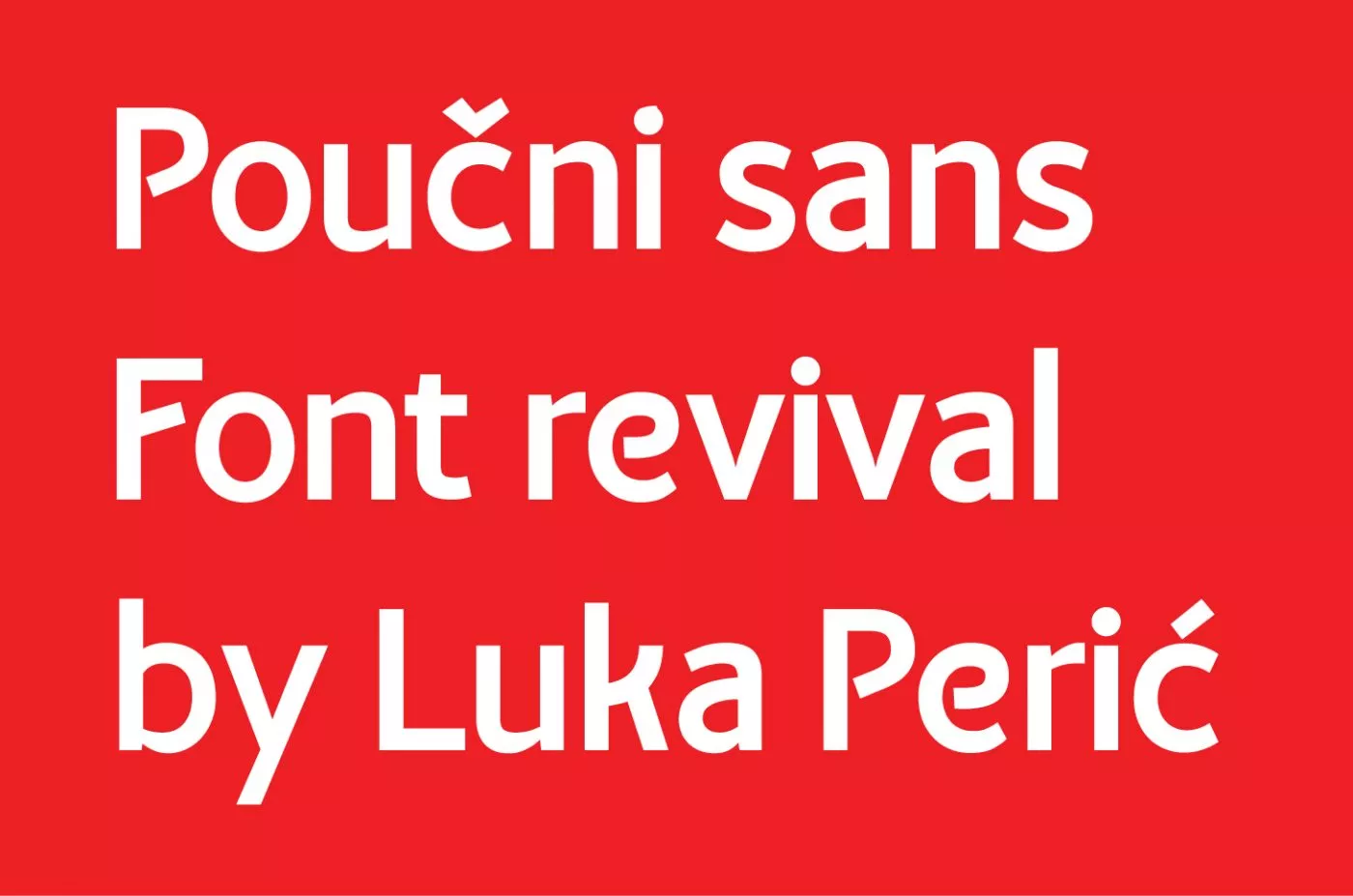
Typography has always been a passion of mine, so doing a font revival was an interesting endeavor for me. When doing typeface revivals, you basically take several letters from an old, undigitalized, typeface and design the rest of the glyphs (letters and characters).
I decided to revive title lettering from an old book published by the St. Jerome Society and create the Poučni Sans font. Poučni Sans is a typeface created by reviving the title lettering of the book Instructive Conversations published in 1909 by the St. Jerome Society.
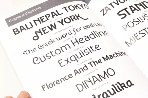
The typography is low contrast intended for text and display, and there are basically 4 styles:
- regular
- italic
- bold
- bold italic

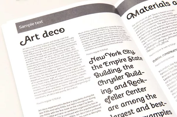
An interesting fact is that italic style is principally a deco style, inspired by letters O and Č from the cover of the book, and other letters and details were built based on that.
Starting a revival

When doing a revival typeface, the goal is not to make a digital copy of an existing typeface. The goal is to copy it to some degree, but also make improvements regarding spacing, tracking and the form of a letter.
After doing that, the next step can be adding your own feature, your own personal touch. That can be anything from an open type feature to a different font style. My personal touch was creating a deco looking italic style.
Font weights
First I went about creating the regular and bold styles.


After creating the regular and bold styles, my next step was creating italics. Italics were inspired by the letters “O” and “C” from the book cover.

It has a swirly line that enters the counter (the inside of the letter), from which I developed a series of glyphs with swashes. By doing that, I got a distinctive italic form that I actually prefer to call “Deco” style.
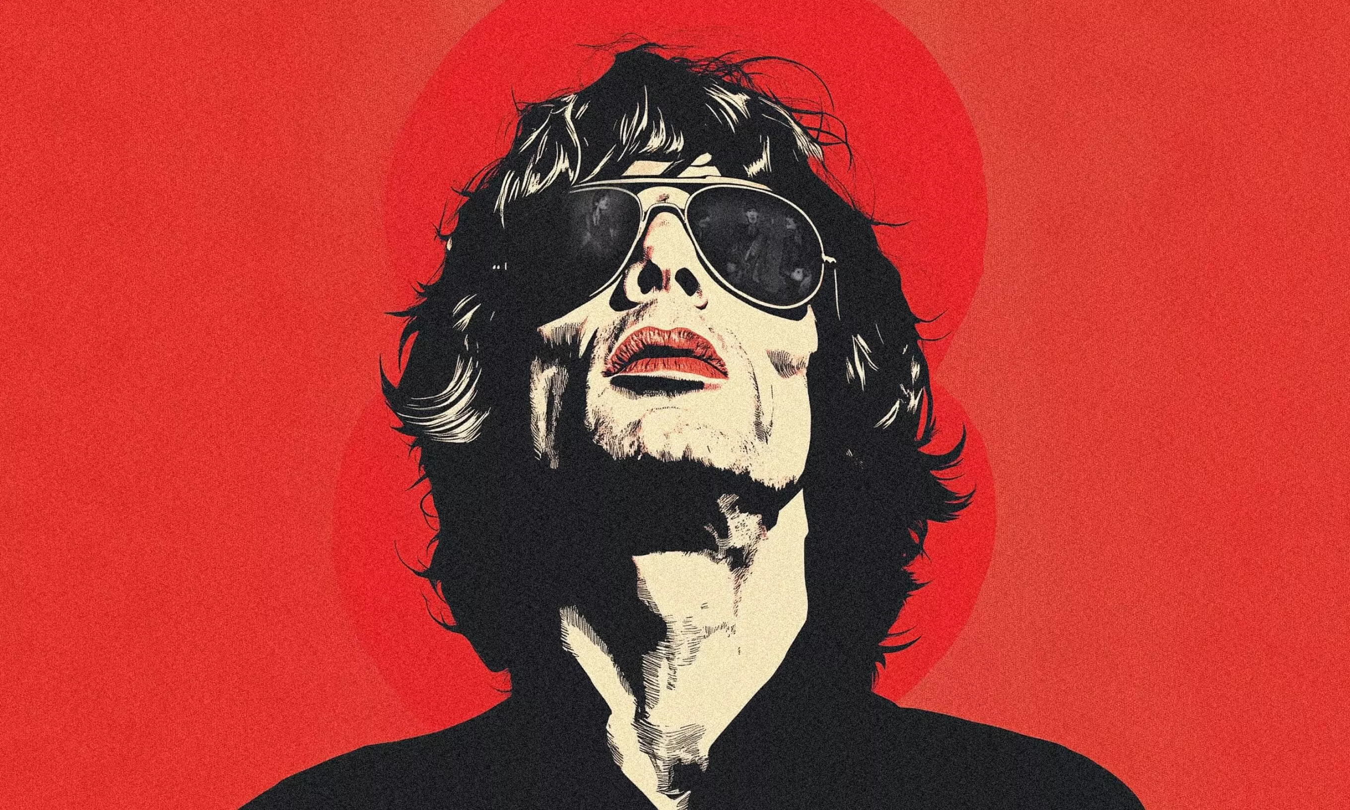
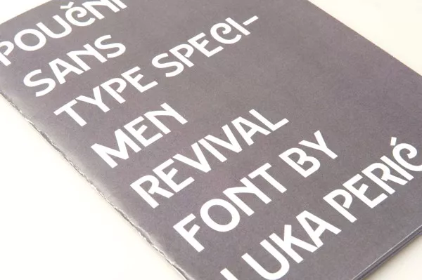
Type specimen


The final product
Here are some specimen photos of the final product.
Where could this font be used?
Because of it’s legibility, Poučni Sans can be used for body text in the normal style, while the italic style is intended for highlighting words, headings, subheadings and posters (mostly because of the art deco inspired swashes).
There’s also a set of alternate glyphs that can be used instead of lettering, when combined properly.