


After more than two years of development, Google’s modern toolkit for native UI reached its stable build.
Jetpack Compose is now officially 1.0.
It’s official: Jetpack Compose is now officially a stable version, but it has actually been used in its pre-release state since 2020 – so much so that there were 2000+ apps using Compose in the Play Store at the time of the official release. I mean, even the Play Store app itself uses it.
We’ve introduced Compose’s basics in a previous blog post, so now is the perfect time to concentrate on some of its features in more detail.
This blog post covers the tool’s core functionality – State. We’ll get into composition and recomposition, stateful composables, making them stateless with state hoisting, and their integration with ViewModel. We’ll also introduce animations to make the UI more alive. Finally, we’ll write instrumental tests to demonstrate how to test Composables.
(Re)composition and state management
State in Compose
State is one of Compose’s core principles, declared as any value that can change over time. Let’s use the example from the previous blog post:
@Composable
fun InfinumContent() {
   Surface(shape = MaterialTheme.shapes.large) {
       Row {
           Image(
               ...
           )
           Text(
               ...
           )
       }
   }
Imagine that the composable content above initially only displays the Infinum logo and then a click reveals the word “Infinum”. It’s possible to achieve that effect with the help of State. However, first we need to explain how Composable runs composables (composition) and how it reacts to state changes (recomposition).
Composition and recompositon
Composition is the tree structure made up of composables used to describe the UI, accomplished by running composables. When we emit a user interface for the first time, that’s the initial composition. During that initial composition, Jetpack Compose tracks the composables that we called to describe the user interface.
Every time the app’s state changes, a recomposition takes place. It re-runs the composables to update the composition.
Stateful composables
Every composable function has its own memory space. We can store mutable and immutable objects inside that memory space with the composable remember. The value computed by remember is stored in the composition during initial composition, and that stored value is returned during recomposition. If a composable function contains remember, that composable is called statefully composable because it holds a local state.
In our example the goal is to display only the Infinum logo initially and then show the word “Infinum” when a click is performed. We need to store a variable that represents the current state in the composable’s memory: whether the composable is expanded or not. To do this, add the following line inside the beginning of InfinumContent:
var expanded by remember { mutableStateOf(false) }
The expanded boolean value is stored in the composable’s memory by calling remember. The function mutableStateOf used above is just an observable type in Compose. Every time that a value changes, Compose performs a recomposition of any composable function that reads that value. As you can see, during the initial composition our composability is not expanded.
We need to somehow change the expanded value on click. To do this, we add a modifier attribute on Surface:
Surface(
   ...
   modifier = Modifier.clickable {
       expanded = !expanded
   }
)
Every time a user clicks on the surface, the variable expanded changes. However, no recomposition will take place when expanded changes because we’re not reading that value anywhere. This is the composable Wrap Text with an if-statement that checks the value of expanded:
if (expanded) {
   Text(
       ...
   )
}
When the value of expanded changes, a recomposition will be scheduled. Compose is smart enough to update only the if-statement because it has read that value.
@Composable
fun InfinumContent() {
   var expanded by remember { mutableStateOf(false) }
   Surface(
       ...
       modifier = Modifier.clickable {
           expanded = !expanded
       }
   ) {
       Row(
         ...
       ) {
           Image(
              ...
           )
           if (expanded) {
               Text(
                   ...
               )
           }
       }
   }
}

The function remember helps us retain a state through recomposition, but it doesn’t retain a state when a change in configuration occurs. If some data needs to be retained after configuration changes, you need to use rememberSaveable, equivalent to onSaveInstanceState in view-based UI. Of course, the best solution would be to store data inside ViewModel, whose integration will be explained later.
Stateless composables and state hoisting
Our composable from the previous section InfinumContent is stateful because it holds a state. Stateful composables are hard to test and reuse because they are tightly coupled to that state. Instead, we should make our composables stateless and move that state out of the composable function. We can do that with state hoisting.
State hoisting is a programming pattern for moving the state higher up in the composition tree, usually to the caller, to make a composable stateless. The easiest way to do that is to replace the state with a function parameter and an event with a lambda function to do a particular action when the value changes.
Let’s make our InfinumContent stateless. Add a function parameter of the Boolean type that will represent the state and a lambda function to represent an event to be invoked when the state changes. This is how our InfinumContent looks like now:
@Composable
fun InfinumContent(expanded: Boolean, onExpandedChange: (Boolean) -> Unit) {
   Surface(
       ...
       modifier = Modifier.clickable {
           onExpandedChange(!expanded)
       }
   ) {
       Row(
          ...
       ) {
           Image(
              ...
           )
           if (expanded) {
               Text(
                   ...
               )
           }
       }
   }
}
Change the onCreate method inside MainActivity as follows:
override fun onCreate(savedInstanceState: Bundle?) {
   super.onCreate(savedInstanceState)
   setContent {
       InfinumComposeAppTheme {
           var expanded by rememberSaveable { mutableStateOf(false) }
           InfinumContent(
               expanded = expanded,
               onExpandedChange = { expanded = it }
           )
       }
   }
}
As you can see, the state is hoisted to the caller and we use rememberSaveable instead of remembering because we want to survive configuration changes. Also, pay attention to how we named the lambda function. It’s onExpandedChange, present tense, not onExpandedChanged. The state hasn’t changed yet and a composable function is requesting the event handler to change it. The state moves down (onCreate → InfinumContent) and the event moves up (InfinumContent → onCreate). That pattern is called unidirectional data flow and it’s one of the core principles in the composable world.
Integration with ViewModel
Storing the state inside rememberSaveable is good enough for simple cases. When there are complex data objects involved, a better solution is to store that state inside the ViewModel. Compose provides support for ViewModel integration. We can move our state inside the ViewModel, expose it in an observable holder, and handle events that request state changes.
Create the following ViewModel class:
class MainViewModel: ViewModel() {

   private val expanded = MutableLiveData(false)
   val expandedHolder: LiveData<Boolean> = expanded

   fun onExpandedChange(newExpanded: Boolean) {
       expanded.value = newExpanded
   }
}
Refactor onCreate inside MainActivity as follows:
override fun onCreate(savedInstanceState: Bundle?) {
   super.onCreate(savedInstanceState)
   setContent {
       InfinumComposeAppTheme {
           val viewModel = viewModel(modelClass = MainViewModel::class.java)
           val expanded by viewModel.expandedHolder.observeAsState(false)
           InfinumContent(
               expanded = expanded,
               onExpandedChange = { viewModel.onExpandedChange(it) }
           )
       }
   }
}
Compose provides the function viewModel() for getting an instance of the provided ViewModel class. The function follows the lifecycle of the caller by default, in this case Activity. The variable expanded is obtained by exposing LiveData inside the ViewModel and it’s observed as State. A state is another observable type that Jetpack Compose can use directly. The function observeAsState observes LiveData and returns a State object that is updated whenever LiveData changes. The parameter “by” is just the Kotlin syntactic way for unwrapping the returned value from State, in this context, Boolean.
Animations in Jetpack Compose
Overview
Animations are great tools in modern app development that help us build a more creative and better user interface. Jetpack Compose provides an API for easier animation implementation. The animation API in Compose is divided into two sections:
- High-level animation API – contains common animation patterns used across the app and is most suitable for Material Design Motion
- Low-level animation API – gives more control and customization options and is built with Kotlin coroutine suspending functions
In this article, we’ll cover only the High-level animation API. You can find out more about low-level APIs here.
AnimatedVisibility (experimental)
The AnimatedVisibility composable animates the appearance and disappearance of its content. By default, content appears by fading in and expanding, and disappears by fading out and shrinking. Keep in mind that this is an experimental API so it might change in the future or be completely removed.
Replace the if-statement inside InfinumContent with AnimatedVisibiliy as follows:
@Composable
fun InfinumContent(expanded: Boolean, onExpandedChange: (Boolean) -> Unit) {
   ...
   AnimatedVisibility(visible = expanded) {
               Text(
                   ...
               )
           }
       }
   }
}

AnimateContentSize
As its name says, AnimateContentSize animates the size changes of the called composable. Inside InfinumContent, add the animateContentSize modifier to the composable you want to animate:
@Composable
fun InfinumContent(expanded: Boolean, onExpandedChange: (Boolean) -> Unit) {
   Column(
     ...
   ) {
       Card(
           modifier = Modifier
               ...
               .animateContentSize()
       ) {
          ...
       }
   }
}

Crossfade
Crossfade animates the switch between two layouts with a crossfade effect. Let’s say we want to accomplish that between the non-expanded state only showing the Infinum logo composable and the expanded state that shows only the Infinum text composable. Switching between these composables needs to be done with a crossfade. Refactor InfinumContent in the following way:
@Composable
fun InfinumContent(expanded: Boolean, onExpandedChange: (Boolean) -> Unit) {
   Column(
      ...
   ) {
       Card(
           ...
       ) {
           Row(
               ...
           ) {
               Crossfade(targetState = expanded) {
                   if (it) {
                       Text(
                          ...
                       )
                   } else {
                       Image(
                          ...
                       )
                   }
               }
           }
       }
   }
}
Testing a Compose layout
Overview
Testing a Compose layout is substantially different than testing view-based UI. View-based UI architecture defines what the view is. The view occupies its space on screen and has attributes such as the identifier, margins, padding, etc.
On the other hand, composables are functions that emit pieces of UI. They don’t have attributes or identifiers to distinguish them by. We will test our sample by introducing semantics.
Semantics
We need a way to identify our composables. Semantics, as the name implies, gives meaning to a piece of UI, it describes it. Semantics are generated alongside the UI hierarchy emitted on screen. A piece of UI in semantics can be anything, from a whole screen to just a single composable.
Testing the InfinumContent composable
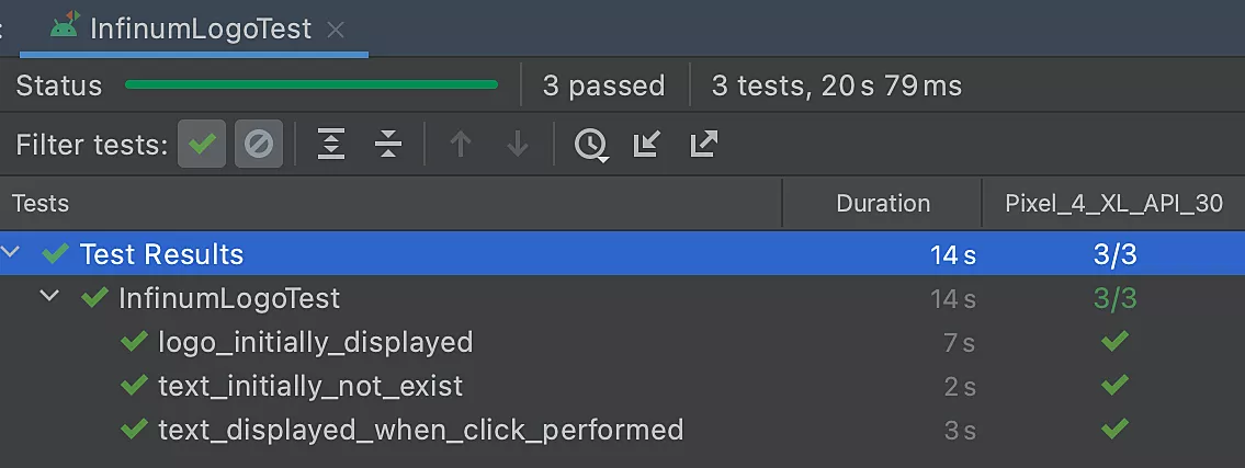
Compose tests are instrumented tests that will be executed on an Android device. To perform this test, create the InfinumLogoTest class inside the androidTest folder as follows:
@RunWith(AndroidJUnit4::class)
class InfinumLogoTest {

   @get:Rule
   val composeTestRule = createAndroidComposeRule<MainActivity>()
   ...
}
We are creating composeTestRule by calling createAndroidComposeRule with the given activity. With this rule, we can use Compose functionalities or access the Activity directly if we need to.
We want to check if only the logo is displayed initially. Since the logo is an Image composable and it must have the contentDescription attribute, this would be our testing method:
@Test
fun logo_initially_displayed() {
   val infinumLogo = composeTestRule.activity.getString(R.string.infinum_mark_description)
   composeTestRule.onNodeWithContentDescription(infinumLogo).assertIsDisplayed()
}
We use composeTestRule to access the Activity directly to fetch the String that represents the Image content description. We then call the function onNodeWithContentDescription() with a given String, which will try to find a semantic node with that description. And finally, we call assertIsDisplayed() on that semantic node representing the Infinum logo. Our test is successful!
Next, we test to confirm that the text doesn’t initially exist inside the composition. Let’s use this method:
@Test
fun text_initially_not_exist() {
   val infinumText = composeTestRule.activity.getString(R.string.infinum)
   composeTestRule.onNodeWithText(infinumText).assertDoesNotExist()
}
Since the Text composable doesn’t have a content description, we can’t use the onNodeWithContentDescription() function. Instead, we can use onNodeWithText() with the provided text and then call assertDoesNotExist(). Another success!
Finally, we want to test that the text is displayed when a click is performed. Our clickable composable inside InfinumContent is a Card. A card doesn’t have a text or content description. We need to somehow tag that component to use it inside our test class.
Let’s declare our tag for that Card composable:
const val INFINUM_CARD = "Infinum Card"
Connect the composable Card with the declared tag as follows:
@Composable
fun InfinumContent(expanded: Boolean, onExpandedChange: (Boolean) -> Unit) {
   Card(
       ...
       modifier = Modifier
           ...
           .testTag(INFINUM_CARD)
   ) {
      ...
   }
}
Our test function then looks like this:
@Test
fun text_displayed_when_click_performed() {
   val infinumText = composeTestRule.activity.getString(R.string.infinum)
   composeTestRule.onNodeWithTag(INFINUM_CARD).performClick()
   composeTestRule.onNodeWithText(infinumText).assertIsDisplayed()
}
Now we are calling the onNodeWithTag() function with a given tag, and simulating the click event by calling the performClick() method. After that, we are checking to see if the text “Infinum” is displayed. Again, it passed the test.
Jetpack Compose pros & cons
Jetpack Compose is a powerful tool for building native Android UI. A major advantage of the declarative approach is that we just describe the UI and Compose takes care of the rest as the app state changes. This example showed how quick and easy it is to build the Infinum logo, style it and animate it on click. In other words, you can do more with less code.
The preview feature in Android Studio is an unquestionable development accelerator because you can immediately see how the UI is going to look like. Plus, with interactive mode, you can perform clicks and see the changes.
Furthermore, Compose is interoperable with existing view-based UI so we can quickly switch between the two. This feature comes in handy for migrating a project to Compose because migrating an entire app at once is not a small task.
Compose also provides us with other great features such as the built-in Material Design support for styling, Dark Theme support, powerful Animation API for creating a livelier UI, etc.
On the other hand, integration with other Jetpack components could also be better. Some views inside view-based UI don’t exist in Compose so we need to use AndroidView and custom solutions. Lack of support for most popular libraries nowadays is also a disadvantage.
Jetpack Compose – looking forward
Overall, the previous Android UI toolkit was not sustainable. The API started showing signs of aging, it was tightly coupled with Android OS, not Kotlin based, and lacked Material Design support. Just looking at the base Android View class, we can see that there are over 30,000 lines of code.
Jetpack Compose is an enormous turning point for building native Android UI, not just from the practical side, but in the way we think about it. With the stable version, it’s well on its way to completely replacing Google’s existing toolkit.