


Are you looking for a modern declarative framework designed for building a native Android user interface? Jetpack Compose makes writing and maintaining our UI easier, features Material Design support for theming, is compatible with the existing view-based architecture, and is built entirely on top of Kotlin.
On the recently hosted I/O, Google announced that Jetpack Compose would hit the stable version in July, so the time is right to get up to speed.
What is a declarative framework?
Usually, an Android view is a tree representation of widgets. As the application state changes due to various user events, we must update the widgets accordingly. The most common way to do that is to walk the tree using functions like findViewById() and change the internal state of the widget.
Manual manipulation of views increases the possibility of state inconsistency. Imagine that you have a complex UI with a lot of TextViews, Buttons, and ImageViews. Application state changes and user interface needs to be updated. If we forget to update at least one widget that should be updated with new data, the result is inconsistency between states. And here comes a declarative UI model to the rescue.
A declarative UI model regenerates an entire screen from scratch when the state changes. With this approach, we avoid the complexity of manually updating the view-based hierarchy and also reduce potentially forgotten updated views.
Regenerating the entire screen is expensive, and Jetpack Compose is smart enough to detect which parts of the user interface need to be redrawn at any time.
Styling in Jetpack Compose: Layouts and theming
Before diving deeper into Jetpack Compose, you must download and install the latest beta version of Android Studio Preview to use Compose functionalities. The latest beta version of Android Studio Preview provides core features such as a New Project template for Compose and the ability to preview Composable functions.
Jetpack Compose Setup
If you want to start a new project, navigate to templates, select Empty Compose Activity, and IDE will do the rest.
If you want to integrate Compose into an existing project, you must configure your project with the required settings and dependencies.
Make sure that you are using Kotlin 1.4.30 or newer inside your project:
buildscript {
    ext {
        kotlin_version = "1.4.32"
        compose_version = "1.0.0-beta07"
                ...
    }
    dependencies {
        classpath "org.jetbrains.kotlin:kotlin-gradle-plugin:$kotlin_version"
                ...
    }
}
Next, ensure the minimum supported API version is set to 21 or higher, as shown below. Also, do not forget to enable the Jetpack Compose feature, set the Kotlin compiler settings, and add Compose-related dependencies:
android {

    defaultConfig {
        minSdkVersion 21
                ...
    }

    compileOptions {
        sourceCompatibility JavaVersion.VERSION_1_8
        targetCompatibility JavaVersion.VERSION_1_8
    }

    kotlinOptions {
        jvmTarget = JavaVersion.VERSION_1_8
        useIR = true
    }

    buildFeatures {
        compose true
    }

    composeOptions {
        kotlinCompilerExtensionVersion compose_version
        kotlinCompilerVersion kotlin_version
    }
}

dependencies {

    implementation "androidx.compose.ui:ui:$compose_version"
    implementation "androidx.compose.material:material:$compose_version"
    implementation "androidx.compose.ui:ui-tooling:$compose_version"
    implementation "androidx.compose.runtime:runtime-livedata:$compose_version"
    androidTestImplementation("androidx.compose.ui:ui-test-junit4:$compose_version")
    implementation "androidx.activity:activity-compose:1.3.0-alpha08"
    implementation "androidx.lifecycle:lifecycle-viewmodel-compose:1.0.0-alpha05"
        ...
}
Getting started with Jetpack Compose
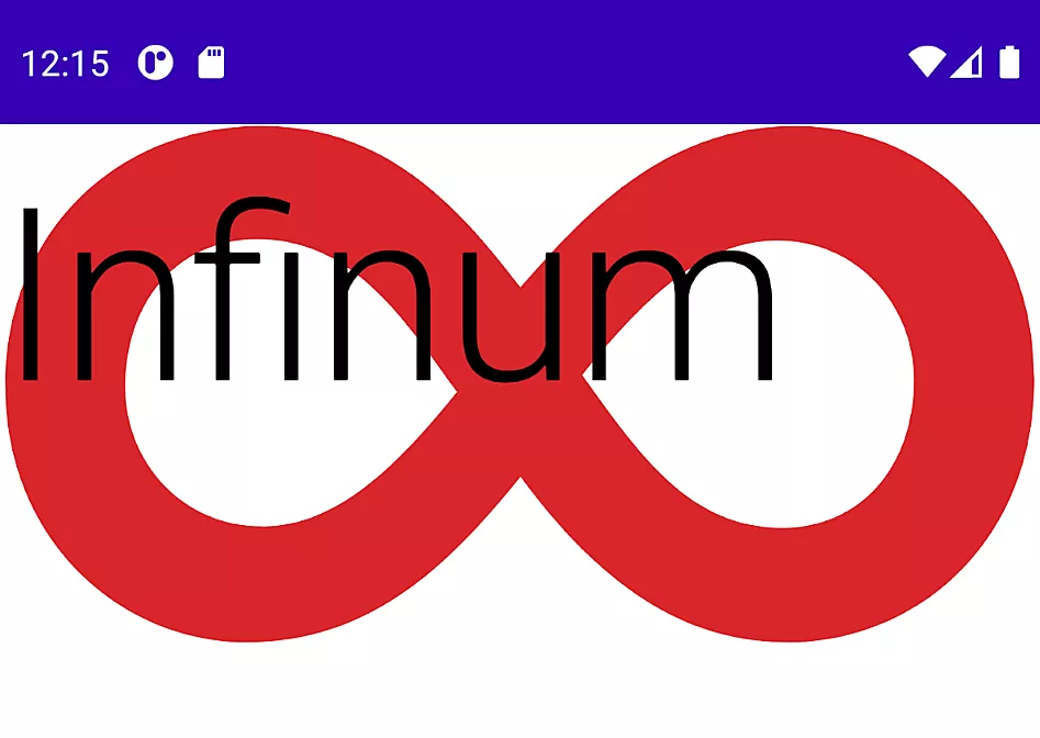
Let’s look at an example including a simple image and the corresponding text emitted on screen. To do that, we need to call composable functions from the setContent block. Composable functions are regular functions annotated with @Composable, emitting UI elements and showing them on screen.
You must annotate all composable functions with @Composable because it tells the Compose compiler that the function is intended to convert data into UI. Composable functions don’t return anything, they only describe some piece of UI, and are written with the first uppercase letter.
Declare the following composable function:
@Composable
fun InfinumContent() {
   Image(
       painter = painterResource(id = R.drawable.ic_infinum_mark),
       contentDescription = stringResource(id = R.string.infinum_mark_description)
   )
   Text(
       text = stringResource(id = R.string.infinum)
   )
}
Text is a composable function that emits text on the screen and its TextView equivalent in regular view-based UI. Image is a composable function for emitting images on screen, and it is equivalent to ImageView.
Open or create MainActivity and paste the following:
class MainActivity : AppCompatActivity() {

   override fun onCreate(savedInstanceState: Bundle?) {
       super.onCreate(savedInstanceState)
       setContent {
          InfinumContent()
       }
   }
}
setContent is the composable equivalent to setContentView. It composes given composables inside the block. This means that the content declared inside the block will become the root view of a given activity; in this example MainActivity.
Previewing layouts with Jetpack Compose
Instead of running the project every time a change occurs, Android Studio provides a feature for previewing layouts and how they will appear on screen. Declare another composable function and annotate it with @Preview.
Within it, call a composable function that you initially want to inspect. Preview composable functions don’t accept parameters. If we want to inspect how InfinumContent shows on screen, we can achieve this by declaring the preview composable function as follows:
@Preview
@Composable
fun PreviewInfinumContent() = InfinumContent()

Basic layouts in Jetpack Compose
Now that we have learned how to create a simple view, we can discuss possible layout variations. Jetpack Compose provides aRow, composable layout that places its children in a horizontal sequence. It is equivalent to LinearLayout with horizontal orientation.
For a vertical sequence of children, there is a Column composable. It is equivalent to LinearLayout with vertical orientation. In this example, we want the text to show after the logo and we can achieve that by writing the following snippet:
@Composable
fun InfinumContent() {
   Row(verticalAlignment = Alignment.CenterVertically) {
       ...
   }
}

Other layouts that we will use often are:
Box– allows us to have items behind and/or in front of others and it is equivalent toFrameLayoutin view-based UIConstraintLayout– helps us place composables relative to others on the screen and as the name implies, equivalent to the same layout in view-based UI
LazyColumn–RecyclerViewwithLinearLayoutManagerequivalent in view-based UI
LazyRow–RecyclerViewwithLinearLayoutManager.HORIZONTALequivalent in view-based UI
Theming in Jetpack Compose
The previous section shows how quickly we can build a piece of UI with Jetpack Compose. Moving on to cover theming in Compose, it comes with Material Design built-in support which is easy to customize. In case you are unfamiliar with Material Design, it is a design system for digital interfaces that is comprised of colors, typography, and shape attributes.
Colors in Jetpack Compose
The usual practice in Compose is to declare colors inside the Color.kt file, which is equivalent to colors.xml in view-based UI.
Create the file and define just one custom red color variant as follows:
val InfinumRed = Color(0xFFD9262B)
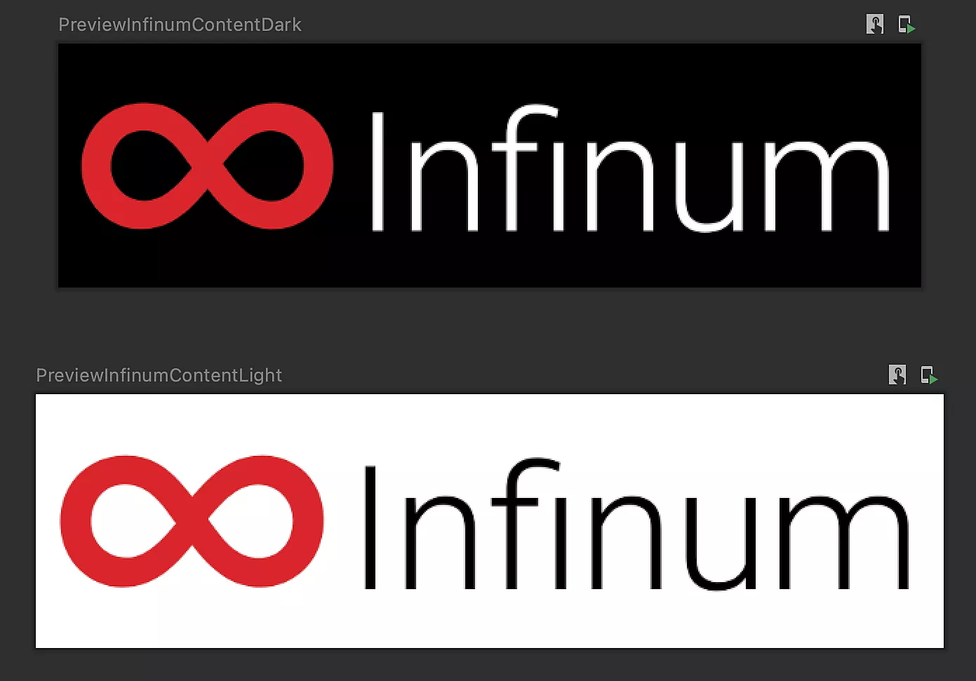
Jetpack Compose provides support for Light and Dark Theme, leaving you to declare which colors will be displayed where. It is best to put everything theme-related inside the Theme.kt file which is equivalent to themes.xml in view-based UI.
We will define our Dark and Light Color palettes, put them inside the file mentioned above and use the defined custom color and other default ones:
private val DarkColorPalette = darkColors(
   primary = InfinumRed,
   primaryVariant = InfinumRed,
   secondary = InfinumRed,
   background = Color.Black,
   surface = Color.DarkGray,
   onPrimary = Color.White,
   onSecondary = Color.White,
   onBackground = Color.White,
   onSurface = Color.White
)

private val LightColorPalette = lightColors(
   primary = InfinumRed,
   primaryVariant = InfinumRed,
   secondary = InfinumRed,
   background = Color.White,
   surface = Color.White,
   onPrimary = Color.White,
   onSecondary = Color.Black,
   onBackground = Color.Black,
   onSurface = Color.Black
)
In the same Theme.kt file, wrap everything into the composable function which we will call everywhere to apply custom theming:
@Composable
fun InfinumComposeAppTheme(
   darkTheme: Boolean = isSystemInDarkTheme(),
   content: @Composable () -> Unit
) {
   val colors = if (darkTheme) {
       DarkColorPalette
   } else {
       LightColorPalette
   }

   MaterialTheme(
       colors = colors,
       content = content
   )
}
Now, add the composable function above inside setContent before emitting content:
override fun onCreate(savedInstanceState: Bundle?) {
   super.onCreate(savedInstanceState)
   setContent {
       InfinumComposeAppTheme {
           InfinumContent()
       }
   }
}
By calling InfinumComposeAppTheme before emitting content, we explicitly say that we want to use Material Design attributes from that custom composable function. It is similar to declaring an application theme inside in a regular view-based UI.
Finally, add color attributes to our InfinumContent composable function to get the effect:
@Composable
fun InfinumContent() {
Row(Modifier.background(MaterialTheme.colors.background)) {
       Image(
           ...
           colorFilter = ColorFilter.tint(InfinumRed)
       )
       Text(
           ...
           color = MaterialTheme.colors.onBackground
       )
   }
}
Typography in Jetpack Compose
Regarding typography and how to show custom fonts, the best practice in Jetpack Compose is to put all typography-related stuff into theType.kt file. Create the file and declare a custom font family as follows:
val GTHaptik = FontFamily(
   Font(R.font.gt_haptik_regular, FontWeight.Normal),
   Font(R.font.gt_haptik_bold, FontWeight.Bold)
)
Inside the same file, create the typography object with an upper font family. For simplicity, we only use the h2 style:
val Typography = Typography(
   h2 = TextStyle(
       fontFamily = GTHaptik,
       fontWeight = FontWeight.Bold,
       fontSize = 60.sp,
       letterSpacing = (-0.5).sp
   )
)
Inside the Theme.kt file, update InfinumComposeAppTheme with the previously declared typography attribute:
@Composable
fun InfinumComposeAppTheme(
   darkTheme: Boolean = isSystemInDarkTheme(),
   content: @Composable () -> Unit
) {
   ...
   MaterialTheme(
       ...
       typography = Typography
   )
}
Inside InfinumContent add style to Text composable to get the effect:
@Composable
fun InfinumContent() {
       ...
       Text(
           ...
           style = MaterialTheme.typography.h2
       )
   }
}

Shapes in Jetpack Compose
With shape customization, we want our composable content to have rounded corners. To do that, the best practice is to create the Shape.kt file and define shapes for small, medium and large components as follows:
val Shapes = Shapes(
   small = RoundedCornerShape(4.dp),
   medium = RoundedCornerShape(8.dp),
   large = RoundedCornerShape(16.dp)
)
Inside the Theme.kt file, update InfinumComposeAppTheme with previously defined shapes attribute:
@Composable
fun InfinumComposeAppTheme(
   darkTheme: Boolean = isSystemInDarkTheme(),
   content: @Composable () -> Unit
) {
   ...
   MaterialTheme(
       ...
       shapes = Shapes
   )
}
Since shapes are used on the surface, not in the background, wrap Row composable inside the InfinumContent with Surface composable to get the effect:
@Composable
fun InfinumContent() {
   Surface(shape = MaterialTheme.shapes.large) {
       Row {
           Image(
               ...
           )
           Text(
               ...
            )
       }
     }
}

Ready to adopt? Jetpack Compose interoperability
Jetpack Compose is interoperable with existing view-based UI. If you are building a new application from scratch, implementing a UI complete in Compose is the best option.
If you have an existing project and want to migrate to Jetpack Compose, it is a big step to migrate all at once. Instead, you can combine Compose with existing UI design implementation.
Compose in Android Views
We already covered using Compose inside Activity in previous sections. To create an entire Compose-based UI, call setContent inside the onCreate method in Activity and pass whatever composable functions you like, like the following:
override fun onCreate(savedInstanceState: Bundle?) {
   super.onCreate(savedInstanceState)
   setContent {
       val viewModel = viewModel(modelClass = MainViewModel::class.java)
       InfinumHome(viewModel)
   }
}
When you want to use Compose functionalities in an existing Fragment, we need to add ComposeView inside the fragment layout and call setContent on that view. ComposeView is Android View that it is attached to LifecyleOwner like any other view.
Simply add ComposeView into XML layout:
<?xml version="1.0" encoding="utf-8"?>
<androidx.constraintlayout.widget.ConstraintLayout
   xmlns:android="http://schemas.android.com/apk/res/android"
   xmlns:app="http://schemas.android.com/apk/res-auto"
   android:id="@+id/container"
   android:layout_width="match_parent"
   android:layout_height="match_parent">

   <androidx.compose.ui.platform.ComposeView
       android:id="@+id/composeView"
       android:layout_width="0dp"
       android:layout_height="0dp"
       app:layout_constraintBottom_toBottomOf="parent"
       app:layout_constraintEnd_toEndOf="parent"
       app:layout_constraintStart_toStartOf="parent"
       app:layout_constraintTop_toTopOf="parent" />

</androidx.constraintlayout.widget.ConstraintLayout>
Inside the Fragment source code, inflate upper layout, find ComposeView and call setContent on it:
override fun onCreateView(
   inflater: LayoutInflater,
   container: ViewGroup?,
   savedInstanceState: Bundle?
): View = inflater.inflate(
   R.layout.fragment_main, container, false
).apply {
   findViewById<ComposeView>(R.id.composeView).setContent {
       val viewModel = viewModel(modelClass = MainViewModel::class.java)
       InfinumHome(viewModel)
   }
}
If you want to build the whole Fragment screen into Compose, you can directly pass ComposeView without needed for XML at all:
override fun onCreateView(
   inflater: LayoutInflater,
   container: ViewGroup?,
   savedInstanceState: Bundle?
): View = ComposeView(requireContext()).apply {
   setContent {
       val viewModel = viewModel(modelClass = MainViewModel::class.java)
       InfinumHome(viewModel)
   }
}
Android Views in Compose
Including existing Android Views in Jetpack Compose UI is also possible. This approach is handy when some components are unavailable in Compose like MapView or AdView. This approach is also applicable to already created custom views.
Implement the mentioned MapView in the Compose world like this:
@Composable
fun ComposeMapView() {
   var googleMap: GoogleMap? = null
   AndroidView(
       modifier = Modifier.fillMaxSize(),
       factory = { context ->
           MapView(context).apply {
               MapsInitializer.initialize(context)
               googleMap = awaitMap()
           }
       },
       update = { mapView -> /* do something with the MapView */ }
   )
}
AndroidView is a composable function that shows existing Android components inside Compose UI. It took a modifier parameter for defining view attributes, factory function that will return the declared component (in the upper scenario MapView), and update the function invoked when the view is inflated. Showing MapView inside Compose UI is easy peasy.
Dig deeper into Jetpack Compose
This article covered the declarative approach used by Compose, how to get started with Compose project, and how to create basic layouts. We also reviewed theming and how easily we can style our components and use a color palette depending on Light or Dark Mode. Finally, we explored Jetpack Compose interoperability and explained how to switch between regular view-based UI to Compose and vice versa.
A sequel to this blog post is in the making as we speak, in which we will dig deeper into Jetpack Compose, covering some more advanced aspects such as state management and composition, how to perform animations and make our UI more alive, as well as how to test our Compose layout. Stay tuned!