


Dark patterns are interfaces designed to deliberately deceive users in favor of a business. These manipulative elements are money-driven, sneaky, intentional and forced. These are not user-centered experiences, but rather business-oriented tactics.
I stumbled across the term by accident. I was searching for an interesting article on UX/UI design, and the phrase popped up somewhere and caught my attention.
If you’re like me, you don’t tolerate injustice. It got me thinking… why not present all of these evil tricks in one place? That way we can all be aware of them and know what design solutions to avoid. That’s exactly what I’ve done here. Let’s dive in.
13 deceptive dark patterns
There are 13 different identified dark patterns. You will recognize most of them as common tricks in e-commerce business. These businesses use color, confusing wording, pre-checked options and strategic button placements to reach their profit goals. Big thanks to the independent User Experience consultant Harry Brignull for sharing this summed up collection of dark patterns.
1. Disguised ads
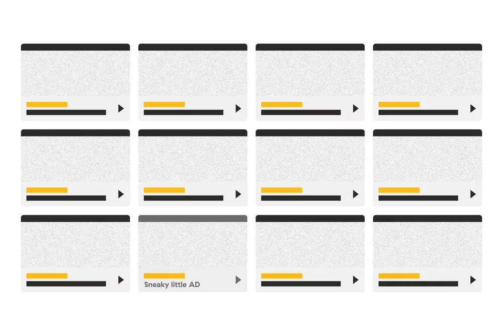
Some pushy stuff here. These are adverts disguised as content or navigation. They blend in with the page, which makes it incredibly easy for a user to unintentionally click on them.
2. Confirmshaming
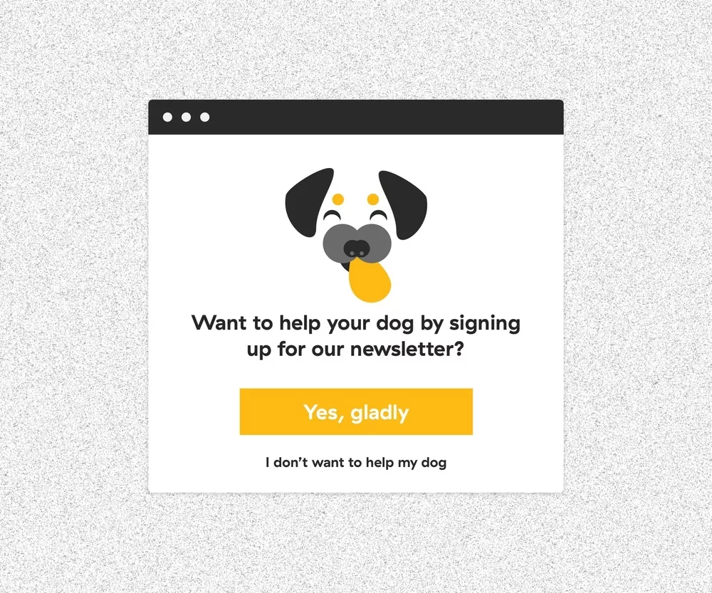
This is the act of guilting the user for not choosing a suggested option. The content is written in a way to shame the user and make them feel bad for not signing up for a newsletter or some other desired option.
3. Bait & Switch

In this scenario, the user attempts to select a specific option, but some other undesirable thing happens instead. This leaves the user confused, frustrated and dissatisfied.
4. Hidden costs
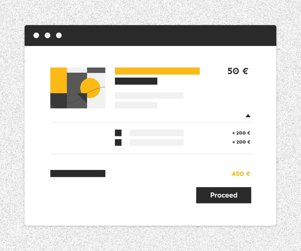
Look twice, because the advertised price is often far from what you will actually pay. Many e-commerce businesses are guilty of hiding extra costs. Once you add the shipping fee, cleaning fee, convenience fee and other hidden costs, it’s suddenly not the cheapest option.
5. Friend spam
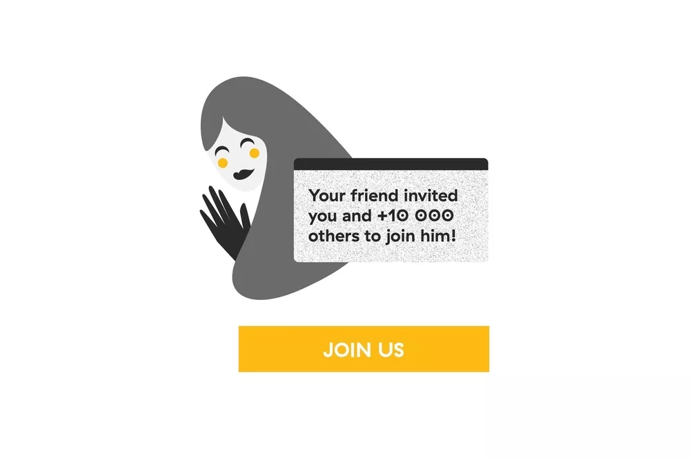
You probably receive tons of e-mails claiming your friend is inviting you to join a specific service. The truth is your friend was probably tricked into connecting with you, and they had no idea it would turn into a series of spam messages. Even worse, your friend may have never signed up for anything, but you still received an e-mail that looks like a recommendation from her. Sounds like a horror story to me.
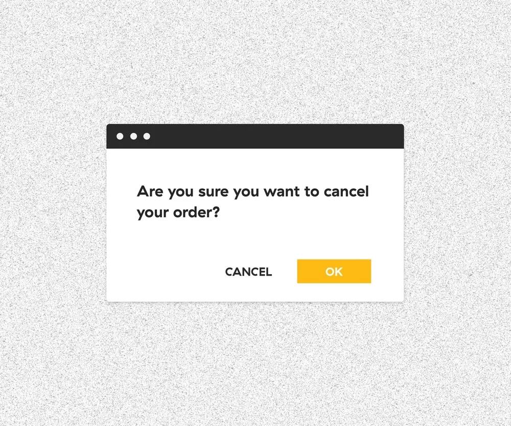
6. Forced continuity
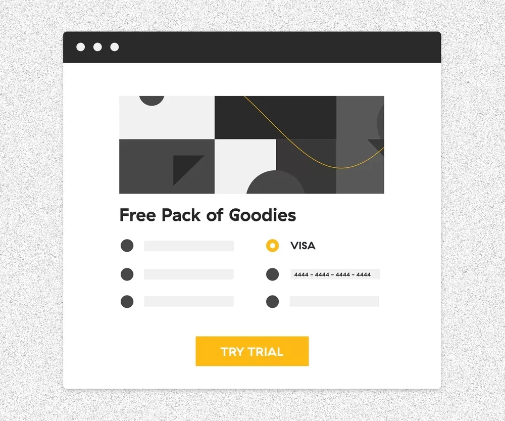
This one is easy-peasy. The service offers you free 30-day access, but in return, you have to provide your credit card info. Seems fair, right? Sure, if you don’t mind selling your soul to the devil. Don’t fall for this trap. If you choose to accept the free trial, set a reminder to cancel your subscription on time. Otherwise, you’ll keep getting charged.
7. Misdirection
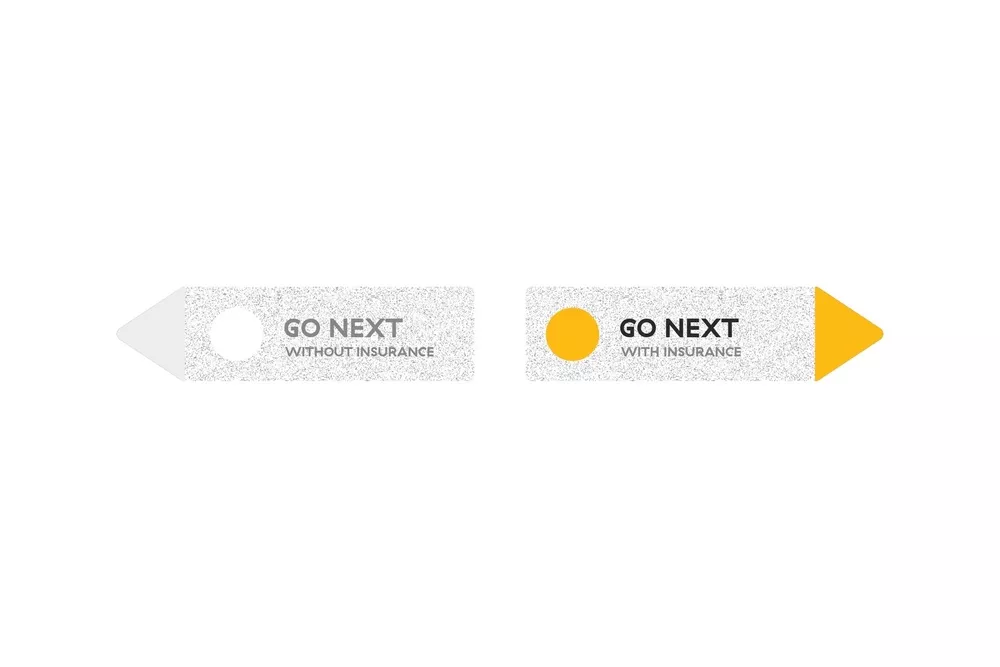
This dark pattern design forces you to focus on one thing just to distract you from another. Your reflex actions could send you far, far away from what you had in mind. So, take your time before you click click click.
8. Roach motel
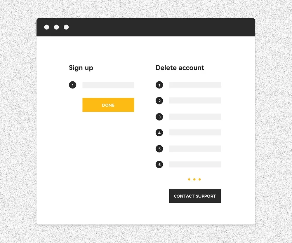
With this one, it’s easy to get in, but nearly impossible to get out. You joined a service in just two clicks. But when you decide it’s time to bail, you end up playing a game of escape room.
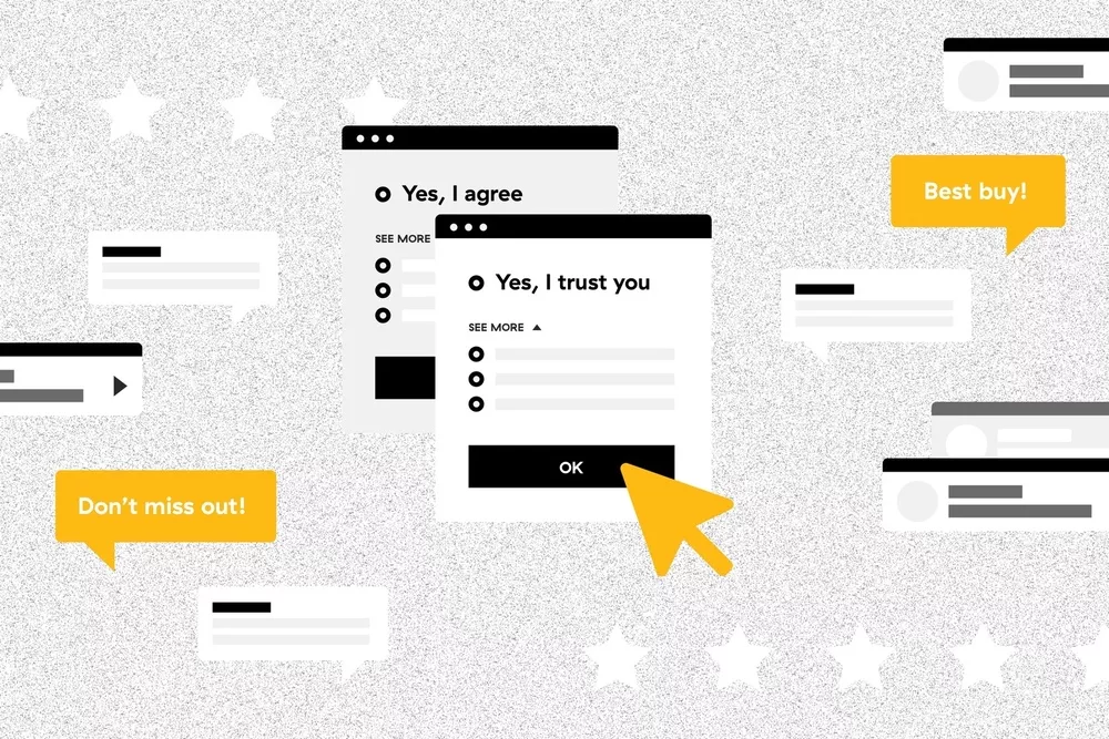
9. Privacy Zuckering
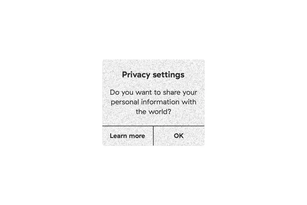
This is a sneaky one. If you want to continue using the service, you basically have one option: To agree to share your information. On the other hand, if you select “Learn more” you’ll be redirected to pages upon pages of complex terms and conditions. If you actually attempt to read this heavy text, you may begin to feel like you’re studying for a law school exam.
10. FOMO
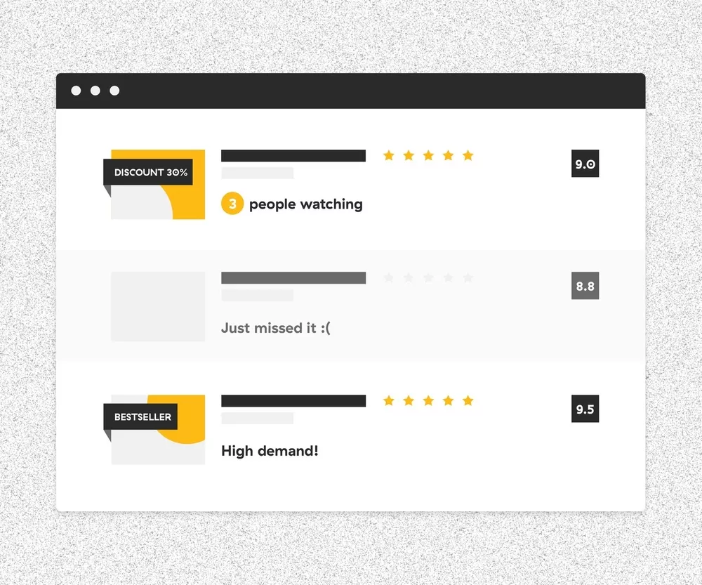
FOMO is an aggressive visual approach of trying to make a sale. It stands for Fear Of Missing Out. This tricky maneuver makes it look like an item you’re thinking about purchasing is in high demand, putting you under pressure to make a fast decision.
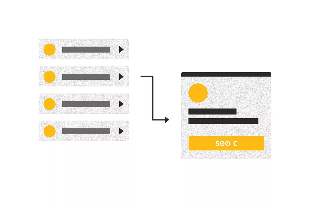
11. Sneak into basket
This one is incredibly common in web shops. It’s when an extra item is magically added to your cart along with the product you actually chose. It’s basically a hidden pre-selected option. This is why it’s important to always double-check your cart before proceeding to checkout.
12. Trick questions
In this sly stunt, the content is written in a way to intentionally confuse the user. Cancel the cancellation or your cancellation will be cancelled in a cancellation period. Huh?
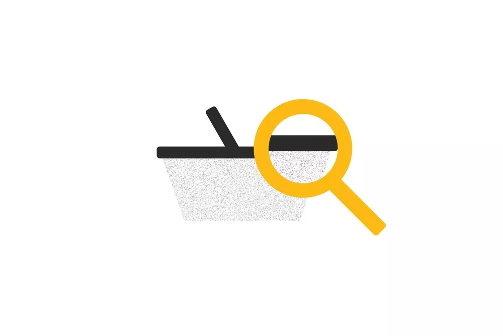
13. Price comparison prevention
The business makes it downright impossible to compare the price of an item with another item. Good luck making an informed decision.
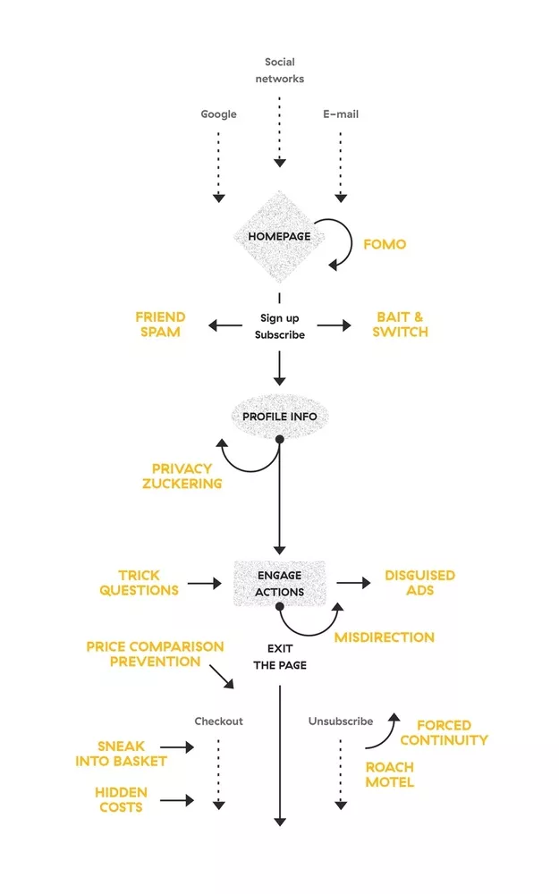
Dark Pattern Flow Chart: Where Do These Tricks Appear?
A satisfied customer is the best business strategy of all
So, there you have it: 13 tricky, sneaky, dirty dark patterns. Fortunately, if users are educated, they can steer clear of these schemes. As Harry Brignull says, the scams don’t work if the victim knows what the hustler is trying to do.
However, I believe it’s also our duty as designers to avoid these dark patterns and explore alternative solutions to create a pleasant experience for users. We should never force actions upon users, but present options in a clear and honest way.
If you are a designer just starting out in the UX/UI sphere, this is a great opportunity to build up your research and design skills. For your next project, try redesigning a specific dark pattern and show how you would use a more honest approach. For example, you could rework the checkout process for an airline.
If you are an experienced designer, think about your previous design cases. Have you ever been forced to design a dark pattern? What was your approach? If you are currently implementing some of these dishonest patterns, try to keep the user in mind at all times. Stick with honest design values, create simple, understandable flows and remind your superior about the negative perception of businesses that use dark patterns.
If you are a business leader, consider this quote from Michael LeBoeuf:“A satisfied customer is the best business strategy of all.” Sure, using these dark patterns may result in short-term success — but along the way, you will anger and confuse users, ultimately driving them away. When you employ honest, transparent strategies and give the user control to make their own decisions, you’ll build customer loyalty and put your business on the road to long-term success.