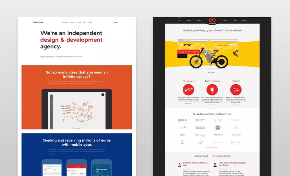
If I’ve learned anything in the past decade of running a software consulting company, it’s that redesigning your own website is an extremely difficult endeavour, just for the sheer fact that you are your own client with extremely high expectations. This made me cautious to any undertaking that involved a redesign of our website.
It’s been 2,5 years since we last redesigned our website. The website we created in the winter of 2013 could still hold it’s own (even in todays terms of quality), and we were still getting a lot of compliments for it. Also, to be very honest, we could have managed completely fine as a business with the old one.

But, our team wasn’t happy with the current state of affairs and wanted to change things. The designers wanted to create a completely new look and feel. The developers weren’t happy with the code, mostly because we’ve increased our development standards so much since then.
Everyone just felt that we’ve improved so much over the past 2,5 years and that our website should show it. We recently celebrated the company’s 10 year anniversary and felt this was a good occasion to do a redesign. So we threw caution to the wind and went for it.
Who are we doing this for?
Whenever you approach a major task like a redesign, you need to have a clear idea of why are you doing it, and what are the business goals you want to achieve.
We set out with a simple, but important, process:
- Analyzing existing website traffic – we went into Google Analytics and researched in-depth where our visitors are coming from and what pages are they visiting
- Defining personas – who are our main visitors, why do they come to our website and what do they care about?
After that, we defined two primary personas that we’d be building the site for. All subsequent decisions would be made with these two personas in mind.
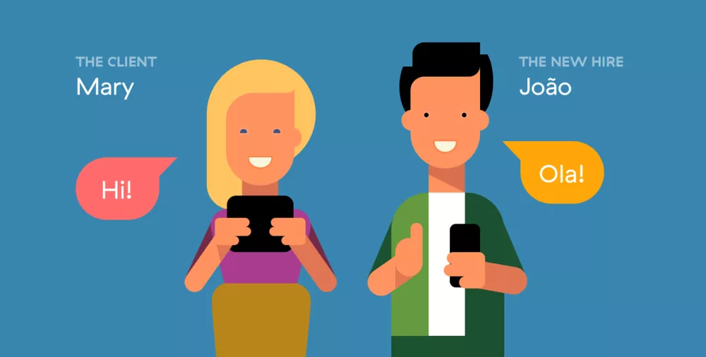
- The Client – someone who wants to build a digital product. He/she may be a manager at an established company, running their own startup or working at an agency. The Client is looking for a quality design/development shop that can build the product or work in cooperation with his/her team. The Client has a rough vision of the product and a dedicated budget.
- The New Hire – someone who wants to work on building digital products. He’s interested in the type of work we do (iOS/ Android/ Rails/ JavaScript/ UX/ UI Design). He may have experience, he may be in college or he may work with different technologies and is looking for a career change. He’s laid back and wants to work with like-minded people.
Presenting the work
Probably the most important part of our website is presenting the work we do in the form of case studies. It’s one thing to say we do good work, it’s another to actually put it up on display.
From a branding perspective, we wanted each case study to be branded according to the clients (or projects) individual brand. If we were to present this work “inside” the Infinum website, the brand would be mixed up with the Infinum brand so we wanted to avoid that.
Also, we wanted to make it easy for the visitor to jump in and out of different case studies. We thought the idea of having a case study pop out, and then pop back in after you’re done viewing the case would do the trick.
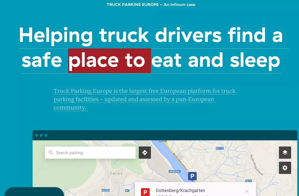
For this, we built a custom case display system we call “Zoomer”. We prototyped the interactions and animations for Zoomer in Keynote and Adobe Flash (yes, Flash is still good for something) and we immediately fell in love with the concept. You can see it on our Homepage or in the Client work sections.
Our stuff
We do a lot of stuff internally that’s not billable client work. It’s either productized software (like Productive), education initiatives (like iOS/Android talks or Infinum Academy) or open source contributions.
We do this for a variety of different reasons:
- it improves our internal processes
- it improves our skill that we leverage later for Client Work
- we use a lot of open source, so it makes sense to give back to the community
- it’s fun to do so it’s kind of a creative outlet for us
Our old website didn’t talk about this part of Infinum enough, so we needed to change that. We created Our stuff where we will showcase this aspect of the company.
Careers
As we mentioned earlier, one of the most important Personas visiting our website is the New Hire. Our old website had the Careers section listed as a 2nd tier item, somewhere under the “About” section. We wanted to raise the importance of this.
More importantly here was to convey the work atmosphere, and the way we take care of everybody (gym, health checks, ..). So, an imperative here was to use only real photos, no stock photography. No bullshit, just the real stuff.
Selfies
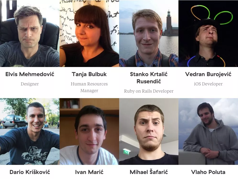
And when it comes to real photos, it doesn’t get more real than this. For the People section, we wanted people to be able to express their own personality, so instead of doing professional photos of the crew, we told everyone to take a selfie of themselves.
What we learned from this is that we need to work on educating people what a selfie actually is.
There’s no About page
Currently, our website doesn’t have an About page, and this is on purpose.
We figured it’s kind of stupid to have a special About page, since the whole website is basically about us. The best way to find out “About” Infinum is to:
- check out our Client work
- see the People you’ll be working with (either as a client or potential employee)
- read our blog posts
I just hate lengthy mission statements and wanted to avoid talking about how great we are and let our work speak for ourselves.
Hiring us is now even easier
We improved our Request For Quote (RFQ) form to make it even easier to Hire us for any projects you might have. We scaled down the number of questions, while staying true to the facts we need to know before engaging in a project:
- About you and your business
- About your project
- Your deadlines
- Your budget
- Your target audience
The typography
A lot of thought went into selecting the right typography. This was also a mini rebranding event for us since we’re changing our base typography set.
We wanted to choose a clean typeset, but also one that has character and that would leave an impact. The idea was to avoid trendy and overused fonts like Futura, Circular and Proxima. Those are some great fonts but we wanted to try something different.
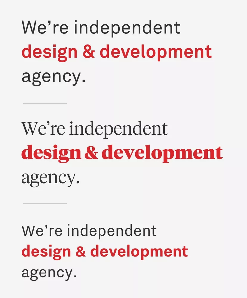
After bouncing around a couple of ideas and testing a number of different fonts, we fell in love with the monolinear geometric grotesque typeface GT Haptik. It has a regular and rotalic style, and includes alternate versions of certain characters (like G, C etc…) that also have a strong influence on optical legibility.

A continuing story
We wanted a feeling of continuation on each page, so after you get to the bottom of a page, you can continue the story by following the prominent links in the page footer. We wanted to emphasize this with extra-snazzy page transitions, and this is the part where the designers really pushed our JavaScript developers to the limits.
The backend
For the backend, we use a custom CMS. Apart from serving blog posts, it also handles RFQs, Client surveys, Event signups and a couple of other doo-dads. All the copy editing is done via Phrasing, making it simple to tweak any wording when we feel like it.
We use Amazon Cloudfront to serve our images quickly to visitors and also Google PageSpeed Module for further optimization.
The frontend
The old website was built on Bootstrap because…well, everything was built in Bootstrap back then. In the meantime, Bootstrap proved not so great at doing everything, so we ditched it and went with a custom set of frontend technologies that would be more flexible and easier to maintain in the future.
We didn’t want one big CSS/JavaScript framework that solves everything, but rather a loosely coupled set of different libraries, each great at its job.
As an example, some of the techniques we used include:
- SUSY – the subtext for this project says it all – “CSS Libraries are a bloated mess of opinions about how to do your job. Why let the table-saw tell you where to put the kitchen?”
- Lazyr – Lazy loading of images keeps everything running smoother, especially on mobile
- BEM methodology – Block Element Modifier is a methodology, that helps you to achieve reusable components and code sharing in the front-end.
- SVG images – all around we use Scalable Vector Graphics. This especially makes sense on retina displays.
The result
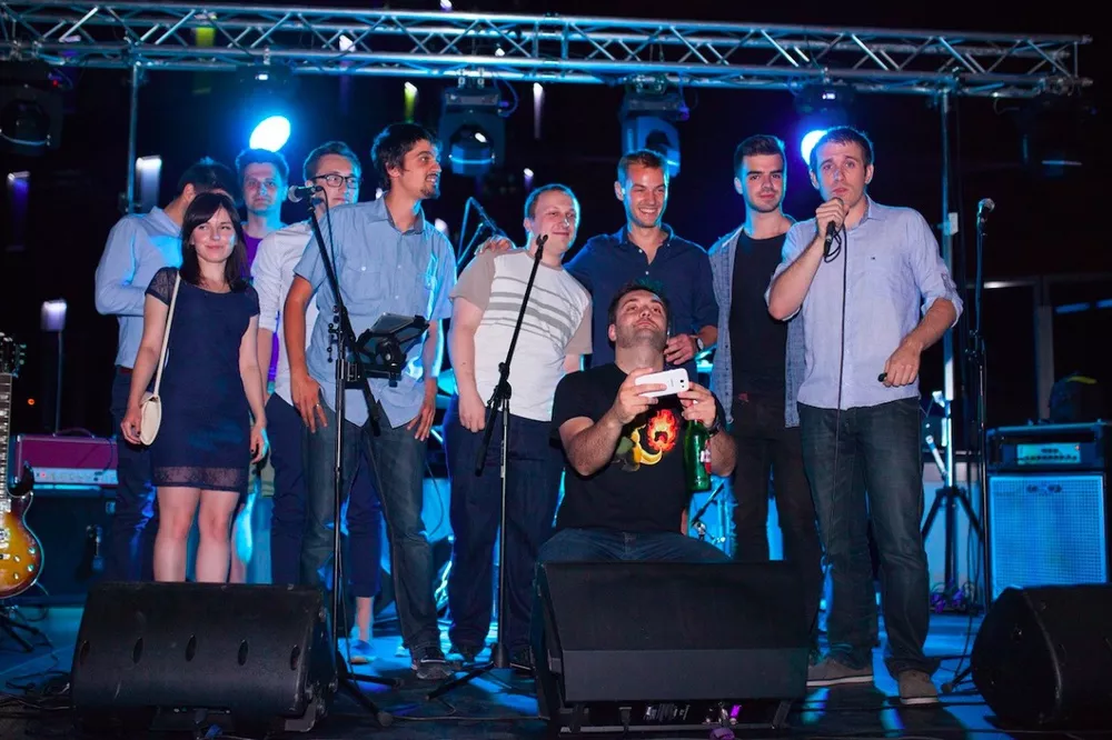
It took us about 2.5 months of working on the website in tandem with client work to get it out the door. We launched the beta version at our 10-year anniversary party. A couple of our closest friends and partners got a glimpse, gave us feedback, and we improved on that feedback.
The devil is in the details, and there is a bunch of special details scattered all around the site for you to find. We don’t want to give anything away, so browse for yourself and explore.
We hope you like it, and if you have any comments, drop us a line at hello@infinum.co.

