


UX is all about people, and funnily enough, so is psychology. That’s why we have three psychologists on our team, two of whom are writing this.
Some impactful psychology findings and theories are in almost every UX article (? hey there, Gestalt principles), while others are left behind. So, here’s a list of lesser-known psychology insights you can apply right away on your next project.
Bizarre = sticky
BIZARRENESS EFFECT
People remember things that stand out. Out of the ordinary, unusual and strange. Break rules of the physical world in your designs on purpose to make people remember something.
When to use: onboarding screens, delight points in user flow, splash screens
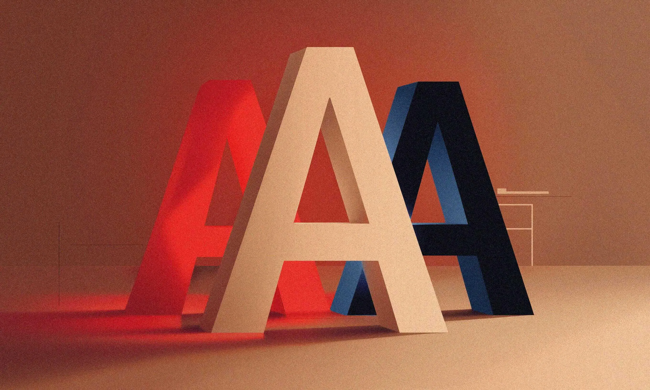
Unforgettable Von Restorff
VON RESTORFF EFFECT
German researcher von Restorff found that “sticking out to be remembered” works even without bizarreness. For instance, people will better remember the word “chair” if words for fruit surround it.
How to apply it in UX? Stretch your brand book a bit and create a few distinctive screens. The visual novelty will make them more memorable.
When to use: critical screen (e.g., checkout), onboarding, new features’ screens
You lose!
LOSS AVERSION
We hate losing two to three times more than we like winning or gaining something. Playing it safe is what kept your ancestors from eating that “maybe rotten” mammoth.
Frame the (in)action in your app as avoiding something bad for users, and you should see an uplift in that behavior. But don’t overdo it, don’t scare users all the time.
When to use: upsell, permission priming, landing pages, pricing pages
Unfinished business
ZEIGARNIK EFFECT
Psychologist Zeigarnik discovered that people better remember tasks they haven’t finished than the ones they have. So, break user flows (or content) into smaller chunks to make people come back for more.
When to use: shopping carts, profile setting, learning lessons, long forms
Tap on the back
CONTINUOUS POSITIVE REINFORCEMENT
Dad’s smile, mum’s hug, grandparents’ bribe sweets – that’s how you’ve learned your native language. They’ve praised every linguistic step you’ve taken. So do the same for your users: praise them every time they take the desired action.
When to use: success screens, first interactions with the app, teaching users more complex features, confirmation emails
Why?
GOAL-ORIENTED BEHAVIOR
This one is simple: tell people why they should do something. Be clear and concise in your copy and design, and you should see more users taking that action. Bonus points: combine it with a “You lose!” insight.
When to use: checkout, small new features, permission priming, upsell, error messages
Oh, stop it, you…
LIKING AND FLATTERY
Compliments work. Even when people are warned that someone will try to flatter their way to a “yes”.
Use it for praising the user’s action (like “Tap on the back”) or as a primer for asking users to do something. Keep your compliments specific and believable.
When to use: onboarding, landing pages, success screens
Keep on (reading this article)
PERSUASION PRINCIPLE: CONSISTENCY
We love to think our behavior is consistent. We value it in others and in ourselves. Leverage that in UX. Occasionally, remind users how using your app aligns with their previous behavior.
When to use: additional requests, escalating user commitment, soft retention
King of the hill
NEED FOR AUTONOMY
Next time you’re in a cafe, observe people when they’re sitting down at the table. Everyone moves their chair around a bit. Why? We like to customize our environment. Your app shouldn’t be an exception.
When to use: customizable UI color, personal shortcuts in the app, favorites, user name visible
No training wheels for pros
NEED FOR COMPETENCY
Getting better at something feels good. From tiny things like making your first real dish (fish sticks don’t count) to getting an MA in whatever makes you happy (or rich).
Acquiring a new skill or understanding a new concept is a reward in itself. Takeaway: match the UX to the users’ competence level.
When to use: reveal complex features and subfeatures, add shortcuts, remove UI elements (e.g. labels)
Be picky
Should you apply all of these insights straight away? Of course not. Choose the ones that fit your project best.
If it works out, cool. Be sure to mention us in your Apple Design Awards acceptance speech. If not, it’s a long list, choose another insight and bake it into your designs. After all, to design is to experiment, right?