Most people will agree that design is all around us. However, what that idea actually entails can vary substantially from one person to the next. Having worked in UX design for 18 years, I’ve come across many misconceptions people often have about design. This misalignment in expectations can make conversations about design difficult and impair moving forward with a project.
Everyone could argue that a certain design “feels right”; however, indulging this perception leaves a huge gap – the missed potential to make something more optimal.
Misconception #1: Everybody is a designer
Every day, we make aesthetic judgments. We say “Oh, I like this” or “I’m not too keen on that”, we choose our bedroom wallpaper, put together outfits for work, buy a poster that reflects our personality. However, deciding whether something looks good or not has absolutely nothing to do with how it’s designed.
I like to contrast UX design work with software development. People wouldn’t assume they have any coding ability. If anything, they would say they could never get their heads around that. Yet, when it comes to product design or any type of design for that matter, they think they’ve got an innate ability to understand it.
Because people know what they like, they will mistake design for their own ability to make an aesthetic judgment, while actually, it’s an ability to understand why something might appeal to different people in different ways.
The fallacy of “everyone is a designer” is evident in the expectation that when designing a new product or service, you’ll choose between screens you like and those you don’t, when in fact those screens are just a final visual layer of a concept built over time and through ample research and observation.
Misconception #2: Design is how something looks
We all conceptualize design in our heads in some way, but for most people, that concept remains at the level of visual design – a tangible, emotional, aesthetic thing. Actually, when we are talking about design, we are talking about designing the experiences of use.
We use things all the time. We take trains and buses, we take in information from various sources, and we never think of the fact that someone designed those experiences for us.
To explain this, I like to use my story with trains in Germany as an example. Once I was traveling there, and I had to change trains. I was told which platform to go to and when the appropriate train would arrive. When I got to the platform I could consult the map of the configuration of the train and thanks to markings on the platform even identify where I should stand to be next to the correct door of the correct carriage.
The train arrived late at the station and station officials immediately made themselves available as people got off. They knew that due to a delay passengers would have missed connections and may not know how to get to their destinations. They answered questions effectively and efficiently and settled any nerves that anyone had about where to go next. One of them directed me to the ticket office.
The train carriage in itself was luxurious, and the seats felt like they belonged in a high-end Mercedes Benz. However, it was interactions on the platform and the feeling of comfort I received that shaped my experience the most. Lots of factors went into making me feel that way, and they were the result of intentional, user-centered design.
It was the best train delay I have ever had. Technically, this was a failure in service but a decade later, it sticks with me how they managed to reverse this so I point to it as an example of great design.
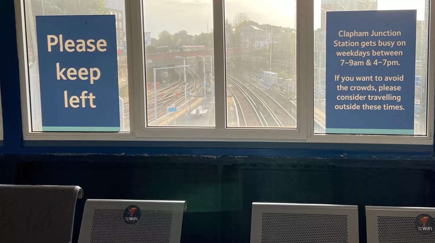
Then I think about Clapham Junction in London. It’s technically the busiest train station in Europe, often the first place where people arrive to visit the UK. At the time when I was traveling through Germany, it was a complete nightmare, especially if you were coming from another country. Trains change platforms all the time, and you have no idea what is happening. You hear the announcements over the speakers, but they are garbled. This is your experience. Things have somewhat improved since then, but the experience is still light years away from Germany.
I use this example because it shows how a person can have a vastly contrasting experience when a service is designed, whether it’s a digital journey or a physical one.
A designed experience coordinates a person’s expectation of what they know and what they are trying to do in such a way that it matches their mental models to service information needs and provides solutions to those needs.


Misconception #3: UX design can be based on assumptions
Following up on the example above, I am often amazed at how often things aren’t designed but just happen to be there. There’s a huge difference between something that is carefully designed and something that is built ad hoc, and we rely on people to fill that gap.
To truly design for the people, we need to understand their behavior in different contexts. As a stakeholder, you know your business and you may think you know the best way to set up the service you are offering, but it doesn’t make you the user of this service coming to it fresh.
Being too close to the thing that you want to create can give you the false assumption that you really understand it. Ultimately, that can lead to suboptimal design or sometimes even no design at all.

We may build a thing that meets basic requirements set out by a stakeholder and it may have an attractive visual layer – but it has not really been designed. There is a difference.
Designers are, in essence, problem solvers. Design is about understanding the world and making experiences easy for the users. You need to have true empathy for them, and the only way you can achieve that is if you’ve sat next to them, watched them and understood their struggles.
Dispelling misconceptions
Sometimes it’s hard to get on the same page with people about design because they already have their mental preconceptions. However, to truly understand design, it’s important to move away from its visual, surface aspect.
Design is about understanding how something will be used, who are the people who will be using it, and then creating something that will make the experience of using the thing the best that it can be.
This idea is slowly gaining ground. Unfortunately, in the vast spaces of the Internet, the voices advocating these kinds of practices are often outnumbered and outgunned by those willing to embrace the more facade nature of design. It’s a continual challenge, but getting more people to do away with their misconceptions will ultimately lead to more superior and valuable design.
If everyone thought about design the way they think about development, the world would be a different place.


