With the September Apple event behind us, there is only one thing everyone is talking about. The Dynamic Island.
By now, you have probably absorbed the multitude of articles outlining the pros & cons and marveled at the animations. Some love it, others don’t. Whatever your opinion about the Dynamic Island, it’s a UX renaissance in the making.
Making the notch a feature, not a bug
So far, phone manufacturers have tried hiding the notch, the camera housing which sits dead center at the top of the screen. A simple Google search reveals hundreds of articles and apps suggesting how to make it less intrusive.
Leave it to Apple to swim against the tide!
With the Dynamic Island, Apple embraced the notch and made it a focal point by adding useful functionality to it. By doing so, they are blending the borders between hardware and software.
Why is that such a big deal, you ask? Well, first of all, Apple saw the otherwise useless space as room to improve user experience. Secondly, they made the Dynamic Island work by using beautiful animations and seamless transitions. These two reasons alone make for a truly delightful experience, but wait, there’s more!
What can you do with the Dynamic Island?
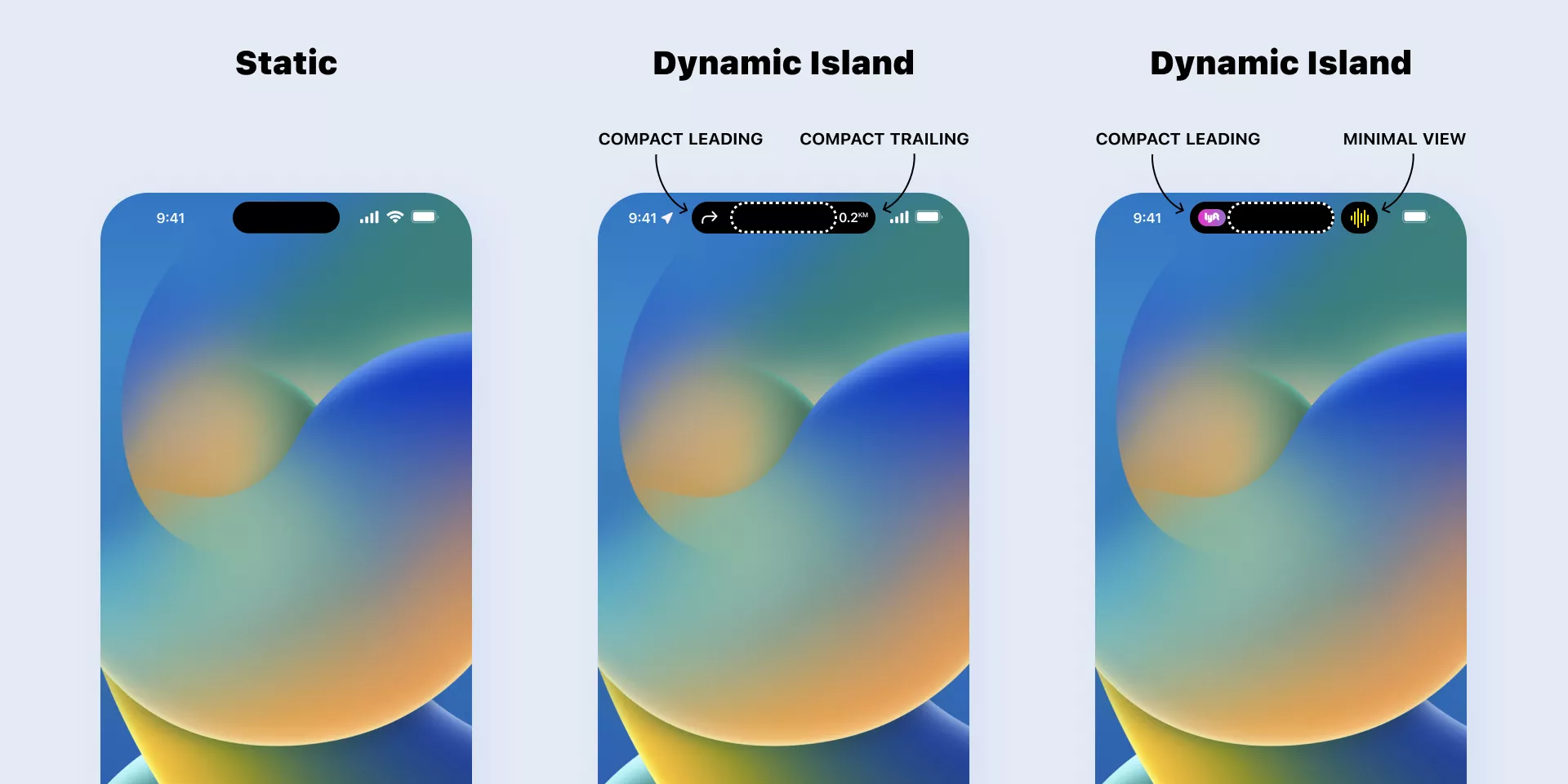
The Dynamic Island comes in four different sizes and shapes: a compact leading view, a compact trailing view, a minimal view, and an expanded view.
Each of these views provides users with important information at a glance. The expanded view allows them to see more detail and perform different actions depending on the app used.
Speaking of apps, the Dynamic Island displays live information from up to two currently used apps – the so-called Live activities. It could be a timer counting down, Maps instructing you that your next right turn is in 200 meters, the charging status of your battery, connectivity with your headphones, or how long will your Uber ride take to arrive.
The information is displayed for up to eight hours or until your Live activity ends, similarly to the behavior of Live Activities on the lock screen.
Designing for the Dynamic Island and Live activities
Live activities will be available on all iPhones with iOS 16 installed, while the Dynamic Island is available only for iPhones with the pill-shaped notch.
This means that even though you might not be designing for the latest iPhones, you should cover the Live activities as many users will likely use them.
Designing for the Dynamic Island means designing for all possible views, from minimal to expanded, because there are three different ways Live Activities can be displayed on the Dynamic Island:
- a leading and trailing compact view for single activities
- a minimal view, attached to or detached from the TrueDepth camera, visible when there are two active activities
- an expanded view on a long press
Minimal and compact view

The simplest views are compact and minimal view.
The compact view is divided between a compact leading view on the left-hand side and a compact trailing view on the right-hand side of the Dynamic Island. These views are reserved for the most important live information from the app currently in use, e.g., the time until food is delivered, confirmation of a successful wireless earbuds connection, or a notice of call duration.
Use both sides of the compact view to get a centered shape, but keep in mind that in the case of two live activities, the iOS system could place the other one in Dynamic Island’s minimal view. This means you need to design for compact leading and minimal views.
The Dynamic Island resizes horizontally to fit all your content, but be mindful of placing really detailed visuals in compact and minimal views as they would not be readable.
- The height of the Dynamic Island is 36 px.
- Your icons and images should be sized at 24 px with a bounding box.
- Text size should be 15pt with 22 line height.
Expanded view

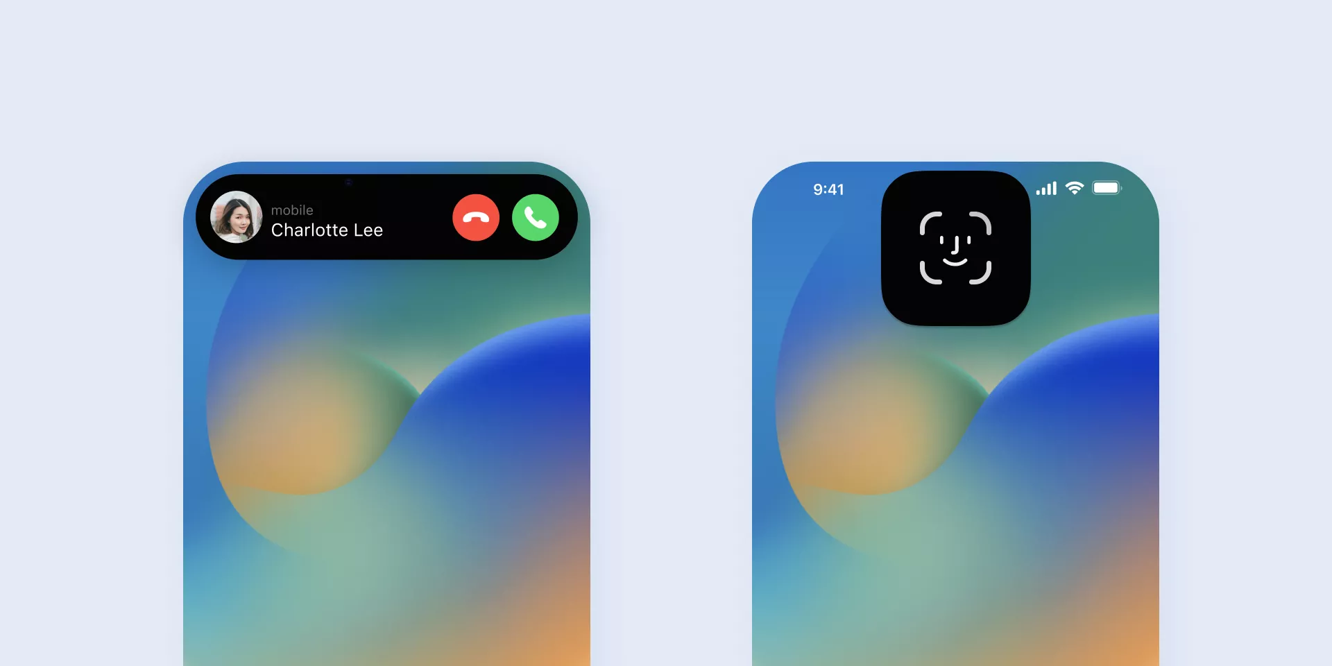
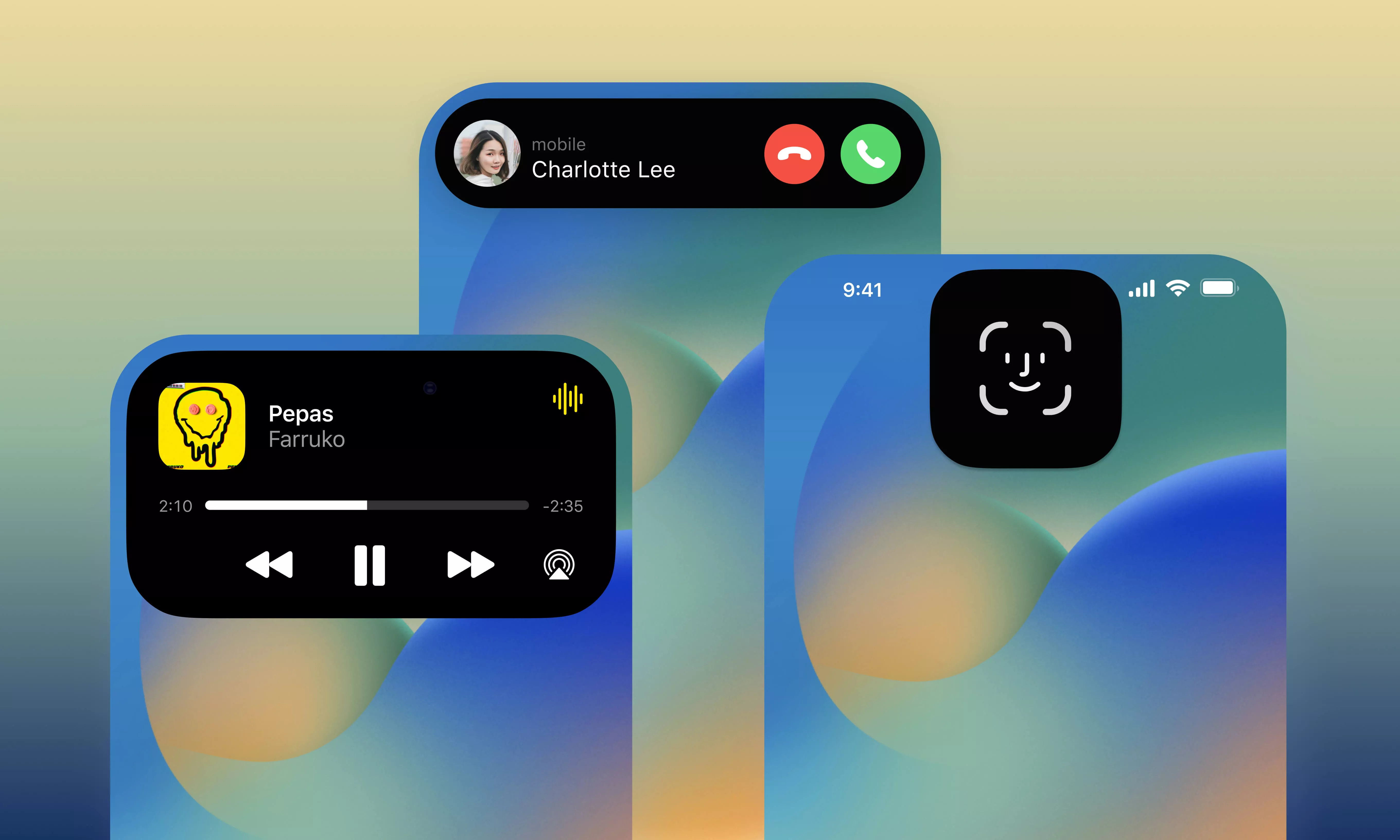
Expanded view appears when users press and hold the compact or minimal view or when there is an update in the Live activity.
This view also appears when a live activity requires a user’s action, such as an incoming call or a FaceID authentication.
- The height of the extended view in the Dynamic Island can’t exceed 144 points (≈192 px)
- The system may truncate a Live Activity on the Lock Screen if its height exceeds 160 points (≈213 px).
The expanded view is useful for displaying more detailed information. You might see sports apps displaying the national team’s country flag along with the match score. Or a music app showcasing album covers, a song bar, and controls to switch or pause songs.
The possibilities are endless but don’t go overboard. The Dynamic Island should only be used for important information and the most crucial controls. Leave the other parts in the app.
General guidelines
By default, the system uses the default primary color for text and background color for your Live Activity that best fits a person’s Lock Screen, but you can also set custom colors for both the background and text.
Make sure you handle any errors that may occur gracefully. For example, starting a Live Activity may fail because a user’s device may have reached its limit of active Live Activities. Your users need to know this happened and why it happened. If possible, provide them with an alternative so they don’t get stuck in a loop.
Should you design for the Dynamic Island?
In short, yes! All designers who do any work with the iPhone/iOS will need to take into account designing for the Dynamic Island moving forward.
Also, the past has taught us that soon enough many other manufacturers will be using a variation of this, so start implementing this pattern in your designs as soon as possible.


