


CSS-in-JS concept has a bad reputation because of its bad runtime performance. This is about to change. With Panda CSS, you can have the best of both worlds, performance and nice syntax – and we have the code examples and runnable projects to prove it.
Update note, 20 June 2023: This article has been updated based on the official documentation. For the latest information, please visit https://panda-css.com/docs.
As front-end developers, we’re always looking for tools and libraries that streamline our workflow and improve the performance of our web applications. One such promising solution that has caught my attention is Panda CSS. With Panda CSS, we can simplify front-end styling and completely eliminate the runtime overhead of CSS-in-JS libraries, making it a compelling choice for modern web development.
This blog post will dive into the basics of setting up Panda CSS and explore the key features that make it a standout tool for front-end development. From installation to usage, we will cover the steps to get started with Panda CSS and discover how it can help us achieve efficient and optimized styling in our web applications.
So let’s get started with this exciting new addition to the front-end development ecosystem!
Chakra UI – a development workflow game-changer
As a Lead React Engineer with a strong passion for React and a special love for Chakra UI, which I have been using for the past two years, I’m excited to share my thoughts on the future of this powerful component library. Chakra UI has been a game-changer in my development workflow, solving challenges like delivery speed, providing a basic component library, and managing design tokens for consistent UIs.
Looking ahead, the Chakra UI team is actively working on enhancements, including integrating Panda CSS to eliminate the runtime overhead of CSS-in-JS, resulting in even faster and more optimized UIs.
In addition to my insights, the author of Chakra UI, Adebayo Segun, has also shared his thoughts on the future of Chakra UI in a recent blog post, providing further insights and perspectives on what’s to come for this popular component library.
Panda CSS – frontend styling, simplified
Panda CSS is a utility CSS library that provides a set of utility classes, patterns, and recipes for building modern and responsive user interfaces in Web applications.
In addition, it offers a declarative approach to styling components using JavaScript objects, making it more readable and maintainable than pure string-based approaches. Similar to Tailwind CSS, Panda CSS enables developers to customize styles easily, and more details about its features will be revealed in step 3 below.
Get started with Panda CSS in three steps
1
Install Next.js
If you haven’t already, install create-next-app globally on your local machine using pnpm, npm, or yarn.
You can use the following command to create a new Next.js project with TypeScript:
npx create-next-app@latest --use-npm
Here are my answers to the prompts:
- What is your project named? test-app
- Would you like to use TypeScript with this project? Yes
- Would you like to use ESLint with this project? Yes
- Would you like to use Tailwind CSS with this project? No
- Would you like to use
src/directory with this project? Yes - Use App Router (recommended)? Yes
- Would you like to customize the default import alias? @/*
This will create a new Next.js project with a TypeScript template, which we will use as the base for our Panda CSS setup.
Enter the newly created directory:
cd test-app
2
Setup Panda CSS
Install @pandacss/dev:
First off, install Panda CSS as a dependency in your Next.js project and initialize it.
You can run the following commands:
npm install -D @pandacss/dev
npx panda init --postcss
The panda init --postcss command will automatically create a postcss.config.js file at the root of your project with the following code:
module.exports = {
   plugins: {
     '@pandacss/dev/postcss': {},
   },
 }
Update package.json scripts:
Update the scripts section in your project’s package.json file to include the necessary Panda CSS scripts. Replace the “dev” script with the following:
"scripts": {
   "prepare": "panda codegen",
   "dev": "next dev",
   "build": "next build",
   "start": "next start",
   "lint": "next lint"
}
This is the prepare script that will run codegen after dependency installation. You can read more about codegen in the CLI section of the official documentation.
Set up the configuration using the PostCSS plugin:
1
Set up custom PostCSS configuration
Follow the Next.js PostCSS guide to set up a custom PostCSS configuration by referring to this link.
2
Install additional dependencies:
npm install postcss-flexbugs-fixes postcss-preset-env
3
Uninstall “concurrently” if it was previously installed:
npm uninstall concurrently
4
Update your PostCSS configuration
Update your PostCSS configuration to include the Panda CSS PostCSS plugin:
{
  "plugins": [
    "postcss-flexbugs-fixes",
    [
      "postcss-preset-env",
      {
        "autoprefixer": {
          "flexbox": "no-2009"
        },
        "stage": 3,
        "features": {
          "custom-properties": false
        }
      }
    ],
    ["@pandacss/dev/postcss", {}]
  ]
}
Configure the content:
Open the panda.config.ts file in the root of your Next.js project directory. This file will serve as the configuration file for Panda CSS.
You can start with a basic configuration, such as:
import { defineConfig } from "@pandacss/dev";

export default defineConfig({
  // Whether to include css reset styles in the generated css.
  preflight: true,

  // Where to look for your css declarations
  include: ["./src/components/**/*.{ts,tsx,js,jsx}", "./src/app/**/*.{ts,tsx,js,jsx}"],

  // Used to create reusable config presets for your project or team.
  presets: ["@pandacss/dev/presets"],

  // Files to exclude
   exclude: [],

  // The framework to use for generating supercharged elements.
  jsxFramework: "react",

  // The output directory.
  outdir: "styled-system",
});
Configure the entry CSS with layers:
In your Next.js project, navigate to the src/app folder and open the global.css file. Replace all the content with the following code:
@layer reset, base, tokens, recipes, utilities;
Update Next.js layout (layout.tsx) and index page (page.tsx):
In your Next.js project, navigate to the layout.tsx file located at src/app/layout.tsx. Make sure that ./globals.css is imported at the beginning of that file.
The final snippet for layout.tsx would look like this:
import './globals.css'

export const metadata = {
  title: 'Hello ?!',
  description: 'Generated by create next app',
}

export default function RootLayout({
  children,
}: {
  children: React.ReactNode
}) {
  return (
    <html lang="en">
      <body>{children}</body>
    </html>
  )
}
Also, delete all the default CSS files, for example src/app/page.module.css.
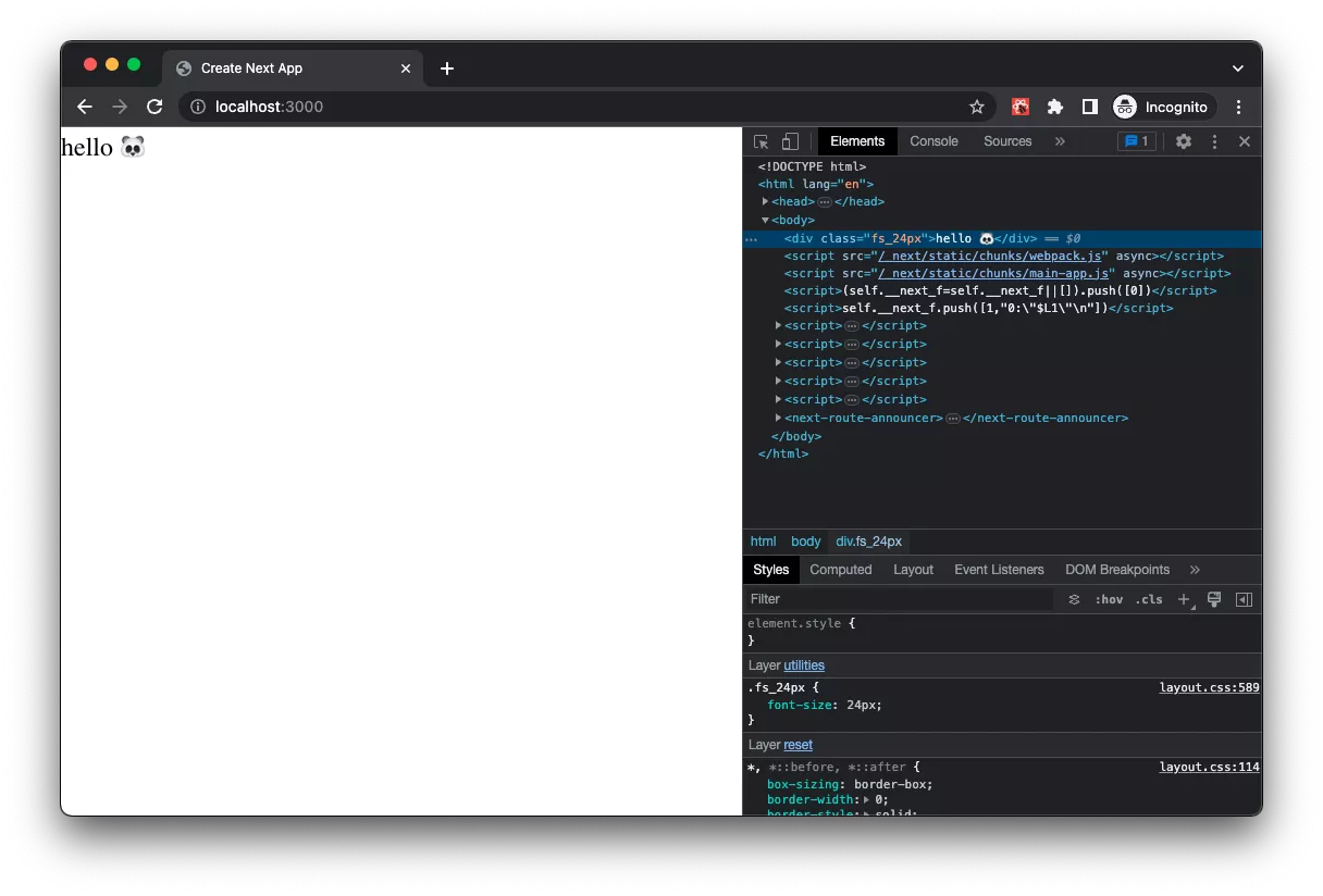
Next, you can update the contents of page.tsx with the following snippet that uses Panda CSS:
import { panda } from '../../styled-system/jsx';
export default function Home() {
  return (
    <panda.div fontSize="24px">hello ?</panda.div>
  )
}
Start the development server:
In your Next.js project, run the command npm run dev in your terminal to start the development server. This will launch your Next.js application locally at http://localhost:3000/ in your web browser.
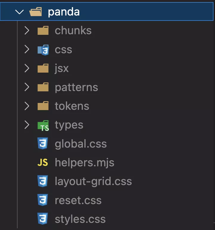
After running the dev server, you should be able to see the panda folder with all the generated components in the root folder of your project. The components will be generated based on the styles defined in your Panda CSS configuration file (panda.config.ts) and the usage of the panda object in your components.
With these setup steps, you will be ready to use Panda CSS in your Next.js project and leverage its powerful features for creating responsive and customizable CSS styles.
3
Customize styling
Panda CSS provides a set of default styles for its components, but you can easily customize the styling to match your project’s design.
Theme
One of the powerful features of Panda CSS is the ability to customize the theme according to your project’s specific needs. You can easily define your own color palettes, typography, spacing, and more to create a unique visual style for your application.
To customize the theme, you can define your own theme configuration in a panda.config.ts file. For example, you can add a custom color gradient called “infinum” to your theme:
import { defineConfig } from "@pandacss/dev";

export default defineConfig({
  //...

  theme: {
    extend: {
      tokens: {
        colors: {
          infinum: {
            50: { value: '#FBE9EA'},
            100: { value: '#F7D3D5'},
            200: { value: '#EFA8AB'},
            300: { value: '#E77D81'},
            400: { value: '#E05257'},
            500: { value: '#D8262C'},
            600: { value: '#BD2127'},
            700: { value: '#A21C21'},
            800: { value: '#87171C'},
            900: { value: '#6C1216'},
          },
        },
      },
    },
  },
});
After defining the custom color gradient in your theme configuration, you can easily apply it to your component:
<panda.div
  color="infinum.400"
>
  hello ?
</panda.div>
Note: This will use ‘#E05257’ color from our custom theme.
Patterns
Panda CSS patterns are common layout building blocks that provide pre-designed styles and configurations for elements such as box container, flex containers, grid containers, grid items, and more. These patterns are included by default in Panda CSS and can be easily used in your Next.js projects.
You can also extend or customize these patterns in your project by adding additional configurations in the panda.config.ts file.
import { defineConfig } from "@pandacss/dev";

export default defineConfig({
  //...

  patterns: {
    extend: {
      container: {
        transform(props) {
          // TODO descructuring props.centerContent is not working @panda
          delete props.centerContent;

          return Object.assign(
            {
              position: "relative",
              width: "100%",
              maxWidth: "7xl",
              mx: "auto",
              paddingX: { base: "4", md: "6" },
            },
            props
          );
        },
      },
    },
  },
});
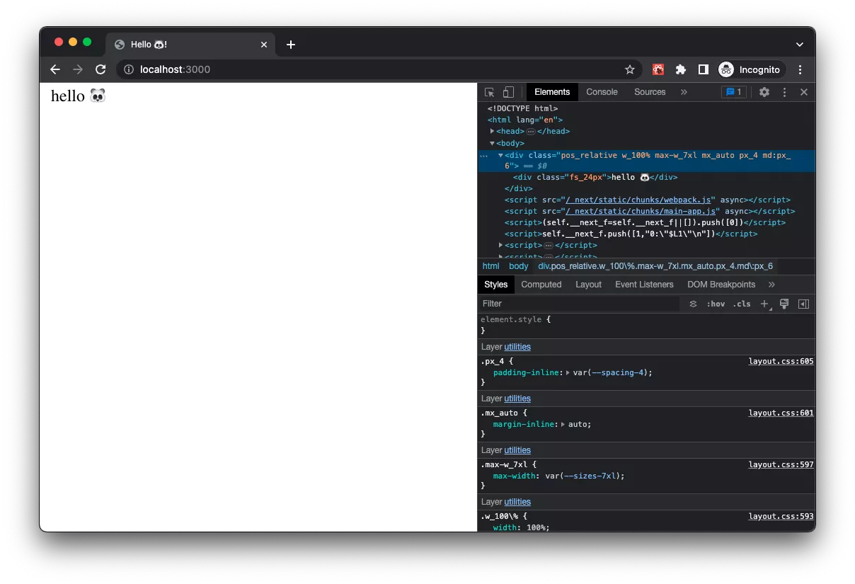
And this is how you can use container pattern with the simple div:
import { panda } from '../../styled-system/jsx';
import { container } from '../../panda/patterns';

export default function Home() {
  return (
    <div className={container({})}>
      <panda.div fontSize="24px">hello ?</panda.div>
    </div>
  )
}
Or, by using JSX component:
import { Container, panda } from '../../styled-system/jsx';

export default function Home() {
  return (
    <Container>
      <panda.div fontSize="24px">hello ?</panda.div>
    </Container>
  )
}
In the browser, it looks like this:
This way, you can easily customize and extend the default patterns provided by Panda CSS to suit your specific layout requirements in your Next.js project.
Recipes
Panda CSS allows you to create pre-defined styles for common UI components, referred to as “recipes.” These recipes include styles for core components such as accordions, buttons, links, selects, and more. Recipes are designed to be highly customizable and can be easily extended or overridden to match your specific design requirements.
You can configure and extend the default set of recipes or add additional recipes to your project’s Panda CSS configuration file, panda.config.ts.
For example, you can define a recipe for a custom Link component:
First, we need to create a recipe:
import { defineConfig } from "@pandacss/dev";

export default defineConfig({
  //...
  theme: {
    extend: {
      //...
      recipes: {
        link: {
          name: "link",
          description: "A link styles",
          base: {
            // some base styles
          },
          variants: {
            variant: {
              primary: {
                color: "infinum.500",
                textDecoration: "underline",
                _hover: {
                  color: "infinum.600",
                },
                _active: {
                  color: "infinum.700",
                },
              },
              unstyled: {
                color: "inherit",
                textDecoration: "none",
              },
            },
          },
          defaultVariants: {
            variant: "primary",
          },
        },
      },
    },
  },
});
Then, we need to create a custom Link component and apply the recipe. We will also use Next.js Link component as the base:
import { cx } from '../../../styled-system/css';
import { panda, type HTMLPandaProps } from '../../../styled-system/jsx';
import { link, type LinkVariants, } from '../../../panda/recipes';
import NextLink, { type LinkProps as NextLinkProps } from 'next/link'

export type LinkProps = LinkVariants & { href: NextLinkProps['href'] } & HTMLPandaProps<'a'>;

export const Link = (props: LinkProps) => {
  const { href, variant, content, className, ...rest } = props;

  return (
    <NextLink legacyBehavior href={href} passHref>
      <panda.a className={cx(className, link({ variant }))} {...rest} />
    </NextLink>
  );
}
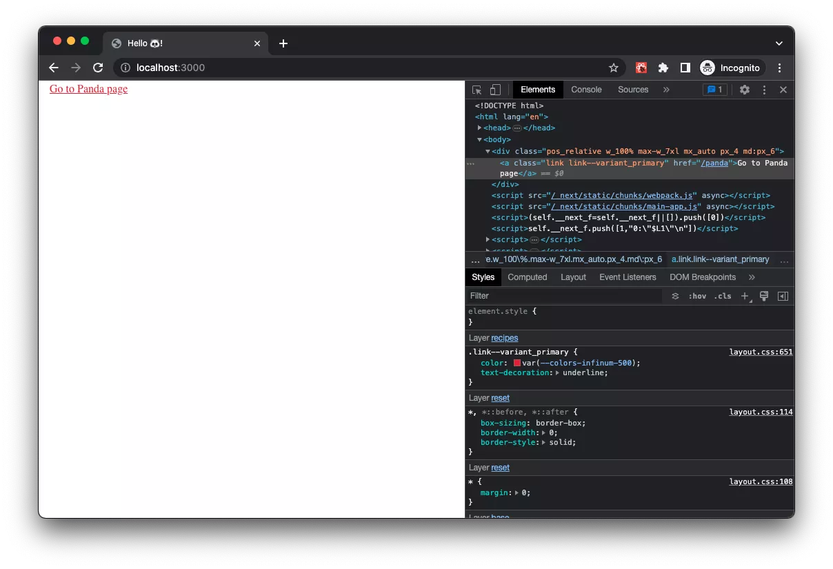
Then we can use it like this:
import { Container, panda } from '../../panda/jsx';
import { Link } from '@/components/core/Link';

export default function Home() {
  return (
    <Container>
      <Link href="/panda">Go to Panda page</Link>
    </Container>
  )
}
In the browser, it looks like this:
If you prefer not to write your components from scratch, you can leverage the pre-defined components available in the Ark-UI library at ark-ui.com, saving time and effort in building your user interfaces.
Advanced Usage of Panda CSS: Implementing Animated Card Hover Effects
The complex example section demonstrates how to implement a card with animation on hover using Panda CSS, showcasing the versatility and flexibility of the library for creating complex and interactive user interfaces with ease.
import { Link } from "@/components/core/Link";
import { Container, panda } from "../../styled-system/jsx";

export default function Home() {
    return (
        <Container display="flex" justifyContent="center" py="10">
            <Link
                href="/panda"
                variant="unstyled"
                className="group"
                display="flex"
                flexDirection="column"
                alignItems="center"
                maxW="300px"
                fontFamily="sans"
                borderWidth="1px"
                borderColor="gray.200"
                borderRadius="3xl"
                shadow="md"
                transition="all 0.2s"
                _hover={{
                    transform: 'translateY(-2px)',
                    shadow: 'lg',
                }}
            >
                <panda.div
                    display="block"
                    fontSize="9xl"
                    _groupHover={{
                        animation: 'spin 1s infinite',
                    }}
                >
                    ?
                </panda.div>
                <panda.h2 fontSize="2xl" mb="2">
                    Panda CSS
                </panda.h2>
                <panda.div color="gray.900" p="4">
                    Because why settle for just regular bear CSS when you can have a cute,
                    powerful, and flexible framework like Panda CSS to make your web
                    development roar with excitement!
                </panda.div>
            </Link>
        </Container>
    );
}
In the video demonstration below, you can see the Card component rendered in the browser, showcasing the implementation of the code snippet above.
Live link: https://js-panda-css.vercel.app/
Start experimenting with Panda CSS
That’s it! You’re ready to start using Panda CSS in your Next.js project. With its simplified approach to front-end styling, Panda CSS can help you streamline your development workflow and create efficient and optimized web applications. Happy coding!