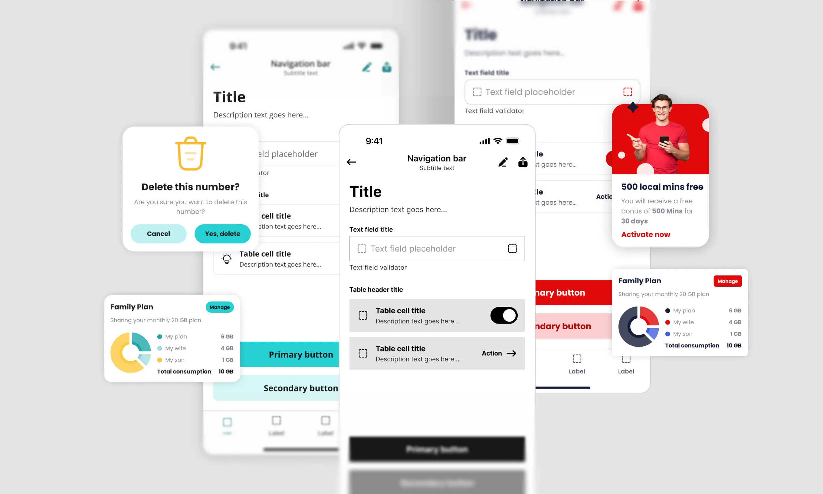


There are some things users don’t see, but we, as designers use them to make laying out components on the screen easier and more consistent. When you design a screen, you have different components which differ in size and distance relative to each other. Here is a brief overview of how to structure a screen to make quick decisions while designing.
The margins!
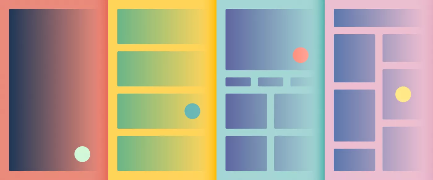
Margins are spaces that sit between content and the edges of the screen. They are defined with fixed width — usually 16 px, but some apps use 20 or 24 px margins.
All the sizes of UI elements and spaces between them are set as a multiple of the number 8. Why 8? Because it’s easy to divide most mobile screens into an 8pt grid.
TIP: iPhone 13 mini screen has 375 px width, so you’ll have to steal 1 px from a component to keep an 8pt grid. Don’t worry, devs use percentages anyway.
Things between the margins
The content is placed inside the columns (within margins). These help us make decisions on where to place an element and make a well-structured interface. Columns help developers to create consistent layout across multiple screen sizes. Most common number is 4, but you can try 6 or 8. The width is defined using percentages, rather than fixed values.
TIP: Not every element in the component has to align with the vertical column. Align the bounds of the components with the columns.
What about gutters?
Gutters separate the content in the columns. The recommended value for the gutters is also 16 px. Less than 16 px is usually not enough to keep elements visually separated, but hey, maybe 8 px might work sometimes. Try it out for yourself.
Should I divide the screen horizontally too?
A horizontal UI grid is used to horizontally align UI elements — such as buttons, cards, and switches. The horizontal grid is set on an 8 px rhythm (here’s that number 8 again). This will ensure that the vertical and horizontal spacings are in sync.
Baseline
The text sits on a baseline grid. The baseline grid helps you to keep the rhythm of various texts on the screen consistent. If you want to know more, you can search for “4 px grids”.
Ok, but how do I set that up?
It’s not that hard, assuming you use Figma. Here are the steps:
1
Create a new frame (shortcut F), in this case iPhone 13 mini
2
Select the frame → Add Layout grid → Layout grid settings
3
In the Layout settings window type in the values

That’s it?
Type in the values and look at your beautiful layout?

TIP: Play around with numbers a bit. Maybe try 6 columns or 8 to see what will happen and how you can use it. To toggle the layout grid off and on, simply click on the eye icon in the right sidebar or use the shortcut Control + G on Mac, or Control + Shift + 4 on Windows.
Extra tip
In Figma preferences, set up a custom Nudge amount so you can always move things on the 8 pt grid.

That’s it for now
That’s our short overview of things that should help you to start exploring grids. Don’t worry if a component works and looks better when it’s not perfectly aligned on the grid — grids are here to help you, but you don’t have to follow them blindly. If you keep most things aligned, small adjustments won’t break anything.
The content will define the grid, not the other way around.