


After waiting for what seems like an eternity, iOS is officially getting a feature its users have been crying for: a system-wide dark mode. As it sees the light of day, Android users should finally stop gloating over their advantage!
The wait has been long but it’s been worth it. Dark mode suits iOS well, as is evident from the settings app screenshot below.

Beg to differ? Well, even if you’re not digging the new color scheme, you should still try it out as it’s not only a visual update–it comes with more hidden benefits.
Dark mode can help preserve battery life on OLED screens since true black (#000000) color means turned off pixels. It’s not much, but if you need every little bit of the energy juice available, it’s worth considering. Also, late-night texters will appreciate the dark color causing less strain than default white.
Chances are these benefits have sparked the interest of mobile users, so in this article we’ll cover everything you need to know in order to make your app a dark mode native.
By the way, adding dark mode support becomes much easier when you put our Bullet-Proof Color-Naming System for iOS Development to use.
Requirements
Before diving in, there are a couple of requirements you must meet in order to actually make your app dark-mode compliant.
- It must be built and released using Xcode 11
- It must run on a device running iOS 13.0 or later
If you built your app using any older Xcode, the app will always display its normal appearance, even on devices which support dark mode. The exact same is true for apps built using Xcode 11 but running on older versions of iOS–these new features will not apply and the app will retain its default appearance.
Getting our hands dirty
Now that we’ve gotten the prerequisites out of the way, let’s get started. If you turn dark mode on, it will automatically be applied to all system UI elements and all Apple apps.
Install your application on a device running iOS 13, and you’ll quickly see that it falls into one of the following categories.
- App is ready for dark mode on day one. Kudos to you, you can kick back and enjoy the fruits of your labor.
- App is a Frankenstein-like mix of light and dark modes. Yikes…
- App does not support dark mode at all. Uh-oh!
But even if your app falls in the bottom two categories, don’t worry. You will learn how to leverage trait collections, dynamic colors and dynamic images in order to successfully transform your application into a versatile theming champion.
The scope of the work on your plate depends on the size of the app, the amount of custom elements used, and your project structure. However, the adoption steps will mostly remain the same. Let’s check them out.
1. Understanding trait collection
It’s worth noting that traitCollection property was introduced over 5 years ago in iOS 8, as a part of the UITraitEnvironment protocol adopted by UIScreen, UIWindow, UIViewController, UIPresentationController and UIView.
It can be used to provide information about the iOS interface environment to your apps such as device type, device size class and display scale, but with iOS 13, we get a new property–userInterfaceStyle, which is used to determine the view’s appearance style.
enum UIUserInterfaceStyle: Int {
   case unspecified
   case light
   case dark
}
Furthermore, .unspecified case is used to say that the object will inherit its style from its superview (or the system in case of a UIScreen), and .light and .dark styles are pretty self-explanatory.
This traitCollection information is passed through the interface hierarchy, as can be seen here:
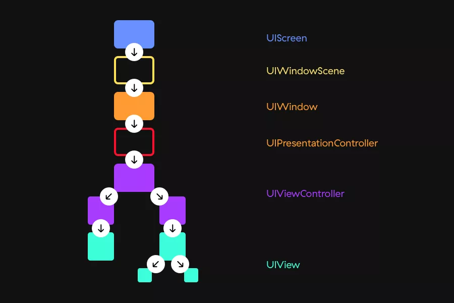
UIScreen gets the userInterfaceStyle property from the system and passes it onto the window scene, which propagates it to the window etc., etc. You get the idea.
This propagation means that the theme which should be used is not being read from the system on each hierarchical level, which allows us to override system appearance mode whenever we choose. For example, we can define a different interface style for just one view controller inside our app, and that style is then passed onto each of its child views, while unrelated views remain unaffected.
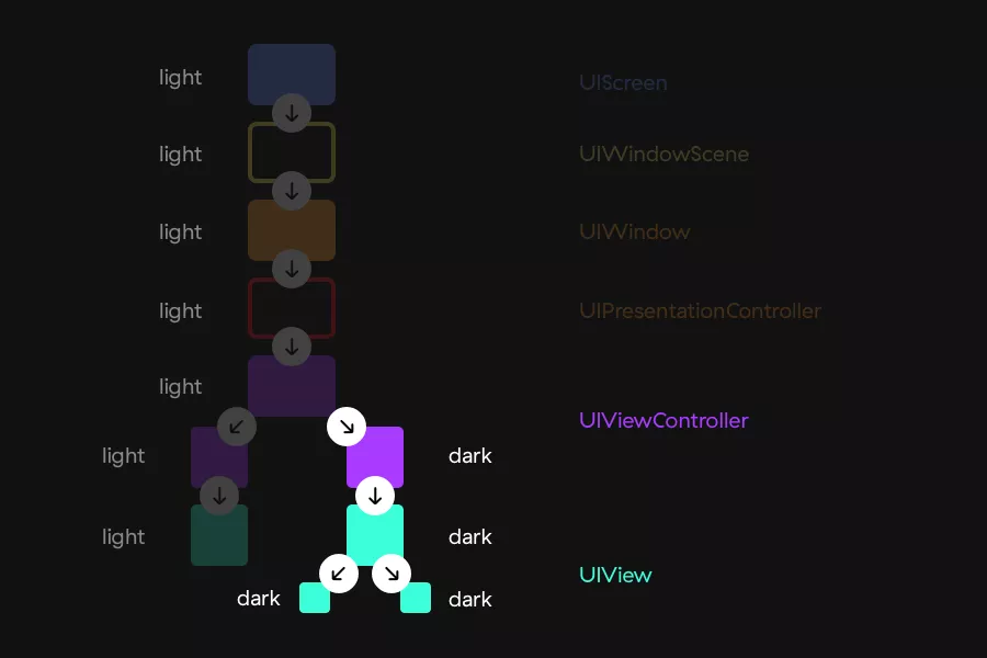
With iOS 13, UIView, UIViewController, and UIWindow have gained a new overrideUserInterfaceStyle property that lets us override the system appearance:
// Always light.
let lightView = UIView()
lightView.overrideUserInterfaceStyle = .light

// Always dark.
let darkView = UIView()
darkView.overrideUserInterfaceStyle = .dark

// Follows the appearance of its superview.
let view = UIView()
view.overrideUserInterfaceStyle = .unspecified
This will get applied to the view at question, but also to all its subviews, so be careful when doing so and make sure it’s what you really want.
2. Dynamic colors
Until now, both images and colors were static, which meant that they were always the same, independent of the environment. For example, if we added our own theming before, we would have to specify x different colors or images, with x being the number of themes we support.
Let’s see what has changed here.
Dynamic system colors
Starting from iOS 13, UIColors can be dynamic, which means they contain one set of RGB values for light mode, and another for dark.
Whenever users change the system appearance, the UIScreen trait collection is changed, and the UI objects in the hierarchy are notified. If any view in the hierarchy contains elements which are using dynamic colors, such as labels or buttons, everything will automatically update to the appropriate color instantaneously, without us doing any work.
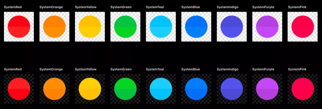
As you can see from the picture above, contrary to the old static colors, system colors are slightly different for each mode, sporting a shade specifically made to look better on light or dark mode, respectively.
Same as with the static colors before, these can be easily selected from the storyboard/xib:
Dynamic semantic colors
What makes semantic colors different from regular ones? Naming convention based on purpose. Instead of telling us what color they’re representing, these colors are named with their use in mind.
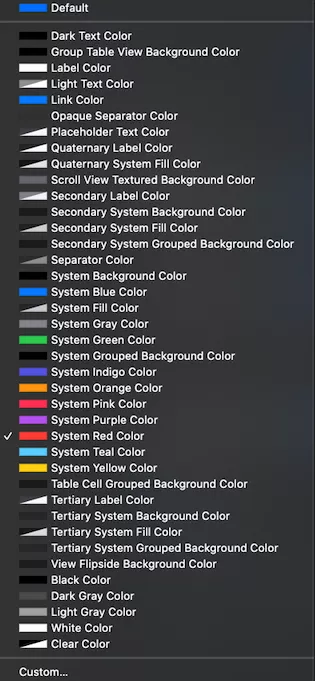
Previous Xcode versions offered two static colors which were semantically named – .lightText and .darkText. Since they are static, they don’t play nicely with the dark mode. Lucky for us, Xcode 11 provides us with a full new suite of semantic colors such as UIColor.label, UIColor.secondaryLabel, UIColor.headline and many others which do!
The most important take here is that using them ensures your app’s appearance will look familiar to the rest of the system. UIColor.label will look the same in all system apps, and using it in your app as well will make it feel native, which is always the best experience for the user.
Asset catalog dynamic colors
Asset catalog provides us with an option to create a different color set, which can later be used in both code and storyboards/xibs. When you create a new color set, choose the attributes inspector and in the appearance section select “Any, Light, Dark” and add appropriate colors for all styles.

Note that this approach will not work in iOS 10 since it doesn’t support color declarations in the asset catalog.
Code
If that disclaimer made you think “Oh sh**, I still support iOS 10, what now?”, no worries.
It’s also possible to create dynamic colors in code. You can initialize UIColor via init(dynamicProvider:) and return the corresponding colors depending on the current trait collection.
let myDynamicColor = UIColor { (traitCollection: UITraitCollection) -> UIColor in
    switch traitCollection.userInterfaceStyle {
    case .unspecified, .light: return UIColor(red: 220, green: 220, blue: 220, alpha: 1.0)
    case .dark: return UIColor(red: 0, green: 0, blue: 0, alpha: 1.0)
    }
}
One thing to note here is that if you’re working with CALayers, they do not play nicely with dynamic colors since they are not a part of UIKit.
However, there is a neat way to get precisely the colors we need. Apple has also provided us with a function we can use to resolve colors for the current trait collection aptly named resolvedColor(with:), as you can see below.
let resolvedColor = UIColor.label.resolvedColor(with: traitCollection)
layer.borderColor = resolvedColor.cgColor
One more thing to consider and keep in mind regarding CALayer: since it’s not a part of UIKit, it also will not respond to any appearance changes. This is something you need to take care of manually, by updating its style through a callback or an observable (if you’re feeling reactive).
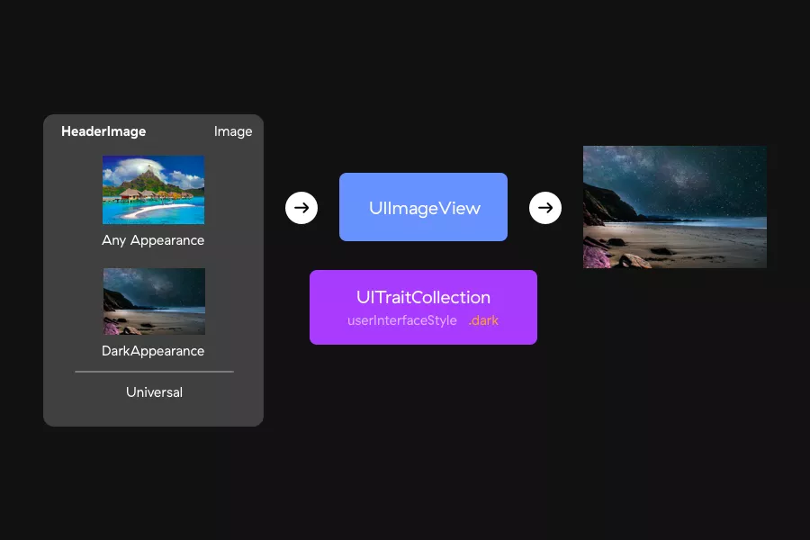
3. Dynamic images
In iOS 13, images, just like color sets, can also be dynamic. There are multiple ways to achieve this, so let’s take a look at the different options at our disposal.
Note that not all images will need to be dark-mode compliant. For example, if you allow user-imported images or color profiles, those will need to remain as they are regardless of the currently set appearance, so there’s no need to adjust them on the fly.
SF Symbols
SF Symbols are a huge collection of over 1,500 consistent, highly configurable symbols you can use in your app that Apple has introduced during this year’s WWDC. They are fully integrated in the iOS 13 SDK and will automatically be available on every device that is running it, which means you don’t need to increase your app size by adding additional images and icons.
Another thing that really makes them shine is the automatic adaption to light/dark modes that comes out-of-the-box. In the image below, you can see just how versatile they really are, allowing you to adapt them to whichever style, weight or scale you may need.

You can use SF Symbols in two ways in your apps, through storyboards/xibs or by creating them in code.

To use SF Symbols through the interface builder, all you need to do is add an image view, type the symbol name and you’re done. Next to the image name you’ll be able to se the “System” text telling you that you are using an SF Symbol; images you import through the Assets will not have that text.
If you prefer setting up your images through code, you can also use symbols there by using the new UIImage initializer which takes a system name, like so:
let image = UIImage(systemName: "cloud")
Since there are a lot of symbols available here and scrolling through them in Xcode can quickly become tiring, Apple has created an official SF Symbols app that can be used for easier reference or a quick look at all the available symbols.
Custom images
For your custom images, you can define different image assets for both light and dark modes, and it can be done directly from the asset catalog, just like with custom colors. Just set their appearance in the right pane, drop a new image for each appearance and you’re done.
If, for some reason, you want to resolve the image and determine which one will be used, you can do that easily by resolving images by using the current trait collection:
let image = UIImage(named: "image")
let asset = image?.imageAsset
let resolvedImage = asset?.image(with: traitCollection)
4. Attributed text
If you’ve ever used attributed text in your apps, you probably know that unless you specify the foregroundColor property, it will be automatically set to .black.
That was probably fine before if you weren’t using a black background, but with iOS 13, it will not work as expected when using the dark appearance–black text on a black background is a big no-no.
That’s where things like semantic colors come into play, as you can see below.
let attributedText = "Hello dark mode"

let attributes: [NSAttributedString.Key: AnyObject] = [
    .font: UIFont.preferredFont(forTextStyle: .body),
    .foregroundColor: .label
]

attributedText.draw(at: .zero, withAttributes: attributes)
5. Responding to appearance changes
Whenever users change their appearance styles, several methods get called. You can leverage this by putting any additional UI logic which depends on the current appearance into these methods:
- UIViewController – viewWillLayoutSubviews(),
- UIPresentationController – containerViewWillLayoutSubviews(),
- UIView – layoutSubviews() and tintColorDidChange().
In addition, since all those objects conform to the UITraitEnviromentprotocol, traitCollectionDidChange() will also get called.
To simplify–if you’ve been initializing your colors/images in the init and viewDidLoadmethods, move that logic into the layoutSubviews() and viewDidLayoutSubiews() methods and you should be good to go. Any additional logic you have regarding the appearance can go into the traitCollectionDidChange() method, which will also get called when the appearance updates.
But… What if I don’t want to support it?
Having read all of the above, this question may have popped into your head, and it’s a perfectly valid dilemma.
There are several reasons why you wouldn’t want to add dark mode support: perhaps there’s no time to implement it properly or your brand guidelines are centered around light themes, to name only a few. Luckily for you, it’s really easy to disable dark mode and forget all about it.
There are three main ways to do this:
- set UIUserInterfaceStyle to Light in your info.plist,
- override the appearance in the UIScreen,
- keep shipping your app with older Xcode versions.
For partial support, just override interface styles on screens where you don’t want to support dark mode by using the code shown in the first heading, 1. Understanding the trait collection.
However, keep in mind that Apple really wants you to fully support dark mode, and their quote from WWDC should really drive that point home.
“You really don’t want to be that one light appearance that’s stuck in dark appearance.”.
In other words, not switching to dark mode will make you the black sheep… If that makes any sense.
The dark mode sees the light of day
We’ve been eagerly anticipating dark mode on iOS ever since Apple released it on the Mac last year–and it’s finally here.
It appears to be a much-needed trigger which will encourage more iOS developers to look into app theming. By following the steps I’ve detailed in this post, you’ll be on course for perfecting dark mode in no time.
Go ahead, paint it black. Happy theming!