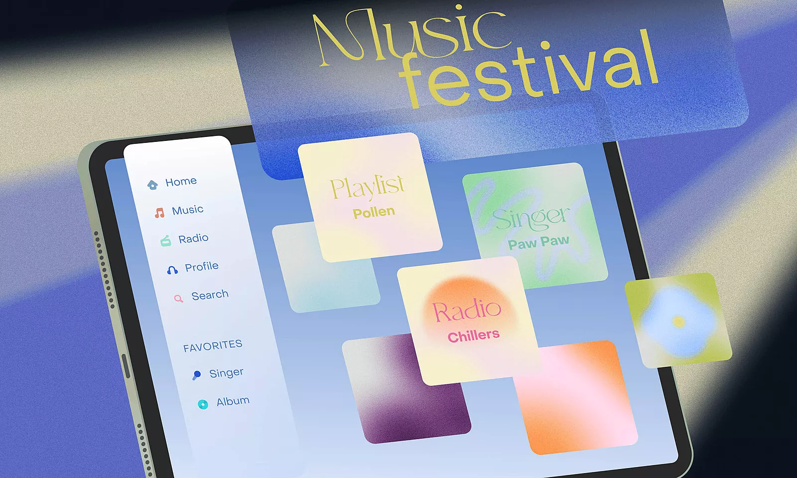
Ever since the first iPad release in 2010, this lightweight, big screen device has gotten more powerful hardware with each iteration. It has given developers the opportunity to create a variety of apps, from beautiful, graphic intensive games to Apple Pencil-supported apps for drawing. An iPad can even run things we never would’ve imagined these days.
However, until WWDC 2019, the software inside the iPad was just a scaled-up version of iOS, minus a few distinct features that were custom-created for the iPad. To say the least, it didn’t look like much.
At last, an iPadOS?
Then, in June 2019 at WWDC, Apple finally offered a solution for the problem in the form of the iPadOS 13.
In the background, it featured everything iOS 13 did, plus some of the functionality features created specifically for the iPad and based on the philosophy of the device itself. In addition to Home Screen, multitasking, Safari, and Sidecar changes, there was also mouse and keyboard support, which marked the beginning of change in how people can use their iPads.
However, the new features hardly offered any info about designing the apps other than how to adapt the design to the newly introduced dark mode.
iPadOS 2.0
Luckily, in the summer 2020 edition of WWDC, Apple decided to push the iPad experience even further with iPadOS 14, introducing the new Scribble mode, a compact UI, and several essential system-wide redesign features.
This new design took the best ideas from macOS and iOS and combined them into something that looks new but feels very familiar. It reminded us that the iPad is a device in its own right, and urges designers and developers to make an effort and adapt a digital product’s design according to the device it will run on.
How to adapt an app to the iPad?
When adapting your current iPad apps, you should revolve around two goals, or checkpoints, depending on the app and its purpose: layout and user interaction.
Design and layout app adaptation
Can you tell what’s wrong with the user experience in the screen below?
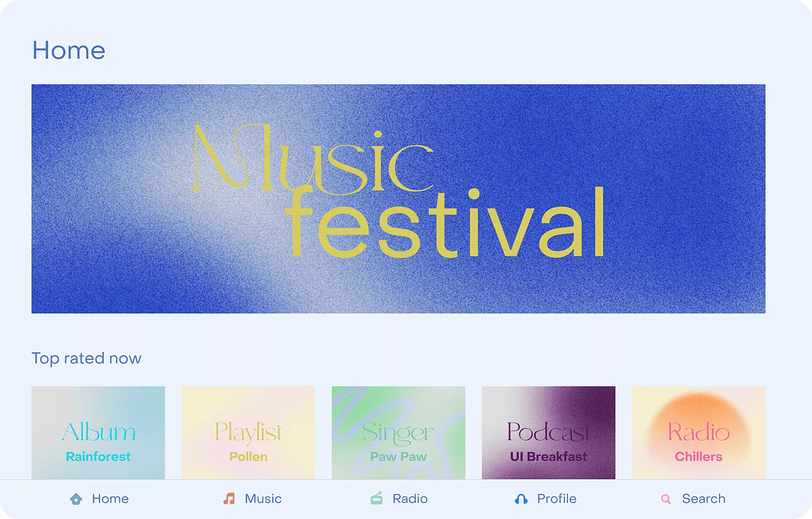
We can see a tab bar app with the Home screen, and that the enlarged iPhone interface doesn’t really work. By applying a few simple steps, we can make this app easier to navigate and utilize space in a better way.
The sidebar
Ever since iPadOS 13, iPad apps come in two width classes – regular and compact.
Compact sizes are used for slide-over apps. This means that if this app happens to be displayed in its compact width, the sidebar will never appear and the user will navigate through tabs. However, once any app is in its split view or full size, the sidebar is the way to go.
Apps should never use both the sidebar and tab bar at the same time because it can be confusing to the user. Stick to one option depending on the app width.
Let’s add the sidebar.
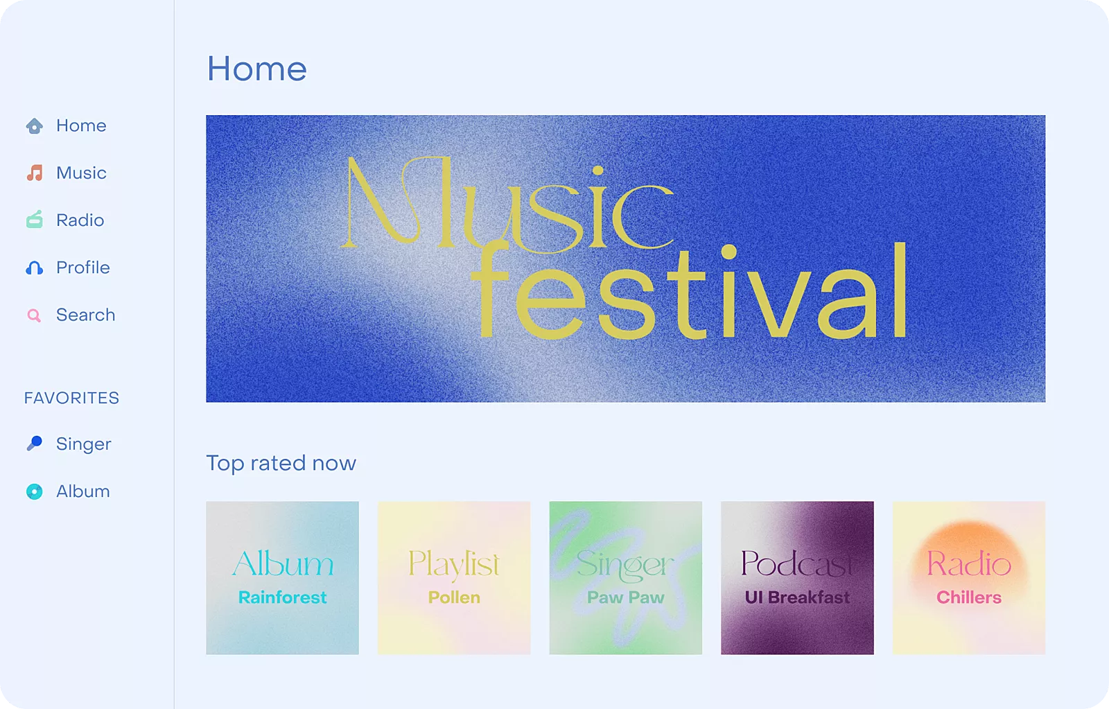
With the iPadOS 14, sidebars do not only display navigation but can also be customized by the user. For example, users can simply drag and drop favorite artists into the sidebar, making the most important content easily accessible. Awesome!
Sidebars can be toggled with a button that comes automatically, after which the full size of the view will emerge. However, if you want to access it in portrait mode, you have to swipe from the left side to the screen and it will present itself.
The best use case of the sidebars is quick and easy access to important content. Don’t go too deep into the hierarchy because this kind of UI is not suitable for that.
Content size
When talking about content size, always think about displaying it in a sense where you can put as much as possible in a way that is pleasant to the eye and readable.
The next screen shows things you should avoid.
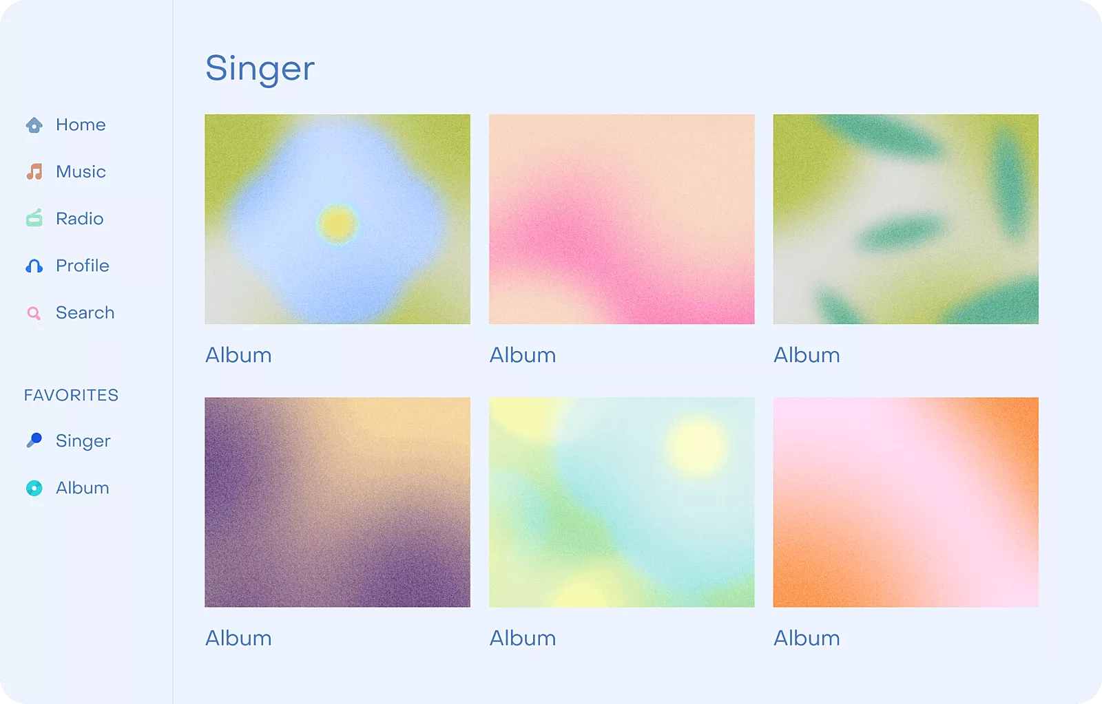
Imagine owning a 12.9 inch iPad Pro and being able to see only six albums at a time. Does that make sense at all? And what if I told you that with a simple readability rule, you could put more content on a single screen, without forcing users to scroll through six things at once?
Here’s how it works.

The context
This has a lot to do with modals and popovers. If possible, modals should be avoided unless using them really makes sense. Their actions may be better presented as a popover or a simple toolbar.
The end result of either option is staying in the same context of the screen you are currently on.
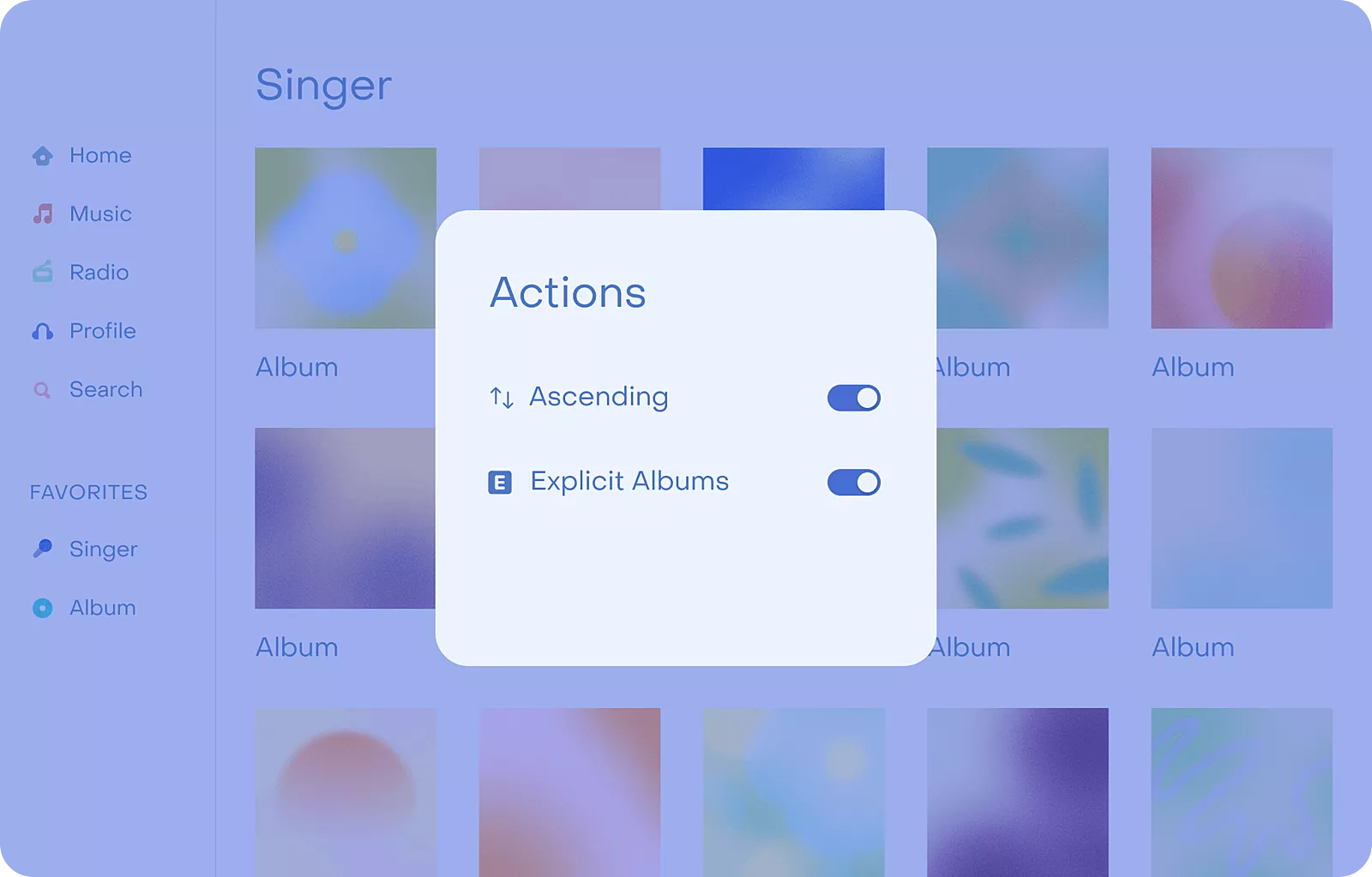
For example, using a modal in the screen above doesn’t make sense at all. Since the content behind those actions is under their direct influence, the best way of representing them is within the same context to which they are applied.
Now, the only thing left is to check whether there is enough space to put them. In this case, the answer is yes.
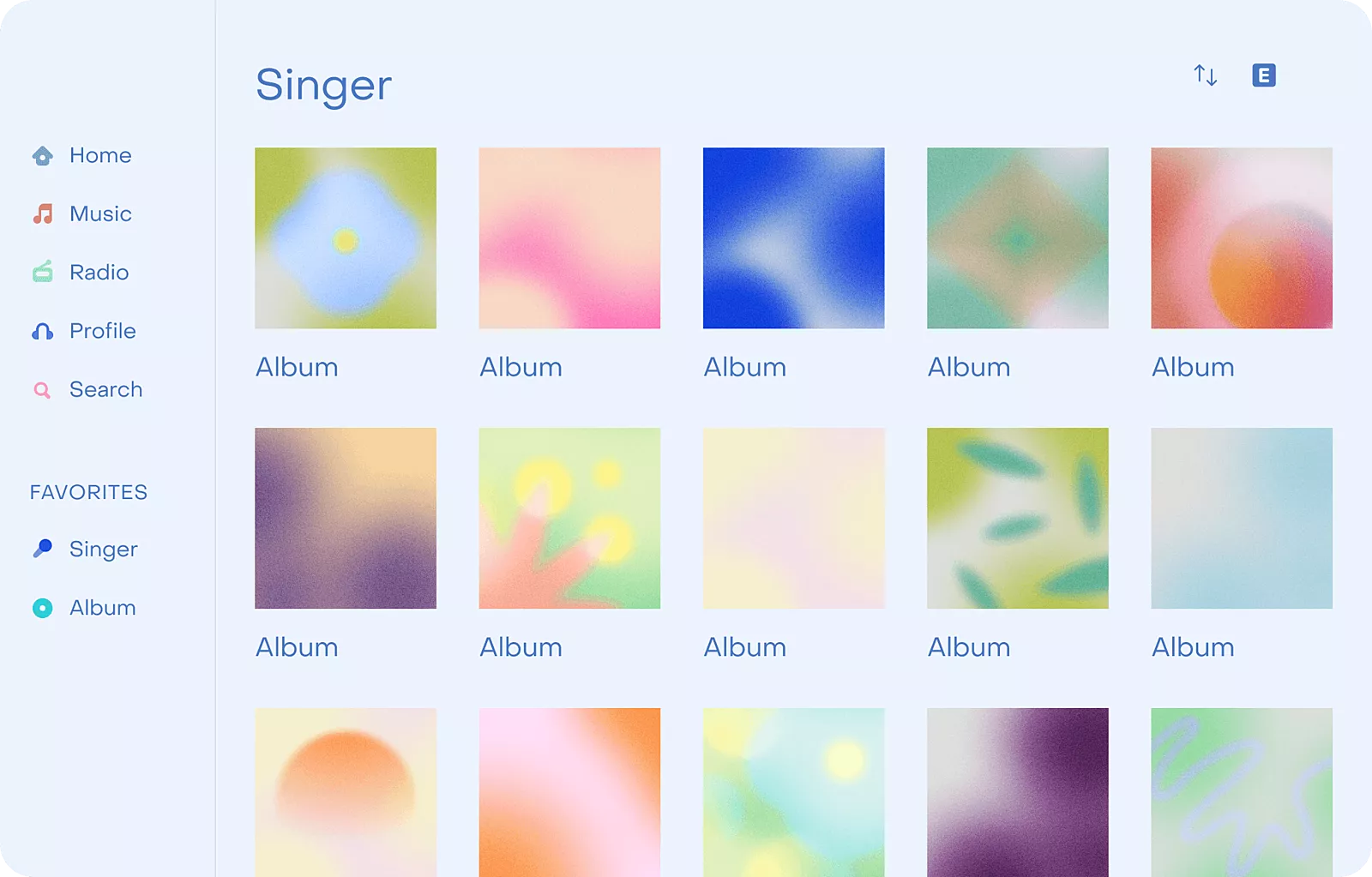
This way of displaying actions provides more context to the content and gives the user ability to use these actions much quicker than before.
User interaction
There have never been more possibilities to use an iPad. What used to be just a multi-touch device nowadays has a pencil, keyboard, and mouse support.
This means that you can easily integrate keyboard shortcuts into your app. You can also combine multiple interactions to achieve the specific usage functionality. For example, keyboard and mouse combined can be used for selecting items the same way like we’ve been doing it on macOS for years.
Giving users the possibility of interacting with the app and customizing it the way they like makes for a richer user experience.
Embrace the new design era with iPadOS 14
Repeat after me: Great iPad apps shouldn’t be lovechildren between a Mac and an iPhone, stuck in 2016.
Even though adaptation cannot be applied on every app, or every screen of the app, reorganizing the user interface in order to create a better user experience is probably easier than you think.
So add that sidebar and allow the user to customize it to achieve faster access to their favorite content, and take advantage of the new interaction methods to complement new usability options when developing your next iPad app.


