


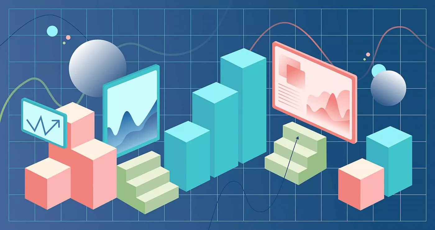
Flutter charts are a challenge to implement in mobile apps. Learn how to do it easier with this handy guide on creating charts that are ready for production. This article will help you navigate the abundance of charting libraries, showing you tricks for customization and smooth integration to bring your designer’s vision to life. Make your data pop in a fun and professional way for your mobile app.
It’s not a secret that apps collect user data. Insight into some of that data is also available for app users. An efficient way to present the information is using visuals, specifically graphs and charts.
They are easy to implement when it comes to Android or iOS, but for designers and engineers working with Flutter, it’s easier said than done due to a scarcity of chart templates at their disposal.
A possible solution is to create custom charts.
Creating custom Flutter charts
Unlike chart templates, charting libraries available at our disposal are abundant. For example, I stumbled upon more than 128 packages for the keyword “charts” when writing. They aren’t perfect, though – most are lacking in customization or require adding some UI elements, making it almost impossible to replicate designers’ ideas.
I’ve tested several available chart libraries, desperately trying to mold our data to fit in the chart and repeatedly failing because the developers had either missed or forgotten something. Don’t get me wrong, none of those libraries are bad per se, nor do developers like to reinvent charts that much.
Charts are challenging to make, especially when presenting an enormous amount of data in a neat visual that should be fully customizable and accurate. And that’s just half of what a chart is supposed to do. The next part would be displaying a legend for more straightforward data interpretation.
The grammar of graphics
Leland Wilkinson has an excellent book about data representation called The Grammar of Graphics. It dissects in simple terms the repression of graphics and their rules into seven layers, from data to themes:

We can see that layers have their functions, namely they enable us to build new layers on top quickly. The book describes how to present any data in any way imaginable. Our library will be used mainly on mobile devices, so we will focus on drawing in rectangular coordinate space to save time.
We can also delegate some layers. For example, we have limited space on mobile where multiple charts in grid view might be overkill. That being said, we can delegate the facets layer to the developer. If necessary, it can be done using GridView and by adding multiple Chart widgets as children.
Working on a custom solution for Flutter charts
We wanted a simple Flutter chart that allows for a lot more UI customization. Making a scatter diagram or pie chart is technically possible using this lib, but it would require a lot of work.
Back to The Grammar of Graphics, how could we use those layers, and what layers do we need to create simple charts? Following this will allow us to implement missing layers later if required.

Now that we know what layers we need to handle immediately, it no longer looks so intimidating. With just four layers, we will be able to see our data.
Data
Now that we know how to make our Flutter chart, we can start handling the data layer. ChartData will map data to chart items. There is also ChartData.randomBarValues that helps with testing when adding charts. Chart data is handling aesthetics as well for now – it will try to display all of the data in the list and scale the chart accordingly. You can change that with exact value by specifying the axisMin and axisMax, or you can change the valueAxisMaxOver. That will add ‘invisible’ data on the max value, acting as ‘padding’ on current data.
Geometries
Geometry is a layer that takes the item and decides how and where to draw it in the chart. By using ItemPainter, we can draw different items while passing the same data. We could also expand our ChartItem<T> to show additional or other data.
Having geometry separated is useful since that way we can show the data we want without reinventing the whole chart. For example, if you need to show a custom chart item with five values, it can be done by extending ChartItem<T> and GeometryPainter<T> to draw and show any item you want. You can even add your own item options by extending ItemOptions.
Statistics
DataStrategy is used to manipulate the data. Current strategies are DefaultDataStrategy and StackDataStrategy. For now, since we won’t be adding an Aesthetics layer at this time, ChartData will also handle the scale the data will use. Horizontal axis for the charts is by default linear.
Themes
Themes are just things that decorate the Flutter chart. In our case, we added “2” layers of decoration, front-ground and back-ground decorations. That way, we can also control the decorations shown on the front and back of the items. The neat thing is that we can use the decoration we make in multiple different use cases while also allowing complete customizability by extending DecorationPainter new Decorations can easily be added.
Animating the Flutter charts
It’s not enough for charts to be customizable and flexible to satisfy the design and blend with the app. Usually, analytics screens will have filters or something similar that will change the chart. That chart should animate to a new state to keep the app looking fluid and smooth.
Making this was a bit of a challenge, but since we already had layers nicely set up, it was just a matter of getting layers to animate between states.
We added lerp functions to each layer. Making a new ImplicitlyAnimatedWidget would ensure users can add AnimatedChart, and it will automatically update when a change in chart state is detected.
Using Flutter charts in production
We have significant experience building healthcare apps, and they always want to show data in some way. That gave us a chance to try our Flutter charts immediately in the app we were developing for the US market. It was a perfect test since the charts were complex, and each screen had a slightly different chart to show.
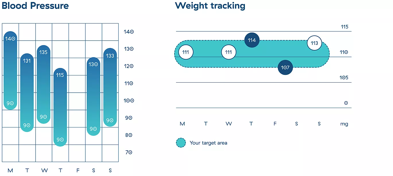
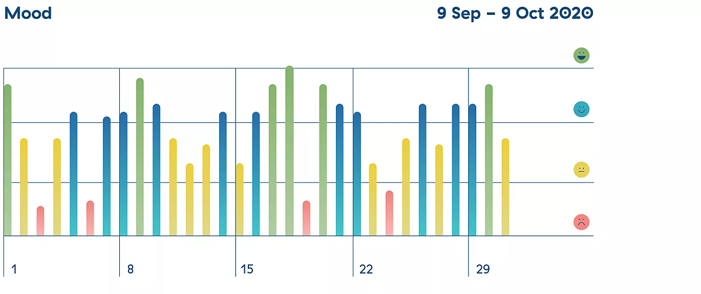
The library didn’t limit us in any way. We could easily create a custom extension and add it to the chart if something was missing. So, by using the library more and more, we added a variety of decorations that would later prove suitable for the charts we were yet to create.
Finally, to make sure we don’t break any of the existing decorations or item painters when adding new features, we added over 80 golden tests. Safety first!
Pixel perfect charts every time
Using charts in production can be tricky, but Flutter charts can help. Try it out and help us make it better with feedback!
Infinum is proud to be enlisted in Google’s Flutter Consultants Repository. If you need a Flutter app that will elevate your business, get in touch with us for top-notch development services.