Do you like designing app onboardings? Even though it comes at the very end of the design project, the introductory flows are usually the most fun.
Onboarding includes much more than just a few screens at the beginning of an app. It also includes app store screens and in-boarding; essentially it’s everything around the app that helps people to use and understand it better. Our focus in this article will be on in-app onboarding.
When I was designing my first onboarding flow, I wasn’t sure which idea to pursue. Should it be filled with eye-candy illustrations, worthy to become my first ever Dribbble shot (since I don’t have any yet), or should I stick with boring tooltips because that’s more useful to the user? Should I make something in-between? Maybe I could add motion graphics, that’s trendy… You understand where I’m going with this.
There are a lot of options, and you need to start somewhere. My advice is to start with the people you are designing for. As usual, when you dig deeper, you’ll find there’s a whole new world around that particular topic. In this article, I have summed up the basics that helped me improve the process of designing onboarding flows.
Why onboarding is important
When a person installs an app that means that the app’s promotion and marketing efforts (e.g. app store screens) were successful. Our person knows about the app and now has the intention to use it. Great! All we have to do now is to retain the user, which is not so easy nowadays, and all that starts with a good onboarding process.
Onboarding is a great opportunity for people to see the main values of the app and to understand it better. In the long run, that can affect their general impression and experience.
Determining the focus of your onboarding flow
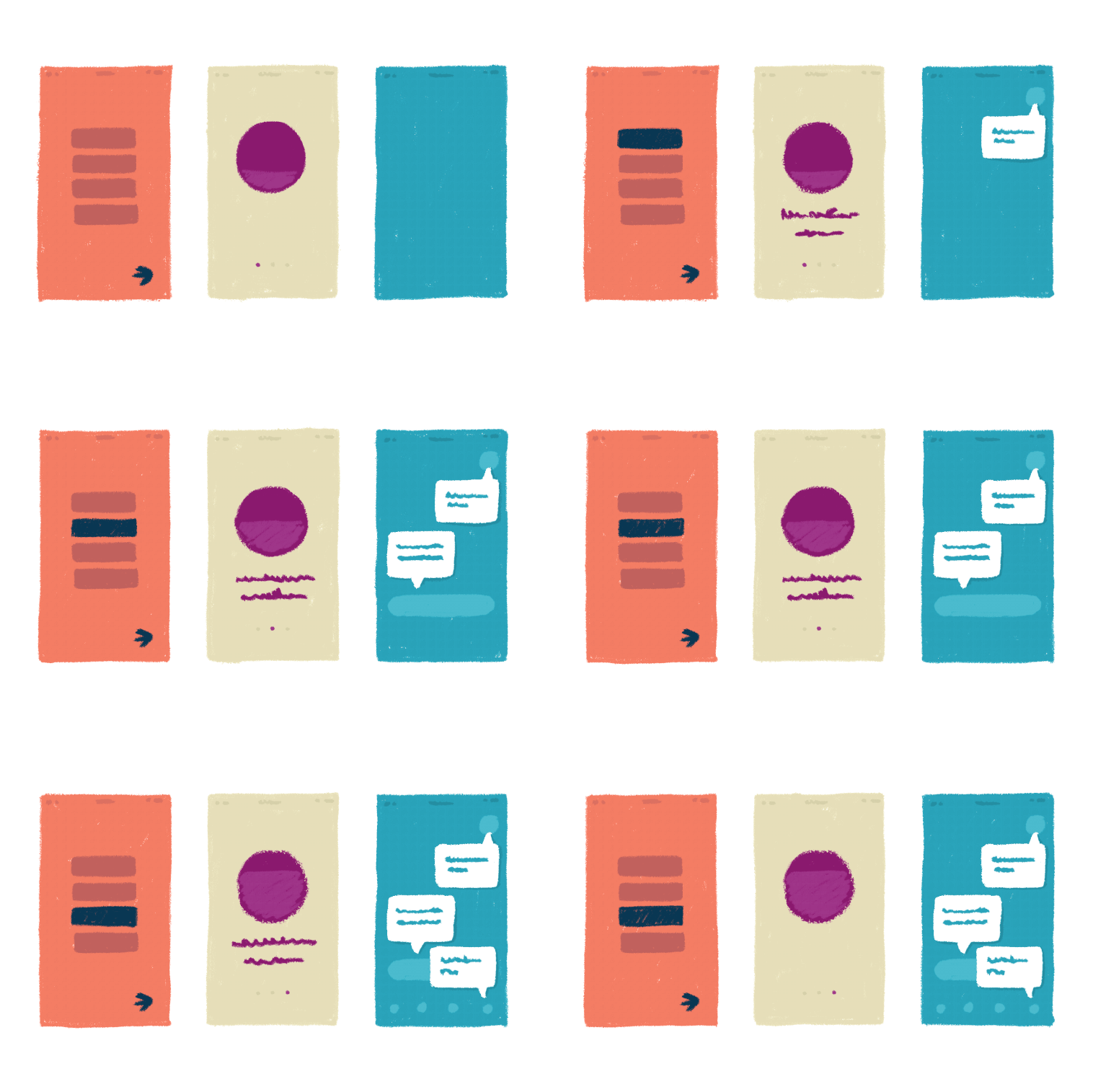
When designing an onboarding flow, you should set some goals. What do you want to communicate to the first-time user? What is the correlation between your goals and the content of the app itself? Can onboarding be useful but also a pleasant experience?
To answer these questions, I’ve found an excellent breakdown of onboarding types:
- Benefit focused – explains two or three core benefits and how to achieve them via the app
- Function focused – explains two or three core functions of the app and how to use them
- Doing focused – walks the user through the first or most common actions
- Account-focused – walks the user through the account/profile creation process, including finding and adding friends or interests
- All – for particularly complex digital products, it may be necessary to combine all of the above
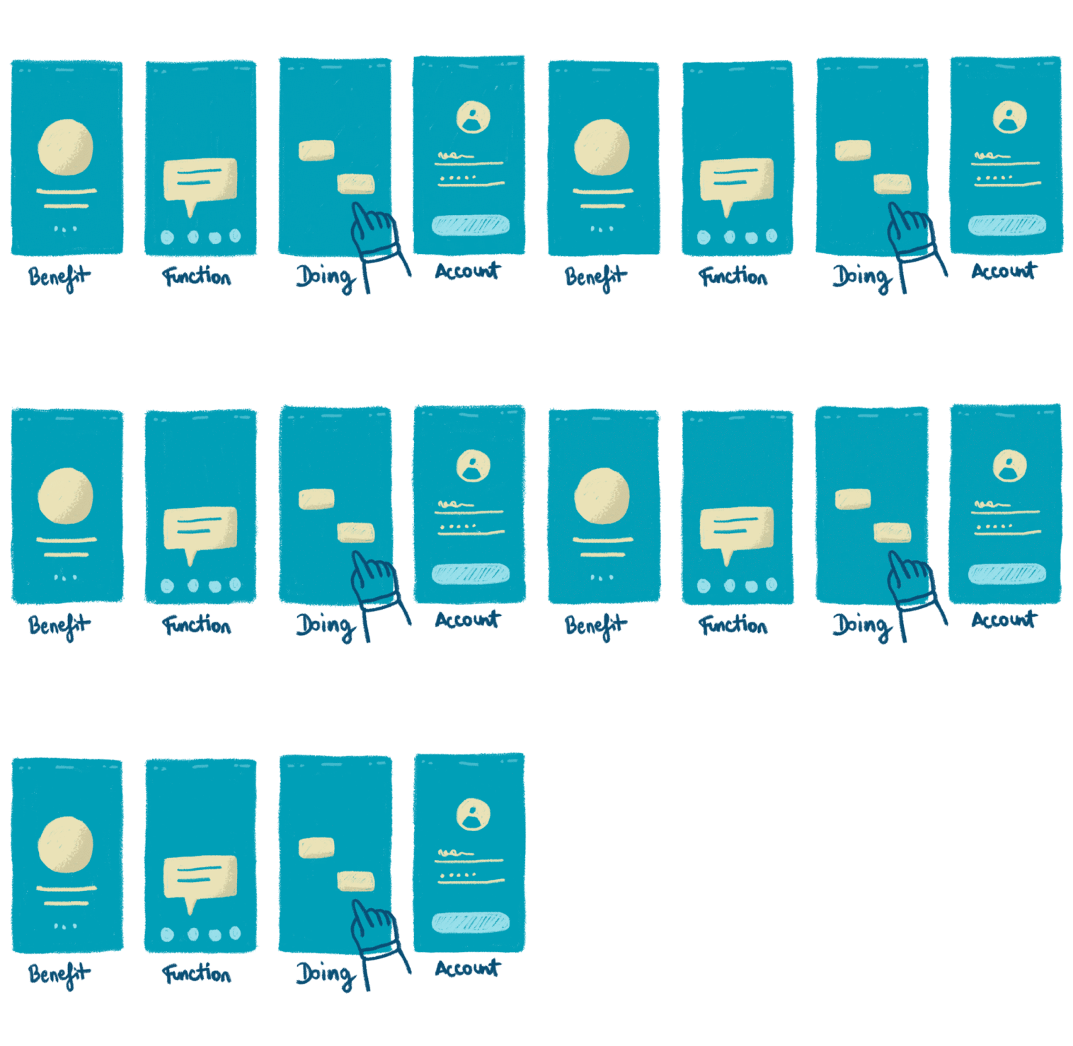
The great thing about this breakdown is that it allows you to build your idea around specific goals. You can then bring that to reality in whatever form you like or think it’s appropriate. This way you’re not stuck between existing visual forms. Also, you can combine two or more focuses depending on your concept or idea.
Let’s see how this works in action.
Benefit and function-focused
Collect app has a combination of benefit and function focused onboarding. In the benefit part, you get an idea what you can expect from the app, and in the function part, you get the understanding of how it works.
Doing focused
A great example here is Lake. The app’s flow is so simple and consistent with the real UI, that the user has a clear idea of what to do when the onboarding is over.
Account focused
Let’s say there are two types of account focused onboardings; basic and non-basic. The basic one can be any flow where users go through input fields and forms in order to create an account. Let’s look at GO’s flow:
Non-basic one is not so common, but a great one to stir up your imagination. An example is Bundler TV, where the onboarding takes form of a simple quiz. What’s great about this is that the user will have custom-made content. The bad thing here is that it requires bigger cognitive effort, and it’s a bit more time consuming.
All focused
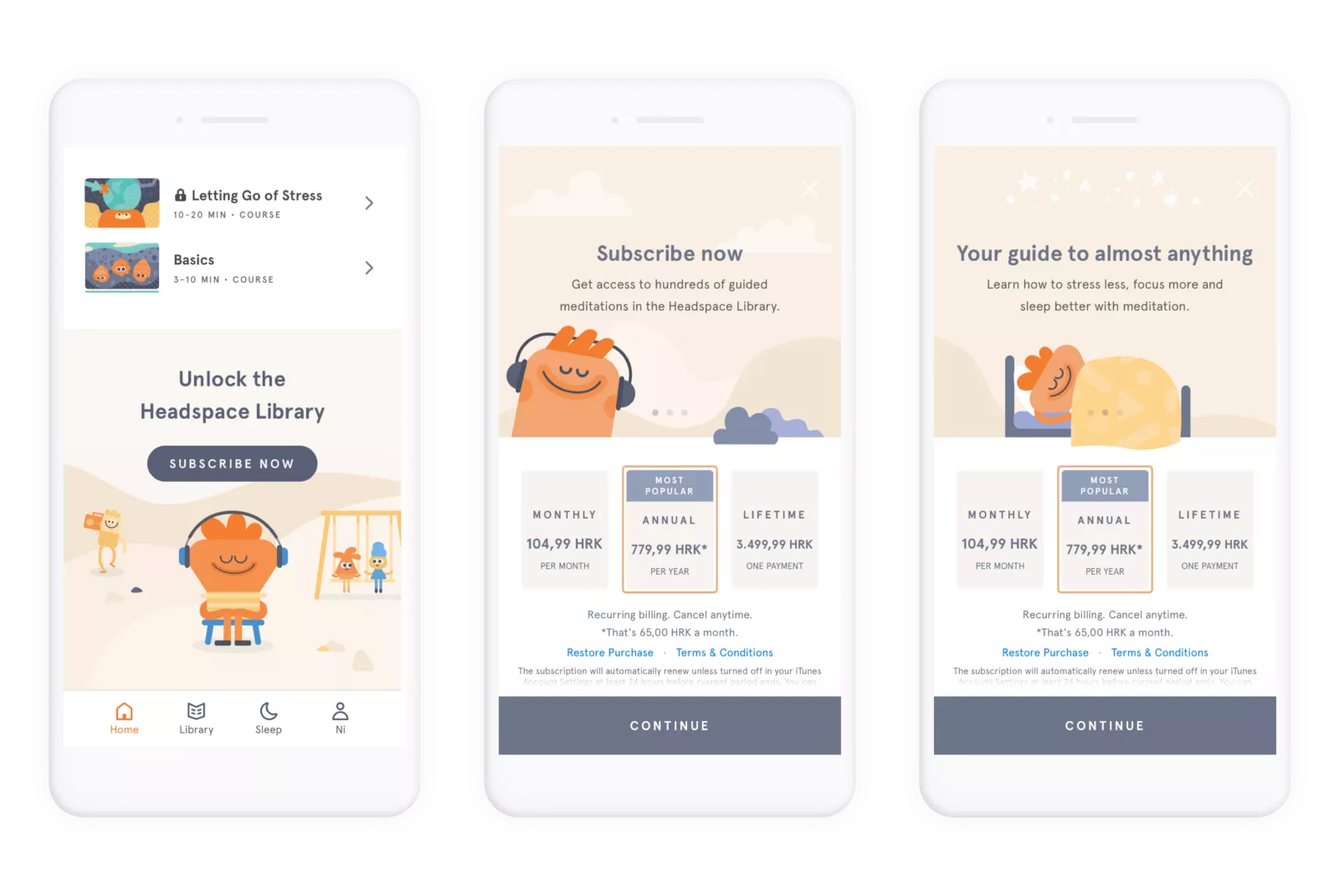
As already mentioned, there are complex onboarding flows that touch upon different goals. A great example is Headspace, which among other things, has an additional onboarding for a premium account. It starts with a suggestion to subscribe, then shows a few subscription plans, and a prompt to purchase. That’s it.
Tips
No matter the onboarding type, here’s a few things to keep in mind:
- Beware when there’s not enough consistency between the onboarding and the UI of the app,
- Beware when your users skip onboarding – is it good, bad, bearable? Check your analytics and see what to improve.
- Don’t forget about different flows such as onboarding onto a premium account, onto new UI design or introduction to new features. It helps.
- Too many tooltips can kill your users.
There are also other classifications of onboarding types, such as walkthrough, personalization or choosing preferences, guided tour, tooltips, inboarding, and so on. But what’s great about a focus-related breakdown we talked about above, is that you’re not depending on existing visual forms but have an opportunity to develop your own.
Conclusion
It’s all about how you want to construct this flow to meet users and business needs. In reality, it depends from project to project, but it’s always good to take time and define the focus type; develop your idea around that, and then design it thoroughly rather than hastily.
In the end, the more I understand this topic, the more it seems to me that great onboarding can:
- Provide necessary information but also make an introduction to the app more pleasant and meaningful.
- Meet both user and business needs.
- Win designers and their hearts
I hope this was helpful. Happy onboarding!
P.S. another interesting onboarding breakdown here.


