


What do crows like? Shiny things. Us humans are not that different, which is why most people prefer using visual interfaces instead of command line terminals.
We love good looking, fluid, modern, responsive, and touch-sensitive applications which provide feedback. We geek out over good looking animations and apps that come alive as we use them. In short, we love our apps shiny.
As developers, too often we focus on functionalities and just getting things done. If a user story or client requirement is completed and it works, we will pat ourselves on the back and call it a day. But what if we spent just a few more minutes to make things – you’ve guessed it – shinier?
This blog post will provide you with 4 quick and easy ways to make your apps stand out in the sea of similar ones, and all it’s going to take is a few minutes of your time.
Waiting for the coffee to brew or the microwave to finish heating up your food? Spend those few minutes adding these into your apps, and make it easier for users to pick your app as their favourite.
Round them up
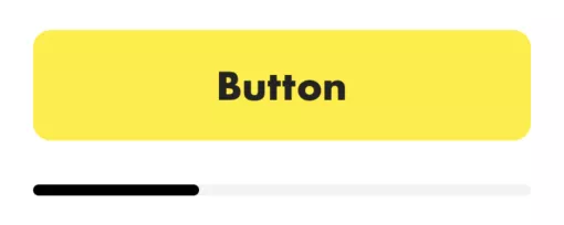
Rectangles; they are everywhere. Let’s take two common UI elements to demonstrate this – the trusty button and the all-knowing, albeit non-native, progress bar. When customizing their look, we would probably come up with something like this:

Sure, they get the job done as best as they can; the button can be clicked and the progress bar shows the current progress (duh). However, are they any different from all other generic UI elements we see throughout the apps we are using? Not really. Let’s change this!
With just a few lines of code, we can easily make them stand out more, and make the UI itself more pleasing to the eye.
public extension UIView {

    /// Corner radius of view; also inspectable from Storyboard.
    @IBInspectable var cornerRadius: CGFloat {
        get { return layer.cornerRadius }

        set (cornerRadius) {
            layer.masksToBounds = true
            layer.cornerRadius = cornerRadius
        }
    }

}
Since UIButton is also a type of UIView, no additional code is necessary to make our button rounded as well. All we have to do is set the proper corner radius in the storyboard. After applying this small change, our rounded UI looks much nicer and, dare I say, shinier.
Feedback is important
Apple started taking device vibrations more seriously when they removed the home button from the iPhone 7 and 7 Plus. The various haptic signals needed for all the actions in this new buttonless device required Apple to build a 2nd generation of the Taptic Engine, as well as several frameworks in a bundle called Haptic Feedback to easily use this new technology. These frameworks are available from iOS 10, which in 2019 means most of your target audience’s devices support it.
There are three main types of feedback generators that we can use:
- UISelectionFeedbackGenerator indicates that the selection is actively changing. This feedback type is intended for communicating movement through a series of discrete values. Apple uses it throughout the system (e.g. toggle, picker wheel etc.) and if you provide a custom way for users to pick or select something, you should probably be using it as well.
- UINotificationFeedbackGenerator should notify the user that a task or action, such as making a payment or saving to a database, have completed, along with the completion state which should be obvious without looking at the screen. It has three variations:
.success,.warning, and.error, which should be used accordingly. - UIImpactFeedbackGenerator provides a physical means of complementing the visual experience. For example, the user might feel a thud when a view slides into place or two objects collide. Same as UINotificationFeedbackGenerator, this one also has three variations:
.light,.medium, and.heavy.
Haptic signals are a great way to complement an app’s interface and create a stunning user experience overall. In addition, iOS 13 expands on this with the ability to create your own feedback patterns, which could result in interesting ways of interacting with our phones.
One thing to keep in mind is that you shouldn’t go overboard and make the device vibrate at all times. As uncle Ben said in the first Spider-man movie, ”With great power comes great responsibility”, so use haptic feedback wisely and with purpose.
Ups and downs
Following along with the theme of notifying users of their actions, let’s switch from haptic to visual feedback. We’ve all used buttons inside our applications – when we press them, some action occurs. If we use Apple’s default buttons, they change the colour a bit, which notifies us something’s happened. Although subtle, the effect serves its purpose rather great. But why stop at that – why not make it look even better?
What we can do here is implement button scaling when it’s highlighted, which (subjectively) looks a lot better. The code for that is pretty straightforward:
class AnimatedButton: RoundButton {

    override var isHighlighted: Bool {
        didSet {
            let transform: CGAffineTransform = isHighlighted ? .init(scaleX: 0.95, y: 0.95) : .identity
            animate(transform)
        }
    }

}

private extension AnimatedButton {

    private func animate(_ transform: CGAffineTransform) {
        UIView.animate(
            withDuration: 0.4,
            delay: 0,
            usingSpringWithDamping: 0.5,
            initialSpringVelocity: 3,
            options: [.curveEaseInOut],
            animations: {
                self.transform = transform
            }
        )
    }

}
As you can notice, we have also used our RoundButton created before. They fit together perfectly, and this is what it looks like in action:
You can also do something similar for the tab bar items in the UITabBarControllerDelegate’s tabBarController(_ : didSelect:) method. It looks really nice and provides a visual pop. For bonus points, add selection haptic feedback for a well-rounded user experience.
Tab sliding
Last but not least, we will return to our tab bar controller for a moment. When we tap on the bar items, their respective view controllers come into focus. Good thing about Apple’s implementation of this is that their state is preserved when switching. However, the result is slightly basic-looking, which we don’t want. Why not switch it up a bit and improve the looks of this, too?
All we need are a few lines of code to animate the transition of our view controllers:
extension TabBarController: UITabBarControllerDelegate {

    func tabBarController(_ tabBarController: UITabBarController, shouldSelect viewController: UIViewController) -> Bool {
        guard
            let tabViewControllers = tabBarController.viewControllers,
            let targetIndex = tabViewControllers.firstIndex(of: viewController),
            let targetView = tabViewControllers[targetIndex].view,
            let currentViewController = selectedViewController,
            let currentIndex = tabViewControllers.firstIndex(of: currentViewController)
            else { return false }

        if currentIndex != targetIndex {
            animateToView(targetView, at: targetIndex, from: currentViewController.view, at: currentIndex)
        }

        return true
    }

}

private extension TabBarController {

    func animateToView(_ toView: UIView, at toIndex: Int, from fromView: UIView, at fromIndex: Int) {
        // Position toView off screen (to the left/right of fromView)
        let screenWidth = UIScreen.main.bounds.size.width
        let offset = toIndex > fromIndex ? screenWidth : -screenWidth

        toView.frame.origin = CGPoint(
            x: toView.frame.origin.x + offset,
            y: toView.frame.origin.y
        )

        fromView.superview?.addSubview(toView)

        // Disable interaction during animation
        view.isUserInteractionEnabled = false

        UIView.animate(
            withDuration: 0.5,
            delay: 0.0,
            usingSpringWithDamping: 0.75,
            initialSpringVelocity: 0.5,
            options: .curveEaseInOut,
            animations: {
                // Slide the views by -offset
                fromView.center = CGPoint(x: fromView.center.x - offset, y: fromView.center.y)
                toView.center = CGPoint(x: toView.center.x - offset, y: toView.center.y)
            },
            completion: { _ in
                // Remove the old view from the tabbar view.
                fromView.removeFromSuperview()
                self.selectedIndex = toIndex
                self.view.isUserInteractionEnabled = true
            }
        )
    }

}
After doing this, our tab switching should have a fresh new look, like in the example below:
Wrapping it up
If you’re underwhelmed when using applications with bland interfaces, you shouldn’t be satisfied with creating them either. Sudden UI changes or no feedback on inputs could result in users thinking they might have done something wrong or question whether anything is happening under the hood at all.
Listed above are just some of the ways you can increase app engagement and make it stand out. The best thing is they are so easy to execute and so helpful in capturing the attention of users!
Got any tips & tricks of your own? Feel free to leave them in the comments below, we’re always eager to learn new things.