





Building one design system is already difficult. Building one that serves four different brands simultaneously is a whole new ball game.
As a product designer working on a project for our client Beyond ONE, I led the design system effort across four brands: Virgin Mobile, FRiENDi Mobile, Virgin Connect Roam, and FRiENDi Pay.
At the start, each brand had its own design system files: an assets file, a mobile app components file, and a web components file. That’s twelve files in total to maintain. Every time we updated a shared component, we had to update it multiple times. And as the team grew and the products evolved, maintaining the system became increasingly difficult.
This is where design tokens became essential. In this article, I’ll walk you through how we built the token architecture and overall system structure from scratch, which eventually became the single source of truth for both design and development teams.
Four brands, four different user experiences
The four brands shared almost identical structure, from buttons, checkboxes, and inputs to navigation patterns and layout systems. But each product had a different look and feel. The differences weren’t limited to colors, typography, or icons. Every brand had different features, served a different purpose, and therefore required a different kind of experience.
For example, FRiENDi Pay needed to feel secure and reliable because users were managing payments, transfers, and wallets. If the experience looked too playful or too similar to a telecom product, users might not feel enough trust while managing their money.
At the same time, we supported multiple languages and platforms, which made typography especially complex. We used Poppins across Virgin products, Open Sans for FRiENDi products, and Tajawal for Arabic, while also maintaining separate typography rules for mobile apps, desktop web, tablet web, and mobile web experiences.
Without a structured system behind it, maintaining components at that scale would eventually become impossible.
Separating the structure from the visual layer through tokens
Instead of building and maintaining completely separate design systems, we decided to create a single shared system across all four brands by separating structure from the visual layer.
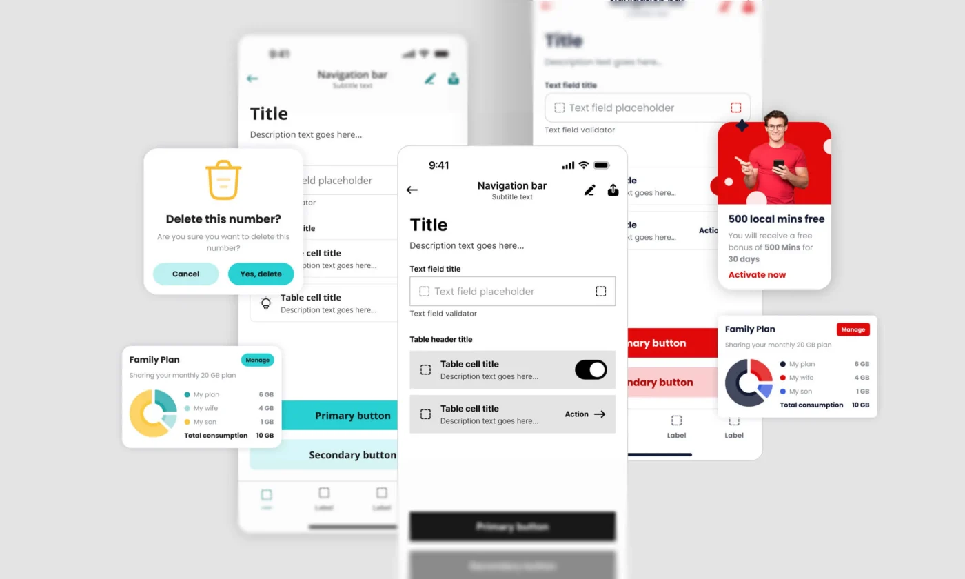
The idea was simple: keep the core components, logic, and behavior shared, while allowing each brand to apply its own visual identity through design tokens. The components themselves stayed the same, but the token values changed across brands.
We built the system in grayscale first. Once the structure was stable, we layered brand-specific styles on top using tokens for color, typography, corner radius, iconography, and other visual properties.
This approach made the system far more scalable. Instead of rebuilding components for every brand, we could reuse the same foundation while adapting the visual experience through tokens.
For example, the same button component could appear bold and rounded in Virgin Mobile, while feeling simpler and more minimal in FRiENDi Mobile, without changing the component structure itself.


Our token structure
We used Figma Variables extensively to build a layered token system that could support multiple brands, themes, and platforms without duplicating components.
Primitive tokens
At the base level were primitive tokens, raw values such as spacing, radius, shadows, and core color palettes. Each brand defined its own set of primitive values.
Semantic tokens
On top of that, we defined semantic tokens. These were especially important because all products supported multiple themes, including light and dark mode, as well as different brand expressions.
Color mode tokens
Instead of assigning hardcoded colors directly to components, we mapped semantic tokens such as background colors, text colors, border colors, and icon colors to different values based on the selected theme and brand. This made it much easier to scale dark mode consistently across all products without rebuilding components or manually updating colors in multiple places.
We used tokens such as background-interactive-primary, text-accent-secondary, and border-error-primary. We also included interaction states such as hover, pressed, focus, disabled, and selected.

We used the naming structure depicted below, which helped both designers and engineers quickly understand tokens.

Typography tokens
Typography turned out to be the most complex layer of the system.
We weren’t just supporting multiple brands, we were also supporting multiple languages and platforms. That meant typography had to scale across different fonts, layouts, and device-specific rules.
For example:
- Virgin products used Poppins for Latin and Tajawal for Arabic
- FRiENDi products used Open Sans for Latin
- Web and mobile each had their own typographic scaling rules
Instead of treating these as separate systems, we structured typography tokens around reusable groups such as titles, subtitles, body, and labels, each with consistent sizing scales (xl, lg, md, etc.).
Each token controlled font family, size, weight, line height, and letter spacing, while modes handled variations across brand, language, and platform.
Appearance tokens
At the top layer were appearance tokens, which controlled brand-specific visual traits such as corner radius.
For example, Virgin brands use more rounded corners, while FRiENDi uses less rounded corners. By controlling this with tokens, the same button component could automatically adapt its appearance based on the selected brand, without any component-level changes. This saved us a lot of time.
When a single shared file for all components stopped working
At the beginning of the project, we wanted to keep all components across four brands in a single shared file, because it felt organized and efficient.
But as the system grew, it became harder to maintain. Components like banners, cards, and templates began to require too many brand-specific variations. Navigating the file structure became increasingly time-consuming, and it wasn’t always clear which variants belonged to which brand.
That’s when we realized not everything should live in the same space. Core UI elements like buttons, inputs, checkboxes, and navigation patterns still made sense as shared components because their behavior was consistent across all brands. But more customized experiences worked better in separate brand-specific files.
This separation made the system easier to understand, maintain, and scale for both designers and engineers.

Designers and engineers, speaking the same language
Before we introduced tokens, engineers working across brands had to check multiple files and implementations for every brand separately. Styles weren’t standardized. Button colors, spacing values, and border definitions were hardcoded differently across products, and finding the right value meant hunting through whichever file a previous engineer had worked in.
With tokens, that changed. Instead of multiple implementations of the same component, we had a single system where tokens defined behavior and appearance. Developers used the same token names across all products, and values resolved automatically based on brand context.
It also changed how design and development communicated. Instead of pointing to a hex value in a Figma frame, we could talk in terms of token names. Both teams used the same vocabulary, which sped up implementation and reduced back-and-forth over specific values.

From manual updates to system-wide changes
One of the biggest improvements the new system achieved was the ability to roll out changes across all four brands simultaneously.
Changes to button padding, input borders, typography scale, dark mode backgrounds, shadows, spacing, and corner radius were no longer isolated updates. Instead, they automatically propagated across all brands via the shared token system.
Previously, each of these updates had to be repeated manually across multiple files and implementations, which made even small changes time-consuming and error-prone.
Another major improvement was speed. Because the structure was already in place, work that once required significant setup, such as introducing dark mode, supporting Arabic layouts, or launching new apps and websites, became much faster to execute.
This also had a direct impact on onboarding. New designers no longer had to learn multiple disconnected systems. Instead, they could contribute through a single, consistent structure, which significantly reduced ramp-up time.
The advantage of introducing component-level tokens
If I started this project again, I would invest more time up front in exploring component-level color tokens alongside semantic tokens.
In our system, most components shared the same semantic tokens for interactive backgrounds, borders, and text colors, which worked well because the brands shared most UI patterns. But there were moments when we needed to customize a specific component for a single brand without affecting other components that used the same semantic token. With semantic tokens only, that kind of targeted override was difficult to do cleanly.
Component-level tokens, where a button has its own button-background-primary rather than sharing background-interactive-primary with every other interactive element, would have given us more flexibility for those cases without breaking the overall system structure. The tradeoff is added complexity upfront. For the scale we were working at, semantic tokens were the right call. But for a larger system or more complex brand differentiation, component tokens are worth the investment.
There is no single perfect token structure or design system architecture
Many teams focus only on creating beautiful components, but over time, maintaining consistency across products becomes the real challenge. In our experience, design tokens are the most effective way to scale multi-brand products while maintaining consistency, flexibility, and maintainability.
That said, there is no universal token architecture that fits every company. Every system needs to be adapted to its own products, workflows, and team size. But the principle that made this work — separate component structure from the brand identity, and let tokens bridge the two — applies broadly.
For any team managing multiple digital products that share underlying patterns, this approach will reduce duplicated work, improve consistency, and make the system easier to scale over time.
What AI can take off your plate
When we started this project, AI wasn’t part of our workflow yet. Building the architecture, defining naming conventions, organizing tokens, and maintaining consistency across four brands required manual effort, close collaboration, and extensive experimentation.
AI tools could have accelerated many parts of the process, such as generating token structures, reviewing naming conventions, identifying inconsistencies, creating documentation that once took hours of manual work, and even suggesting improvements to component architecture.
If you’re starting a project like this now, it’s worth exploring which parts of your workflow AI could assist with before you commit to doing it all manually. The foundational thinking still needs a human. But the execution could be a lot faster.