


Reimagining an iconic publishing brand

TRAVEL + LEISURE
We created an engaging, cross-platform user experience that earned a Webby Award and pushed the brand forward.
SERVICES
CONTENT STRATEGY
UI DESIGN
UX DESIGN
PROJECT INFO
A content-centric overhaul
Travel + Leisure is a global travel and lifestyle brand known for its inspirational editorials and stunning visuals. Although we were initially brought in for a digital rebrand to align with their refreshed print identity, we revealed that the site contained a significant amount of content that no longer served the brand.
This insight prompted us to expand our scope and place a greater emphasis on content strategy, ensuring that Travel + Leisure’s digital experience would do justice to their world-class storytelling.
What a great partner. Together, we created a site that significantly increased user engagement and won a Webby!
Increase in ad revenue
17%
Increase in page views
38%
Webby Award
1
THE PROBLEM
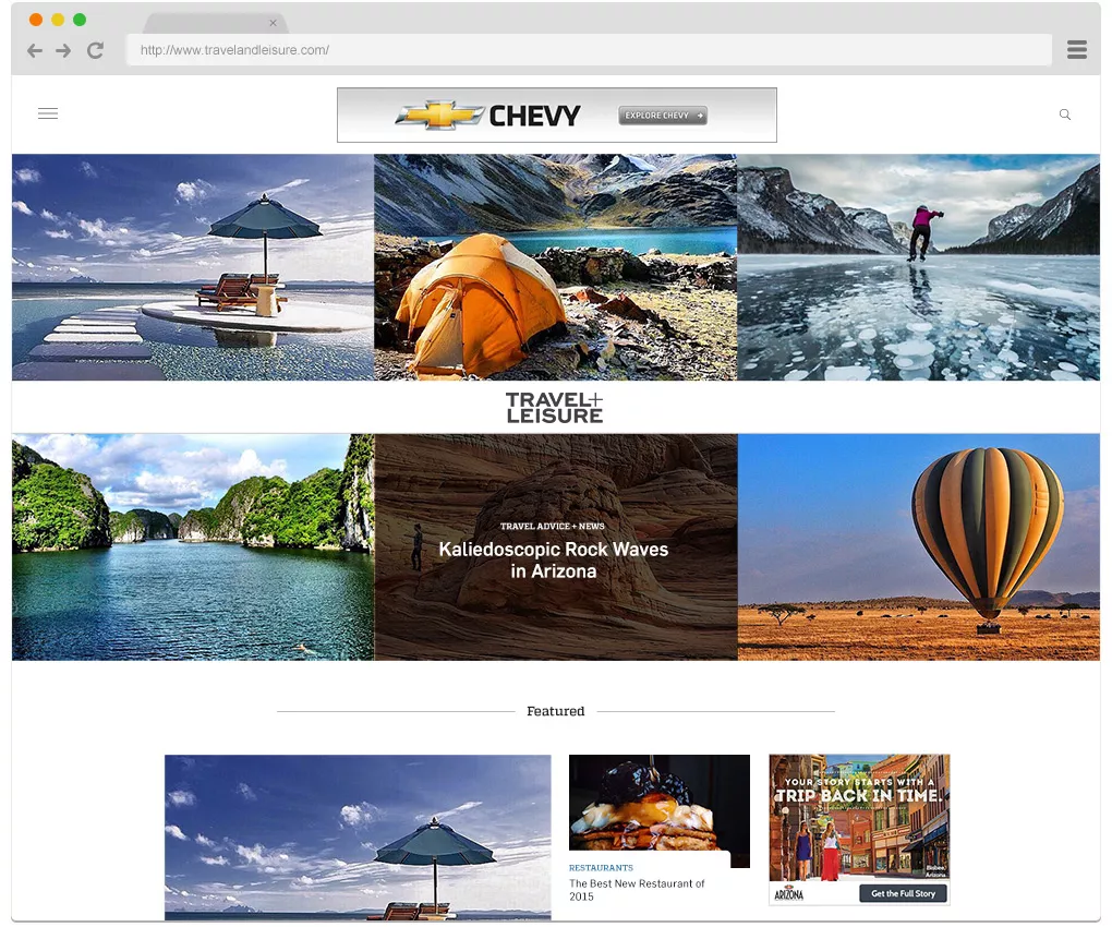
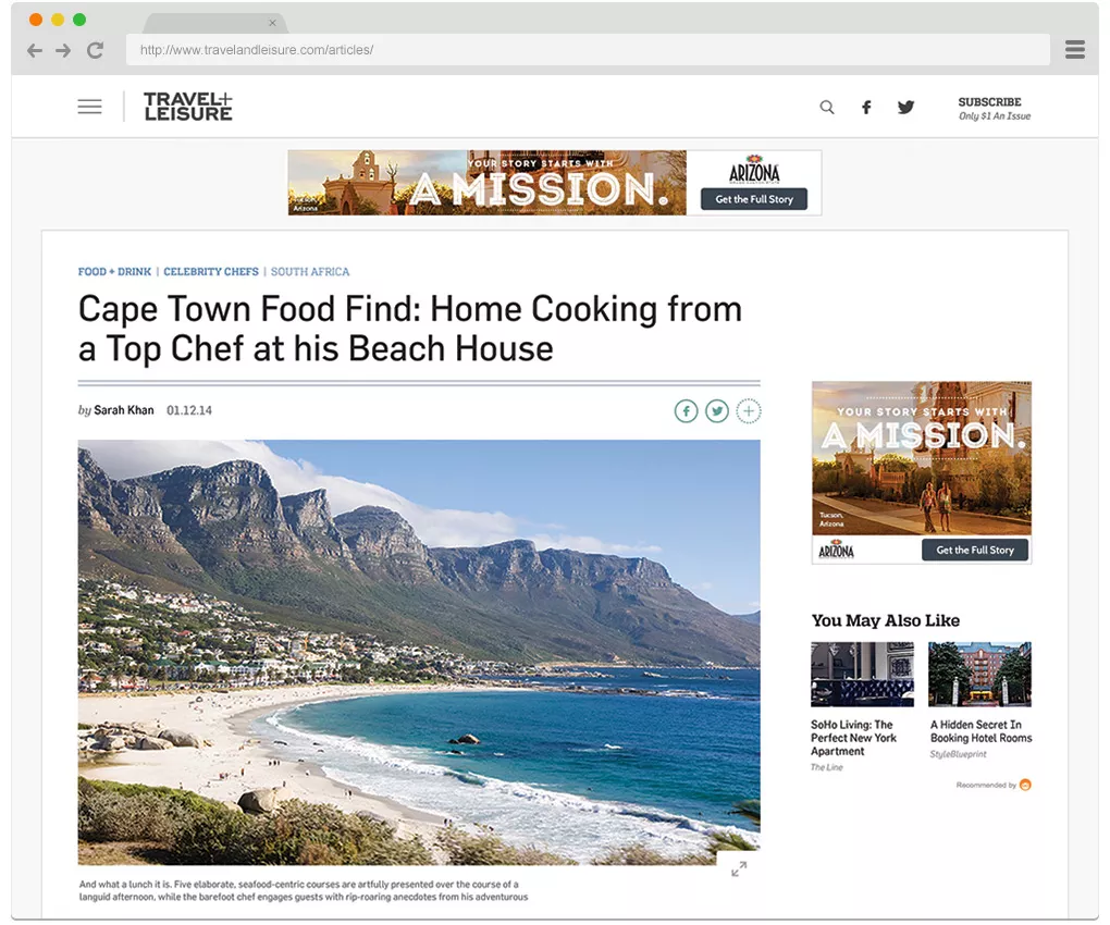
Clutter over content
We took a look at the Travel+Leisure website both with the brand and independently in our own research and discovery, and talked through the things that were important to the brand. The site, we discovered, housed a lot of things today that didn’t necessarily need to be there tomorrow. It was this realization that led us to shifting the focus of this digital rebrand to T+L’s content strategy.
The brand had so much great content to offer, but the design and user interface did not lend towards easy discovery. Essentially, the quality of the website didn’t match the quality of the content. It gave us the opportunity to remove the clutter and focus on the product and its experience in a way that would best convey the core values of the brand and bring the purity of the product back into the design. That sounded like something that was right up our alley.

OUR APPROACH
A shared vision, realized
The new Travel+Leisure digital brand had to sync up with the rebrand on the print side of the business. For us, this meant an aggressive timeline with an unmovable launch date. Fortunately, the team at T+L shared our vision for great quality while understanding the implications of their deadline, enabling us to utilize an agile workflow effectively.
Because we were aligned with the same goal and because both teams were incredibly solution-oriented, we were able to work collaboratively and nimbly, righting ourselves as soon as we had even an inkling of a feeling that we were teetering off-course. We studied the brand together and made decisions around which pieces we wanted to bring over from the print side of the house and which pieces we wanted to be digital first.
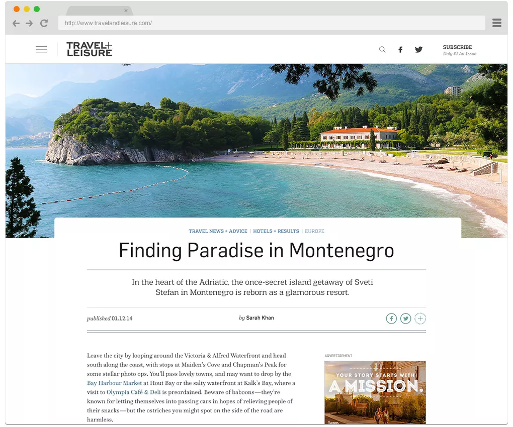
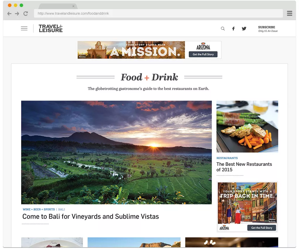
We helped them to simplify their brand, reorganizing the way their content was laid out and giving their beautiful travel imagery a chance to shine. Smartly utilizing analytics they had on hand, we were able to help them re-architect all the great content they had and pushed them forward in creating a sleek, easy-to-use design that reflected the brand’s core values.
Our teams gelled, each sharing a vision for what the brand could evolve into and an enthusiasm for tackling tough problems with strategic solutions. We worked so well together that halfway through the rebrand, T+L asked us to work with their backend team to integrate the new user experience and designs we’d so carefully crafted together.
Creating consistency across platforms
Two things came up frequently in our discussions. There was the need for the new site design to be inspirational, to be the catalyst for their users to pursue their wanderlust. But inspiration wasn’t the only goal. The site was also a place where users could get travel tips, find the best places to stay, and the best things to do – essentially, it was also a travel tool for world wanderers everywhere.
Once we architected the strategy that we thought would elegantly meet both of these goals in a way that would give T+L users a unique experience, we meticulously mapped out how each of these experiences would change to fit the platform from which the user was interacting with the brand.
What was the experience in the magazine? Was there off-platform content syndication we had to account for in, for example, hotel lobbies? How did that translate digitally? Even though our task was to rebrand T+L from a digital lens, we still had to be in sync with the rebrand in all media to create a consistency. Users should recognize T+L no matter how or where they engaged with the brand.
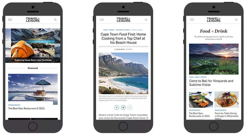
From there, we worked to create the ideal experience on each digital platform: desktop, tablet, and mobile. We recognized that users engaged with these platforms differently and strived to tailor each experience to its platform while keeping the design and overall user interface consistent.

THE SOLUTION
A mobile-first, connected content strategy
As we reviewed our research, it was clear, though unsurprising, that the T+L mobile audience was exploding. So, we quickly decided on a mobile-first strategy. We had the luxury of having a whole database full of beautiful imagery that Travel+Leisure could draw upon to populate the website, and we used that to our advantage. Additionally, the solution that we implemented needed to be inspirational but also utilitarian – two very important parts of the T+L brand identity.
We put together a content strategy that gave content a hierarchy so that the editorial staff could point users to the things that were most important. To avoid making the site feel cluttered while allowing the user to easily navigate their way around without taking away from the experience, we selectively implemented transitions where we thought was necessary.
Recirculation strategies were put into place to inspire readers to keep exploring, keeping them curious and engaged – a T+L brand of wanderlust where content strategy and beautiful design intersected. Together, we created a website that was elegant, simple, and easy to use. The end result? A beautifully designed, extremely usable, responsive website that created an experience tailored to the user’s device of choice.
THE RESULT
An award-winning experience
We successfully launched the newly branded T+L in 2015, and it was met with resounding success. So much in fact, that the new T+L site became a Webby Award Winner. We were able to measure against metrics we had set goals against at the beginning of the project and analytics show double digit positive increases in all success metrics, from revenue to pages per visit per user. But, perhaps, most importantly, our content strategy coupled with our crisp design and purposeful cross-platform user experience integration pushed the brand forward, giving them the tools to succeed in a rapidly evolving digital landscape.
This project was executed by our US team, formerly known as ETR. The company was acquired by Infinum in 2023.