Making room for play with Dutch interior design brand
polspotten
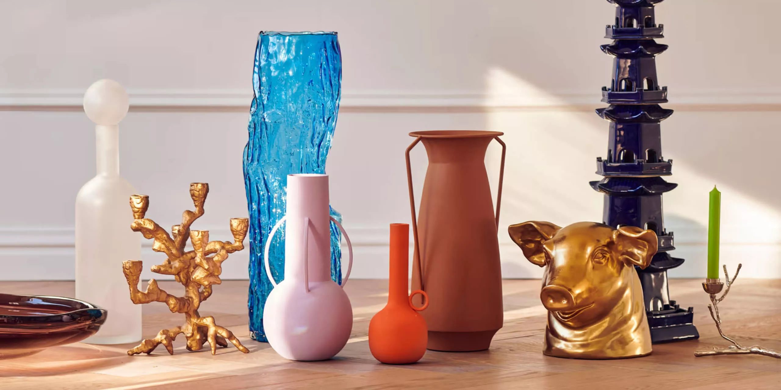
Research insights helped reposition the Dutch interior design brand Polspotten as the company expands to new markets.
SERVICES
BRAND IDENTITY
VISUAL IDENTITY
MESSAGING & COPYWRITING
BRAND FILM
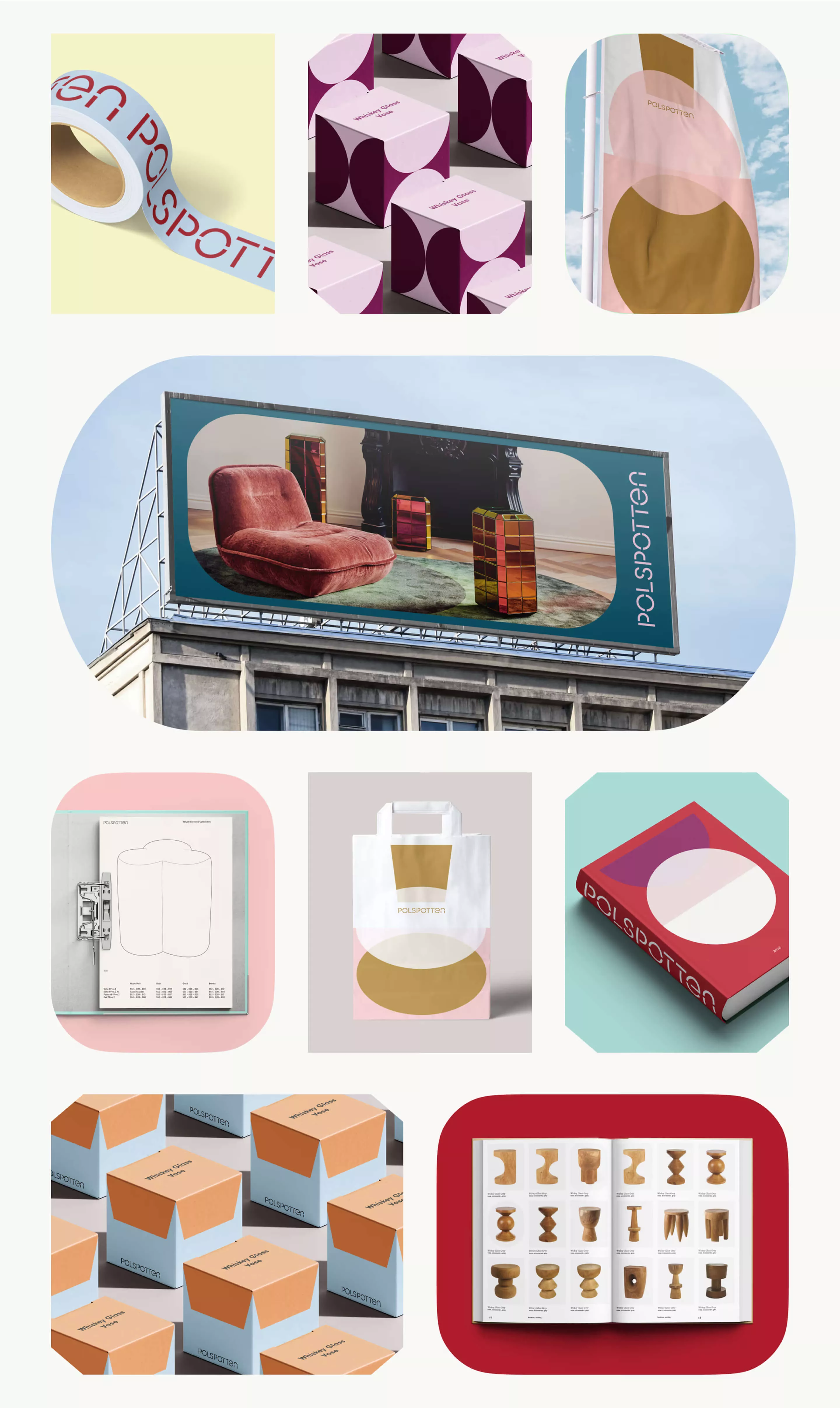
BRAND APPLICATION
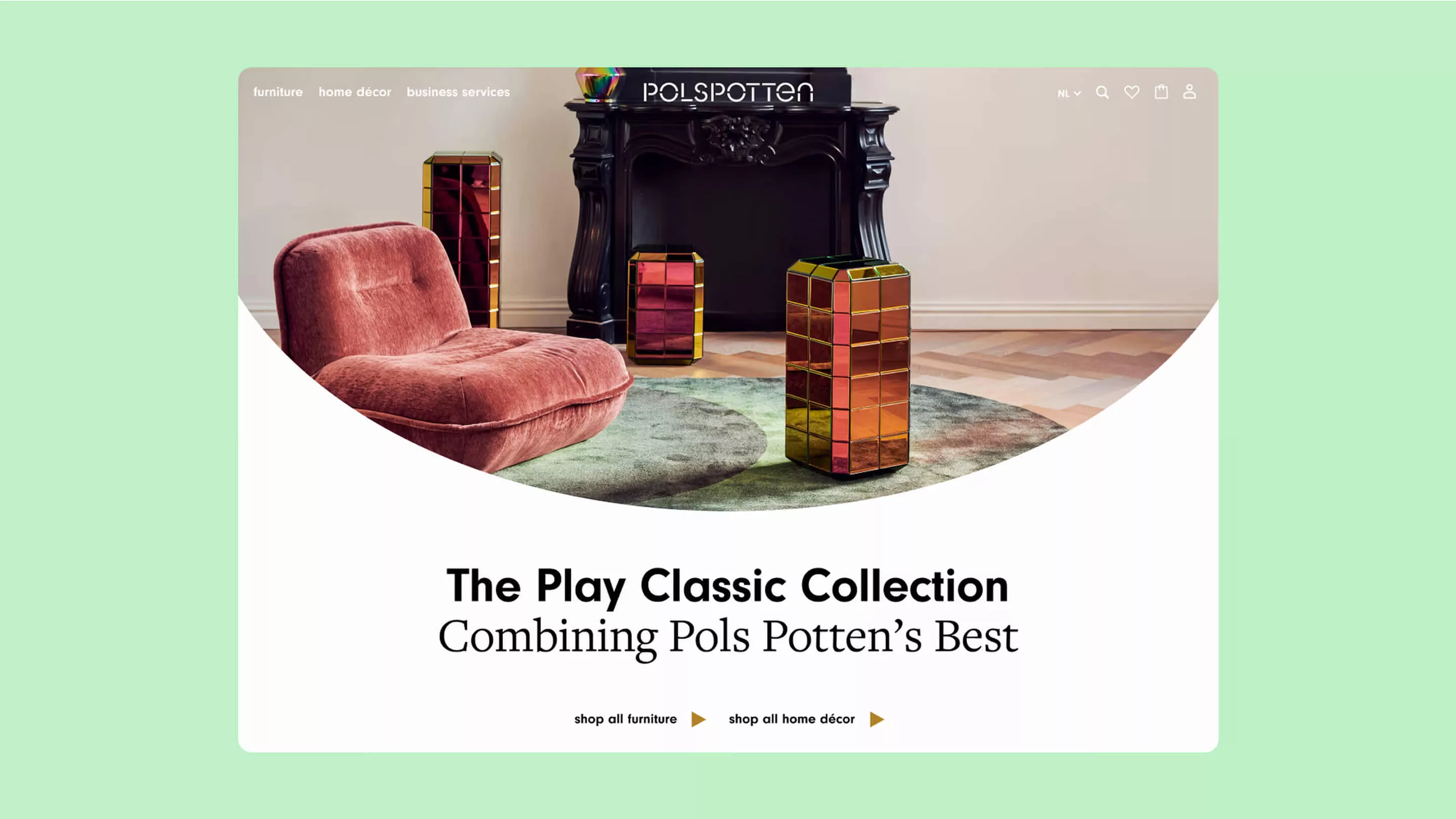
B2C ECOMMERCE
B2B ECOMMERCE
PROJECT INFO
Challenge
Since its inception in 1968, POLSPOTTEN has designed creations that are imbued with humor, vibrancy, audacity, and an appreciation for traditional crafts from around the world. We worked with the Dutch home decor company to transform its brand during a private equity acquisition.
Solution
Our research helped reposition POLSPOTTEN as a brand that ‘plays’ and an interior company that adds play to space. The new visual identity supports this positioning with a design system that combines basic shapes and vibrant colors to create branded assets.
Outcomes
With its new, scalable brand and visual identity system, POLSPOTTEN has seamlessly expanded its brand across Europe and North America, ensuring a consistent look and feel across all brand and marketing touchpoints.
In 1968, POLSPOTTEN was born out of its founder’s worldly, intuitive, and free spirit.
Ever since, the teams behind the brand have continued to elevate the company into iconic status through creations imbued with humor, vibrancy, audacity, and an appreciation for traditional crafts worldwide.
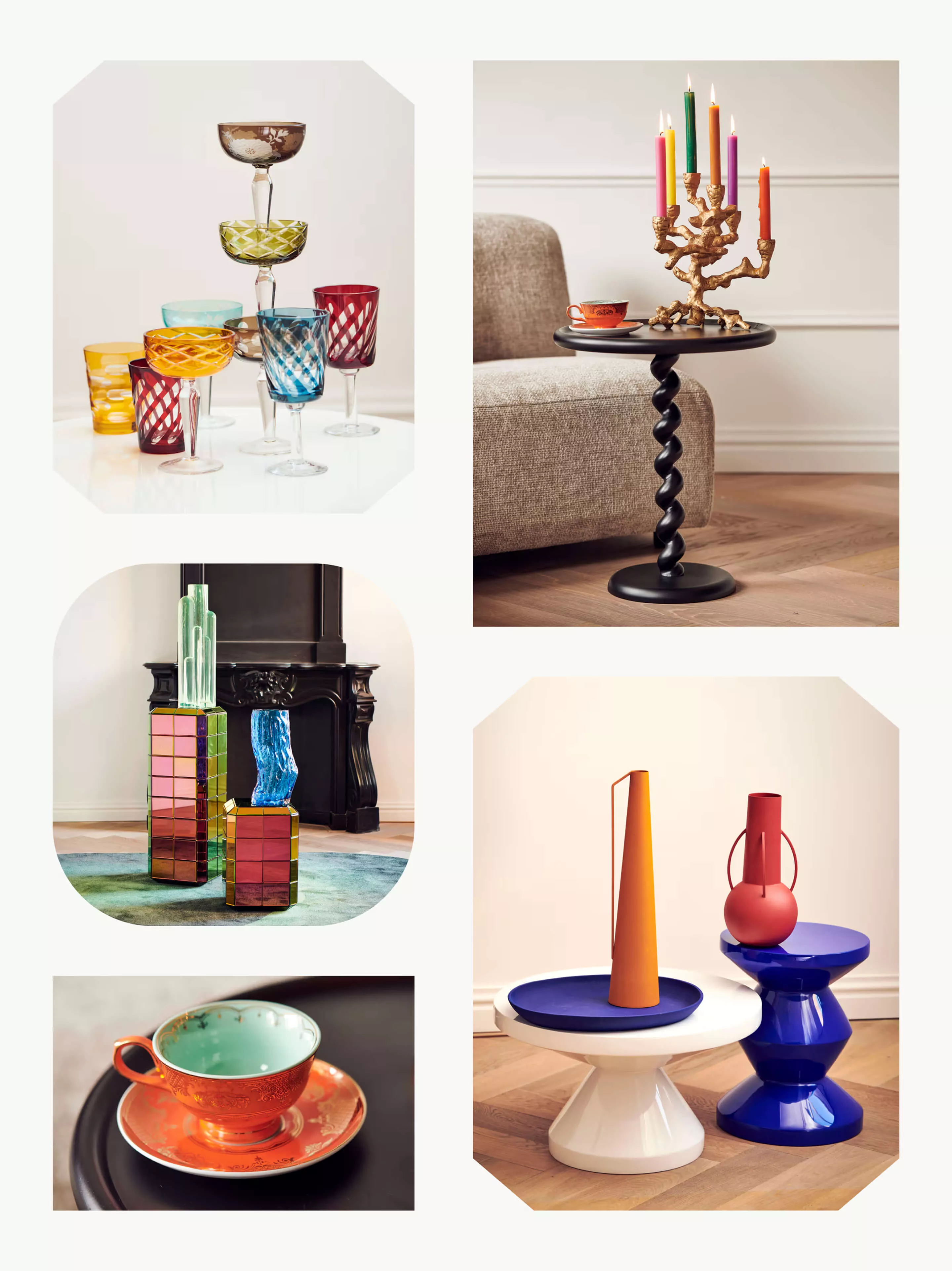
Adding play to space
Through interviews with employees and current and prospective customers, we discovered that what makes POLSPOTTEN unique is the brand’s relentless pursuit of newness and fun.
In an interior market filled with performance-optimizing aesthetics, they can be the brand that dares not to meet expectations and instead immerses itself in having fun through and with its creations.
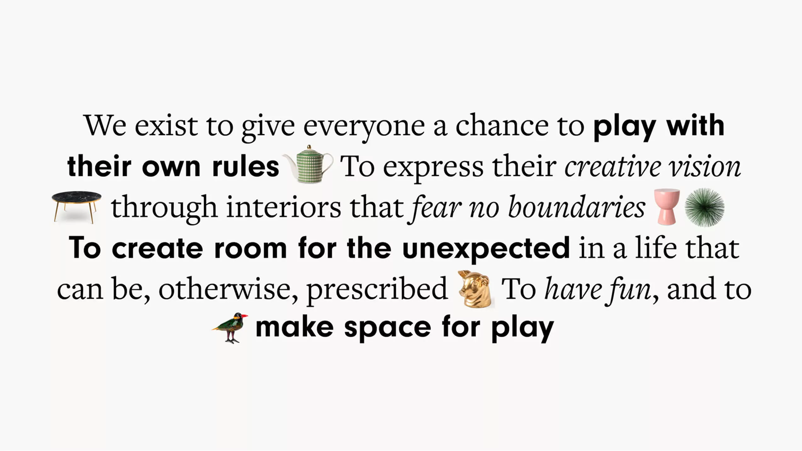
Therefore, POLSPOTTEN was positioned as a brand that plays and an interior company that adds play to space.
Modernizing an iconic mark
The old brand logo is made of two separate words, “Pols’ Potten,” which dates back to when the business started selling pots in the back of Erik Pols’ car.
As the brand and its stencil-based logo became an international player with an ever-expanding product line, it was time for Pols’ Potten to evolve from its past and become an iconic name that can stand on its own.
The new one-word logo POLSPOTTEN takes inspiration from its stencil precursor, refining the thickness to evoke a new sense of elegance and enhance legibility.
Mixing, matching, creating
With ‘Play’ at the core of POLSPOTTEN’s new expression, the visual identity introduces a design system that reflects the idea of mixing and matching basic shapes and vibrant colors into branded assets.
From 11 basic shapes and a wide range of colors, POLSPOTTEN teams can create infinite ‘Fused Shapes.’ These combined shapes can be used as non-photographic assets for various touchpoints, such as Instagram posts, profiles, posters, and site animations.
A new era of play
After the project was over, our team was delighted to join the POLSPOTTEN leadership team on stage to present the new brand strategy and identity to the entire organization, which both excited and united the team’s spirit.
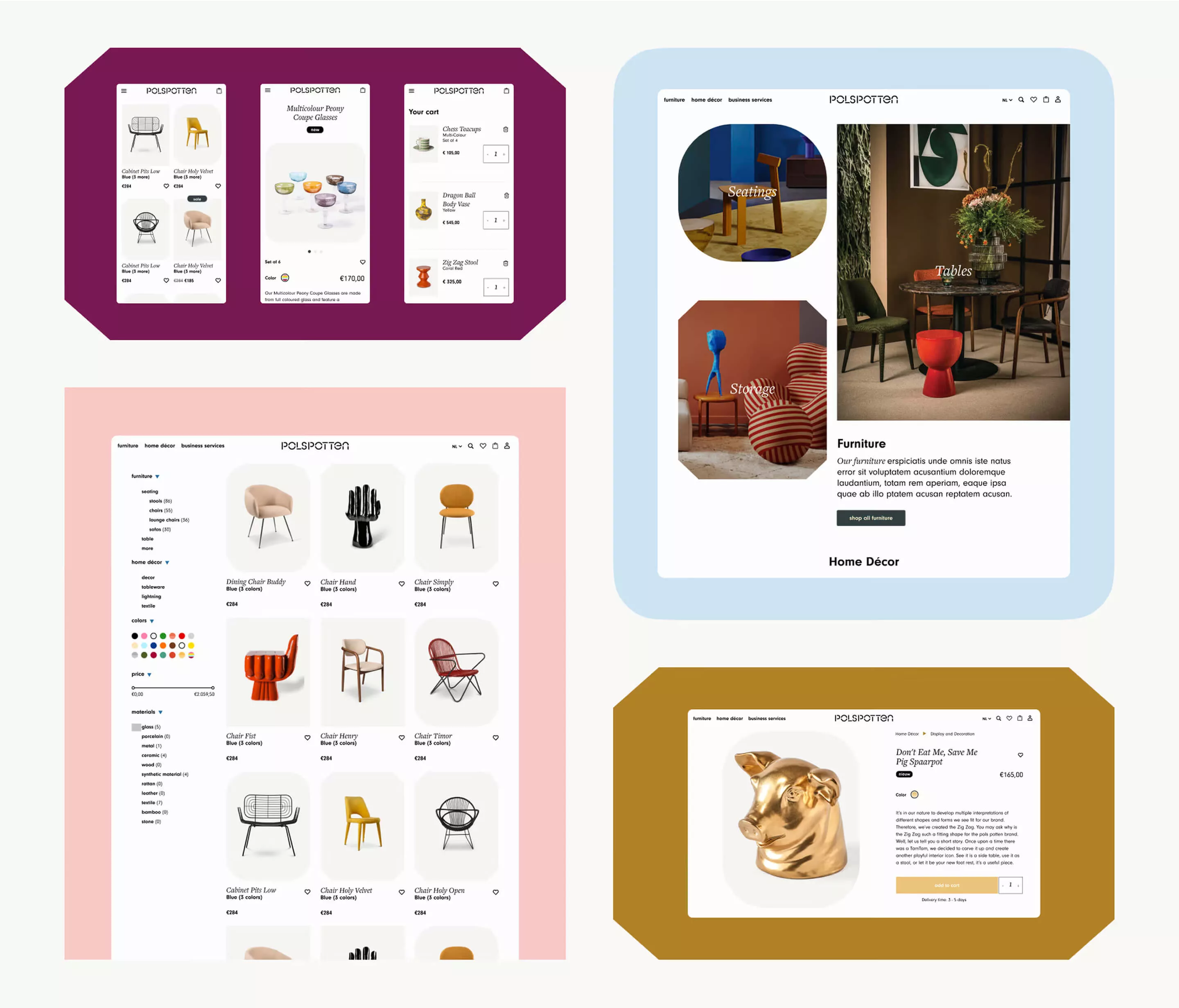
The brand strategy has since informed all of POLSPOTTEN’s brand expansion, from store interiors to its growing Salesforce Commerce Cloud-powered e-commerce platform.
This project was led by Your Majesty, Amsterdam’s award-winning creative agency that became part of Infinum in 2025. The original case study can be read here.


