


The new iOS7 was presented yesterday. What do the folks at Infinum think about it?
The new iOS7 was presented yesterday at WWDC. As always with the radical changes that Apple makes, I’m expecting a plethora of different opinions and impressions, so I wanted to hear what some of the people at Infinum have to say about it, based on the WWDC presentation and iOS7 beta we installed on some devices.
Matej Špoler, iOS Team Leader
I think we can all agree that iOS has always set the standards for mobile design. In light of everyone hating on the new design, I’d like to see a couple of specific examples where the iOS7 design is worse than the older iOS versions.
Personally, I enjoy the new look for Mail, Photos, Weather and Camera apps. The Notification Center and new Multitasking are also much better. I also have a feeling there’s improvement in the animation field (check out the Messages app and notice the scroll effect).
I’m not even going to waste words on the Game Center design, because the old one was horrific.
App icons are a specific debate, but if you compare the Calendar icon with the old one, you can see how the day of the week is actually readable now.
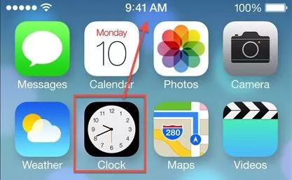
The Clock icon also shows the actual time now, which is a nice touch.
I’d have to actually use the apps to know if I really like the icons or not, but I think that, in general, changing them was a good thing. I think everybody was getting fed up with the old ones.
When talking about features, I don’t think that any iOS release has had this number of new features like this one (comparing iOS5 → iOS6 and iOS6 → iOS7)
All in all, I think this is a good move for the iOS ecosystem. This coming fall, we’ll see if I was right.
Darko Škulj, Lead Designer
Not really a fan of the new design. It’s fairly unreadable, low contrast. A bold move, but in the wrong direction.
The functionality is great, but the icon design, just throwing color gradients around (same gradients used in reverse – Safari, Mail app, App Store) and low typography vs. background contrast make me not like it that much.
Flat gone wrong. Huh, good luck iOS.
Also, there are a couple of quirks with the UX.
Not to be negative all the time, I really enjoy the new animations and the way they’re done on the new iOS7.
Adis Mustedanagić, iOS Developer
For the design part – I’ll have an informed opinion when I use it more, although I welcome getting rid of skeuomorphism, old glows and gradients.
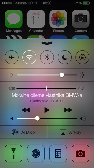
However, all these new features are the only reason I jailbroke my iPhone in the first place (Control Center, drool). From a usability perspective, these features were the ones that power users were pleading Apple to introduce for years, so this gives Apple back the advantage other platforms started to take away.
Additionally, iPhone 3GS, which is the last iPhone with a non-retina screen, is losing support, . No more graphics in two resolutions – woohoo!
Anyway, Apple managed to innovate again, and in the next month, Apple will be on everyone’s lips, opinions will differ, criticism and praise will be heard, memes will be made, etc.
All in all, Apple basically upgraded iOS with a lot of of features that belonged to the jailbreak/root community as tweaks to the stock OS. This is a huge improvement with a very positive reaction in itself.
Krešimir Antolić, Web Developer
iOS7 is great. The iPhone is finally going to look like an Android phone!
But no, seriously. I’m expecting a lot of ugprade work on our existing apps, both design and bug-related. (In the same way that upgrading to iOS6 changed the caching mechanism in WebViews, etc.)
Darko Kukovec, Web Developer
From a functional standpoint – outstanding. Finally, iOS is getting feature upgrades that have been around for a while on other platforms.
From a design standpoint – it’s great that they’re dropping the leather/wood patterns, but that’s about it, don’t like the rest.
Nikola Kapraljević, Android Team Leader
If Steve Jobs was still around, Control Center wouldn’t be that ugly.
Dino Kovač, Software Tester
Now, this icon really reminds me of MS Paint.
