If you’re a design student or a junior designer and you’re about to dig into your first mobile project, here’s some guidance on what to keep in mind when adjusting your mobile design for both platforms.

Think for a second about the apps on your first smartphone back in 2009. Skeuomorphic icons, gradient buttons, and background textures? Remember the dark backgrounds and vibrant typography on Android phones?
I’m sure you can tell the difference between mobile app design in 2009 and 2015. But can you really point out a huge difference between iOS and Android UI design today? Although nowadays mobile interfaces are clear and user-friendly, a flat approach to design made all mobile platform styles look pretty similar.
The general goal of a multi-platform mobile design is to achieve both brand consistency and alignment with platform-specific conventions. But, the only way to truly ensure style and layout consistency across various platform versions, manufacturers, screen sizes and densities is by using custom UI components. When going custom, you are always risking creating something that doesn’t feel “at home” to the user.
So, here is a brief comparison of the platforms which will help you decide between going with a standard and a custom component design.
Philosophy of style
Google Material Design is more oriented to customizable and fluid interfaces, and iOS has always been more oriented towards clear and intuitive interfaces. In their core philosophy, you can easily find the basis of their specific style characteristics.
Screen depth
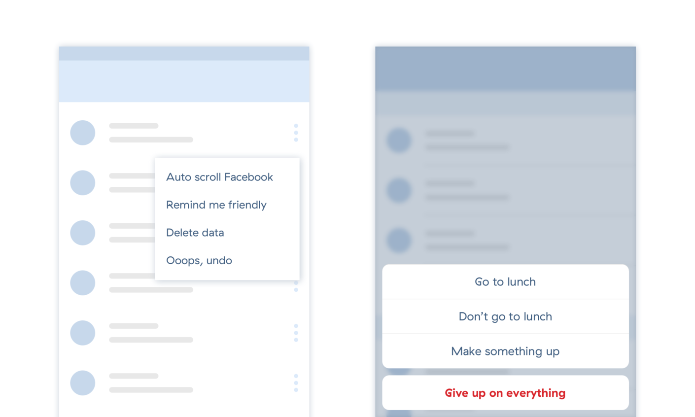
The sense of depth is critical when using an app. The user needs to focus on screen elements such as buttons, input fields and navigation bars which are important for completing tasks.
Material design uses different shadow styles for the UI layers. The shadow value depends on the Z-axis which marks the importance of a particular UI element. iOS design uses gradients, background blur, and semi-transparent color overlays to achieve the same hierarchy.
Colors
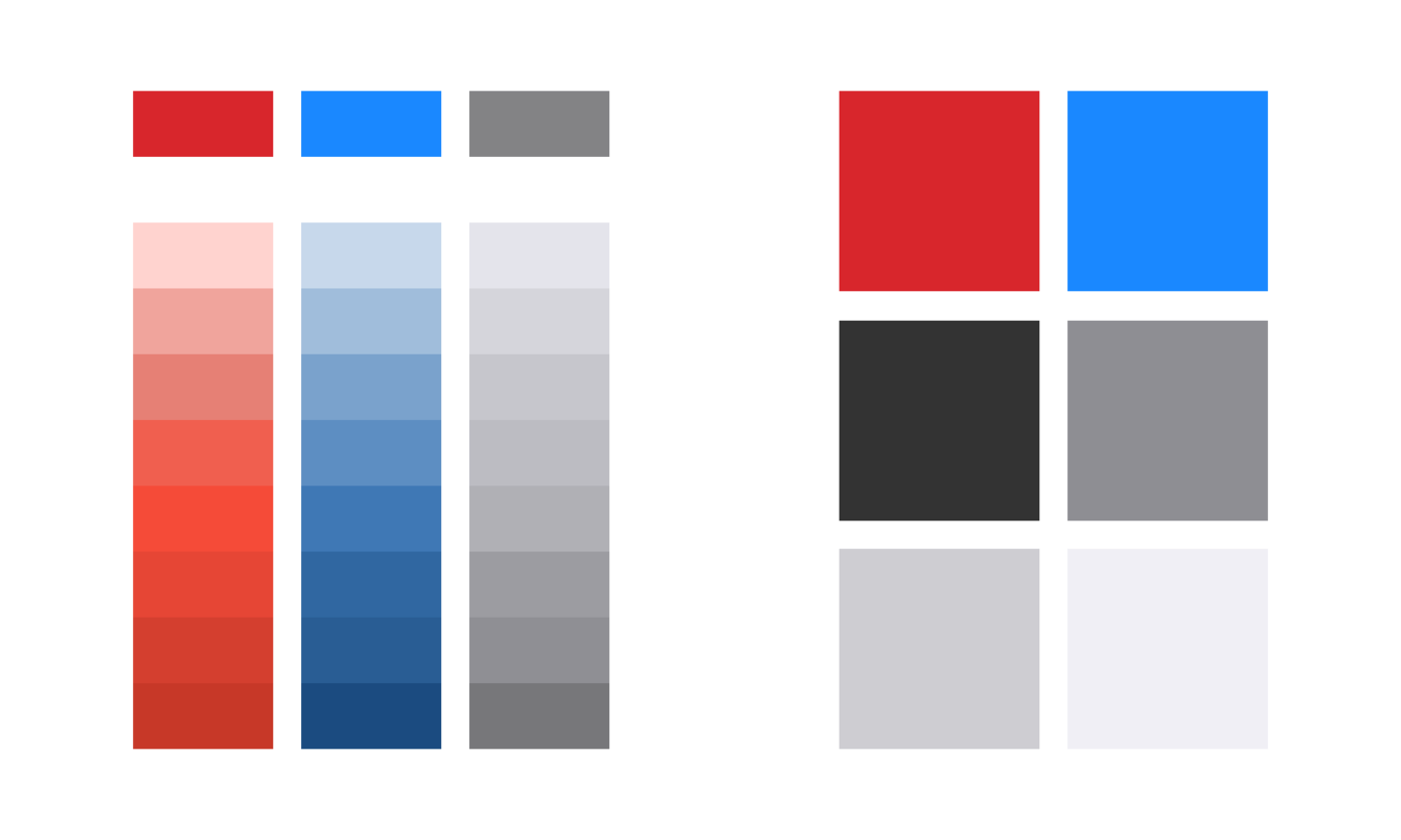
The material design palette is closer to the CMYK model than to RGB. It includes various darker or lighter shades of the basic color. The basic color is mostly used for UI accents such as actions, item titles, icons, etc. The shades of the same color are used in tab bars, drawers, and other navigation elements.
On the contrary, the iOS palette is simple and vibrant. Common UI elements such as list items, bars, backgrounds, etc. are mostly presented in shades of gray, black or white, while vibrant colors are used for icons, buttons, links and other accents.
Typography
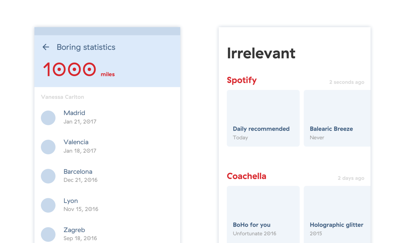
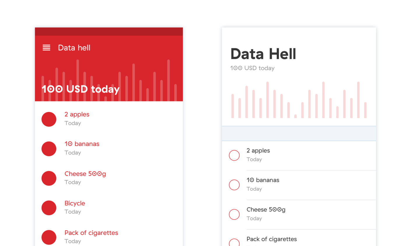
There is a difference in the typographic hierarchy of iOS and Android. The dramatic contrast in font sizes of display and body text makes the content appear more vivid and playful on both platforms. On a typical Android screen, the contrast is achieved by using larger sizes and thinner typefaces. In iOS 11, the contrast is more visible via weight hierarchy with large extra bold headers and tiny captions.
It is important to keep in mind that in Material design titles and text are mostly left-aligned on the screen, especially when it comes to navigation elements. When designing for iOS, you should keep the action buttons and smaller captions centered, while titles, subtitles, and body text could be left-aligned.
Icon style
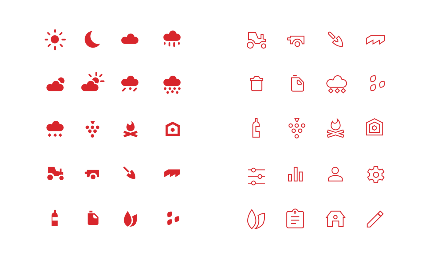
Material design encourages the usage of flat icons, while iOS design prefers thin 1px or 2px line icons. This is a tiny, but important style detail that should be considered when adjusting the app for another mobile platform. If your app has a specific icon style, you don’t necessarily have to follow this rule. Looking at the new lock screen in iOS 11, it seems like they’re moving away from exclusively using outline icons.
Borders
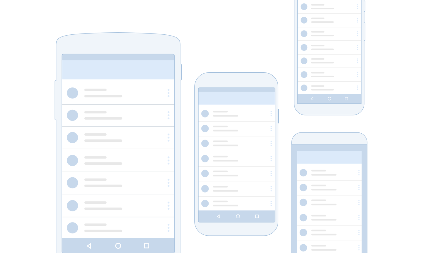
A simple one-pixel stroke accent may look great on high-resolution Android devices, but don’t forget that Android design should be effective at most screen densities. In these situations, the developer has to rethink the design element and account for different cases in the app’s code.
Branding
The use of the brand colors and their shades is more dominant in Material design, while iOS guidelines suggest a more subtle approach to branding. In iOS, it should only be visible in UI elements such as icons, display graphics, buttons or links.
App icons
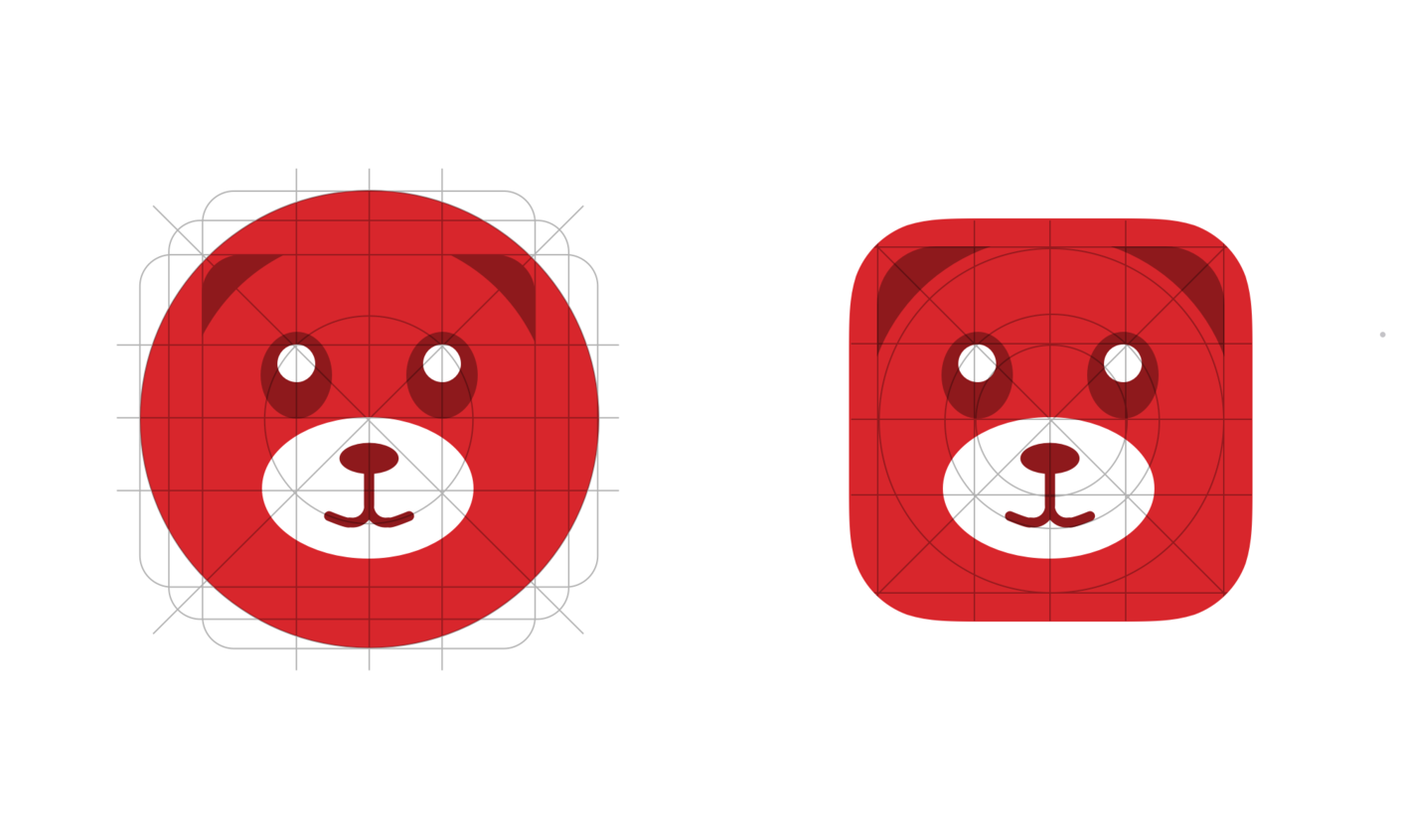
New Android app icons are adaptive, which means they are designed to fit different mask shapes across devices (circle, rounded rectangle,…). iOS app icons are still limited to a rounded rectangle shape.
Animations and Transitions
UI animations should only be used when relevant for user behavior, and they should feel unobtrusive.
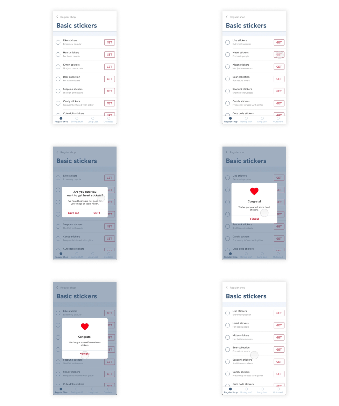
The Material animation style is a result of a paper-layering philosophy, and the motion style contains a lot of ripple effects and dramatic shape expansions, while iOS animations are more subtle and natural.
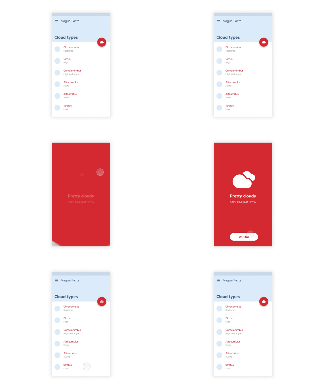
iOS makes transitions a lot easier. Whether it’s fading in and out, sliding, or popping you can be sure that it will look good and consistent across iOS devices. On Android, different frameworks give you much more freedom in designing transitions and animations, but the problem is that you don’t know what’s going to work across different devices.
Navigation
A clear and natural navigation guarantees a healthy information architecture. Other than style differences, it is crucial to understand the basic characteristics of the navigation systems.
The drawer
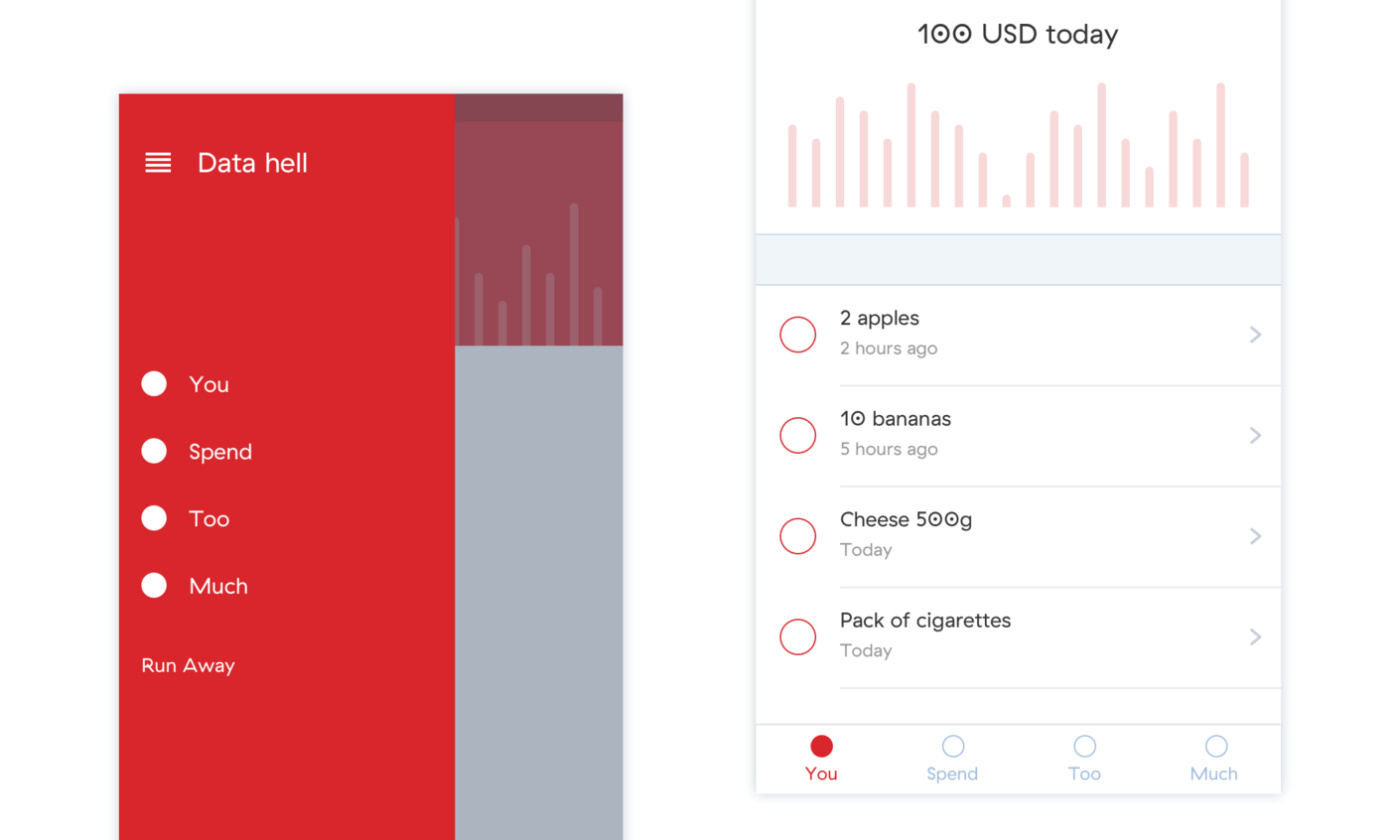
Material design provides a lot of components for hiding content, making it easier for the user to find the most relevant features. For example, you can always use the drawer if you have a lot of content. Display the key features outside the drawer, and keep the less important stuff in the drawer.
There are many iOS apps which use the drawer. Yet, there isn’t a native component or design guideline for the iOS drawer because the recommended solution for the navigation is the native tab bar.
Tab bar
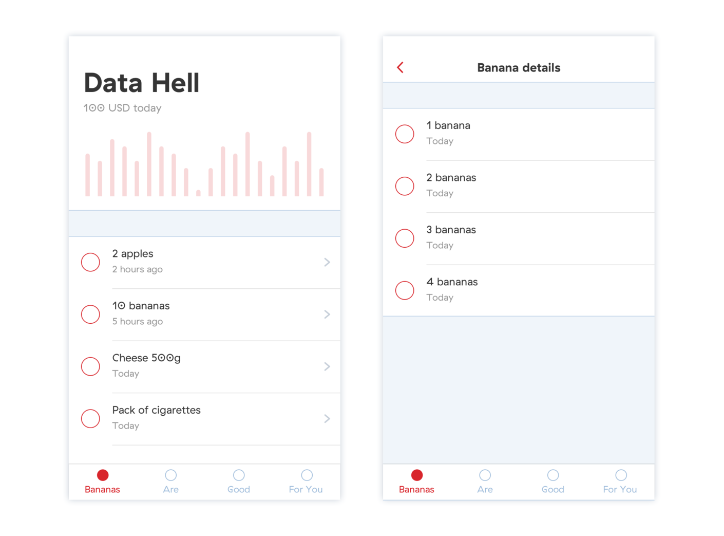
In an Android app, the bottom navigation bar on the home screen is visible only in the top-level navigation, so don’t go too deep from the navigation root.
iOS design philosophy always puts content first and rarely hides anything. The native tab bar enables the user to switch easily between the main content and encourages the user to explore the app. The tab bar is always present, and it’s easy to switch between higher and deeper levels of the navigation.
Back button
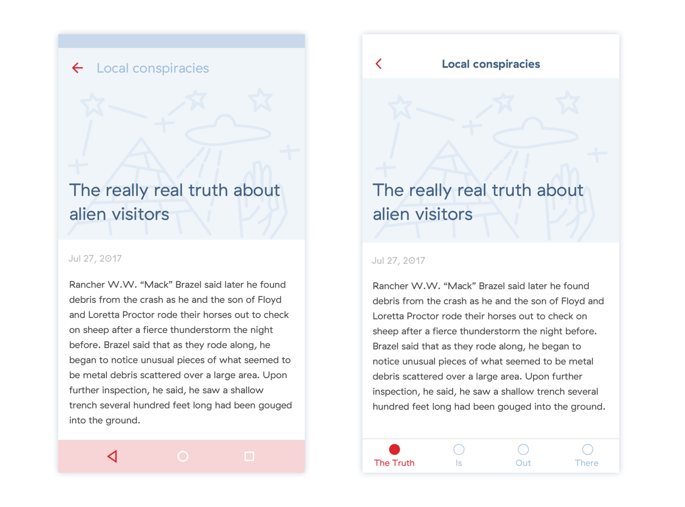
Android apps have both the up button (integrated within the app) and the back button (native component). The up button takes you back up the navigation root. The back button usually takes you back to the same screen as the up button, unless you’ve previously switched from one app to another. In that case, the back button will take you back to the previous app.
In an iOS app, even though you can toggle between tabs in the tab bar, every screen in the lower level of the navigation should have a back button, because it is the only obvious way you can go up the navigation root.
Actions
Material design also enables action hiding. You can use dropdown menus to hide list item actions, or you can use the Floating Action Button to hide a group of important or related actions.
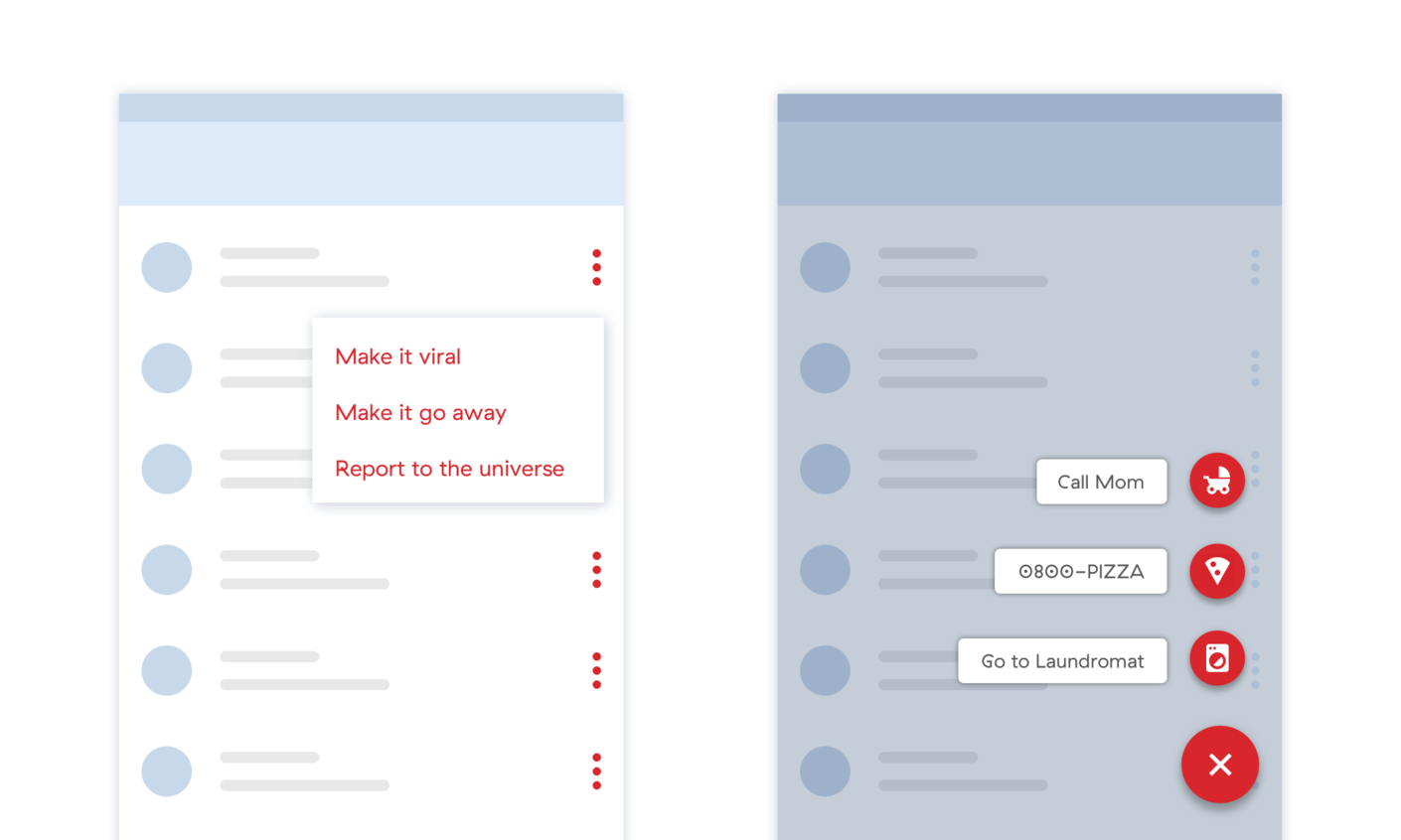
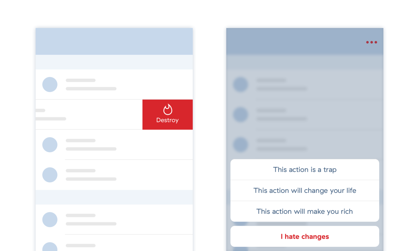
iOS has a different approach. Whenever possible, all the actions should be visible. If there are too many related actions, then these can be found beneath the list item, discoverable by swiping, or placed behind the “more” option which reveals an action sheet containing all the actions.
List items
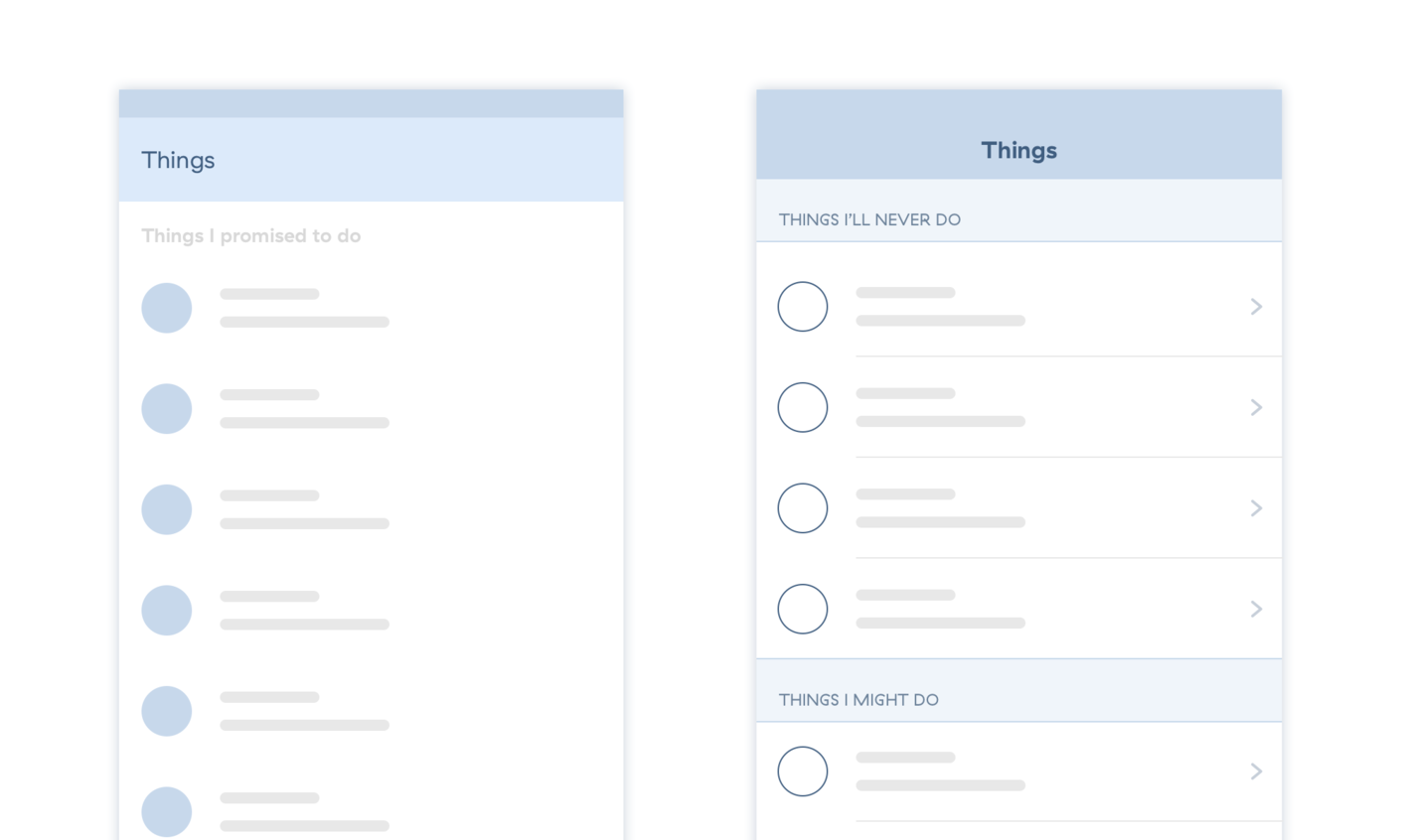
Lists look pretty similar on both platforms. The only important difference is that the iOS list item which leads the user to a deeper level of the navigation should contain an arrow indicator. It is a small yet important detail influencing user behavior.
Cards
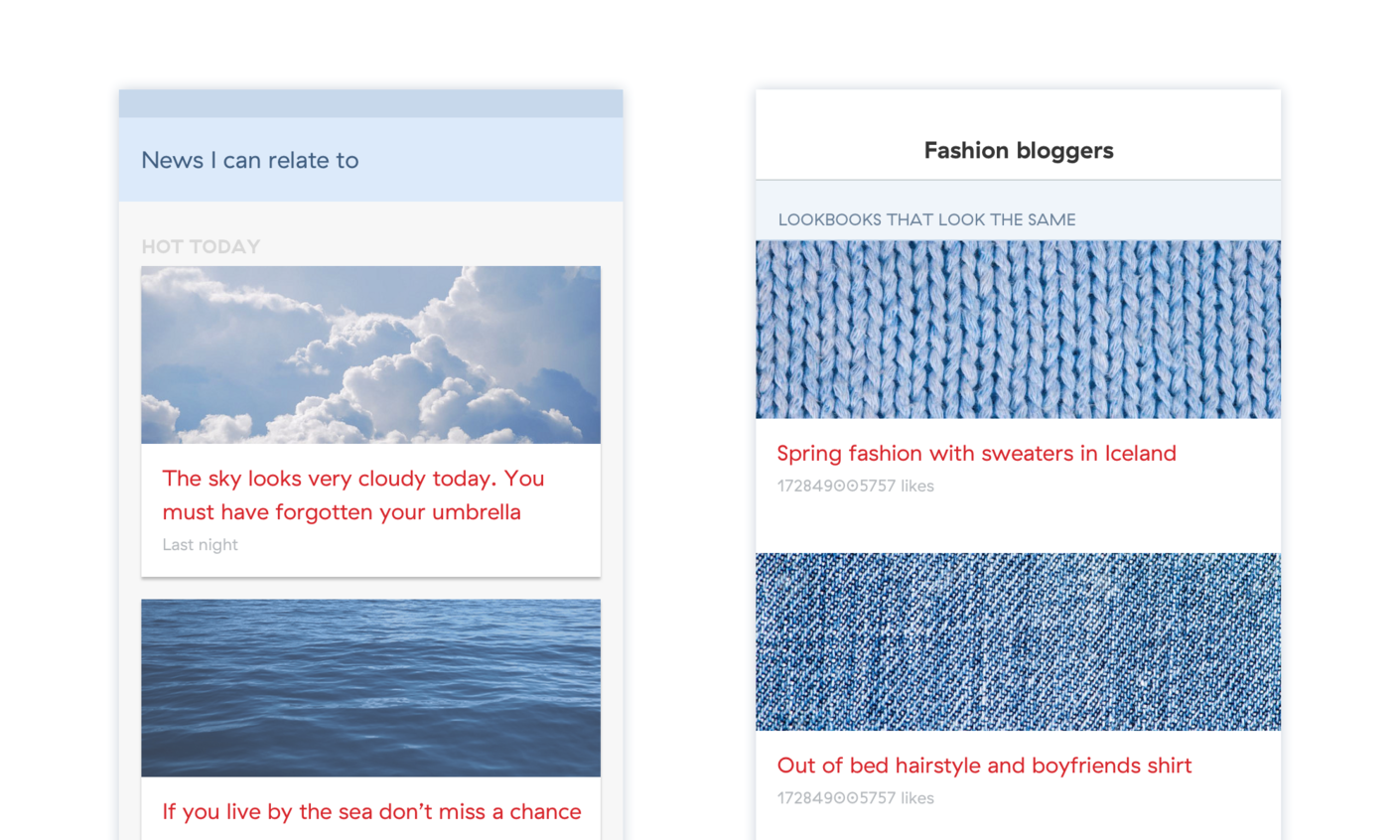
If you are designing a component with all sorts of data and actions, you should use cards. Cards are basically a data preview in a deeper navigation level. Material cards look more like physical cards, with shadows and rounded corners. iOS cards are basically table view list items, they are full width and often divided by a 1px separator.
Conclusion
Although each platform has its characteristic look and feel, mobile designers have a lot of creative space within these constraints. It is advised to use common patterns whenever possible, but if a designer decides to break the rules, it will be a good move only if there’s a strong reasoning behind it.
Remember, it’s not necessary to change a common component. If you want the user to figure out the app in a short timeframe, it is always better to follow the platform’s logic and common patterns.

