Update (Sep 2022): Having fulfilled its purpose of connecting designers from all over the world and encouraging them to share creative ideas, Design Islands has disappeared into the Bermuda Triangle and we won’t be seeing it again. However, the community that gathered around it continues to collaborate in the Design Islands Facebook group, so feel free to join the group and see what designers from all over the world are up to!
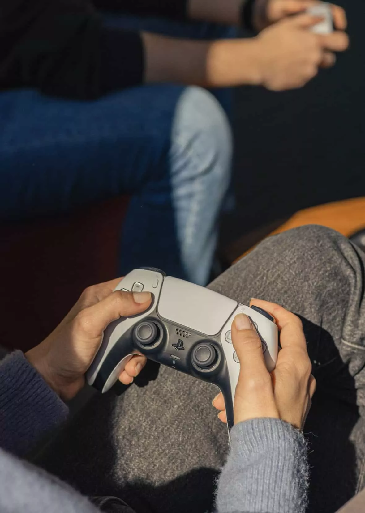
It was around 5.30 PM at cafe Botaničar when Ivana, Beta, and Mario were setting up the last banners on the wall for the upcoming event at 6. Meanwhile, Emanuel, Jelena, and Vita were rolling up the posters, preparing the goodie bags and the stage for the panel.
One moment, it seemed like everything was falling apart. In the other, everything suddenly came together.
The described scene leading up to the launch event accurately depicts the bumpy year of team work that preceded the finalization of the Design Islands website.
What islands now?
Design Islands is the publishing platform of the design team at Infinum.
The idea came with the realization that our team was collecting a huge amount of knowledge and experience on the daily, which then ended up scattered around in shared Google Drive folders or sitting in forgotten Slack channels.
Through Design Islands, we want to connect with the local design community, open doors to some interesting collaborations, and discuss important topics with designers from different backgrounds.
It would be a place where aspiring designers can find professional advice, tips, and tricks, as well as an extension of the Design Course at Infinum Academy.
The featured content is based completely on our projects, proposals, and processes, with a focus on the approach we took and the lessons we learned in each instance. It includes tutorials, tool reviews, and our point of view on various topics.
The content is messy and rough, just like our design process. We never aimed to create polished case studies to present us in a perfect light. We intended to be real.
Thinking outside of the screen
When you have a steady job in the creative field and an established routine of to-dos, meetings, and deadlines, it can be challenging to stay fresh and motivated. You often sit at the office, thinking about how cool it would be if your team did something fun together.
“What would you as an individual like to get from the team?” we asked in our annual design team survey.
Somebody said: “I would love if we had a chance to experiment with technology more, to see if we can offer something more than standard apps and websites, to see if we can make a step forward from what we do at the moment.”
In the past few years, we have worked hard on improving the teamwork outside the design team. It has helped us stay more agile and open-minded in collaboration with our clients and our development teams, as well as deepened our relationships.
In June of 2018, it was the time to take teamwork inside the design team one step further.
We set a goal to come up with a team project which would let us experiment more with different approaches to web design.
We wanted to create an outside-of-the-box concept and start experimenting with some new technologies.
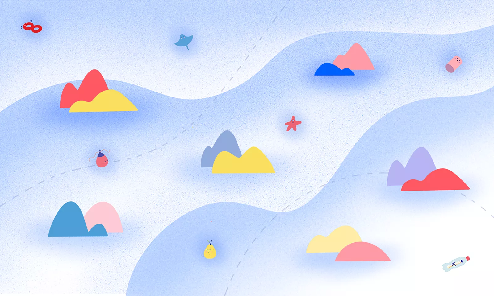
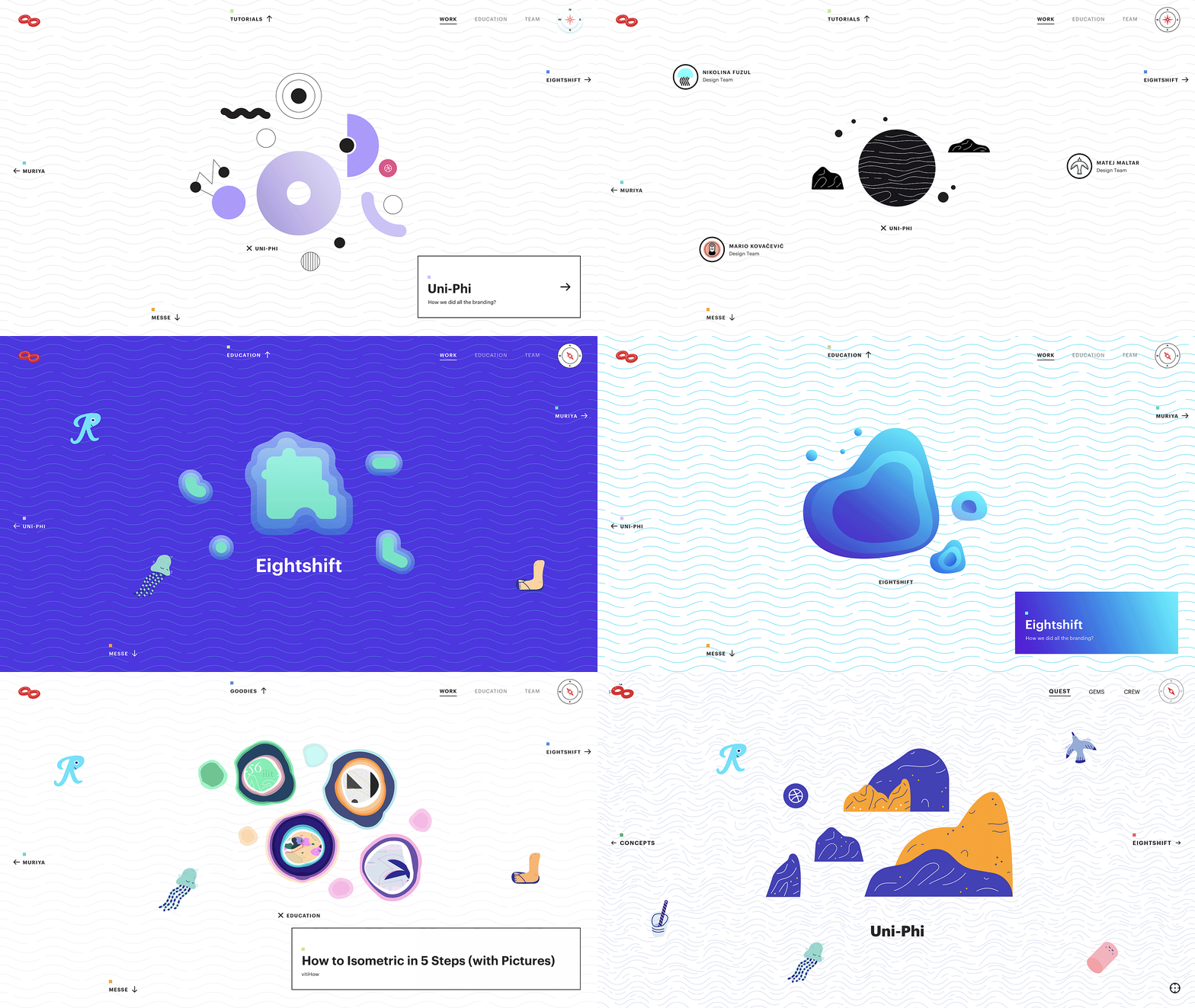
The result is the platform in the shape of an infinite sea, with islands representing the posts. You can drag and scroll through different realms to explore different topics and meet the all the Infinum’s designers who worked on this project.
Quests represent our projects, gems stand for the experience we want to share, and the crew are the team that worked on Design Islands.
Putting the work in teamwork
To define and classify the content for the website we had 3 initial workshops. Each lasted 2 hours and included 15 people.
During the first workshop, we brainstormed the type of content we could publish on the website. During the second, we discussed how to categorize it. We also agreed on writing blog posts in an easy-to-understand and informal tone of voice.
We came up with the visual identity and the website UI through another set of creative workshops.
The first one was a task-based workshop where everyone had to solve a problem from their daily routine at work, but in a new futuristic way. In the next one, we had to translate these imagined scenarios, tools, or spaces into a standardized web layout. For the final workshop, we already knew we were going in the direction of an infinite canvas, so we decided to iterate on the version with islands.
We came up with a rough idea in around 190 hours. After the pitch to the management, we got the budget for the project and could start with defining the UI and writing the content.
Navigating the stormy seas
The UI was finished relatively quickly, since we had a dedicated team and an isolated space where we could all work together.
It was the first time we experienced the actual pitfalls of project management, especially when it comes to content writing.
We were writing, re-writing, and adjusting the content and the visuals from Day 1 to the launch.
The three.js part took the longest because it was new to us and had several limitations we needed to adjust to in terms of the UI. It was a challenge to create a 2D world in a 3D framework, something probably only flat earth movement is experiencing at the moment.
A year later, we got access to the WordPress CMS and started uploading the content, and 2 months later we were ready for the silent launch.
We sent the website to close friends and colleagues from different agencies for feedback, and after a bit more UI polishing, we were ready for the launch.
Setting Design Islands in motion
For the launch event, we hosted a meetup with young creatives from other design agencies to discuss the topics covered on our website. We used the format of a panel to get the most interesting answers from the participants and the audience.
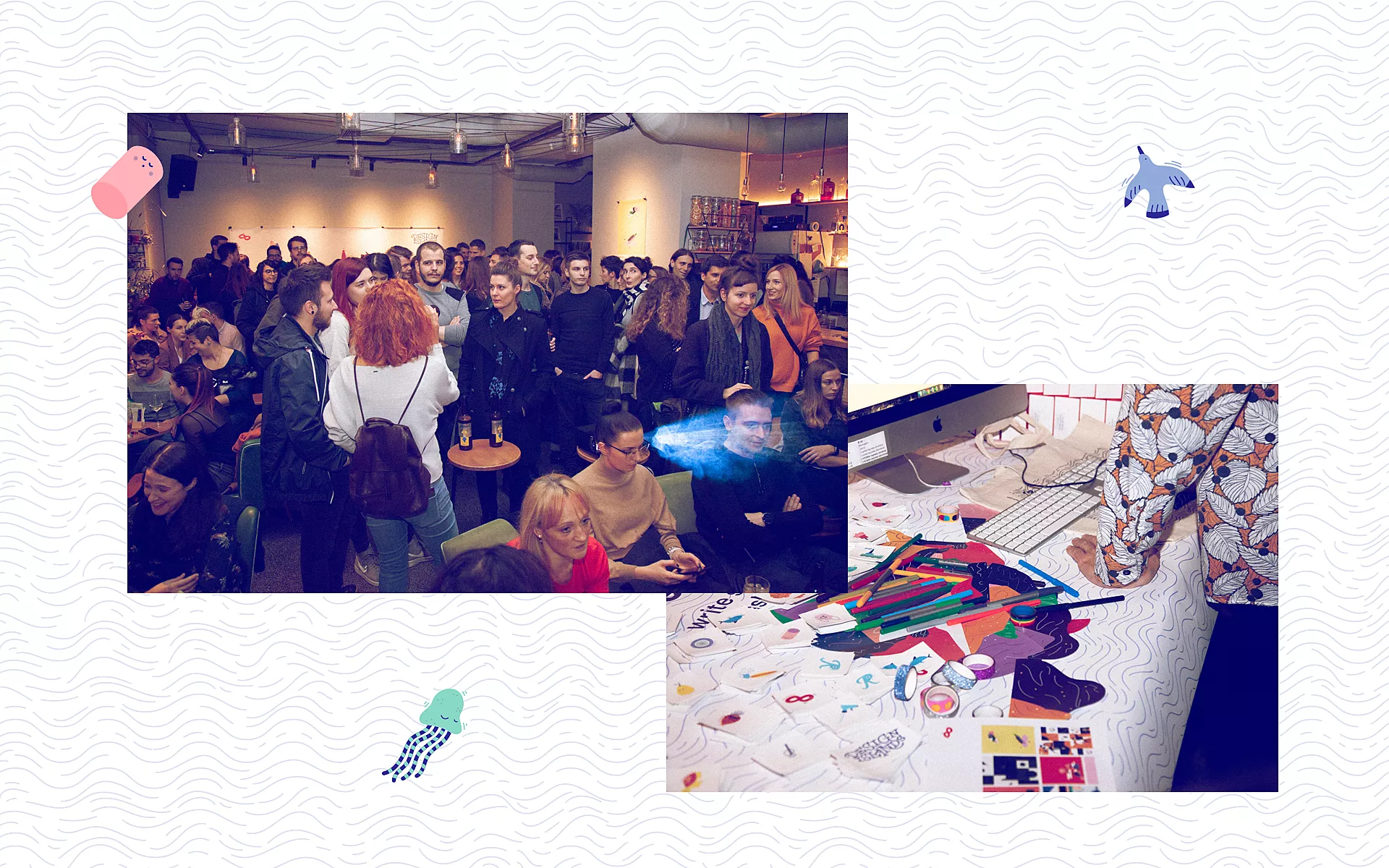
Designers outside of Infinum were also showing their failed projects and the stories behind some of their favorite projects.
The discussions were dynamic, fun, and informal – just like the Design Islands website.
Our Islands are yours to explore
As far as the website content is concerned, we are looking to expand the seas with more collaborative work, either in the form of interviews with designers, creative workshops or even small-scale projects. If this sounds interesting, reach out to us with a project of your own. We’re very curious.
In the meantime, explore away. We only ask that you refrain from skinny-dipping.
