It finally happened – eightshift.com is out! Drumroll please.
To celebrate this long-time coming event, I will reveal how we brought this beautiful website to life bit by bit.
But first, let’s back up a bit and determine what Eightshift is.
What is Eightshift?
The official answer is that Eightshift is a branch of Infinum specialized in the design and development of ecommerce solutions and websites using WordPress. Meanwhile, Infinum continues to focus on complex mobile and web applications.
That makes eightshift.com a lean portfolio website full of beautiful animations & page transitions with a smooth flow. I mean, the damn thing flows like Mozart.
Or in the words of the lead designer on the project, Dubravko Tuksar, it’s a simple website where people can see what we do and how we do it, but not in a way that they get bored while exploring.
Many heads, many minds
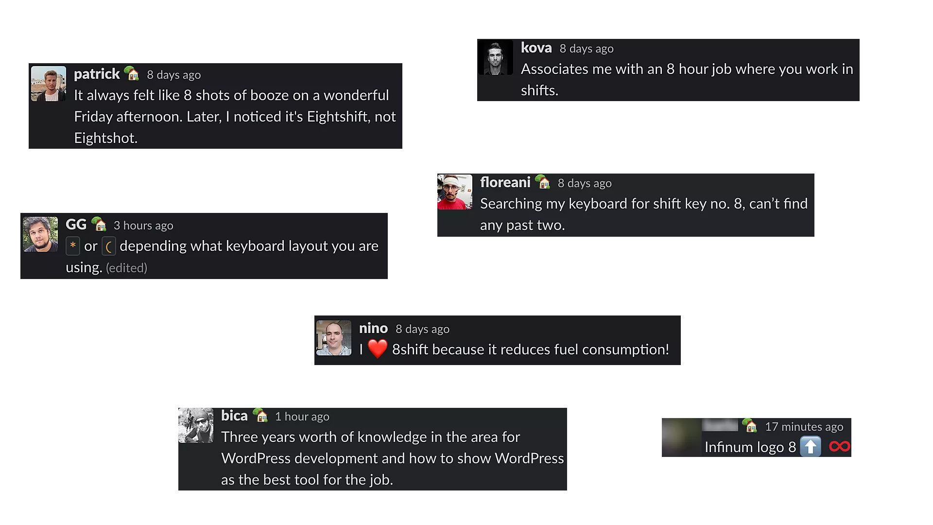
My answer is that Eightshift means different things to different people.
- To our clients, it means the solution for all their website needs.
- To our WordPress developers, it’s the development kit we use to build these beautiful websites.
- To everyone else in our company… well, I’ll let them speak for themselves:

Putting the idea and the design into action
Coding time!
A reasonable decision for a project like this would be a JavaScript framework (such as React). We chose WordPress instead. Why? We didn’t want to just build a website, we wanted to show off.
Let me start by saying that WordPress isn’t designed for things like this.
It’s made for quality websites with quick turnaround without having to write almost any boilerplate. And it’s super-easy for managing content. But it’s not designed for smooth page transitions.
WordPress runs on PHP and PHP is a server side language. Each time you open a new page on a website, a new request is executed in isolation. It does not know or care what happened before it. That’s a problem when you’re trying to seamlessly transition between different pages.
That’s where our friend barba comes into play.
Milestone #1 – Smooth transitions in WordPress
barba.js is a JS library that allows you to create badass smooth transitions between your website’s pages. In 7kb and minimal changes to your markup, it almost magically, transforms your refreshing-on-each-new-page-website into a SPA.
<body data-barba="wrapper">
 <!-- put here content that will not change
 between your pages, like <header> or <nav> -->

 <main data-barba="container" data-barba-namespace="home">
   <!-- put here the content you wish to change
   between your pages, like your main content <h1> or <p> -->
 </main>

 <!-- put here content that will not change
 between your pages, like <footer> -->
</body>
In short, <body data-barba="wrapper"> stays the same while <main data-barba="container"> is replaced on each page
On top of this magic, barba also updates the browser history for you, gives you a bunch of useful hooks to ease into the transition process, allows you to animate the transition however you like, and much more.
Integrating barba into your project
Barba integration in WordPress is straightforward. However, integrating it into your project should not be taken lightly.
Until Barba gets an article of it’s own that it deserves, here are some things you need to keep in mind:
- Some plugins might not work – Some plugins expect a page reload after each navigation. With barba, your user will (ideally) only do a “reload” on the first page visit. Everything after that is reload-less navigation.
- Manage your events – If you’re adding JS events to
document(such asscrollevents), you need to take care of removing them when they’re no longer needed yourself. Usually with WordPress, you don’t worry about it as on each new page load the events are rebuilt. Here,documentis always the same object and if you’re (for example) adding a newscrollevent after each transition, you’re going to have a bad time.
Milestone #2 – Smooth complex animations
So we had barba, the website was behaving like a SPA, everything was going well.
Now we needed something to handle all these animations. After comparing a few animation libraries, we chose anime.js.
At only 6.7kb (minified + gzipped), it was the smallest library, it ticked all our boxes and was open source. While it’s not as performant as something like GSAP, library performance was never really an issue on this project.
Then it was just a matter of defining all animation used throughout the website, building a sequencer for running these defined animations in parallel, and then putting it all together over multiple iterations under a watchful eye of our designer Dubravko. Piece of cake!
BTW, always choose CSS animations over JS-libraries when you can because they will always behave smoother. In our case, this didn’t really seem like an option at the time.
Milestone #3 – Images, images and more images
One of the things I’m particularly proud of on this project is the way we’ve handled images.
Eightshift is full of images and it made sense to spend a considerable amount of time pimping our image delivery pipeline.
The result of this are probably the largest image tags ever. Here’s an example of our Case’s featured image:
<picture>
  <source type="image/webp"
    srcset="https://assets.eightshift.com/img-PL-hotel-150x150.webp 150w,https://assets.eightshift.com/img-PL-hotel-300x175.webp 300w,https://assets.eightshift.com/img-PL-hotel-768x447.webp 768w,https://assets.eightshift.com/img-PL-hotel-1024x597.webp 1024w,https://assets.eightshift.com/img-PL-hotel-1536x895.webp 1536w,https://assets.eightshift.com/img-PL-hotel-1680x979.webp 1680w,https://assets.eightshift.com/img-PL-hotel-1920x1119.webp 1920w,https://assets.eightshift.com/img-PL-hotel-2048x1193.webp 2048w,https://assets.eightshift.com/img-PL-hotel-2160x1258.webp 2160w,https://assets.eightshift.com/img-PL-hotel-2560x1491.webp 2560w,https://assets.eightshift.com/img-PL-hotel-scaled.webp 2560w"
    sizes="(max-width: 150px) 150px,(max-width: 300px) 300px,(max-width: 768px) 768px,(max-width: 1024px) 1024px,(max-width: 1536px) 1536px,(max-width: 1680px) 1680px,(max-width: 1920px) 1920px,(max-width: 2048px) 2048px,(max-width: 2160px) 2160px,(max-width: 2560px) 2560px,2560px">

  <img loading="lazy" decoding="async" class="case-header__image js-case-image js-animate-on-scroll dark-section " alt="Plava Laguna featured image" width="2560"
    height="1491"
    sizes="(max-width: 150px) 150px,(max-width: 300px) 300px,(max-width: 768px) 768px,(max-width: 1024px) 1024px,(max-width: 1536px) 1536px,(max-width: 1680px) 1680px,(max-width: 1920px) 1920px,(max-width: 2048px) 2048px,(max-width: 2160px) 2160px,(max-width: 2560px) 2560px,2560px"
    srcset="https://assets.eightshift.com/img-PL-hotel-150x150.jpg 150w,https://assets.eightshift.com/img-PL-hotel-300x175.jpg 300w,https://assets.eightshift.com/img-PL-hotel-768x447.jpg 768w,https://assets.eightshift.com/img-PL-hotel-1024x597.jpg 1024w,https://assets.eightshift.com/img-PL-hotel-1536x895.jpg 1536w,https://assets.eightshift.com/img-PL-hotel-1680x979.jpg 1680w,https://assets.eightshift.com/img-PL-hotel-1920x1119.jpg 1920w,https://assets.eightshift.com/img-PL-hotel-2048x1193.jpg 2048w,https://assets.eightshift.com/img-PL-hotel-2160x1258.jpg 2160w,https://assets.eightshift.com/img-PL-hotel-2560x1491.jpg 2560w,https://infinum.com/uploads/2019/12/how-we-built-eightshift-1.webp 2560w"
    src="https://infinum.com/uploads/2019/12/how-we-built-eightshift-1.webp" data-animate-on-scroll="featured-image-grow"
    data-animate-trigger-top="1" data-animate-duration="100%" style="transform: scale(1) translateZ(0px);">
</picture>
It’s huge! Here’s what’s going on here:
- Picture tag – The thing that enables most of the things listed here is the
<picture>tag. It allows us to have responsive images and to show.webpimages to only those browsers that support it. It even has a built in fallback if the browser doesn’t support it (it just uses the<img>tag inside it). - .webp – Google’s .webp image format which are ~25-34% smaller than respective
.jpgor.pngimages with no apparent drop in quality. Our pipeline for this is pretty simple. You just upload your.jpgor.pngimage in WordPress’s media library, we automatically create a.webpversion and package it all nicely into the<picture>tag which is then used on the frontend. The only downside? Neither Safari nor IE11 support them. Luckily, we have the<picture>tag that automatically detects that and loads the original image instead. - Lazyloading – Using vanilla-lazyload, we can lazyload all our images on time. It works quite well with the
<picture>tag and responsive images. - WordPress image sizes (
srcset) – In order to have responsive images, you need to differently resize images. By registering new image sizes in WordPress, it automatically takes care of resizing and saving copies for you. A reasonable amount of new image sizes is 3-4 for specific needs. We added 6.
Our content editor uploads 2x or 3x images and it’s automatically scaled down to normal sizes used by screens with smaller DPI.
Milestone #4 – Our (almost) first Gutenberg project
Eightshift was our first project that was entirely built with Gutenberg, WordPress’s new React-based editor.
That meant a considerable amount of time would be spent prototyping.
Repeat after me: Optimize
All those animations, page-transitions and large images can easily produce janky animations resulting in a really laggy website if you’re not careful enough.
It’s still not perfect, but it’s much better than it used to be.
While this is an entirely separate blog post topic in itself, here’s what we’ve done to make the transitions as smooth as possible:
1. Separate the logic from animations
The janky problems start when you try running some javascript logic while an animation is running. To mitigate this, we’ve carefully tried to partition as much logic and animation as possible (with the help of barba’s events) into the following sequential steps:
1
Page out animation – You’ve clicked on a link and are being redirected to a new page and the old page is currently being animated out. We don’t process any logic before starting this animation to make navigation snappy and instantly responsive.
2
Page out after – The old page animated out and now we have a window of running some logic for a couple of milliseconds needed to render the new page BEFORE starting to animate that page in. Here is where most of the magic happens. Here is also where we start decoding the next page’s featured image BUT don’t wait for it to finish – more on that in a bit.
3
Page in animation – Now our new page is ready, most of the logic has already happened so there’s (almost) nothing to slow down our new page animating in. Except for image decoding…
2. Asynchronous image decoding
Decoding a large image on a slower device while a page transition is happening results in choppy animations. This is mostly relevant for our cases with a large featured image as most of the images below it are lazyloaded and don’t cause this issue.
Alternatively, trying to decode 1 or more images between page animations (and waiting for it to finish) doesn’t really work – especially for large images or slower devices. It just takes too much time and would make the page transition seem unresponsive.
This is why all our images are decoded asynchronously on browsers that support it, and manually when it will least impact the animation performance (between page transitions).
3. Animate only composite properties
The smoothest animations are the ones that animate properties which don’t cause a page reflow or recalculating styles. These are called composite properties.
Turns out there’s not a lot of these, in fact it’s only the following properties:
transform: translate / scale / rotateopacity
The good news is that you can build 95% of animations using just those 2 things if you stop and think about your implementation.
On eightshift.com all our animations are built with only translations, scaling and opacity changes.
4. Optimisation “Hacks”
Sometimes an animation seems to lag no matter what you do and that’s when you have 3 options:
transform: translateZ(0)– What this (or using translate3D) does, is essentially forcing the animation to run on GPU. Note that this is only useful if you’re animating using JS. CSS already automatically runs all animations on the GPU.backface-visibility: hidden;– If you’re animating a 2D object in 3D space and you don’t plan on rotating it, hiding its dark side might help a bit.will-change: translate– Adding this on an element which is about to be animated can let the browser optimize some things internally (it works like a black-box). This comes with a giant disclaimer though – you should never use this prematurely but only as the last resort. Over-using this can and probably will cause more performance issues than it solves.
But enough about the technical side – let’s talk about the people behind the project.
What was it like working on the project?
I asked the people who were most actively involved with the project (aka those who attended the weekly meetings) to briefly describe their experience working on the project.
Clearly, there were many other wonderful people who played a part in bringing eightshift.com to life but you haven’t got all day, do you?
- Bojan Bajić, Marketing This project is very dear to me partly because I had a chance to work on it from scratch, but also because the work on the brand is far from done. We’re looking to establish eightshift as a credible and innovative studio that creates websites for enterprises and small businesses alike. The project itself went through many iterations and we all learned a ton along the way. Moving forward, I’m really excited for new initiatives and opportunities with eightshift.
- Dubravko Tuksar, Design Even though the project doesn’t seem big, it was actually pretty challenging to me because I was in charge of creating the whole eightshift feel out of thin air. This included research, designing the visual identity, photoshooting, making a ton of illustrations, creating prototypes, designing the website and continuously monitoring its development. Although I was often demanding, I must say that the realization would not have been possible without the precious developers who fought hard to bring my animations to life. Just to be clear, we still have a lot of work to do to make this project even better.
- Stela Cvijanović, QA It was really cool and exciting to work on something innovative and unusual like this. I loved every minute of it because it expanded the horizons of my knowledge and understanding of all the fields involved. Every person from the team gave their best and was full of new ideas and solutions on how to handle the small and not-so-small problems that we ran into during the development. Was it sometimes challenging? Yes. Would I do it again? Absolutely!
- Tihomir Selak, Development Who knew that Barbajs, Animejs and WordPress can play so well together, well after you tame Barbajs. Barbajs challenges you to really understand all the caveats of javascript, and makes you grow less hair as a person. With all the challenges presented it was really fun to work with some of the nicest people, period. With their example they inspire you to push even further. Whole team went above and beyond and the final product is a barba-esque masterpiece.
- Tomislav Vukić, PM It was a pleasure to work with a team that was devoted to bringing the best possible technical implementation for a design-focused project. Working with the Team (yes, capital T) felt like not working but instead building on top of each other’s ideas to create the best possible web! Hope to work soon with these people on some other project!
- Vedrana Čolić, PM To be honest, it was quite challenging. As the person in charge of everything going according to plan, that everyone is happy and satisfied, that we do not burn the internal budget, and that at the end of the day almost something impossible becomes realistic, I was able to progress and expand my knowledge through such a project. It has been a tremendous pleasure and honor to work with brilliant people on this project and I am very proud of everyone. We did a great job, without much compromise, with the wonderful cooperation of everyone involved. Hat down to the whole team!
- Ivan Grginov, Development (myself) I feel incredibly lucky and thankful for being able to work on this project. It allowed me to try and do many things I’ve never tried before and I’ve learned so much in the process. It was one of those periods in life that’s so interesting it doesn’t really feel like you’re working at all.
Thanks for the benefit of the doubt
It is not always possible to invest so much time on client projects and try again and again, but thanks to our management, we have been given a unique opportunity to explore, learn, try and play around.
Everyone involved has put a lot of effort and knowledge into creating something new, innovative and pushing their boundaries of endurance, creation and knowledge from design to technology on a daily basis.
We’re ready to start building award-winning websites
With eightshift launched and the team well-rested from vacation, now it’s time to start working on projects and creating award-winning websites for other brands and companies.
Speaking of awards, I’m sure we could shift our awards cupboard around a bit to make some room. Just sayin’.
Now, get comfortable in your seat, grab some popcorn, and enjoy the premiere of eightshift.com.
The movie theatre experience on the cover illustration was brought to you by Nikolina Fuzul.


